

The Calendar and delivery settings allow you to customize the appearance and functionality of the scheduling date calendar on your store. You can adjust the calendar view, time zone, date format, and various delivery preferences to enhance the customer experience during checkout. To access these settings, log in to your Shopify admin, open the Delivery & Pickup app, and navigate to the Settings menu.
You can choose between an Input box or Inline calendar display style, set your store's time zone and preferred date format, and customize the calendar's colors to match your branding. Additionally, you can configure delivery preferences, such as making date selection mandatory and auto-selecting the first available date, ensuring a streamlined ordering process for your customers. Remember, changes to the time zone must be made in your Shopify admin settings, as it is read-only in this section.
In this article, you will learn what each setting does and how it changes what your customers see at the cart.
How to access these settings
- Log in to your Shopify admin.
- Open the Delivery & Pickup app from your Apps list.
- Click on the Settings menu under the app name.
- Go to General from the settings options.
Calendar display style
Choose how the delivery calendar appears on your storefront. This setting controls whether customers see the calendar only when they click a field or as a fully visible calendar on the page. You can choose between Input box and Inline, depending on the shopping experience you want to provide.
Displays the delivery calendar as an input field. Customers click the field to open the calendar and then choose their preferred delivery date. This option keeps the storefront clean and is ideal if you want the delivery calendar to take up less space.
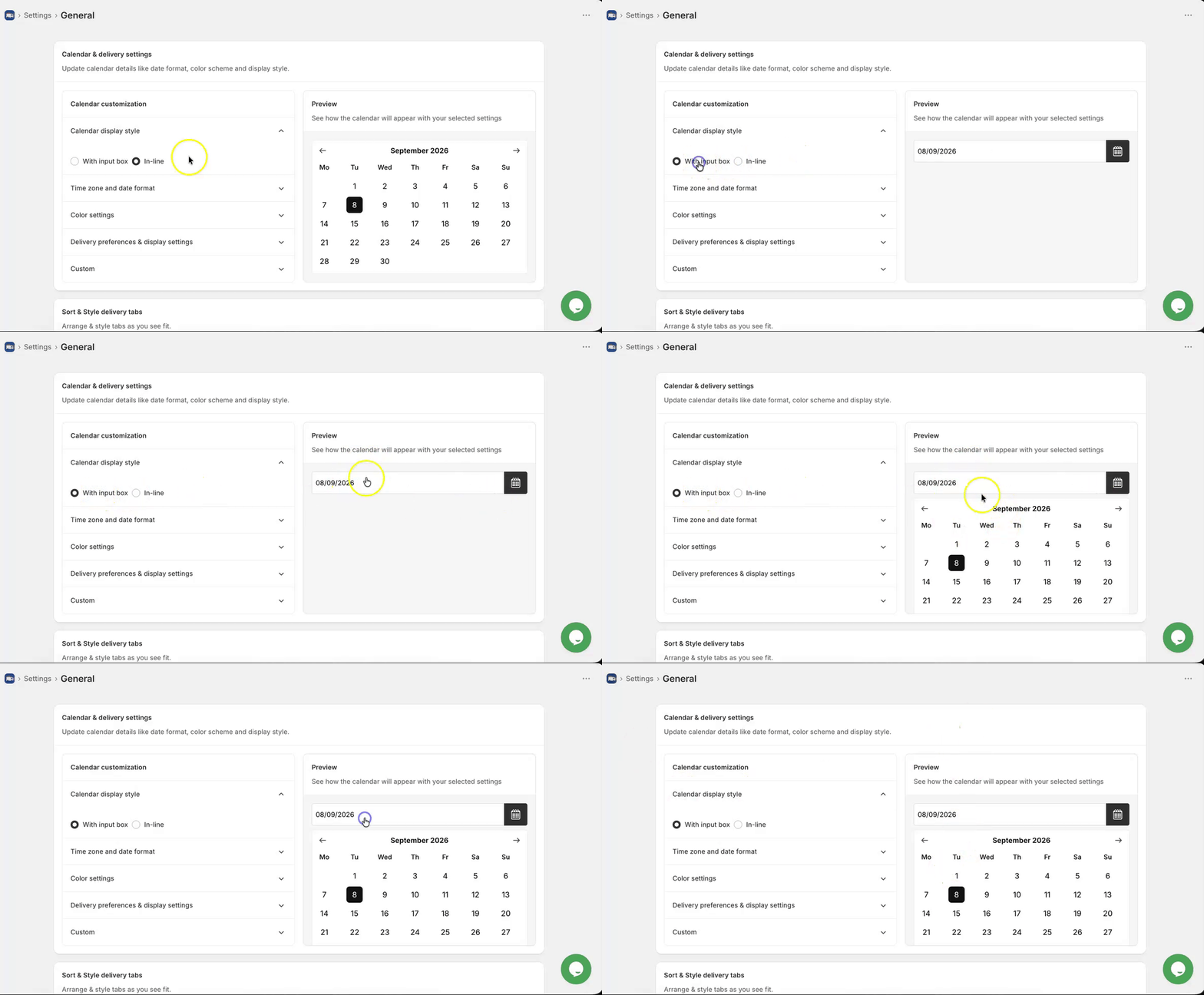
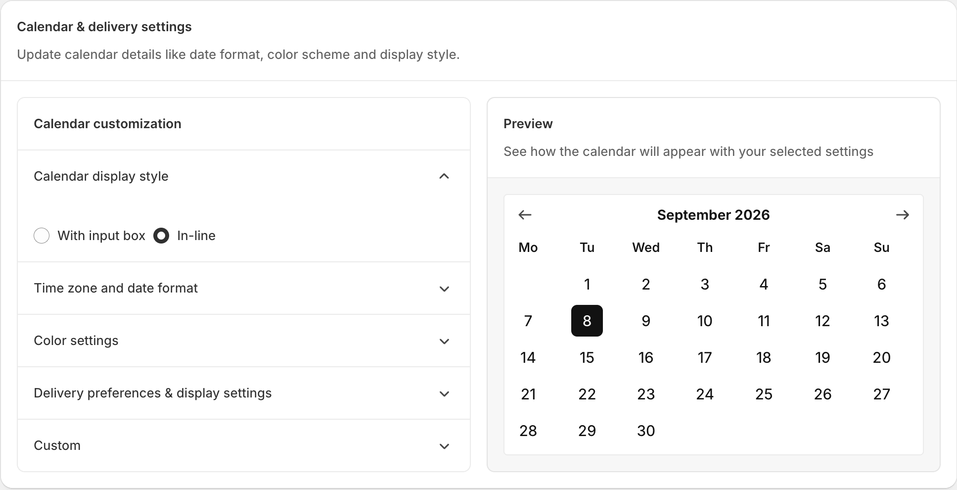
Displays the full delivery calendar directly on the page, so customers can see available dates and select one immediately without opening a pop-up. This option makes the delivery date selector more noticeable and reduces the number of clicks required.
Time zone and date format
Configure how delivery dates and times are displayed on your storefront. These settings ensure your delivery schedule follows the correct time zone, uses the preferred date format, and displays the calendar in a way that matches your business and your customers’ expectations.
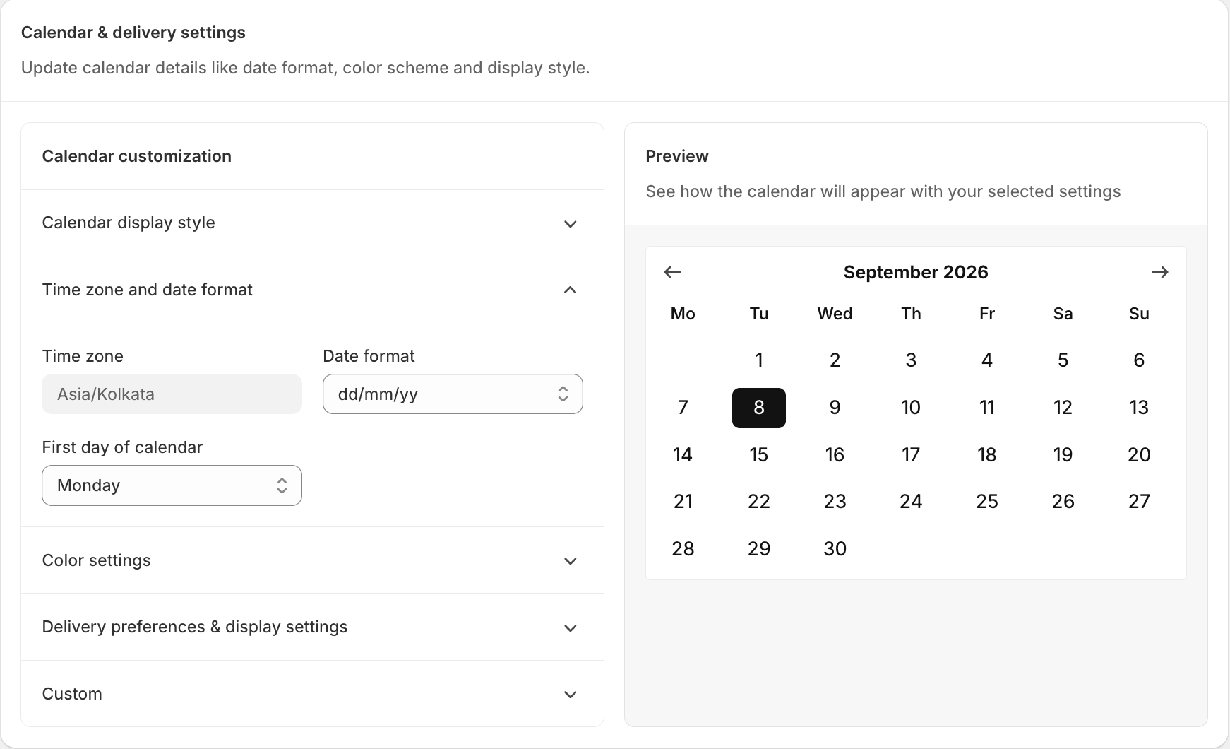
This setting displays your store’s selected time zone and determines how delivery dates and time slots appear on your storefront. All available dates and time slots are shown according to your store’s configured time zone, ensuring customers book deliveries based on your business hours.
This is especially useful if you serve customers in different countries or time zones. For example, if your store operates in UTC +08:00 and a customer places an order from UTC +03:00, the delivery calendar will still display dates and time slots based on your store’s UTC +08:00 time zone, not the customer’s local time.
If you need to change your store’s time zone, update it from your Shopify admin settings, as this field is read-only.
Date format Dropdown
Pick how dates should be displayed on your order, such as dd/mm/yy or mm/dd/yy. This helps match the date style you are familiar with.
The app currently supports the following date formats:
| Date Format | Example |
|---|---|
| dd/mm/yy | 18/08/26 |
| dd/yy/mm | 18/26/08 |
| mm/dd/yy | 08/18/26 |
| mm/yy/dd | 08/26/18 |
| yy/dd/mm | 26/18/08 |
| yy/mm/dd | 26/08/18 |
| dd-mm-yy | 18-08-26 |
| dd-yy-mm | 18-26-08 |
| mm-dd-yy | 08-18-26 |
| mm-yy-dd | 08-26-18 |
| yy-dd-mm | 26-18-08 |
| yy-mm-dd | 26-08-18 |
If you don’t find a format that fits your needs, please contact our support team. We can help add a new date format option for you.
First day of calendar Dropdown
Choose which day should appear first in the calendar, from Monday to Sunday. Select the option that best matches your regional or business preference.
Color settings
Customize the appearance of the delivery calendar to match your store’s branding and improve the customer experience. These settings let you change the colors used throughout the calendar, including the header, navigation buttons, available dates, selected dates, and unavailable dates. A consistent color scheme helps customers quickly identify available delivery dates while keeping the calendar aligned with your storefront’s design.
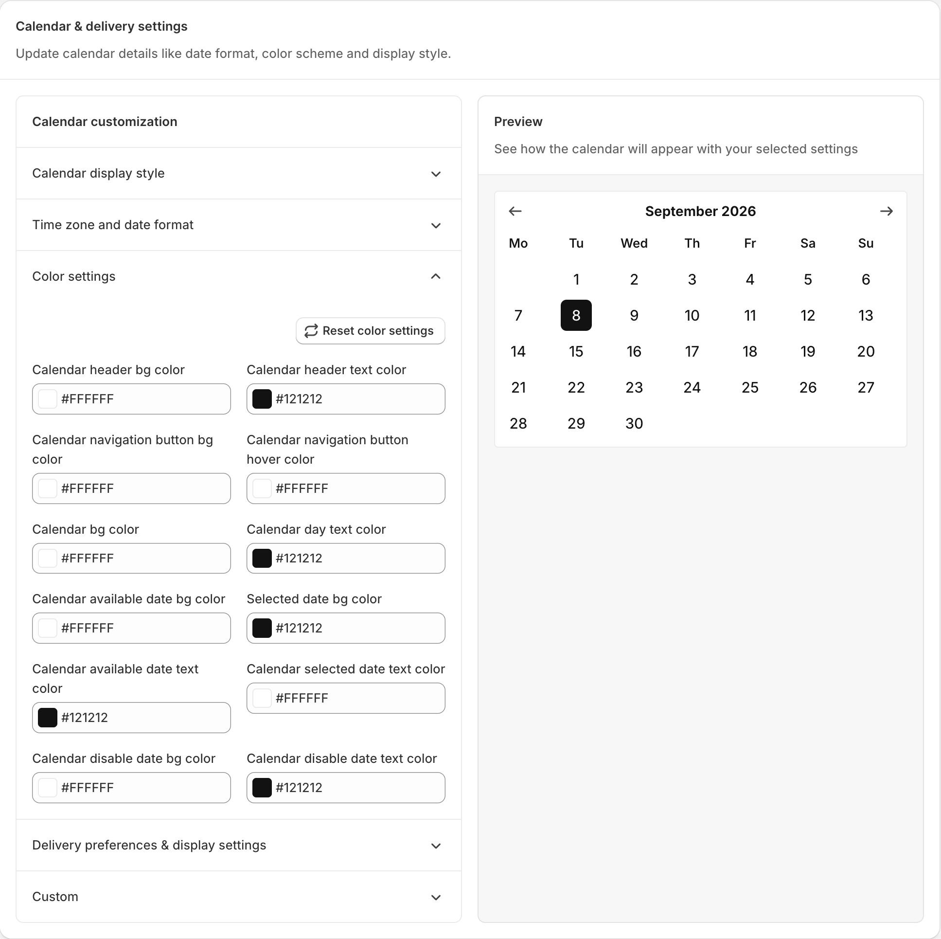
Changes the background color of the calendar header, where the current month and year are displayed. Use this setting to match the header with your store’s branding or make it stand out from the rest of the calendar.
Calendar header text color Color
Changes the text color of the month, year, and weekday names displayed in the calendar header. Choose a color that provides good contrast with the header background for better readability.
Calendar navigation button bg color Color
Changes the background color of the previous and next navigation buttons used to switch between months. Customize these buttons to match your store’s design and make navigation easier for customers.
Calendar navigation button hover color Color
Changes the background color of the navigation buttons when customers hover over them. This provides visual feedback and makes the calendar feel more interactive.
Calendar bg color Color
Changes the background color of the entire delivery calendar. Use this setting to blend the calendar with your storefront or create better contrast for improved visibility.
Calendar day text color Color
Changes the text color of the date numbers displayed in the calendar. Select a readable color so customers can easily view available delivery dates.
Calendar available date bg color Color
Changes the background color of dates that are available for delivery selection. Use a clear and noticeable color to help customers quickly identify the dates they can choose.
Selected date bg color Color
Changes the background color of the delivery date selected by the customer. A distinct color helps customers easily confirm their selected delivery date before completing the order.
Calendar available date text color Color
Changes the text color of dates that are available for delivery. Choose a color that is easy to read and clearly distinguishes available dates from unavailable ones.
Calendar selected date text color Color
Changes the text color of the selected delivery date. Make sure it contrasts well with the selected date background color so the chosen date remains clearly visible.
Calendar disable date bg color Color
Changes the background color of unavailable delivery dates, such as holidays, blocked dates, or fully booked days. This helps customers quickly recognize dates that cannot be selected.
Calendar disable date text color Color
Changes the text color of unavailable delivery dates. Use a subtle color to clearly differentiate disabled dates from available and selected dates while keeping the calendar easy to understand.
Delivery preferences and display settings
Configure how customers select their delivery date and time, and control how the delivery calendar behaves on your storefront. These settings help streamline the ordering process, automate delivery-related actions, and provide customers with a clear and consistent delivery scheduling experience.
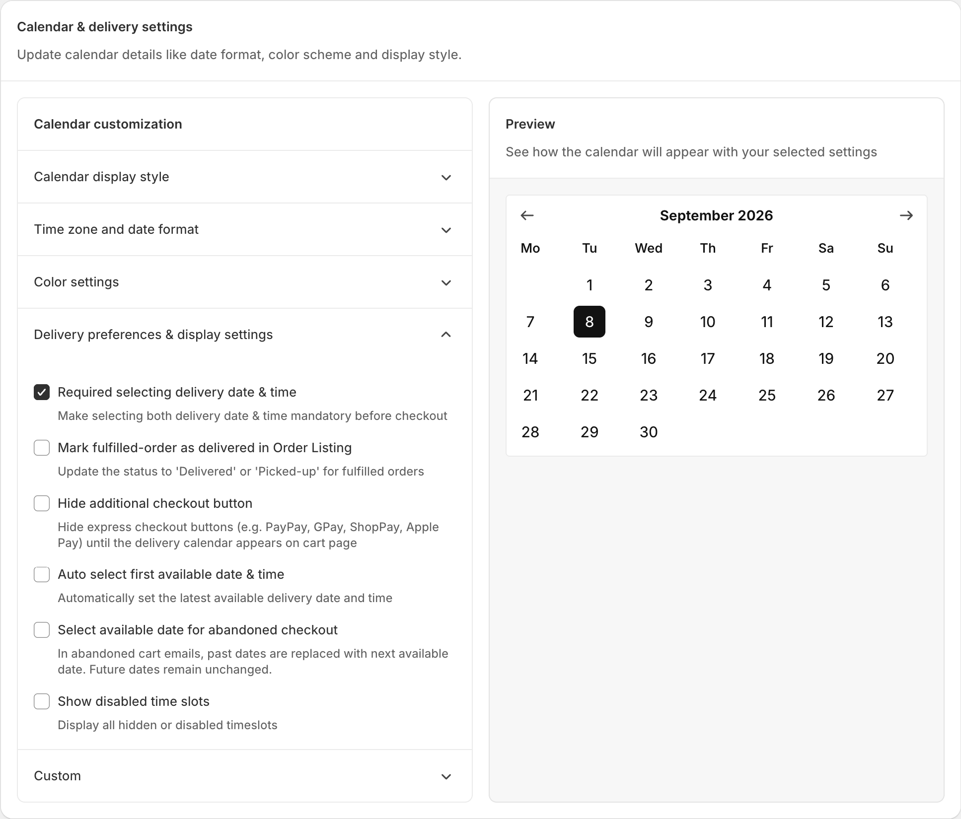
Makes it mandatory for customers to pick both a scheduling date and a time slot on the cart before they visit the checkout. This helps avoid missing scheduling information on new orders.
Mark fulfilled-order as delivered in Order Listing Toggle
Automatically updates an order’s status to Delivered or Picked-up once it has been fulfilled. This keeps your order listing accurate without extra manual work.
Hide additional checkout button Toggle
Hides express checkout buttons, such as PayPal, GPay, ShopPay, and Apple Pay, until the scheduling calendar appears on the cart page. This makes sure customers choose a scheduling date first, instead of skipping straight to a fast checkout option. Learn more in our detailed guide on hiding additional checkout buttons.
Auto select first available date & time Toggle
Automatically selects the earliest available scheduling date and time slot for the customer. This saves time for customers who are fine with the soonest possible scheduling.
Select available date for abandoned checkout Toggle
Fixes outdated scheduled dates in abandoned checkout. If a customer picked a date but never completed payment, this setting updates the date automatically when needed:
- If no scheduled date was selected, the app assigns the first available date and time.
- If the previously selected date has already passed, the app assigns the next available date and time instead.
For example, imagine a customer visits your flower shop on 25th February and scheduled for 28th February, but does not finish payment. If they come back on 1st March, since 28th February has already passed, the app automatically assigns a new available scheduled date.
A few notes on how this works. First, this setting only applies to new orders. Also, the earlier selected date may still briefly appear in the customer’s email and on the Thank You page. Once the Thank You page is refreshed, it shows the updated date. The order listing page, however, always shows the correct, updated scheduled date.
Show disabled time slots Toggle
Displays past or unavailable time slots in a greyed-out state, instead of hiding them completely. This gives customers a full view of the day’s schedule, even the slots they cannot pick. For example, if your available slots are 09 AM to 12 PM and 01 PM to 05 PM, and a customer visits your store at 12:00 PM, the 09 AM to 12 PM slot appears greyed out while the later slots stay active. Any time slots you disabled under Slot-wise Time Format in Time Settings also appear greyed out here.
Custom CSS
Add your own CSS code to style the date and time picker so it matches your store’s theme. This is useful if the built-in color settings don’t give you the exact look you want.


