Generating AI overview
The General Settings section includes global configurations that affect how the delivery date and pickup options function and appear across your store. These settings apply app-wide and help you manage calendar display, styling, and format preferences.
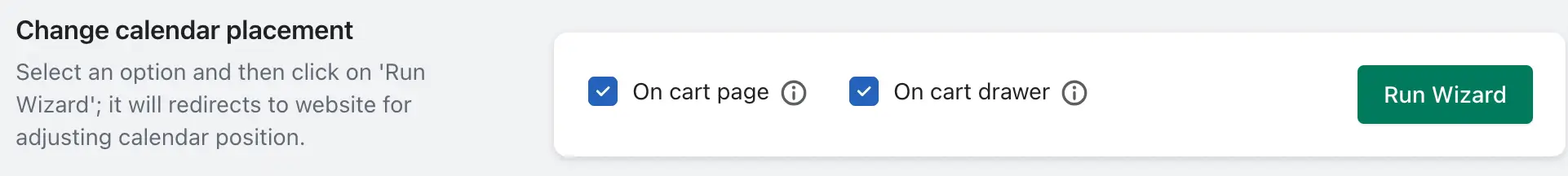
Change calendar placement
This setting allows you to control where the delivery calendar appears on your storefront. It ensures the calendar integrates seamlessly based on your theme and cart setup.
- On cart page: Displays the calendar on the traditional cart page.
- On cart drawer: Ideal for themes using a slide-out cart drawer; places the calendar inside the drawer.
- On product page: (Requires Product Calendar Add-on) Shows the calendar directly on the product details page.
If you have added Product calendar add-on then “On product page” option allows to change the delivery calendar position on the product details page.
For more placement control, refer to the “Calendar Placement” settings page.
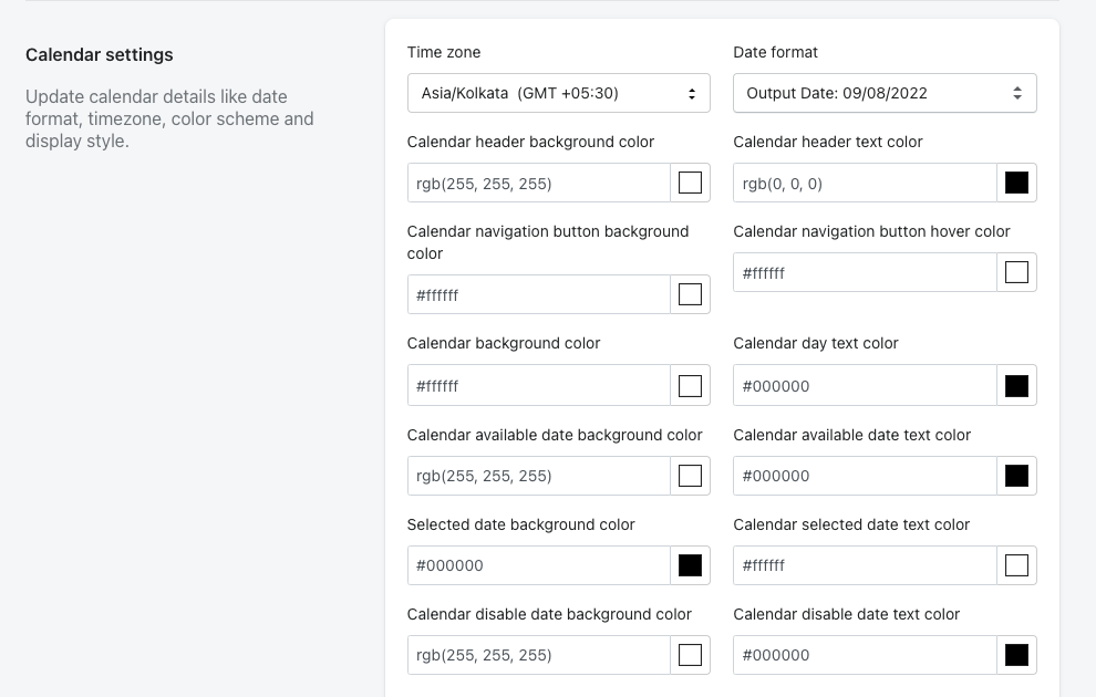
Calendar Settings
The Calendar Settings section includes various options to customize the look and behavior of the delivery calendar. Below is a list of available settings:
2.1 Time Zone:
The calendar automatically uses your store’s time zone. This setting is fixed and cannot be changed manually.
2.2 Date Format:
Allows you to change the format in which delivery dates are displayed to customers (e.g., DD/MM/YYYY or MM/DD/YYYY).
2.3 Calendar Header Background Color:
Lets you customize the background color of the calendar header.
2.4 Calendar Header Text Color:
Lets you change the text color in the calendar header.
2.5 Calendar navigation button background color:
Allows you to set the background color for the calendar’s navigation buttons (e.g., previous/next month).
2.6 Calendar navigation button hover color:
Sets the hover color for the navigation buttons, providing visual feedback when users hover over them.
2.7 Calendar Background Color:
Changes the overall background color of the calendar.
2.8 Calendar Day Text Color:
Allows you to customize the color of the day numbers displayed in the calendar.
2.9 Calendar available date background color:
Lets you set the background color for dates that are available for selection.
2.10 Calendar available date text color:
Changes the text color of the available (selectable) dates.
2.11 Selected date background color:
Allows you to change the background color of the currently selected delivery date.
2.12 Calendar selected date text color:
Sets the text color for the selected delivery date.
2.13 Calendar disable date background color:
Lets you change the background color for dates that are disabled or unavailable.
2.14 Calendar disable date text color:
Allows you to customize the text color for disabled or blocked dates.
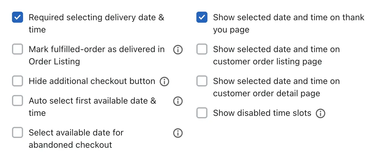
Required Selecting Delivery Date & Time:
Enabling this checkbox makes the selection of both delivery date and time mandatory before placing an order.
Mark Fulfilled Orders as Delivered in Order Listing:
When an order is fully fulfilled, it will automatically be marked as completed in the app’s order listing.
Hide Addition Checkout Button:
This setting hides express checkout options such as GPay, PayPal, Amazon Pay, ShopPay, etc., until the customer selects both the delivery date and time.
Once the delivery information is selected, all payment options will be displayed.
For more details, please article here.
Auto-select first available date & time:
When enabled, the system will automatically select the first available delivery date and time in the calendar and time picker.
Select Available Date for Abandoned Checkout
This feature handles situations where the customer doesn’t complete their checkout:
-> If no delivery date is selected, the first available date and time will be assigned automatically.
-> If a previously selected date has already passed, the app will assign the currently available delivery date and time instead.
Example:
A customer visits on 25th Feb, selects 28th Feb for delivery, but does not complete the payment.
If they return on 1st March, the app will assign a new available date since the selected date has passed.
Notes:
-> This setting applies only to new orders.
-> The previously selected date and time may still appear in the customer’s email and on the Thank You page temporarily.
Once the Thank You page is refreshed, it will show the updated delivery date.
-> The Order Listing page will always display the new available delivery date.
Show Selected Date and Time on Thank You Page:
Displays the selected delivery date and time on the order confirmation (Thank You) page.
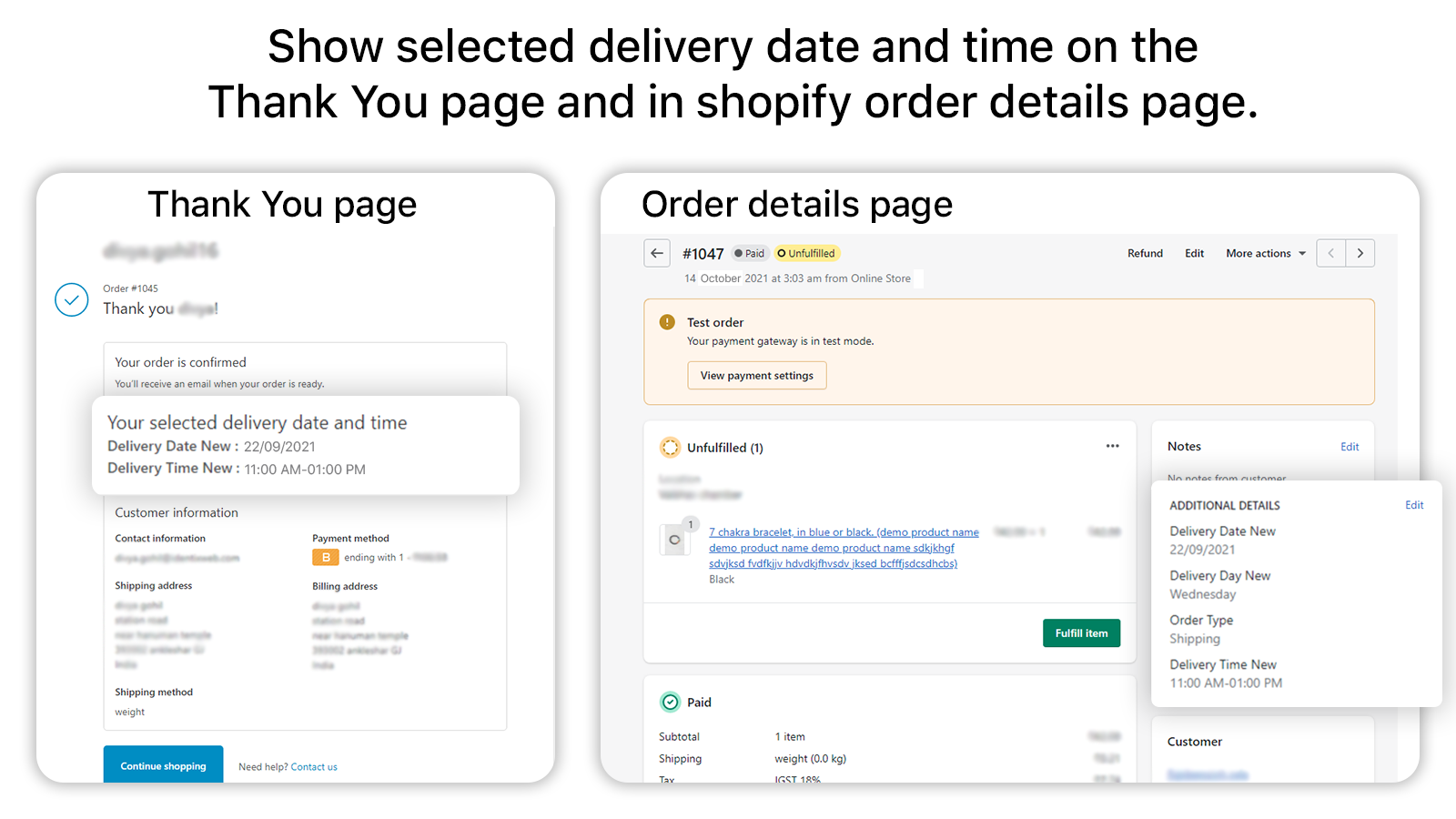
For more information, please visit this article here.
Show Selected Date and Time on Customer Order Listing Page
Once enabled, customers will see their selected delivery date directly on the Order Listing page within their account.
This allows them to change the delivery date if needed.
Show Selected Date and Time on Customer Order Detail Page
Enabling this option will show the selected delivery date on the Order Details page in the customer’s account.
Customers can update their delivery date directly from this page if allowed.
Show disable time slots
When enabled, the app will display past time slots based on the customer’s current time, but those slots will be greyed out and unselectable.
Example:
If available slots are:
09 AM – 12 PM
01 PM – 05 PM
And the customer visits the site at 12:00 PM, the 09 AM – 12 PM slot will appear greyed out and unselectable, while the later slots remain active.
Also, any disabled time slots configured under Slot-wise Time Format in the Time Settings will also appear greyed out in the time picker.
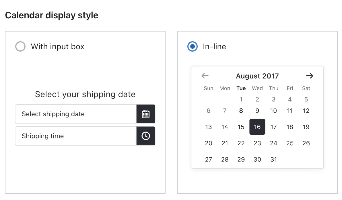
Calendar Display Style
The app offers two types of calendar display styles:
- With Input Box:
The calendar appears only after clicking on the date selection box. This keeps the interface cleaner until a user interacts with it. - In-line:
The calendar is always visible on the page, allowing users to select a date without any extra click.
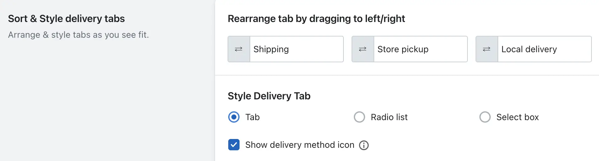
Sort & Style delivery tabs
You can arrange the order of the delivery tabs displayed on the cart page. This allows you to set the display position of the Shipping, Store Pickup, and Local Delivery tabs according to your preference.
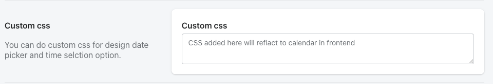
Custom CSS
Here you can add a custom CSS code to modify the calendar design.
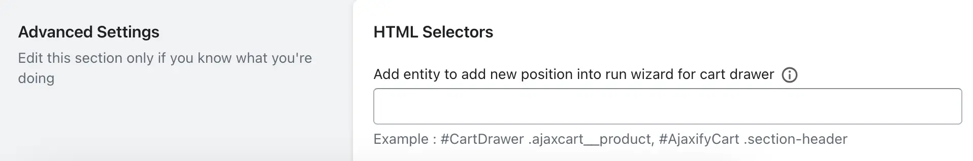
Advanced Settings
Note: Edit this section only if you know what you’re doing
i) Add entity to add new position into run wizard for cart drawer:
– If you’re using the setup wizard and encounter an error such as “class not found/match,” you can manually add the main entity (CSS class or selector) of your cart drawer here to help the app identify the correct insertion point.
If you use Product scheduler plan:
i) Add entity to add new position into run wizard for product details page:
– If you use the setup wizard and encounter an error such as “class not found/match,” you can manually add the entity (CSS class or selector) of the product details page here to help the app identify the correct placement location.