Generating AI overview
The Popup Cart is one of the flexible cart options available in the iCart Cart Drawer Cart Upsell app. Unlike the Side Cart, which slides in from the left or right side of the screen, the Popup Cart appears from the bottom-center of the page — giving it a sleek, modern feel while helping improve conversion rates and customer experience.
With this feature, you can create a quick, distraction-free cart view using multiple widgets, upsell offers, and more — all optimized for speed and engagement.
🚀 Getting started with the Popup Cart
To start customizing your Popup Cart:
- Login into your Shopify admin
- From the admin menu, click on the Apps
- Click on the iCart Cart Drawer Cart Upsell
- By default, the app comes with the Side Cart enabled. To switch to the Popup Cart:
• Go to App Settings > Cart Types
• Under Quick Cart, select Popup Cart from the available options - Now, in the dashboard page, click on the customize button right to the Quick cart from Cart type
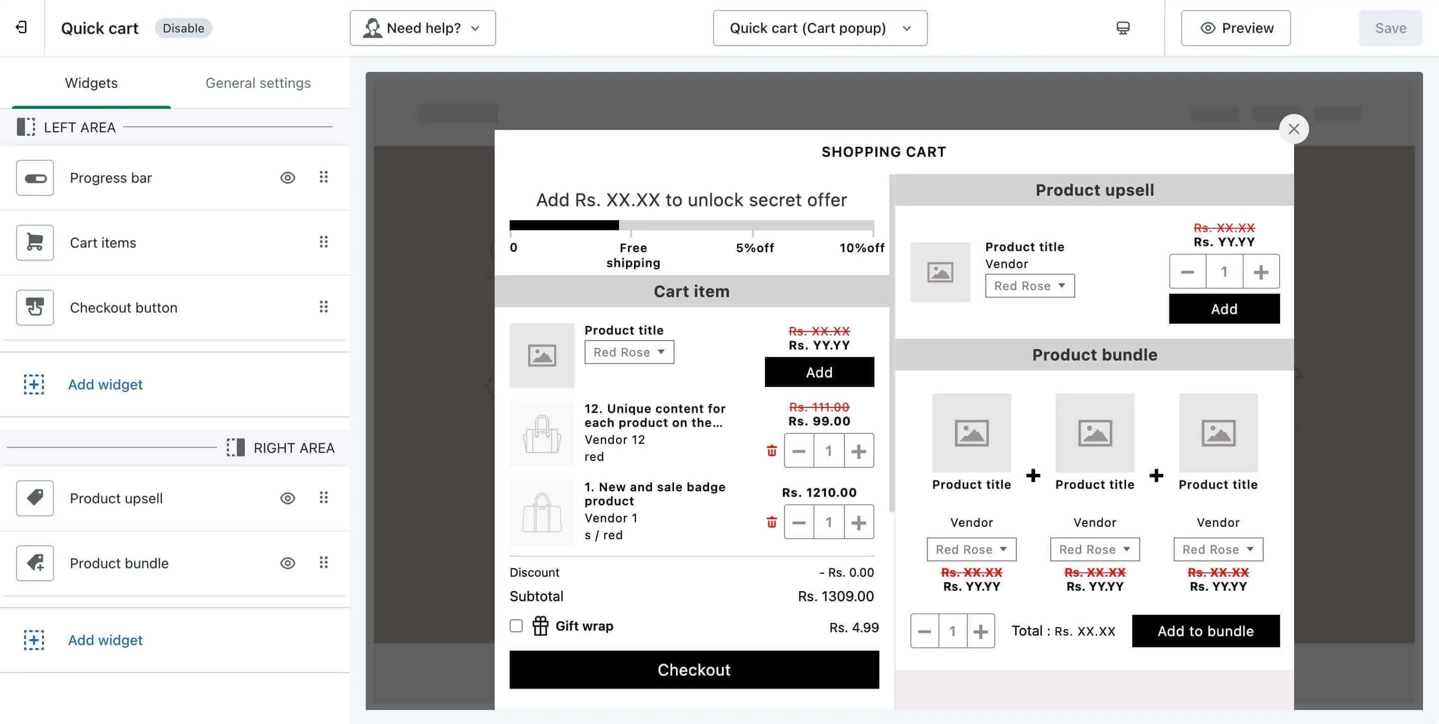
Once inside the Popup Cart Builder, you’ll see a layout divided into two sections — the Left Area and the Right Area — giving you more control over how your cart appears and functions.
🧩 Popup cart layout & features
The Popup Cart customizer comprises two distinct sections – the Left Area and the Right Area. Upon clicking the “Customize” button on the Dashboard page of the iCart app, you’ll be introduced to these components.
▶️ Left area
The left area serves as a canvas for various widgets, allowing a dynamic adjustment of the Quick Cart (popup cart). It holds the core cart widgets such as:
- Cart Items
- Progress bar
- Checkout Button (if only one is added)
These elements are essential to the cart’s function and cannot be deleted or moved. They help keep the layout clean and consistent while ensuring your customers can always view and interact with their cart contents.
Additionally, you can add other widgets in this area and can move or delete them as needed. However, the core widgets listed above will always remain fixed in place.
◀️ Right area
The right area is more flexible — here, you can:
- Add any additional widgets (e.g., product upsells, timers, shipping messages)
- Include multiple Checkout Buttons
- Rearrange or remove widgets as needed (except Cart Items, which stays in the left area)
This allows you to tailor the cart to your store’s specific needs, whether it’s promoting cross-sells, showing progress-based rewards, or collecting customer feedback.
🔄 Moving widgets around
Want to change the order of widgets or shift them between areas? The Popup Cart customizer offers a drag-and-drop interface to:
- Move widgets up and down within their respective areas
- Shift widgets between the left and right zones (except Cart Items and some Progress Bars)
- Cart Items and Progress Bar widgets stay fixed in the left area
- If you only have one Checkout Button, it will also remain fixed. You can move it only when you’ve added more than one Checkout Button
This layout logic ensures users always see the most important actions clearly and consistently.
🧱 Add or remove widgets
The Popup Cart supports all the widgets available in the app. To add a new widget:
- Click on the Add Widget button
- Browse through the available widget list
- Select the one you’d like to add and click Add
You can always edit, reposition, or remove widgets from the right area of the cart to meet your store’s design goals.
👉 Want to explore all available widget types? Check our Cart Customizer Widget Guide
⚙️ General settings
General settings apply across your entire Popup Cart layout. These settings include:
- Button styling
- Custom CSS
- Other global layout controls
👉 For step-by-step instructions, visit our General Settings Help Article
✅ Summary
The Popup Cart feature in iCart helps you offer a fast and modern cart experience — sliding up from the bottom, customizable with drag-and-drop widgets, and perfect for increasing conversions.
Whether you’re showcasing upsell offers, customizing checkout flow, or simply improving cart clarity, the Popup Cart gives you the flexibility to make it happen — without needing a developer.
💬 Need help?
If you’re unsure how to configure your Popup Cart or need help choosing the best layout for your store, don’t hesitate to drop an email or chat with us. We’re always here to help!