Overview
The Funnel feature in the iCart Cart Drawer Cart Upsell app helps you drive more sales and increase your Average Order Value (AOV) — all before the customer reaches checkout. You can set it up on the Home Page or Product Page, ensuring maximum visibility and customer interaction.
A funnel is made up of the following widget types:
- 🛍️ Product Upsell – Suggest premium or complementary products
- 🔄 Product Recommendation – Dynamically recommend relevant items
- 📦 Product Bundle – Offer grouped products at discounted rates
You can control when and how these widgets appear by using smart triggers based on customer behavior — like location, login status, or device type.
🛠️ How to create a Funnel
Follow these simple steps to create your first funnel:
1️⃣ Go to Funnel Setup
- Head to the Dashboard in your iCart app.
- Scroll to the bottom and look for “Upsell settings for homepage and product pages” option
- Click to the Create Funnel button
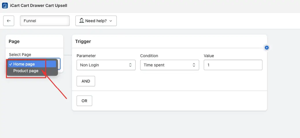
2️⃣ Choose the Page
Decide where your funnel will appear:
- Home Page — Show widgets on your store’s main page.
- Product Page — Display widgets on specific product pages.
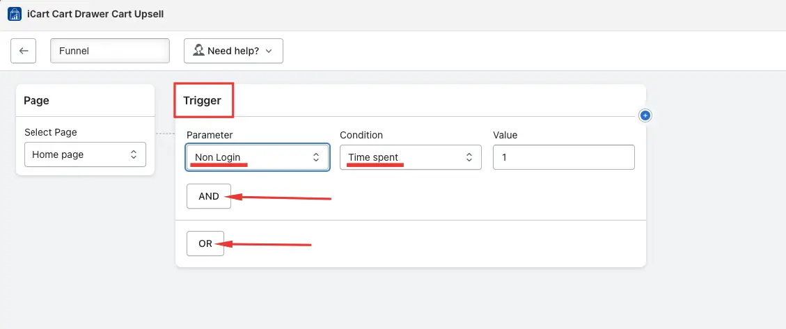
3️⃣ Set Trigger Conditions
Create rules for when your funnel should display:
- Choose conditions like country, customer login status, or cart items.
- Use AND/OR logic to combine multiple conditions.
📝 Example: Show a bundle only for logged-in users from Canada.
4️⃣ Add a Widget
→ Once the conditions are set, choose the widget you want to display on the homepage or product page. Available widgets include Product Upsell, Product Recommendation, and Product Bundle.
→ The Product Upsell, Product Recommendation, and Product Bundle widgets each have their own specific functionalities for setup.
→ After selecting the widget, you can assign a discount to it. For example, if you’ve added an upsell widget, you can set a discount for the upsell product. Based on the conditions you’ve defined, the widget will be displayed on the homepage or product page. When the customer adds the product from the widget, the discount will be applied.
→ If you want to show another widget based on a customer adding products to the cart from a created offer, you can create an additional upsell.
When a customer adds an upsell product from an offer, they will see another offer on the corresponding product page.
→ If you’ve already created an offer for the product page, simply add the widget to the product page based on your requirements.
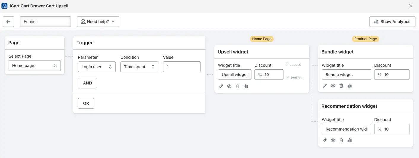
→ We have two operators: Then and Otherwise.
If you add a widget under the “Then” operator, the product will be displayed on the homepage, and once any product is added to the cart, the newly created widget will be displayed to the customers on the product page.
If you choose the “Otherwise” operator, both the previous widget and the newly created widget under the Otherwise operator will be displayed to the customers.
You can edit, hide, or delete the widget, and view the analytics which showcases the widget’s impressions, offer acceptance, and click-through rate.
→ If you are creating a funnel for the first time, it is necessary to make all the required changes, such as design and other settings, as per your preferences.
If you’ve already created one funnel and want to create another, you can either create a new offer or choose an existing widget. For the existing widget, you can simply change the products without needing to make design-related expected changes again. This is one of the main benefits of this funnel—it saves time.
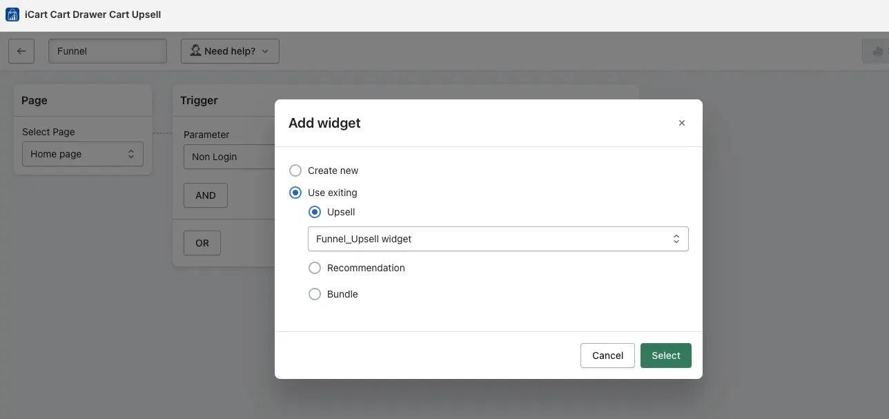
5️⃣ Save Time with Reusable Widgets
Already created a widget? Great! You can:
- Reuse existing widgets
- Swap products
- Skip design changes to save time
🛍️ Product upsell widget
The product upsell widget is divided into two parts:
- Widget Setup
- Design
Let’s take a deeper dive into understanding the widget setup.
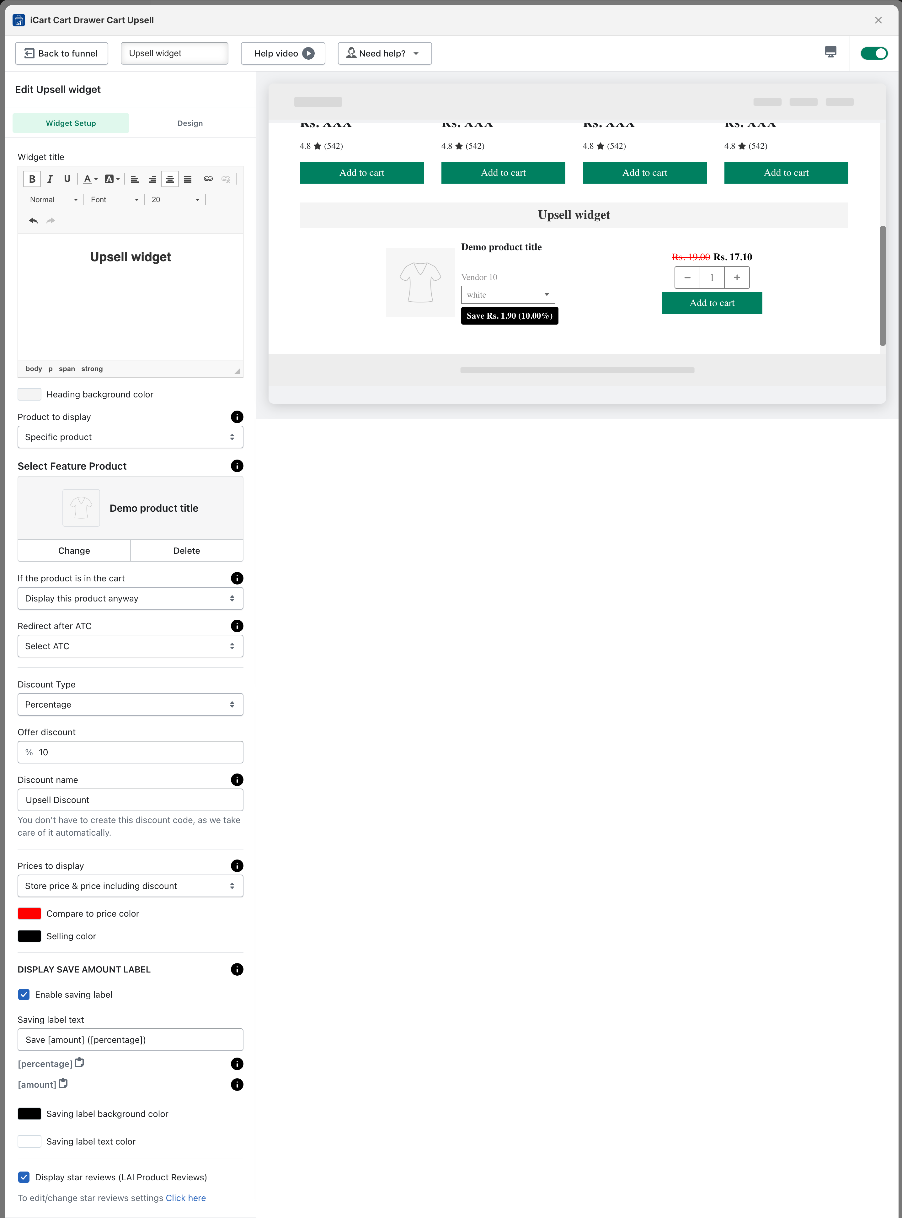
Widget Setup
→ Widget title: You can add or modify the name of the widget. Additionally, you can change the title’s size, and color, and apply formatting like bold, italic, or underline. You can also insert links into the widget title to match the look & and feel of your theme. ADD
→ Heading background color: You can adjust the heading background color to match your theme’s layout.
→ Products to display: You can choose which products to display for the upsell. Options include selecting specific products, product recommendations, or specific collections.
Note: With “product recommendations” and “specific collection” any one random product from the collection or from the Shopify recommendation.
→ If the Product is in the Cart: This option will only appear when you select specific products for upsell. You have three options for handling products that are already in the cart:
- Display the product anyway: This option allows you to display the product in the upsell even if it has already been added to the cart. This ensures that the product remains visible as part of the upsell, regardless of its presence in the cart.
- Hide the product: If you choose this option, any product that is already in the cart will not be displayed in the upsell. This helps avoid showing duplicate products to your customers.
- Display an alternative product: If one of the products in the upsell is already in the cart, you can choose to display an alternative product instead. This allows you to offer an alternative product without removing the upsell offer.
→ Exclusion tags – exclude products that are tagged with: If you select a specific collection or Shopify recommendation, and want to exclude certain products, you can use product tags for exclusion.
→ Redirect after add to cart (ATC): When a customer adds the upsell product to their cart, you can choose where to redirect them. Options include the cart drawer/popup, full cart, and Checkout page. The default selected option would be “select” which means you don’t have any preference and it will work according to the flow set over your theme.
→ Discount type: You can set the discount type, such as a “percentage”, “fixed amount”, or “fixed amount per item” added. You can also specify a minimum price for the discount to apply. If no discount is selected, only the products will be displayed without any discount applied.
→ Discount name: You can change the discount name to suit your preference.
→ Prices to display: You can choose how to display product upsell prices, such as only the “store price”, “store price and compare-at price”, “store price and discounted price”, or store “price and compare-at price including the discount”. You can also customize the color for both of them
→ Display save amount label: To display a savings label, enable this option. You can show the savings as an amount or percentage and customize the background and text color of the label.
→ Review integration: If you have integrated a third-party review app with the iCart app, the product reviews can be displayed on the upsell widget. Supported apps include Loox, Rivyo, Judge.me, Stamped.io, Ali Reviews, Reviews.io, Product Reviews, Yotpo, and LAI Product Reviews.
Design
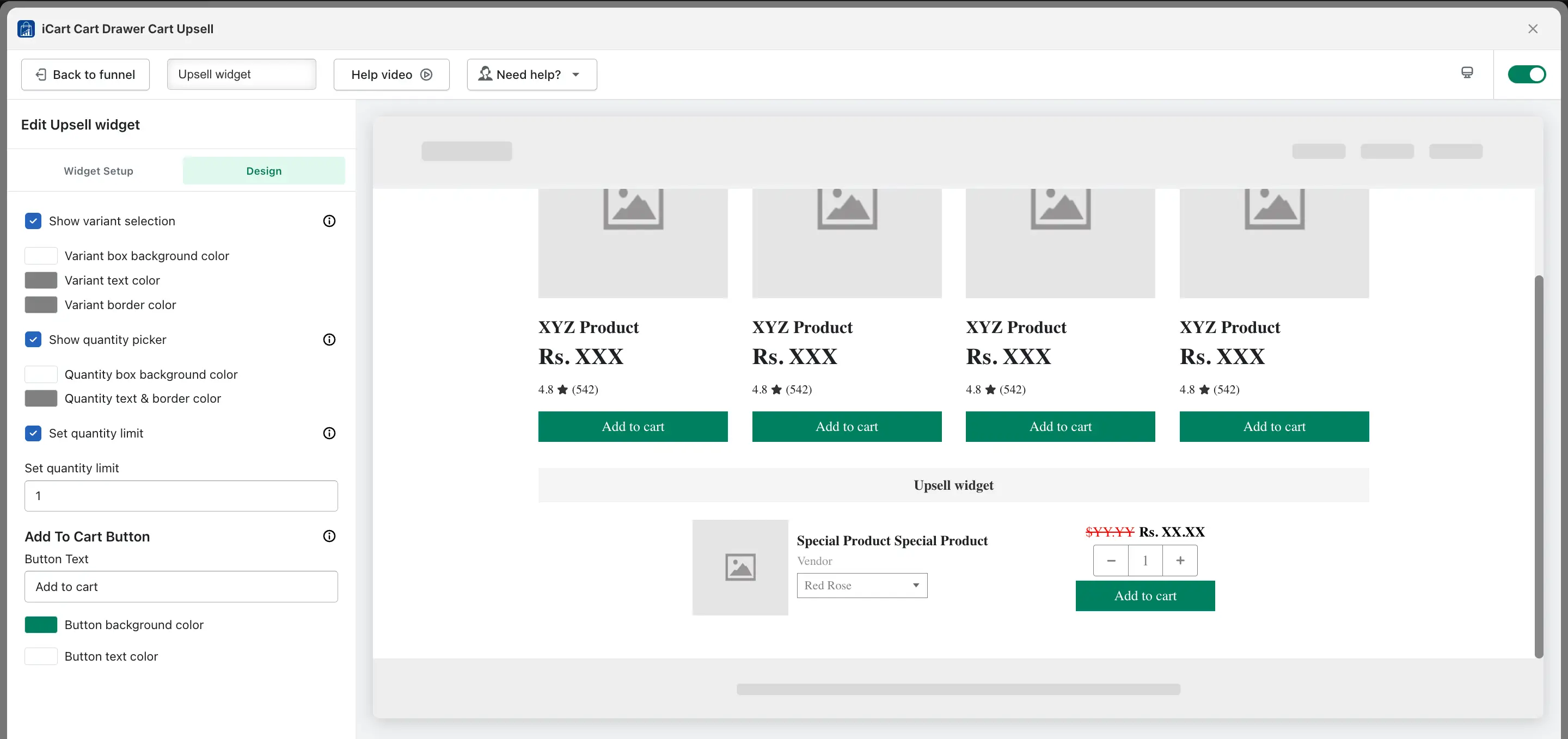
→ Show variant selection: When this option is enabled, customers can choose the variant for the specific product. If this option is not enabled, the first available product variant with inventory will be displayed. You can customize the variant box’s background color, text color, and border color.
→ Show quantity picker: When this option is enabled, customers can select the product quantity. If it is disabled, customers will only be able to purchase one quantity. You can change the background color, text color, and border color of the quantity box to match your theme.
→ Set quantity limit: You can set a quantity limit for the product, which restricts customers from adding an unlimited number of items. For example, if you set the limit to 5, customers can only add up to 5 units of the product to the cart.
→ Add to cart button: You can change the text of the Add to Cart button and customize its background color and text color to match your theme.
🤖 Product recommendation widget
The Recommendation widget is divided into two parts:
- Widget Setup
- Design
Let’s begin with the Widget Setup:
Widget Setup
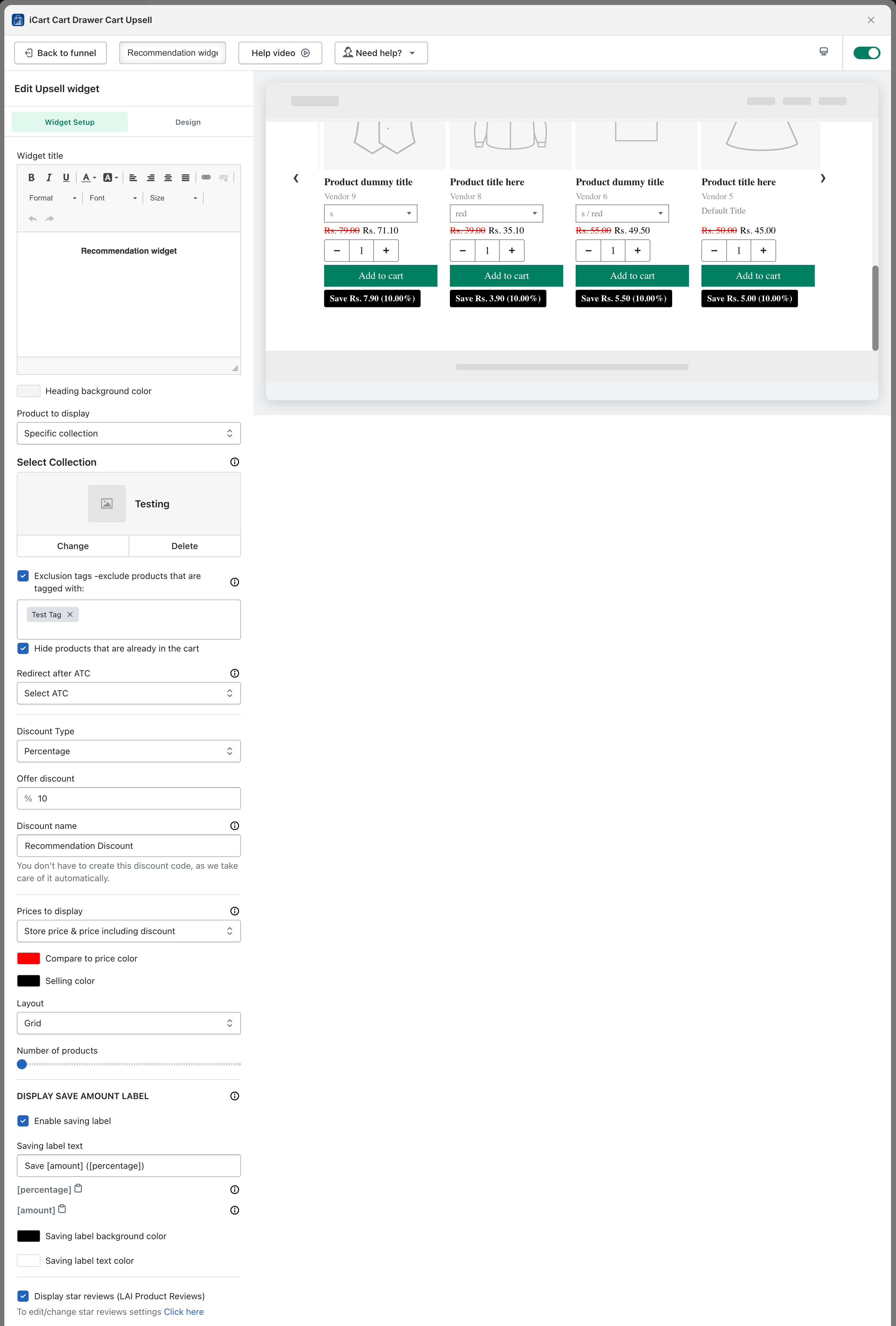
→ Widget title: You can add or modify the name of the widget. Additionally, you can change the title’s size, color, and apply formatting such as bold, italic, or underline. You can also insert links into the widget title.
→ Products to display: You can set a specific collection or use Shopify’s recommendation option to display products as recommendations.
→ Exclusion tags – exclude products that are tagged with: If you select a specific collection or Shopify recommendation and want to exclude certain products, you can use product tags for exclusion.
→ Hide products already in the cart: When this option is enabled, any product already added to the cart will not be displayed in the recommendation widget.
→ Redirect after add to cart (ATC): When a customer adds a recommended product to their cart, you can choose where to redirect them. Options include the cart drawer/popup, full cart, direct checkout page, or not redirecting if the “select ATC” option is chosen.
→ Discount type: You can set the discount type, such as a “percentage”, “fixed amount”, or “fixed amount per item” added. You can also specify a minimum price for the discount to apply. If no discount is selected, only the products will be displayed without any discount applied.
→ Discount name: You can change the discount name to suit your preference.
→ Prices to display: You can choose how to display product prices, such as only the “store price”, “store price and compare-at price”, “store price and compare-at price including discounts”, or store price including discounts. You can also customize the color of the compare-at price and selling price.
→ Layout: You can display the product recommendation widget in two layouts: Grid or List. If you choose Grid, all products will be displayed in a grid view; if you choose List, they will be displayed in a list format.
→ Number of products: You can display a minimum of 12 products and a maximum of 60 products in the recommendation widget.
→ Display save amount label: To display a savings label, enable this option. You can show the savings as an amount or percentage and customize the background and text color of the label. This label will be displayed for each individual product.
→ Review integration: If you have integrated a third-party review app with the iCart app, product reviews can be displayed on the recommendation widget. Supported apps include Loox, Rivyo, Judge.me, Stamped.io, Ali Reviews, Reviews.io, Product Reviews, Yotpo, and LAI Product Reviews.
Design
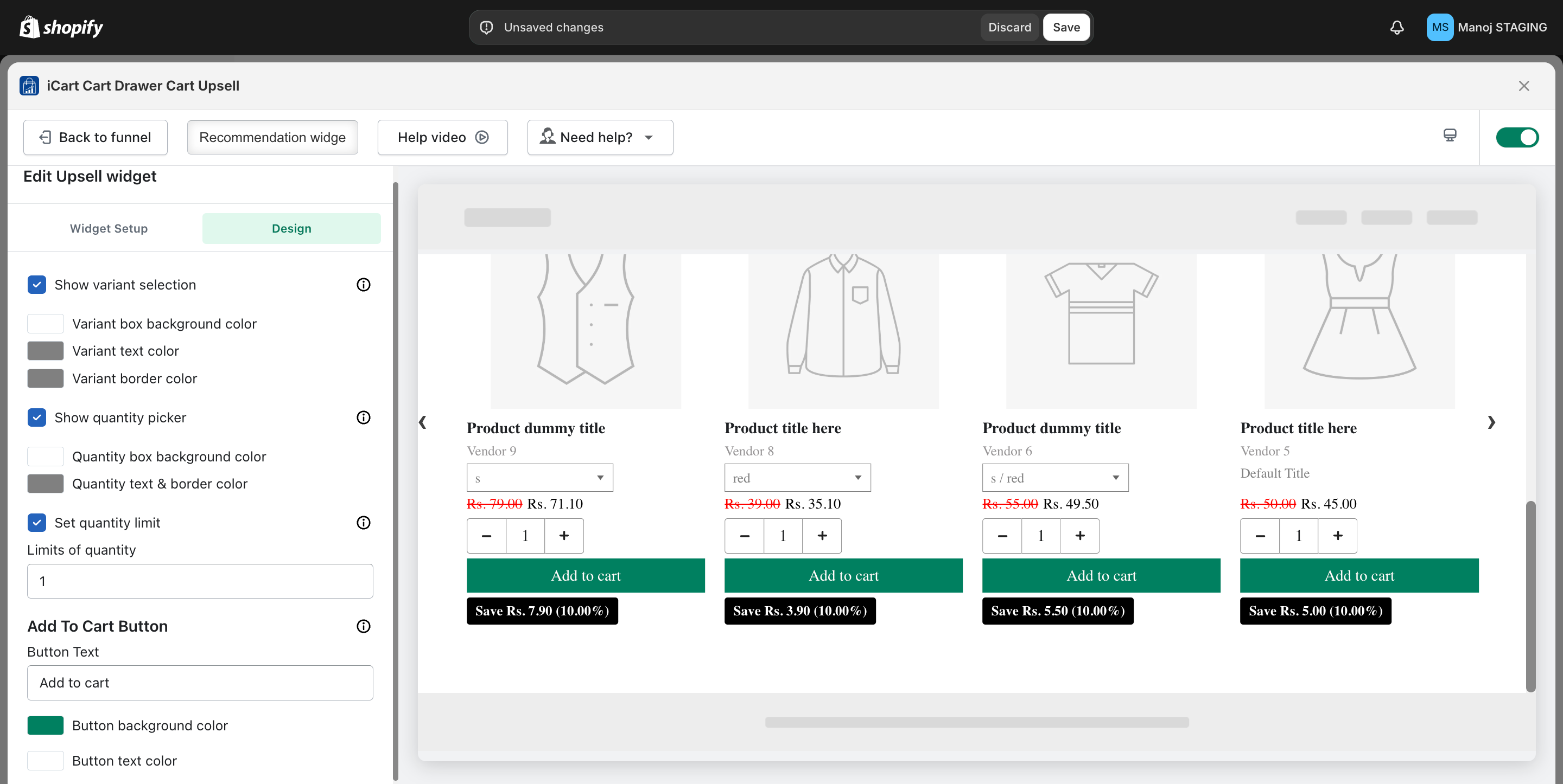
→ Show variant selection: When this option is enabled, customers can choose the variant for the specific product. If this option is not enabled, the first available product variant with inventory will be displayed. You can customize the variant box’s background color, text color, and border color.
→ Show quantity picker: When this option is enabled, customers can select the product quantity. If it is disabled, customers will only be able to purchase one quantity. You can change the background color, text color, and border color of the quantity box to match your theme.
→ Set quantity limit: You can set a quantity limit for the product, which restricts customers from adding an unlimited number of items. For example, if you set the limit to 5, customers can only add up to 5 units of the product to the cart.
→ Add to cart button: You can change the text of the Add to Cart button and customize its background color and text color to match your theme.
🧳 Bundle widget
The Bundle widget is divided into two parts:
- Widget Setup
- Design
Let’s begin with the Widget Setup:
Widget Setup
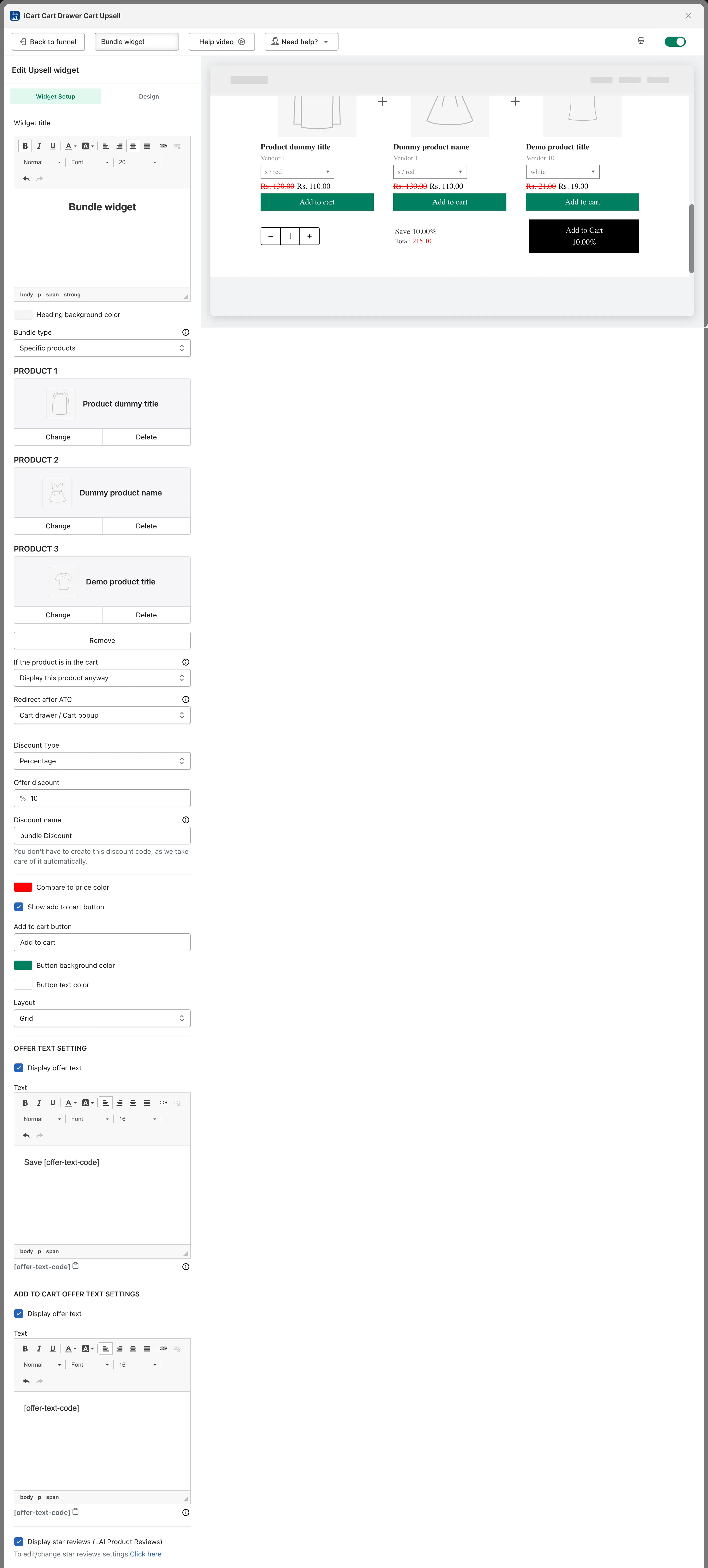
Widget title: You can add or modify the widget title. Additionally, you can change the title’s size, color, and apply formatting such as bold, italic, or underline. You can also insert links into the widget title.
Heading background color: You can change the heading background color to match your theme.
Bundle type: You can select a specific collection or use Shopify’s recommendation option to display products as a bundle.
If you choose specific products, you can create a bundle with 2 or 3 products of your choice.
If you choose Shopify’s recommendation, 3 products will automatically be displayed in the bundle.
Exclusion tags – exclude products that are tagged with: If you select a specific collection or Shopify recommendation and want to exclude certain products, you can use product tags for exclusion.
→ If the Product is in the Cart: This option will only appear when you select specific products for Bundle. You have three options for handling products that are already in the cart:
- Display the product anyway: This option allows you to display the product in the bundle even if it has already been added to the cart. This ensures that the product remains visible as part of the bundle, regardless of its presence in the cart.
- Hide the product If already in the cart: If you choose this option, any product that is already in the cart will not be displayed in the bundle. This helps avoid showing duplicate products to customers who have already added the item to their cart.
- Display an alternative product: If one of the products in the bundle is already in the cart, you can choose to display an alternative product in its place. This allows you to offer customers additional choices without removing the bundle offer, keeping the promotion active with a similar or complementary product.
Redirect after add to cart (ATC): When a customer adds a bundle product to their cart, you can choose where to redirect them. Options include the cart drawer/popup, full cart, direct checkout page, or not redirecting if the “select ATC” option is chosen.
Discount type: You can set the discount type, such as a “percentage”, “fixed amount”, or a “fixed amount per item” added. You can also specify a minimum price for the discount to apply. If no discount is selected, only the products will be displayed without any discount.
Discount name: You can change the discount name according to your preference.
Compare price color: The compare-at price will be displayed by default, and you can choose a color for the compare price to match your theme.
Show add to cart button: If you enable this option, an “Add to Cart” button will be displayed for each product in the bundle, allowing customers to add individual products from the bundle to the cart. This is helpful if customers don’t want to purchase the entire bundle. You can also change the button text, text color, and button background color to match your theme.
Layout: You can display the bundle widget in two layouts: Grid or List. If you choose Grid, products will be displayed in a grid view; if you choose List, they will be displayed in a list view.
Offer text setting: If you want to display the offer price as a percentage or fixed amount, you can enable this option and customize the text according to your preference.
Add to cart offer text setting: If this option is enabled, the discounted price (percentage or amount) will be displayed on the “Add to Cart” button.
Review integration: If you have integrated a third-party review app with the iCart app, product reviews can be displayed on the bundle widget. Supported apps include Loox, Rivyo, Judge.me, Stamped.io, Ali Reviews, Reviews.io, Product Reviews, Yotpo, and LAI Product Reviews.
Design
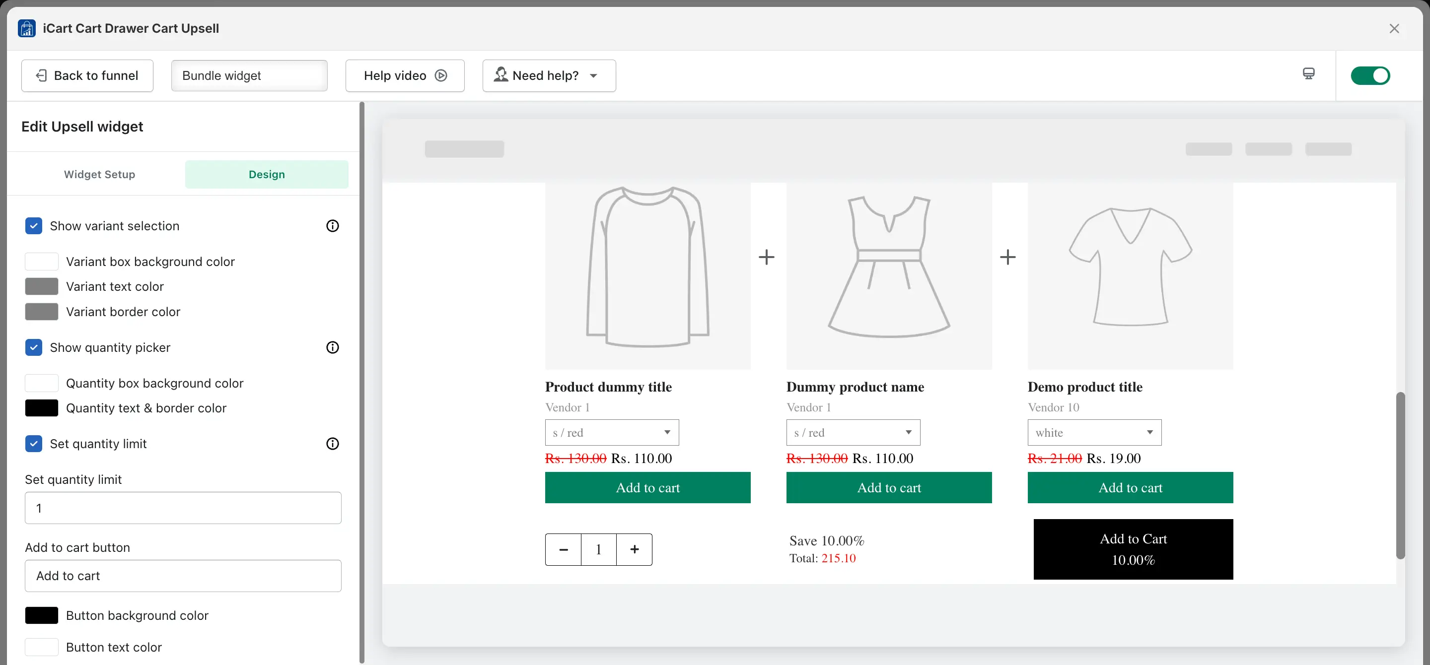
→ Show variant selection: When this option is enabled, customers can choose the variant for the specific product. If this option is not enabled, the first available product variant with inventory will be displayed. You can customize the variant box’s background color, text color, and border color.
→ Show quantity picker: When this option is enabled, customers can select the product quantity. If it is disabled, customers will only be able to purchase one quantity. You can change the background color, text color, and border color of the quantity box to match your theme.
→ Set quantity limit: You can set a quantity limit for the product, which restricts customers from adding an unlimited number of items. For example, if you set the limit to 5, customers can only add up to 5 units of the product to the cart.
→ Add to cart button: You can change the text of the Add to Cart button and customize its background color and text color to match your theme.
📍 Funnel widget placement
To set the placement of your funnel widget, follow these steps:
- Log in to your Shopify admin panel.
- From the left menu, go to Apps and open the iCart Cart Drawer Cart Upsell app.
- In the app dashboard, click on General Settings from the left-side menu.
- Scroll to find the Funnel widget placement option.
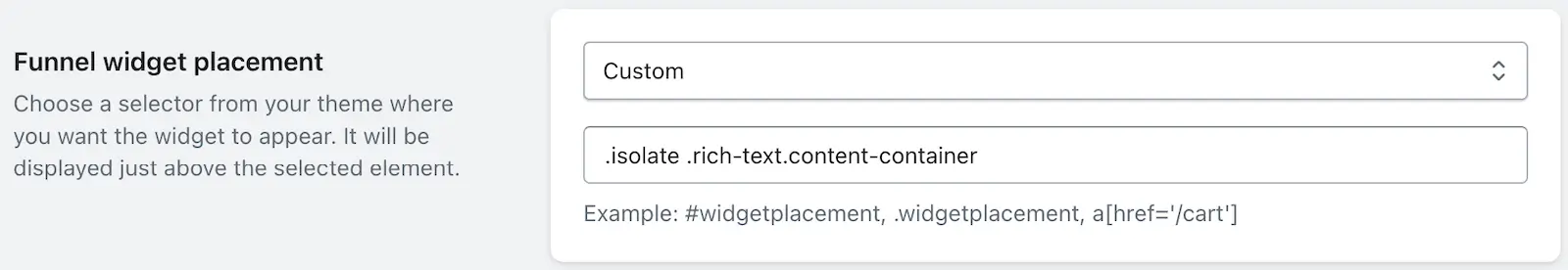
You can control where the funnel widget appears on the Home Page or Product Page using this setting. Two options are available:
- Above footer: Automatically displays the funnel just above your website’s footer. Ideal for consistent placement without manual setup.
- Custom: Allows you to define the exact position by entering a CSS selector (e.g.
.class,#id, ora[href='/cart']). The funnel will appear just above the matched element on your site.
📝 Example selectors: #widgetplacement, .custom-offer-section, or a[href='/collections']
This flexibility ensures your offers blend naturally with your store’s layout and theme design.
💬 Need Help?
If you need any assistance while setting up your funnel or customizing widgets, feel free to email us or live chat with our support team — we’re always here to assist you!