When you select the Cart Popup as your preferred cart style, the editor presents tailored settings for both Mobile and Desktop views under the General Settings tab. These settings are designed to help you fine-tune the look, feel, and behavior of the popup cart across devices. In this guide, we’ll walk you through all the customization options available in both views—such as showing or hiding the cart bubble, setting the popup collapse position, customizing cart messages, and adjusting colors and styles—so you can create a seamless and branded cart experience for your shoppers.
🛒 Select cart style
At the very top of the General Settings tab, you’ll find the Select Cart Style option. This setting lets you choose how your cart should appear on the storefront when customers interact with it.
You’ll have two options:
- Cart drawer – This is a side cart that slides in from either the left or right edge of the screen. It remains anchored to the side and is commonly used for a persistent shopping experience.
- Cart popup – This is a more compact cart layout that pops up and slides from the center or edge of the screen, typically used for quicker interactions. The popup cart is ideal for stores looking for a minimal, non-intrusive cart experience.
Once the Cart popup cart style is selected, the rest of the settings (under Mobile, Desktop, and Common settings) will adjust accordingly to reflect your choice.
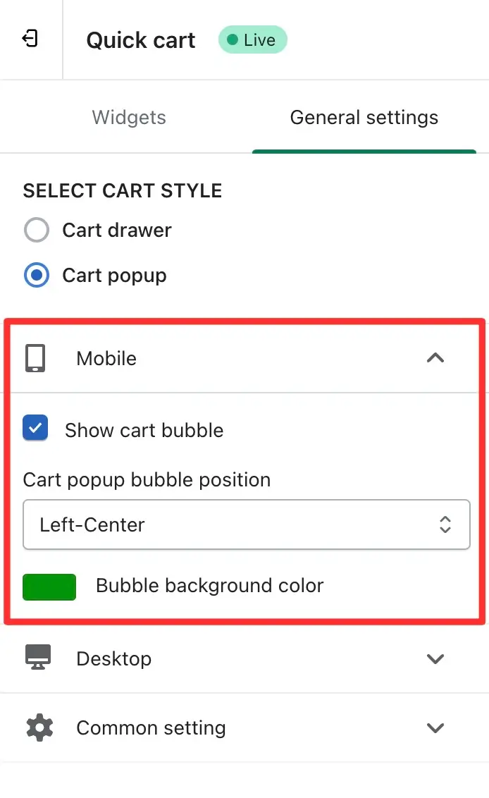
🔹 Mobile Settings
When you expand the Mobile section, you’ll find the following customization options:
- Show cart bubble – Use this option to toggle the visibility of the cart bubble icon on mobile devices. When checked, the bubble icon will appear on the site; otherwise, it will remain hidden.
- Cart popup bubble position – Set the position of the cart bubble on the mobile screen. You can choose from:
- Left-center
- Right-center
- Bottom-center
This defines where the popup cart will slide up from when the icon is clicked.
- Bubble background color – Customize the background color of the cart bubble icon to match your brand’s theme.
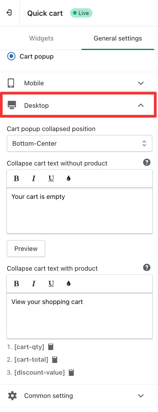
🔹 Desktop Settings
In the Desktop section, you can customize how the popup behaves and looks on desktop screens:
➞ Cart popup collapsed position
This option lets you define where the popup cart collapses to when closed. Available positions:
- Left-center
- Right-center
- Bottom-center
This also determines where the popup cart will slide up from on the screen.
✏️ Collapse cart text without product
Set the message shown in the collapsed popup cart when no products are added. You can format this text and even use rich text editing features.
Example: “Your cart is empty”
✏️ Collapse cart text with product
Set the message shown in the collapsed popup when products are in the cart. You can use dynamic shortcodes for real-time data such as:
• [cart-qty]: Total quantity of items in cart
• [cart-total]: Total cart value
• [discount-value-free-shipping]: Discount value for free shipping eligibility
Example: “View your shopping cart”
It is noteworthy that the remaining settings(common settings) have been centralized into common settings applicable to both cart drawer and cart popup interfaces, streamlining the user experience and ensuring consistency across different views. These adjustments offer a sophisticated level of customization, catering to the diverse needs of users seeking to optimize their cart presentation on both mobile and desktop platforms.