The Side cart editor’s General Settings in the iCart Cart Drawer Cart Upsell app give you full control over your cart’s style, layout, and appearance—helping you create a seamless and branded shopping experience for your customers. This guide will walk you through each setting available under the Quick Cart (Side cart) > General Settings tab, including how to change the cart type, adjust header and button styles, configure the cart bubble, apply custom CSS, and more—whether you’re using a side cart or popup cart.
Let’s walk through each setting available:
🛒 Select cart style
Choose the cart style you want to display in your store’s quick cart:
- Cart Drawer – the side cart that slides from the left or right of the screen.
- Cart Popup – a popup cart that appears from the bottom-center of the screen.
App Settings > Cart Types > Select your desired option under Quick Cart
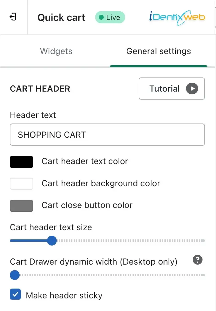
🧾 Cart header
Customize the cart header text and style using the following options:
- Header text – Change the label for your cart (e.g., “Shopping Cart”).
- Cart header text color – Pick a color for the header text.
- Cart header background color – Choose the header’s background color.
- Cart close button color – Adjust the color of the cart’s close button.
- Cart header text size – Resize the cart header text with an easy slider.
- Cart Drawer dynamic width (Desktop only) – Set the width of the side cart for desktop users. You can make the drawer cover up to 50% of the screen.
- Make header sticky – Enable this to keep the cart header visible while scrolling.
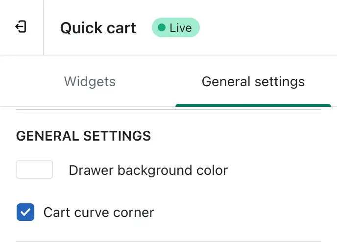
🎨 General cart styling
- Drawer background color – Set the background color of the entire cart.
- Cart curve corner – Enable to apply rounded corners to the cart for a smoother, modern look.
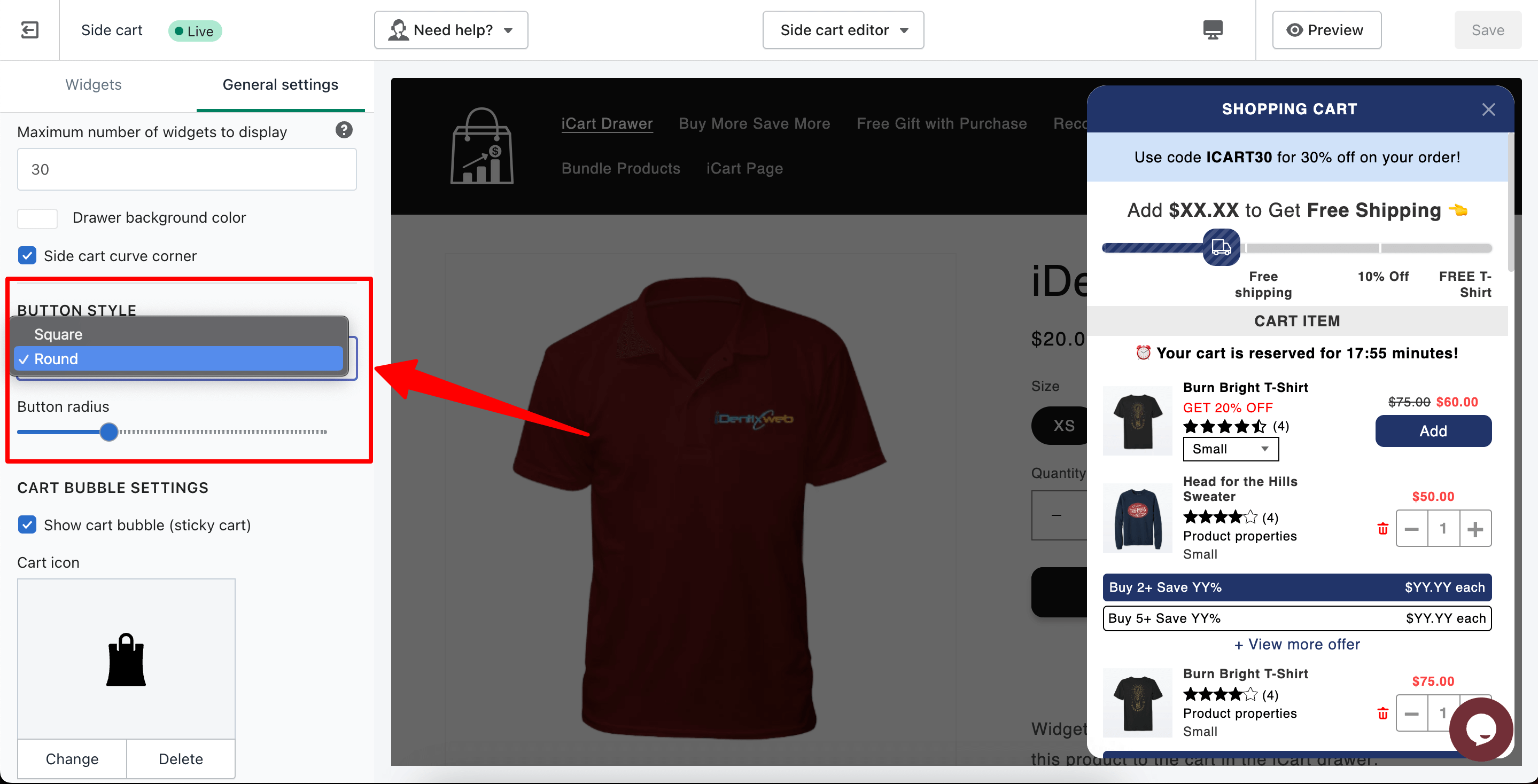
Choose how your cart’s action buttons appear:
- Button style – Pick between Square and Round button shapes.
- Button radius – Fine-tune the border radius to achieve a custom look.
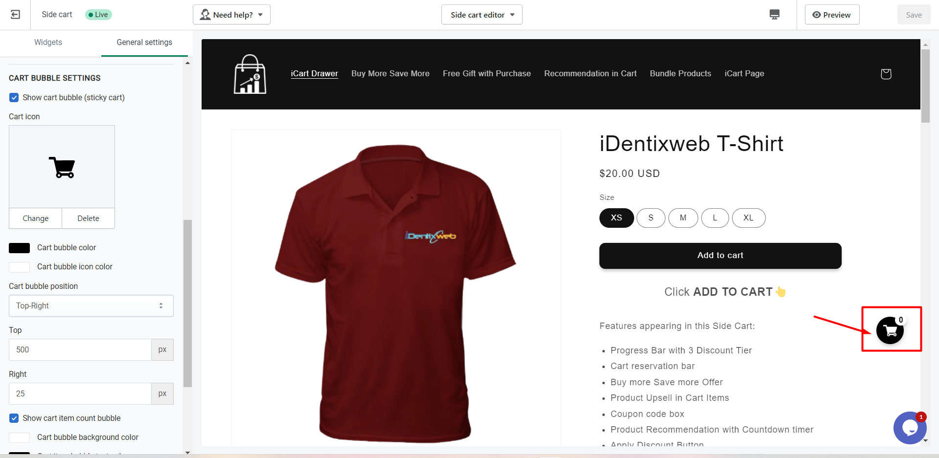
🛍️ Cart Bubble Settings
These settings control the floating cart bubble icon on your storefront:
- Show cart bubble – Use this option to toggle the visibility of the cart bubble on your storefront. When enabled, the cart icon bubble will be visible to customers; otherwise not.
- Cart icon – Choose or change the icon image.
- Bubble background color – Set the background color of the cart bubble.
- Bubble icon color – Customize the icon color inside the bubble.
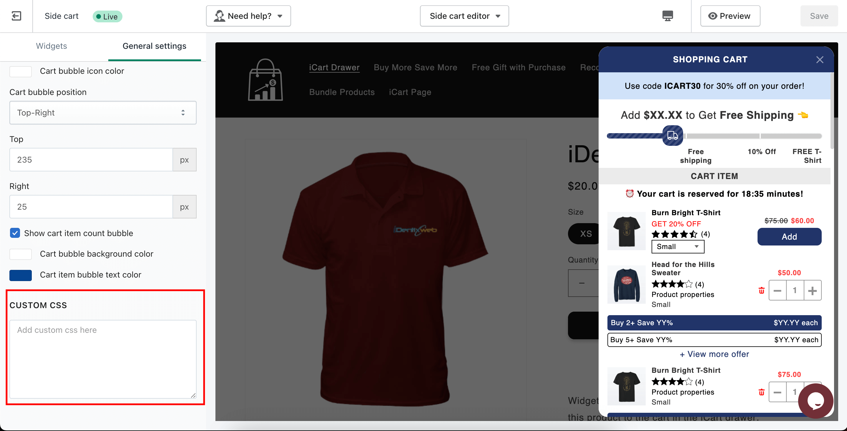
- Cart bubble position – This setting allows you to choose where the cart bubble appears on your store (e.g., top-right, top-left, bottom-right, and bottom-left ). Depending on the position selected, the cart drawer will slide in from the corresponding side—right for top/bottom-right and left for top/bottom-left. This setting controls both the bubble’s placement and the direction from which the drawer opens.
- Top/Right positioning – Adjust the exact position using pixel values.
- Show bubble cart item count – Display the number of items in the bubble cart.
- Bubble cart item count background color – Set background color for the cart item count.
- Bubble cart item text color – Change the text color for item count.
🧩 Custom CSS
Need more styling flexibility?
Use the Custom CSS field to:
- Apply your own font styles
- Change text sizes, colors
- Add animations or hover effects
- Override default styles applied by the app
This is ideal for developers or store owners with a bit of CSS knowledge who want full control over cart appearance.
Please refer to the below video tutorial on general settings to get detailed information.