AI Overview
The Product Catalogue feature in TablePress lets you create a structured table that showcases specific products or entire collection's product directly on your Shopify store. Customers can view product details, compare items, select variants, adjust quantities, and add products to the cart — all from a single table.
This guide walks you through every step of setting up a Product Catalogue table: adding products, configuring columns, enabling wholesale pricing, and customising the table design.
How to Create a Product Catalogue Table
- Log in to your Shopify Admin and open the TablePress app.
- On the app dashboard, click the Add Table button at the top-right corner.
- Select Create a Product Catalog.
- You'll be taken to the Product Catalog page where you can build the table and customise its design.
- Once you've finished configuring everything, save your settings.
- Copy the generated shortcode and paste it wherever you want the table to appear on your store.
Product Catalogue Settings Explained
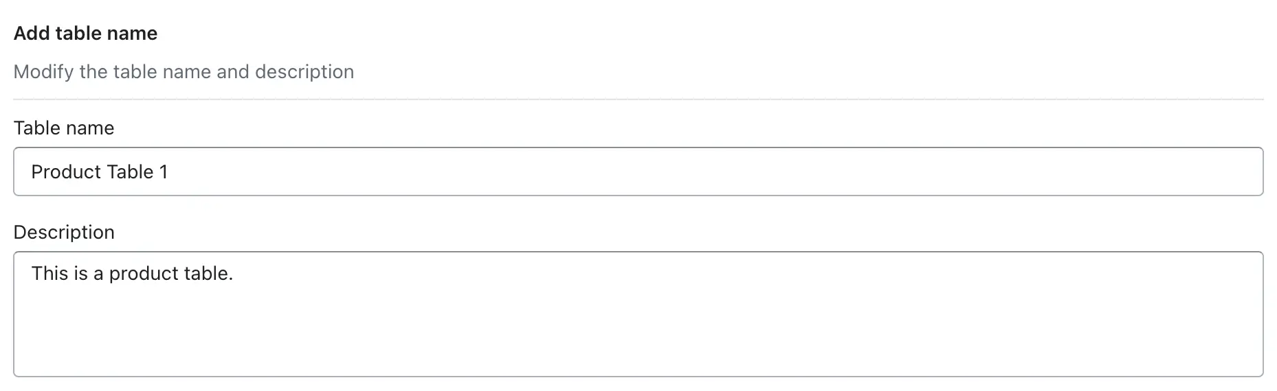
Table Name & Description
Table Name TextThe table name is the title displayed both inside the app and on your storefront. It helps customers immediately understand what the table is about. Choose something clear and descriptive.- Men T-Shirt Size Chart
- Product Comparison Table – Laptops
- Women Jeans Measurement Guide
Tip: Keep descriptions short and action-oriented — for example, "Use this chart to find your T-shirt size based on chest measurements in inches."
Add Products or Collections Product Selector
This section lets you choose which products appear in the catalogue table. You can add individual products, entire collections, or use filters and search to find items quickly. Add Product / Add Collection ButtonClick Add Product to select individual products, or Add Collection to include all products from a collection at once. Add Products Using Filters FilterUse the Add Filter option inside the product popup to narrow results by Categories, Collections, Product Types, Tags, or Vendors. This is much faster than searching one product at a time, especially for large catalogues. Search by All DropdownSearch across all product fields at once, or narrow it down to Product Title, Product ID, Barcode, or SKU. Select multiple products from the results and click Add to include them in the table. Hide / Delete Products Inline ActionAfter products are added, you can manage them directly from the table list. Hiding a product temporarily removes it from the storefront without deleting it. Deleting permanently removes it from the table. Exclude By SelectorChoose how to exclude products from the catalogue. Options include:- Vendor — exclude all products from a specific brand or supplier
- Specific Product — exclude individually selected products
- Tag — exclude products that carry a specific Shopify tag
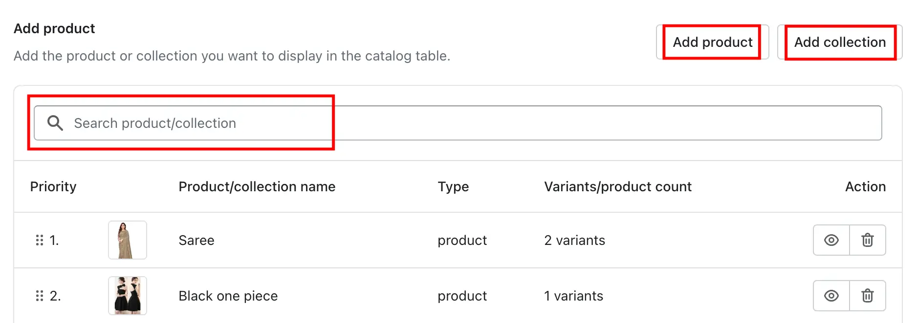
Tip: Exclusions override inclusions. If a product belongs to an included collection but is added to the exclude list, it will not appear in the table.
Customize Product Information (Columns) Column Settings
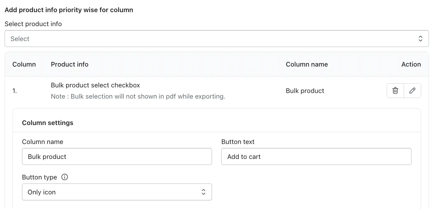
Click Select product info to choose which product details appear as columns in the table. Columns are displayed in priority order from top to bottom, and you can drag and drop them to reorder at any time.1. Bulk Product Select CheckboxLets customers select multiple products and add them all to the cart at once. Configure the column name, button text, and button icon style (No Icon / Only Icon / Left Icon and Text / Right Icon and Text).Note: Bulk product selection does not appear in PDF exports. It is an interactive storefront-only feature.
2. Product NameDisplays each product's title. Options include setting a character limit to keep the table tidy, hiding the variant name from the title, and enabling a click-through redirect to the product page. 3. Product ImageShows the product's featured image. You can set a custom height and width in pixels, and enable click-through navigation to the product page. 4. Product Price Wholesale IntegrationDisplays the price of each product in the table. See the full Product Price settings below, including wholesale pricing and the Request Price feature. 5. VariantLets customers view and select product variants (size, colour, material) directly from the table. Choose between Show as individual in row (each variant appears as its own row) or Show in Dropdown (all variants in a compact dropdown menu).
Note: Variants are not included in PDF exports.
6. Serial NumberAutomatically adds a sequential number to each product row. Updates dynamically if rows are reordered. 7. Add to Cart ButtonLets customers take action directly from the table. Configure the column name, button text, and what happens on click:- To product page — redirects to the product detail page (also works in PDF)
- To website — redirects to a custom URL
- To cart — adds the product and goes to the cart page
- To checkout — adds the product and goes directly to checkout
Note: The quantity picker is not available in PDF exports.
9. Product in StockShows real-time availability for each product. Fully customisable — set the label text, text colour, and background colour for both In Stock and Out of Stock states. 10. Product DescriptionDisplays a short summary of each product. Set a character limit to control how much text appears before the description is trimmed. 11. Product SKUShows the Stock Keeping Unit for each product. Optionally enable a click-through redirect to the product page when the SKU is clicked. 12. Product VendorDisplays the vendor or brand name pulled directly from the product's settings in Shopify. 13. Total PriceShows the calculated total cost based on the selected quantity and unit price, helping customers see their spend before checkout. 14. Product TagDisplays all tags assigned to each product, useful for showing category, style, or promotional labels.🧩 Custom Metafield AdvancedDisplay Shopify product metafield data as a column in the table. If your products have extra information saved as metafields (such as fabric type, fit, or care instructions), this feature pulls that data in automatically — no manual entry needed.
To add a metafield column, click Add Column and choose Custom Field / Metafield. If no metafields exist yet, a Create New option will appear. If metafields are already set up in your store, you'll see a list to choose from.
- Fabric type (Cotton, Denim, Silk)
- Fit type (Slim, Regular, Oversized)
- Care instructions per product
- Model height reference for clothing
Tip: Make sure all products have a value filled in for any metafield you add as a column. Empty metafields will leave blank cells in the table.
Product Price Settings
Price Display Format Product Catalogue
The Product Price column displays each product's price directly in the table, making it easy for customers to compare costs. You can customise the column heading and choose how prices are shown. Column Name TextChange the column heading shown at the top of the table. Common examples: Price, Product Price, Cost. Show Discounted Price ToggleWhen enabled, products that are on sale will show their discounted (sale) price along with the regular price. Price Display Format SelectorChoose how the price is sourced and displayed for each product:- Normal price — shows the original product price from your Shopify store.
- Wholesale slab price — shows the discounted price configured in your Wholesale app for that product.
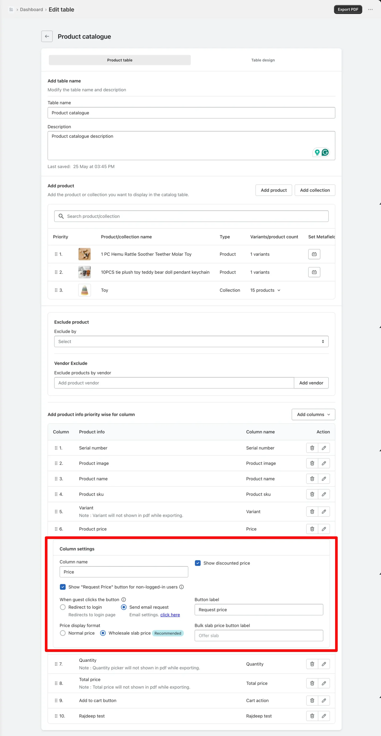
Tip: Only products with a wholesale price configured in your Wholesale app will show a discounted price. Products without a wholesale price will fall back to the Normal Price. To set up a wholesale offer, refer to the Create Offer guide in the Wholesale App.
Show Request Price Button Checkbox
If your Wholesale app is set to show prices only to logged-in customers, visitors who are not logged in will see no price for a product in the catalogue. You can show them a Request Price button instead, so they can ask you for the price directly. Show "Request Price" button for non-logged-in users CheckboxEnable this option to display a Request Price button to customers who are not logged in. Without this enabled, no button or price will appear for those visitors. When a customer clicks the Request Price button, choose one of two actions: Redirect to LoginThe customer is sent to your store's login page. If they already have an account, they can sign in and see the wholesale price. Use this option when your wholesale prices are exclusive to registered customers. Send Email RequestAn email notification is sent to a designated address with the customer's details and the product they are enquiring about. Use this when you handle pricing on a case-by-case basis for each customer.[Insert Image: Screenshot showing the Request Price button options — Redirect to Login and Send Email Request]
Tip: Use Redirect to Login for self-serve wholesale accounts. Use Send Email Request if you prefer to negotiate pricing manually with each customer.
Email Settings Settings Page
If you selected Send Email Request, configure the email from the TablePress Settings page. Receiver Email TextThe email address where all price request notifications will be sent. This can be your own address or a team member who handles wholesale enquiries. Email Subject TextThe subject line for the price request email. Keep it clear and consistent so these emails are easy to identify in your inbox.Note: Dynamic values like customer name or product name are not supported in the email subject. Use a static subject line.
Email Body TextThe content of the email sent when a customer requests a price. Customise this to include the information your team needs to follow up effectively. [Insert Image: Screenshot of the email configuration section in TablePress Settings — Receiver Email, Subject, and Body fields]
Table Design
Title & Description Display Appearance
Show Table Title ToggleShow or hide the table title above the product table on the storefront. Table Title Font Size pxControls the size of the title text in pixels. Example: 24px makes the title prominent. Table Title Font Color ColorSets the title text colour using RGB or the colour picker. Show Table Description ToggleShow or hide the description text below the table title. Table Description Font Size pxSets the font size of the description text. Example: 16px keeps it readable without overpowering the title. Table Description Font Color ColorSets the description text colour to match your store's design.Header Appearance
Allow Column Sorting ToggleWhen enabled, customers can click any column header to sort table data in ascending or descending order. Fix Header ToggleKeeps the column headers visible while scrolling through a long table. Useful for catalogues with many products. Header Background Color ColorSets the background colour of the header row. Header Font Color ColorControls the text colour inside header cells. Header Font Size pxDefines the size of the header text. Example: 14px keeps headers clean and readable.Search Feature
Search Feature ToggleEnables or disables a search bar above the table. When on, customers can type to instantly filter matching rows. Search Full Width ToggleStretches the search bar to the full width of the table area. Search Title TextAdds a label above the search bar. Example: Find data. Search Placeholder Text TextThe text shown inside the search field before typing begins. Example: Search here. No Records Text TextThe message shown when a search returns no results. Example: No matching records found. Loading Records Text TextThe message displayed while the table is loading. Example: Loading…Pagination Feature
Pagination Feature ToggleSplits the table into multiple pages instead of showing all products at once. Ideal for large catalogues. Pagination Per Page NumberControls how many rows appear on each page. Example: 10 rows per page. Pagination Font Size pxSets the size of pagination controls and page numbers. Pagination Font Color ColorControls the colour of pagination text. Pagination Background Color ColorSets the background colour of the pagination area. Pagination Length Change ToggleLets customers change how many rows are shown per page from a dropdown. Example options: 10, 25, 50.General Features Appearance
Row Hover Highlight ToggleAdds a subtle colour change when a customer hovers over a row, making it easier to track across wide tables. Vertical Scroll Height ToggleDisplays the table within a fixed height area with a scrollbar for tall tables, keeping the page layout clean. Table Information ToggleShows a summary below the table such as "Showing 1 to 10 of 50 entries". Alternating Row Colors ToggleApplies different background colours to odd and even rows, making wide tables easier to read. Odd Row Color / Even Row Color ColorSet the background colours for alternating rows individually. Table Background Color ColorDefines the background colour of the entire table container. Table Border Color / Border Style Color / SelectorControls the colour and style (solid, dashed, dotted) of the table's borders and internal grid lines. Cell Padding pxSets the spacing inside each table cell. Example: 3px for a compact layout. Table Data Font Family SelectorChoose the font for all table data. Example: Poppins for a clean, modern look. Table Data Alignment SelectorSets text alignment inside cells — left, centre, or right. Table Data Font Size pxControls the font size of all table content. Example: 14px for balanced readability. Table Data Font Color ColorControls the colour of all table text.Add to Cart Button Style Appearance
Button IconChoose the icon displayed on the Add to Cart button (shopping cart, arrow, etc.). Button Text Font FamilySelect the font for the button label text. Button Text Size pxSets the font size of the button text. Button Text Color ColorSets the colour of the button label. Button Background Color ColorSets the fill colour of the button. Button Border Color ColorSets the colour of the button's border. Button Border Style SelectorChoose the border style — solid, dashed, dotted, or unset.[Insert Image]
Tip: For detailed table design guidance, see the Table Design guide.
Copy Shortcode & Export
Copy Shortcode Embed
Once your table is created and designed, a unique shortcode is generated automatically. Click the copy icon in the Copy Shortcode section — the code is instantly copied to your clipboard. Paste it into any supported content area on your Shopify store to display the table. Show Table Title ToggleShow or hide the table title when the shortcode is embedded. ExportClick the Export button at the top-right of the Product Catalog page to generate a PDF version of the table. Customers can also open products and add them to the cart directly from the PDF.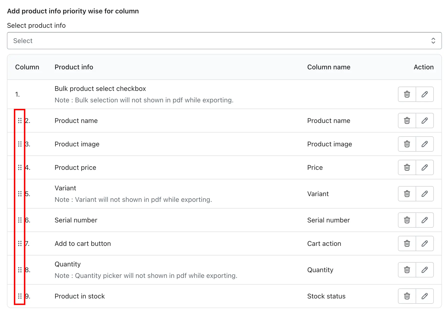
Note: Interactive features — Bulk Select, Quantity picker, and Variants — are not available in exported PDFs. The Add to Cart button with To product page redirect does work in PDFs.