AI Overview
- Header – Add logo and branding.
- Body Section – Configure age verification logic, button styles, and display messages.
- Copyright – Display your store's copyright or legal text.
Steps to Access the Sections Settings
1. Go to your Shopify Admin. 2. Open the LaunchX – Coming Soon app. 3. Navigate to the Age Verification feature. 4. Click on the Customize button. 5. Go to the Sections tab in the left-hand settings panel. 6. Customize the Header, Body, and Copyright sections. 7. Click Save to apply your changes.Header
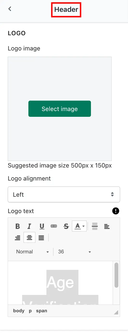
Controls the branding at the top of your age verification page.-> Logo Image- Upload your store’s logo.
- Suggested size: 500px x 150px for best clarity and layout.
- Supports PNG or JPG formats.
- Choose whether the logo aligns left, center, or right.
- Add a text version of your logo or brand name.
- Useful as a fallback when the image doesn’t load.
➞ Setting ➞ Result
 ➞ Result
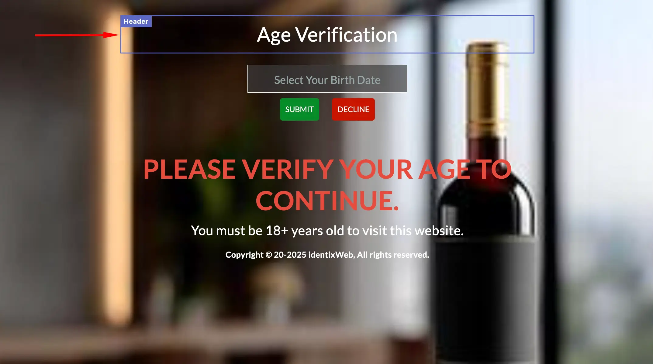
Body Section
This is the core part of the Age Verification screen.🔐 Age Verification Mode
-> Age Limit- Set the minimum age required to access your store (e.g., 18 or 21).
- If using DOB verification, select the format (e.g., DD/MM/YYYY or MM/DD/YYYY).
- Helps validate exact age based on birthdate.
🔘 Submit Button Settings
Customize the confirmation button for verifying age.Submit Button Text: Example: "Enter", "Verify Age", or "I’m Over 18"Submit Button Text Size: Set the font size (e.g., 16px, 18px) for the button label.Submit Button Text Bold: Enable/disable bold styling for better visibility.Submit Button Text Color: Choose a color for the text on the button (e.g., white #ffffff).Submit Button Color: Set the background color of the submit button (e.g., black #000000, red #ff0000).🚫 Decline Button Settings
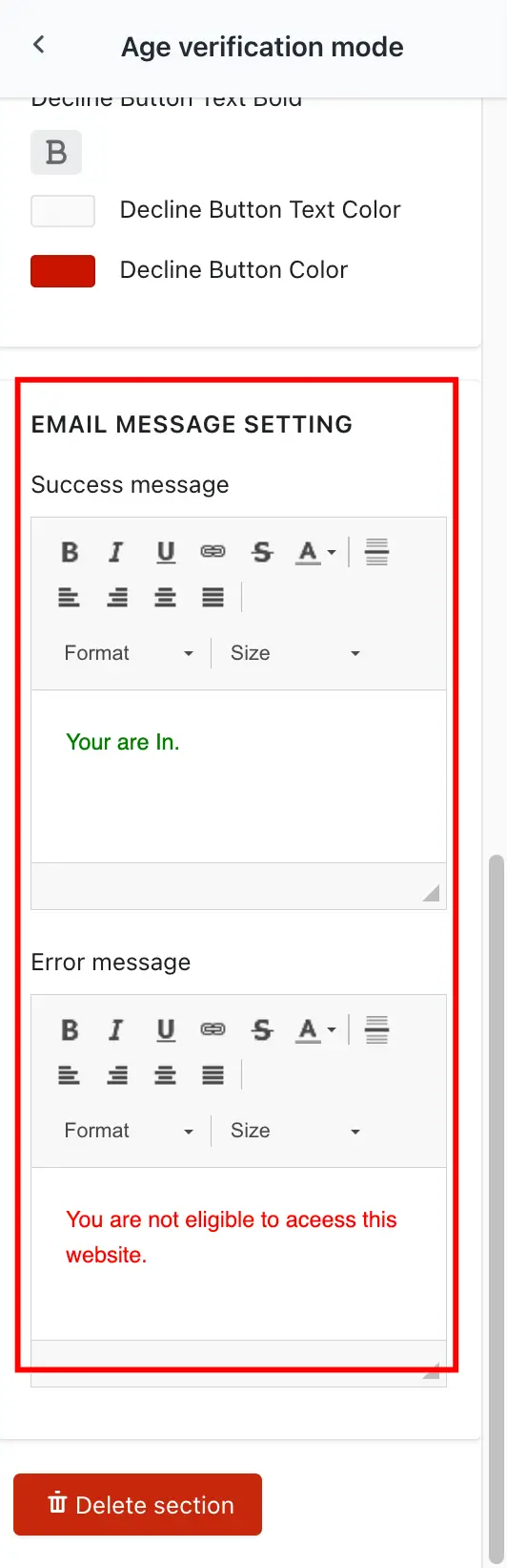
Customize the button users click when they do NOT meet the age limit.Decline Button Text: Example: "Leave", "Not of Age", "Exit Site"Decline Button Text Size: Control text size for the decline button.Decline Button Text Bold: Bold the decline button text if needed.Decline Button Text Color: Choose the color of the decline button's text.Decline Button Color: Set the button background color (typically contrasting for clear visibility).✉️ Email Message Settings
Show feedback messages based on form submission results.➞ Setting ➞ Result
Success MessageText shown when the user passes age verification.Example: "Welcome! You may now enter the site."Error MessageDisplayed when validation fails (e.g., underage or incorrect DOB).Example: "Sorry, you must be at least 18 years old to access this site."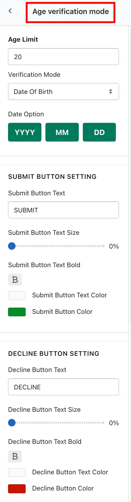 ➞ Result
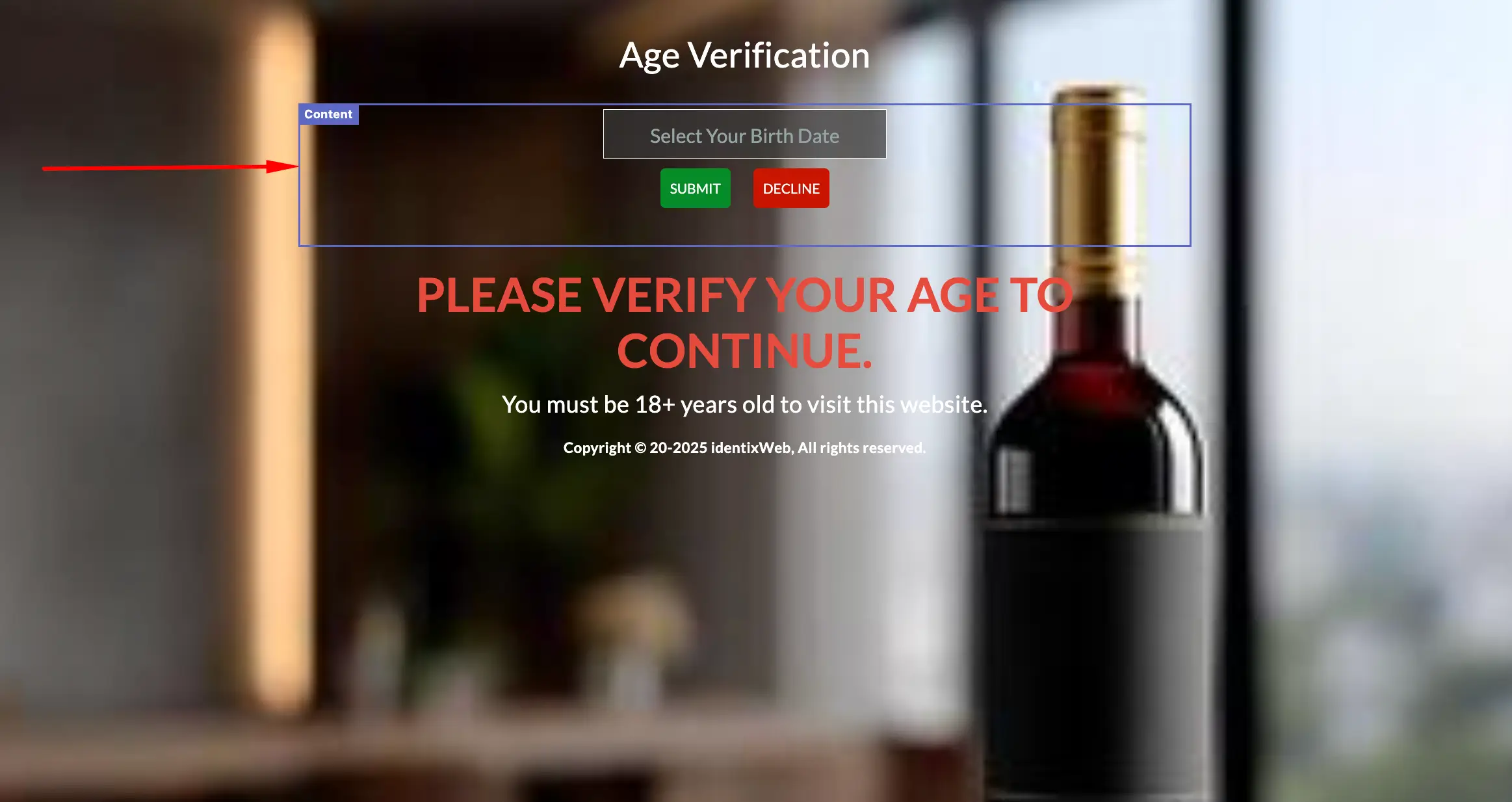
➞ Setting ➞ Result
 ➞ Result
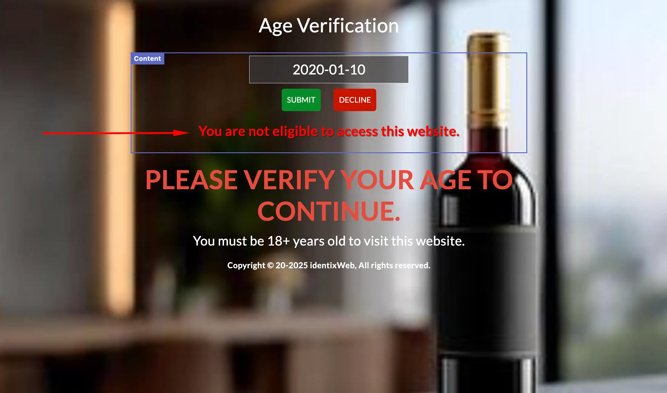
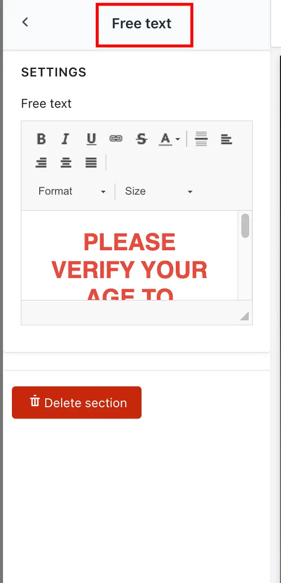
📝 Free Text Section
-> Add a custom message like:“This website is currently under construction.” “We’ll be launching soon — stay tuned!” -> Appears below or above the age verification area (depending on design).➞ Setting ➞ Result
 ➞ Result
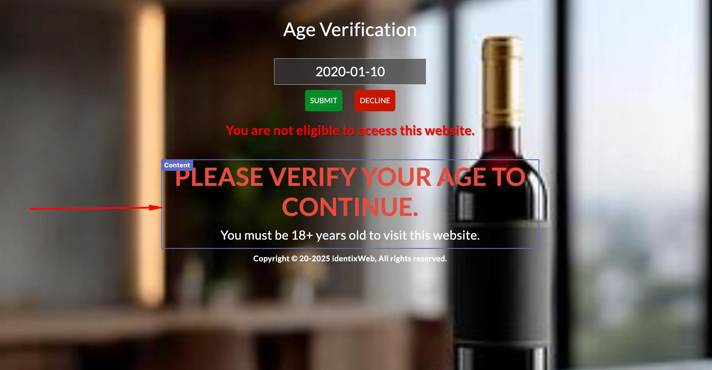
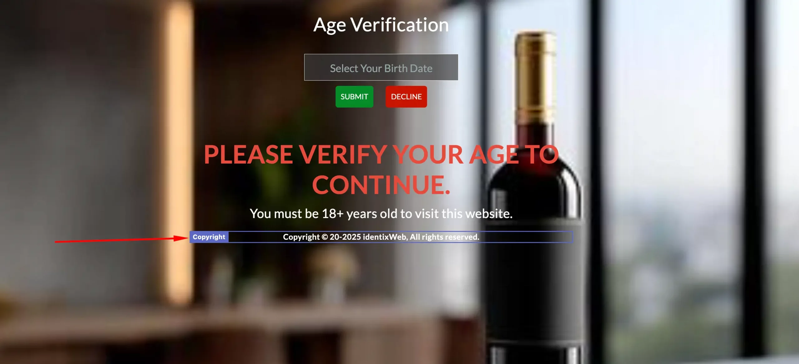
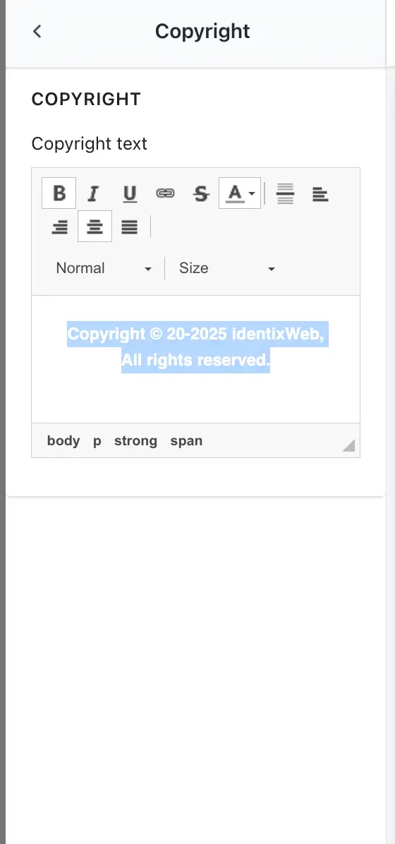
Copyright
-> Copyright Text: Add your store’s legal or copyright information.Example:© 2025 YourStoreName. All rights reserved. © YourBrand — Adults Only 18+➞ Setting ➞ Result
 ➞ Result