Ecommerce
Gather knowledge about the latest insights, updates, tips, and tricks in the Ecommerce industry.
5 Min • 29 April 2026
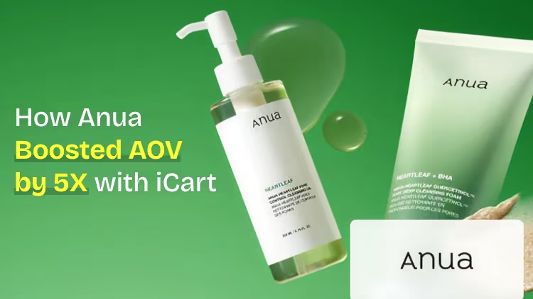
How Anua Unlocked 5X AOV Growth with iCart’s Smart Cart Features
delivery customization Challenges Solutions drive results Scale business delivery customization Challenges Solutions drive results Scale business delivery customization Challenges Solutions drive results Scale business delivery customization Challenges Solutions drive results Scale business Anua is a globally recognized Korean skincare brand known for its minimalist philosophy and focus on gentle yet effective formulations. Built on the idea of simplifying skincare routines, Anua develops products that deliver visible results while avoiding harsh or irritating components, making them suitable for sensitive skin types. Initially using a traditional full cart experience, Anua transitioned to iCart’s side cart solution in August 2025, to create a more seamless and engaging shopping journey. This shift allowed customers to easily explore complementary skincare products without disrupting their browsing flow, making it more intuitive to discover items that fit into a complete routine. By surfacing relevant recommendations directly within the cart, the brand enhanced product visibility across its range. Challenges Before implementing iCart’s side cart solution, Anua faced limitations with their existing full cart experience, which created friction in the customer journey. The traditional cart setup redirected users away from product pages, interrupting their browsing flow and reducing opportunities to explore additional products. As a skincare brand built around routines rather than single-item purchases, this made it difficult to effectively showcase complementary products and encourage customers to build complete regimens. Additionally, the lack of in-cart personalization and strategic upsell opportunities meant that customers were often unaware of related products that could enhance their skincare results. This limited the brand’s ability to increase average order value (AOV) and fully leverage its diverse product range. Anua needed a more dynamic and intuitive cart experience that could seamlessly introduce relevant recommendations while maintaining a smooth and engaging shopping journey. ❌ Cart Value Barriers Low average order value (AOV) due to single-item focus Most customers completed purchases with one primary product instead of building multi-step routines. Cart abandonment near shipping thresholds Customers were not clearly informed or motivated to reach free shipping or discount thresholds. Missed savings opportunities Customers were unaware of potential value in purchasing bundled routines or multiple complementary products. ❌ Absence of Progress-Based Incentives No free shipping or discount progress bar Customers were not motivated to increase their cart value due to lack of visible incentives. Missing tiered rewards system There were no structured milestones (e.g., “Spend more to unlock offers”), reducing upsell opportunities. ❌ Ineffective Cart UI/UX (Pre-Side Cart) Full-page cart disrupted shopping flowCustomers had to leave their browsing journey, increasing friction and drop-offs. No quick add/remove functionality Users couldn’t easily modify their cart or add suggested products without navigating away. Solution To overcome these challenges, Anua implemented iCart’s side cart solution to transform their traditional cart into a high-converting, interactive experience. By replacing the full-page cart with a seamless side cart, the brand ensured that customers could continue browsing while viewing their cart, significantly reducing friction in the shopping journey. Additionally, features like product recommendations & progress bars for free shipping and discounts motivated customers to increase their cart value. By combining personalization, incentive-driven messaging, and a user-friendly interface, Anua successfully turned their cart into a powerful revenue-driving touchpoint rather than just a checkout step. To maximize their cart effectiveness, they implemented two powerful features: ✅ Progress Bar with Multi-Reward Incentives Implemented a tiered progress bar to encourage higher cart value Customers are guided with a clear message like “Add $3.10 to unlock secret offer,” motivating them to continue adding products. Generated over $5M+ in revenue through incentive-driven cart progression Used product-based rewards to align with customer intent Instead of generic discounts, Anua incentivized purchases with relevant skincare items like Dark Spot Pads and mini serums. Built visual motivation for routine expansion As customers add products, they can clearly track progress toward unlocking multiple rewards, encouraging them to build a complete skincare routine. ✅ Product Recommendations Implemented “Frequently Bought Together” recommendations Customers adding a single product (e.g., toner) are shown complementary items like serums, moisturizers, or pads to complete their routine. Generated over 275K revenue through in-cart recommendations Encouraged full skincare regimen building Instead of isolated purchases, the cart suggests step-by-step product combinations aligned with common skincare routines. Increased product discovery at the final stage By surfacing relevant items directly in the cart, Anua ensured customers explore more of their catalog without leaving the checkout flow. Results Achieved in Last 180 Days 22932 Total Store Orders 45101 Total iCart Orders 5X iCart Generated AOV 65.70% Upsell Affected Conversion Rate These improvements reflect a clear shift in customer behavior on Anua’s store. Cart abandonment reduced as shoppers discovered complementary skincare products and felt encouraged to build complete routines. Engagement also increased, with customers interacting more with in-cart recommendations and exploring relevant product pairings. Results & Impact And...Results is Our Main Clarification By implementing iCart’s cart drawer, product recommendations, and progress bar, Anua transformed its cart into a high-performing conversion touchpoint. Shopping Experience Enhancement The improved cart experience encouraged customers to discover complementary products and understand the value of sustainable beauty routines. For instance, the clear presentation of subscription savings alongside one-time purchase options helped customers make more informed decisions about their long-term hair care needs. As Anua continues to optimize its cart experience, the brand is closely monitoring: Routine-based purchasing behavior - tracking how customers move from single items to multi-step regimens Engagement with in-cart recommendations - measuring interaction with suggested products Cart value progression - analyzing how incentives influence higher spending [related_cases_slider] Ready to Write Your Success Story? Try icart App Join successful businesses like Anua and Master your delivery scheduling Delight customers with precise timing Grow your special occasion orders Expand your delivery reach
Read Blog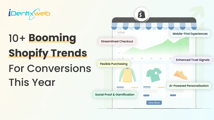
10 Min • 29 May 2026
10+ Booming Shopify Trends in 2026 (Conversions, AI, Designs and More)
The key Shopify trends for 2026 are AI personalization, mobile-first design, smarter checkout, social commerce, zero-party data, subscriptions, AR/3D product pages, AEO, automation, and stronger fraud prevention. Merchants should focus on the trends that directly improve conversions, customer experience, and long-term growth instead of trying to implement everything at once. I've spent the last few years auditing Shopify stores, forecasting where the platform is headed, and helping merchants make the changes that actually move revenue. And I'll tell you straight up: 2026 is the year the bar got higher overnight. Shopify crossed 2.8 million active stores [Source: Store Leads]. New merchants are launching every minute. Shoppers expect Amazon-level speed from a brand that has just started three months ago. The merchants winning right now are the ones picking 3–4 Shopify trends, executing them well, and ignoring the rest. That's exactly what I want to help you do today. I'll walk you through 15 Shopify trends I'm betting on in 2026, why each one matters, and what you can ship this week. Each trend gets the same treatment: what it is, why I care, and the move for new store owners. Let's get into it. 10+ Booming Shopify Trends for Conversions, AI, Designs, and More 1. AI Personalization becomes the default Generic stores are a thing of the past. Shoppers in 2026 expect the store to feel like it was built for them, even on visit one. I'm seeing AI-powered product recommendations, dynamic PDP content, and AI-curated bundles consistently lift AOV by 15–30% across the stores I audit. The brands that ignore this are losing revenue to competitors who don't. Tools worth a look: Shopify Magic (native), Shopify's Search & Discovery app, and iCart Cart Drawer Cart Upsell Quick win for new stores: Don't overthink it. Install one solid recommendation app, test it and only then go for paid plans. Let AI Pick the Right Upsell Before Your Customer Leaves Show smarter product recommendations inside the cart based on what shoppers are already buying. Most carts only show products... iCart can show revenue-boosting offers. Try Free Till 100 Orders With iCart, you can display AI-powered upsells that feel relevant, timely, and easy to add before checkout. 2. Conversion-first Shopify store design trends 2026 Pretty stores don't convert. Stores are designed around how shoppers are the ones that have great conversions. In 2026, the Shopify store design trends I keep recommending: bigger editorial typography, sticky add-to-cart bars, swipeable mobile product galleries, soft scroll-triggered motion, and ruthless cuts to anything that doesn't help someone buy. Hero carousels are mostly over. Replace yours with one strong above-the-fold value prop, a clear CTA, and social proof within the first scroll. My honest take: You probably don't need a full redesign. Audit your top 3 pages by traffic, fix the friction, and you'll see results in weeks, not months. 3. Mobile-First Isn't a Buzzword. It's the Whole Store Although this Shopify trend has been going on for years, I still open stores every week that were clearly designed on a desktop, with mobile checked last. Roughly 65%+ of Shopify traffic now comes from mobile [Source: Shopify]. What mobile-first actually looks like in 2026: page speed under 2 seconds, sticky add-to-cart, one-thumb checkout, full-screen popups that close easily, CTAs in the bottom 60% of the screen. Shop Pay, Apple Pay, and Google Pay should already be live in your checkout. If they aren't, do it right away. 4. Headless commerce goes mainstream (Especially on Shopify Plus) Headless just means your storefront (what shoppers see) is separated from your Shopify backend (where orders live). The result is a faster, more flexible custom experience. Shopify Plus brands are leaning hard into Hydrogen and Oxygen for 2026, especially for campaign micro-sites, B2B portals, and international expansion stores. Performance gains directly improve Core Web Vitals, SEO, and conversion rates. Honest advice: If you're a new store doing under $1M, skip headless for now. Master your Liquid theme first. 5. Social commerce + live selling TikTok Shop, Instagram Shopping, and YouTube Shopping are full revenue channels with native Shopify integrations. Live selling is having a real moment in beauty, fashion, food, and hobby niches. UGC-first product pages, with real customer videos pulled in via apps like Loox or Fera, are outperforming polished studio content in most categories I've tested. If you sell anything visual, ignoring social commerce in 2026 is leaving 20–30% of potential revenue on the table. 6. Zero-party & first-party data take center stage Cookie deprecation and tighter privacy rules mean cheap retargeting is over. The brands that own their customer data are the ones with stable CAC. What's working: quiz funnels (Octane AI, Shop Quiz), gamified popups (Privy, Klaviyo), post-purchase surveys, and SMS opt-ins at checkout. If I were launching a Shopify store in 2026, I'd build a zero-party data flow before my first ad campaign. Collect email + one preference signal per visitor. That's your real moat. 7. Subscription, bundles & predictable revenue One-time purchases are fine, but recurring revenue is much better. Apps like Recharge, Loop Subscriptions, and Shopify's native subscriptions are used by merchants to add subscription options in their storefronts. Bundle builders and "build your own box" experiences are also driving real AOV lifts. A small skincare brand I worked with last year added a 3-product refill subscription and doubled customer LTV inside 6 months. 8. AR, 3D & visual commerce on product pages Static product images aren't enough anymore for furniture, jewelry, eyewear, beauty, and home decor categories. Shopify supports 3D models natively. AR try-on tools (Camweara, YouCam) are getting cheaper. Shoppable videos on PDPs consistently lift conversion by 10–20% in my tests. You don't need to 3D-scan your entire catalog. Start with your top 5 SKUs and measure what happens. 9. Sustainability & ethical commerce Gen Z shoppers will fact-check your sustainability claims. Greenwashing backfires fast in 2026. Carbon-neutral shipping (Shopify Planet, EcoCart), recyclable packaging, and transparent sourcing pages are the moves that build trust. Real receipts beat vague "eco-friendly" badges every time. My take: Don't claim it if you can't prove it. A single honest section on "Where Our Materials Come From" outperforms any page that explains how you are saving the planet. 10. Omnichannel & POS unification Shoppers expect one consistent experience across online, in-store, marketplace, and social platforms. Shopify POS got serious upgrades for 2026, with better inventory unification, local delivery support, and same-day fulfillment integrations. If you have any physical presence at all, even pop-ups or wholesale, your inventory should live in one place. Local delivery for nearby customers is also quietly becoming a conversion lever for food, plants, gifts, and same-day need categories. 11. Voice search, AI search & answer engine optimization (AEO) ChatGPT, Perplexity, and Google AI Overviews are now sending real traffic to Shopify stores. According to the latest reports, AI-referred shoppers on Shopify convert at 50% higher rate than organic search. [Source: Shopify] The brands cited in AI answers are winning trust before a shopper even visits the site. How to show up: structure product descriptions with clear specs, write FAQ sections that directly answer buyer questions, use proper schema markup, and keep your content factual and well-organized. I have written a complete breakdown of best practices in AEO for Shopify merchants in 2026. 12. Smarter checkout: BNPL, one-page, Shop Pay expansion Cart abandonment is still painfully high, but most of it is fixable at checkout. Buy Now Pay Later is not optional anymore. Shop Pay Installments, Afterpay, Klarna, and Affirm cover most use cases. One-page checkout is the new default. Trust signals (badges, guarantees, contact info) on the checkout page itself consistently lift conversion by 5–10%. If you haven't reviewed your checkout conversions in the last 6 months, that's where I'd start. 13. Shopify Plus design trends 2026 For brands scaling past 7 figures, Shopify Plus design trends in 2026 are all about flexibility and unified experiences. Where are Plus brands investing in designs? Combined B2B + D2C storefronts, custom checkout extensions (made possible by Checkout Extensibility), expansion stores for international markets via Markets Pro, and proper design systems instead of one-off page builds. The Functions API has also opened up custom discount logic, shipping rules, and payment customizations that weren't possible a year ago. 14. Automation, apps & Shopify Flow App bloat is the number one reason the speed of your Shopify store decreases. Every app you add costs you milliseconds, which costs you conversions. The lean 2026 app stack I recommend for new stores: one reviews app, one email/SMS platform (Klaviyo), one upsell app, and one analytics layer. Anything beyond that needs to earn its place. Here’s a complete guide on how to build a Shopify tech stack for merchants in 2026. Shopify Flow is also massively underused in my experience. Automate abandoned cart tagging, VIP customer rewards, low-stock alerts, and fraud-risk order holds. Saves hours every week with zero code. 15. Security, fraud prevention & compliance Chargeback rates climbed through 2025. Fraud is more organized than ever. Shopify's native fraud analysis is decent. For higher-risk categories (electronics, luxury, supplements), I'd add Signifyd or NoFraud. ADA accessibility compliance is also no longer optional in many regions, both legally and for SEO. GDPR, CCPA, and accessibility (WCAG 2.1) are 2026 table stakes. Use Shopify's privacy & compliance tools, and audit your store with a free tool like AccessiBe or TestParty. How would I prioritize these Shopify ecommerce trends if I were launching today? Look, you don't need to research and implement all 15 Shopify trends. You need the right 3–4 for your stage. Here's the prioritization framework I use with merchants: Foundational (do these first, no exceptions): Mobile-first design + page speed Smarter checkout (Shop Pay, BNPL, one-page) One solid AI personalization layer Growth (once foundations are solid): Zero-party data collection Social commerce + UGC Subscription or bundle offers Conversion-first design refresh Advanced (for Plus and 7-figure brands): Headless commerce AR/3D product experiences Omnichannel + POS unification Custom checkout extensions Pick a tier. Pick 3 Shopify trends from this list. Ship them well over the next 90 days. Come back for the next tier when you're ready. Stay ahead of the Shopify trends in 2026 More than following the Shopify trends every year, I would fix your mobile experience, clean up your checkout, and add one solid AI personalization layer. That alone will outperform 80% of Shopify stores out there right now. The merchants who win this year are the ones who stop chasing trends and start executing them. Drop your store URL or your biggest 2026 challenge in the comments. Always happy to point you toward what I'd tackle first. FAQs 1. What are the Shopify ecommerce trends to look out for in 2026? The biggest Shopify ecommerce trends I'm watching in 2026 are AI personalization, social commerce, zero-party data collection, subscription and bundle offers, and smarter checkout with BNPL options. Mobile-first design and AEO (showing up in AI search results) are also critical. 2. What are the Shopify store design trends to look out for in 2026? Shopify store design trends in 2026 are all about converting, not just looking good. I'm seeing bigger editorial typography, sticky add-to-cart bars, swipeable mobile galleries, and soft scroll-triggered motion. The brands winning right now design mobile-first and prioritize the first scroll above everything else. 3. Which Shopify Plus design trends will be on top in 2026? In 2026, the Shopify Plus design trends I expect will combine B2B and D2C storefronts, custom checkout extensions powered by Checkout Extensibility, expansion stores via Markets Pro, and proper design systems replacing one-off page builds. Headless commerce with Hydrogen is also having a real moment for Plus brands that need speed and flexibility.
9 Min • 5 June 2026
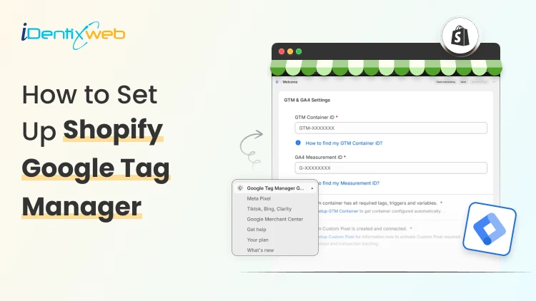
How to Add Google Tag Manager to Shopify in Just 4 Steps (Track Everything in 2026)
You pasted your GTM snippet into Shopify, saw it fire on your homepage, and assumed you were done. Then you checked your purchase data and found nothing. Sales were happening, but your conversion tags were silent. That gap is the single most common mistake I see when installing Google Tag Manager in Shopify, and it got worse in 2026. The old method of dropping one GTM code block into your theme still loads the container on storefront pages. It no longer fires on checkout or the thank-you page. So you can add Google Tag Manager in Shopify in five minutes and still miss the only event that pays your bills: the purchase Here is the short answer. To connect Google Tag Manager to Shopify correctly today, you need two installs working together. GTM goes in your theme code for storefront tracking, and a separate Custom Pixel handles checkout and purchase events inside Shopify's sandboxed environment. Custom Pixels are available on all Shopify plans, including Basic, Shopify, Advanced, and Plus. You do not need Shopify Plus. I'll walk you through the full setup, show you exactly where to add the Google Tag Manager code in Shopify, and help you verify nothing is double-counting before you trust the numbers. What Changed in 2026 With Google Tag Manager in Shopify For years, the standard approach was simple. Paste your GTM container into theme.liquid, and Plus merchants paste a second copy into checkout.liquid. In February 2023, Shopify announced that checkout.liquid is deprecated, moving to a new foundation for checkout and accounts that is more secure, upgrade-safe, and customized using apps. The replacement is Checkout Extensibility, and tracking now runs through Custom Pixels instead of injected scripts. The deadline matters. Shopify Plus merchants had until August 28, 2025, to migrate, and non-Plus merchants had until August 26, 2026. If your checkout pages have not been upgraded, your Custom Pixel will not fire on checkout or thank-you pages, and your purchase data will stay incomplete. Why the change? Checkout used to allow arbitrary scripts, which created security and performance risks. The new model runs your tracking code in a sandboxed iframe. It is safer, but it means your old single-snippet setup no longer covers the full customer journey. GTM vs GA: Know the difference People mix these two up constantly, and it leads to broken setups. Google Analytics is the tool that provides reports about activity in your store. Google Tag Manager is a tool that triggers your tracking codes based on defined rules. GTM is the container. It holds and fires your tags. GA4 is one of the things it can fire. Adding Google Analytics to Google Tag Manager in addition to using Shopify's built-in integration can result in duplicate tracking. If you have already connected GA4 through Shopify's native integration and then also fire GA4 through GTM, you will double-count everything. Pick one path per tag. I'll come back to this when we verify the setup. If you are optimizing your store beyond just tracking, you should check out my Ultimate Shopify SEO Guide for 2026. The above breakdown will help you measure your content and conversion strategy. Don't Want to Touch Code? We'll Handle the Whole Setup Our Shopify development team installs and configures GTM correctly across your storefront and checkout, no guesswork on your end. Your Store Is Leaking Data. We'll Fix That Schedule a Free Strategy Call How to add Google Tag Manager code in Shopify: Step-by-step Step 1: Create Your GTM Container Go to tagmanager.google.com and sign in with your Google account. Create an account, name your container after your store, and set the target platform to Web. Accept the terms, and GTM hands you two code snippets: One for the <head> and one right after the opening <body> tag. Copy your container ID too. It looks like GTM-XXXXXXX. If you already have a container, skip ahead to Step 2. Step 2: Add the GTM code to your theme This covers your storefront: product pages, collections, cart, blog posts, everything before checkout. In your Shopify admin, go to Online Store > Themes > Edit code. Open the theme.liquid file in the Layout folder. Paste the first GTM snippet immediately after the opening <head> tag, and paste the second snippet immediately after the opening <body> tag. Save. That answers the "where to add Google Tag Manager code in Shopify" question for the storefront half. But you are only halfway done. Step 3: Add a custom pixel for checkout and purchases The theme code stops at checkout. To track checkout and purchase events, you create a Custom Pixel. Go to Settings > Customer events in your admin and click Add custom pixel. Name it something clear, like "GTM Checkout." Inside the pixel, you load GTM and subscribe to Shopify's standard customer events, pushing them to the data layer. Shopify gives you the event subscription pattern directly. You subscribe to standard events like product_viewed, and when the event triggers, it pushes the event to the dataLayer. Here is the shape of that code: analytics.subscribe("checkout_completed", (event) => {window.dataLayer = window.dataLayer || [];window.dataLayer.push({event: "purchase",transaction_id: event.data.checkout.order.id,value: event.data.checkout.totalPrice.amount,currency: event.data.checkout.currencyCode});}); Step 4: Consider the Google & YouTube App If your priority is Google Ads conversion tracking rather than full custom GTM control, Shopify and Google recommend a managed route. Shopify is deprecating mechanisms like checkout.liquid and additional scripts, and recommends migrating your tags to the Google-developed Google & YouTube app on Shopify. The app handles the migration for you and preserves your measurement through the checkout upgrade. For merchants who want granular control over every tag and trigger, the manual GTM-plus-Custom-Pixel route above gives you more flexibility. For merchants who mostly run Google Ads, the app is less to maintain. Where to add Google Tag Manager code in Shopify GTM in Shopify lives in two places. The theme.liquid install covers storefront pages. The Custom Pixel covers checkout and the thank-you page. Storefront code does not reach checkout, and the Custom Pixel does not reach your storefront. One critical caution. Do not fire the same conversion from both locations. Some merchants add GTM to their theme.liquid file and also install it as a Custom Pixel, which is a common configuration error. If your purchase tag exists in both, every sale counts twice. Keep storefront events in the theme container and checkout events in the pixel. How to verify your GTM setup fires correctly? Open GTM's Preview mode and connect it to your store URL. Browse a few product pages and confirm your storefront tags fire. The harder test is checkout. Because the pixel runs sandboxed, you verify it differently. Place a real test order. Open GA4 DebugView and your browser's DevTools Network tab, filtered for the collect request. You want to see exactly one purchase event with a stable transaction ID. Two purchase events mean you have a duplicate firing somewhere, usually from running both Shopify's native GA4 integration and a GTM-based GA4 tag at once. Check the transaction ID specifically. If it changes on page refresh, your deduplication will fail, and you will inflate conversions. A stable order ID is what keeps your reporting honest. If you are testing checkout behavior, here’s a complete breakdown of Shopify checkout upsell strategies for merchants. Also, read these breakdowns GTM is one tool in a larger SEO and conversion measurement ecosystem. You might also find these topics relevant: How to Improve SEO on Shopify: Once you have GTM firing correctly, use the data to identify which pages and products drive traffic and conversions. SEO improvements compound when informed by real user behavior. Shopify A/B Testing Guide: With GTM tracking reliably, run controlled experiments on your store. GTM tags fire the same way regardless of variant, so your test results stay clean. How to Reduce Shopify Customer Acquisition Cost: GTM feeds data to Google Ads, which in turn helps you measure and optimize CAC. The feedback loop only works if GTM is set up correctly. Shopify Sales Funnel Guide: Understanding your full funnel (awareness → consideration → conversion) starts with accurate event tracking in GTM. Without it, you can't measure funnel leakage. Connect Google Tag Manager to Shopify the right way The Google Tag Manager Shopify setup is no longer a single paste-and-forget snippet in 2026. It is a theme install for your storefront and a Custom Pixel for checkout. Get those two pieces talking, and your conversion data finally matches your actual sales. Run your test order today. Open GA4 DebugView, place one order, and confirm a single purchase event fires with a stable transaction ID. If it does, your tracking is sound, and you can start building the tags that actually grow the store. FAQs 1. What is GTM in Shopify? GTM in Shopify means Google Tag Manager, a tool that lets you manage tracking codes like GA4, Google Ads, Meta Pixel, TikTok Pixel, and other scripts from one place instead of adding each code manually to your theme. 2. Do I need Google Tag Manager for Shopify? You don’t need GTM for every Shopify store; Shopify’s built-in Google Analytics / Google channel setup is enough for many basic stores, and you can use its built-in Google Analytics integration to avoid duplicate tracking. But GTM is useful if you run multiple ad platforms, need custom event tracking, or want more control over tags. 3. Where to add Google Tag Manager code in Shopify? For the current Shopify setup, the recommended method is Shopify Admin → Settings → Customer events → Custom pixel, especially if you want GTM to work with modern Shopify checkout/customer events. Google’s normal GTM install uses one code in the <head>, and one after the opening <body>, but Shopify’s GTM custom pixel method is different from simply pasting code into theme.liquid. 4. How to add Google Tag Manager code in Shopify? Go to Google Tag Manager → Admin → Install Google Tag Manager, copy the code Shopify asks for, then in Shopify go to Settings → Customer events → Add custom pixel, paste the GTM custom pixel code, save it, and connect the pixel. After that, test it using Shopify Pixel Helper or GTM preview mode to make sure events are firing correctly.
14 Min • 16 June 2026
Shopify PPC: A Practical Guide to Paid Advertising That Actually Converts in 2026
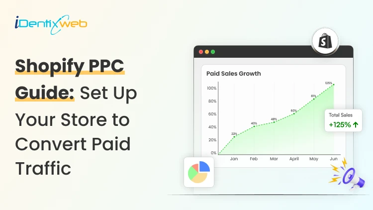
Shopify PPC refers to pay-per-click advertising campaigns run by Shopify store owners across platforms like Google, Meta, Microsoft Ads, Pinterest, and TikTok. Advertisers pay only when a user clicks their ad. Shopify's native integrations with these platforms automate catalog syncing, conversion tracking, and dynamic ad creation, giving Shopify merchants a technical foundation that many other ecommerce platforms do not offer out of the box. Paid ads can be the fastest way to grow a Shopify store. They can also be the fastest way to burn through a budget with nothing to show for it. The difference between the two almost always comes down to how the campaign is built, managed, and connected to the rest of the store's conversion stack. PPC for Shopify works. But it rewards merchants who treat it as a system, not a shortcut. Here is how to build that system properly. What is Shopify PPC & why it works differently Shopify PPC (pay-per-click advertising) means running paid ads across platforms like Google, Meta, Microsoft, and TikTok, paying only when someone clicks. If a thousand people see your ad but none click, you pay nothing. What makes PPC for Shopify websites distinct is Shopify's native integration with the major ad platforms. Your product catalog syncs automatically to Google Merchant Center and Meta. The Meta Pixel and Google conversion tag install without manual coding. Any product change you make in your Shopify admin (price, stock, title) propagates to your ad feeds in real time. The result is that Shopify merchants have access to richer, real-time product data in their ad accounts than most competitors running on other platforms. Is your Shopify store ready for PPC? Check this first Before spending anything on ads, run through this readiness check: Conversion rate: The typical ecommerce store converts between 2% and 3% of sessions. If yours is significantly below 1%, paid traffic will not fix that. It will expose it, at scale. Product page quality: Every product your ads link to needs clear, high-resolution images, benefit-focused copy, visible social proof, and an obvious path to purchase. If someone clicking from an ad has to work to understand what they are buying, they will leave. Mobile experience: A large share of paid ad traffic lands on mobile. Test your product pages and checkout on actual mobile devices. Average order value relative to CPC: Work backwards from your margin. If your AOV is £60 with a 35% gross margin, your maximum allowable CPA is £21. At a 2% store conversion rate, that means your maximum CPC cannot exceed £0.42. If CPCs in your category run £1.50 and above, paid search will not be profitable without first raising your AOV or conversion rate. Here’s my complete breakdown on improving your store's conversion rate before scaling ad spend is not a delay. Also, for building traffic while you get your store ready, check out my guide on how to increase traffic to your Shopify store using organic methods. How does PPC advertising work on Shopify? Every time an ad slot becomes available on a search results page, a social media feed, or a product listing, the platform runs an auction in real time. Your ad wins or loses that auction based on three inputs. Your bid The maximum amount you are willing to pay per click or action. On Google, you set this via bidding strategies. On Meta, it is a daily or lifetime budget with optional bid caps. Ad quality Google assigns a Quality Score to every ad based on expected click-through rate, relevance to the user's search, and the landing page experience. A higher Quality Score means a lower effective cost per click for the same position. Meta uses ad relevance diagnostics that function similarly: higher-relevance ads cost less to reach the same audience. Competition The more advertisers bidding on the same keyword or audience, the higher the price. High commercial intent queries like "buy [product] online" carry significantly higher CPCs than broader or informational searches. Here are the core metrics to track across any PPC campaign for Shopify websites: MetricWhat It MeasuresCPC (Cost Per Click)What you pay each time someone clicks your adCTR (Click-Through Rate)Percentage of ad impressions that result in a clickCVR (Conversion Rate)Percentage of clicks that turn into ordersCPA (Cost Per Acquisition)What you pay per completed purchaseROAS (Return On Ad Spend)Revenue generated for every £1 spent on adsImpression SharePercentage of eligible auctions where your ad appeared Where to run ads? Top platforms for Shopify PPC management Choosing where to start should be based on where your ideal customer already spends time and what they are ready to do when they get there. Google Ads Google is the highest-intent PPC platform for most Shopify stores. When someone searches "waterproof hiking boots UK," they are actively looking to buy. Your ad appearing at that moment positions you in the purchase path with minimal persuasion required. Google Ads for Shopify encompasses four distinct formats: Search Ads target specific keywords. You write the headlines and descriptions; Google shows your ad when someone searches a matching query. Google Shopping Ads pull directly from your Shopify product catalog via Google Merchant Center. They display product images, prices, and your store name inside search results. Performance Max campaigns are Google's AI-driven format that distributes ads across Search, Shopping, Display, Gmail, Maps, and YouTube from one campaign. They require quality first-party data to optimize effectively: your product feed, customer lists, and Shopify conversion data. YouTube Ads work best for retargeting existing site visitors and building brand awareness for visually compelling products. They become valuable once you have enough conversion data to build lookalike audiences. Meta Ads (Facebook and Instagram) Meta's ad platform reaches users based on who they are and how they behave, rather than what they are searching for. Users who have shown interest in sustainable home goods, recently browsed competing products, and fall in a specific demographic can all be layered into a single audience definition. Facebook advertising mistakes, such as broad targeting with no segmentation or static creative that does not stop the scroll, account for the majority of wasted spend on Meta. Getting the basics right is more impactful than finding clever hacks. One significant advantage exclusive to Shopify merchants is Shopify Audiences. The tool generates custom high-intent audience lists using aggregated purchase data from across the Shopify network, identifying users who have demonstrated real buying behavior for products similar to yours. My Shopify Audiences guide walks through exactly how to activate and use it inside Meta Ads. Microsoft Advertising (Bing Ads) Bing reaches a smaller audience than Google, but often at 20 to 30% lower CPCs with meaningfully less auction competition. The demographic skews slightly older and higher-income, which suits specific product categories well, particularly home goods, professional services, and premium items. A key practical advantage: you can import your Google campaigns directly into Microsoft Ads, making launch fast and low-effort once your Google campaigns are structured properly. TikTok Ads TikTok has matured into a legitimate ecommerce channel, particularly for products targeting younger demographics. It syncs with Shopify, enabling in-app product discovery and purchase. Creative requirements differ from other platforms: native-feeling, unpolished content performs better than polished advertising. Production costs can be lower, creatives can feel more authentic, and audiences are genuinely open to discovering new brands mid-scroll. If you are building a multi-channel presence, my guide to promoting your Shopify store on social media covers organic and paid tactics. How to set up your first Shopify PPC campaign Step 1: Define a measurable goal Every campaign needs one primary objective: drive purchases, capture leads, or build awareness. Your goal determines which bidding strategy you use, which ad format serves it, and what metric you measure success against. Step 2: Sync your Shopify catalog Install the Google & YouTube and Facebook & Instagram channel apps in your Shopify admin. These pull your product data into the respective ad platforms, enable dynamic creative, and configure conversion tracking without manual pixel implementation. Clean data here means clean attribution data from day one. Step 3: Research keywords High-intent buying terms: Searches like "[product] buy," "[product] price UK," "[product] free delivery." Users searching these phrases are close to purchasing. Long-tail keywords: Specific phrases like "men's waterproof trail running shoes size 10." Lower search volume, far less competition, and users who know exactly what they want typically convert at higher rates. Negative keywords: Just as important as your target keywords. A store selling premium dog food should exclude "homemade dog food" and "free dog food samples" from the start. Step 4: Write ads that pre-qualify the click Effective ad copy does two jobs simultaneously: It attracts buyers who are genuinely interested It signals to everyone else that this ad is not for them. Use headlines to communicate your key differentiator, whether that is next-day delivery, a current promotion, or a specific product feature. Ad extensions (sitelinks, price extensions, promotion extensions) add contextual detail without adding to your click cost. Step 5: Match every ad to the right landing page If someone clicks an ad for "navy linen chinos" and lands on a homepage, they do not have to search for the product. Every ad should land on the most relevant destination: a specific product page, a tightly curated collection page, or a dedicated Shopify landing page built around the campaign's offer. Match the headline, images, and offer between your ad and landing page exactly. Step 6: Set a budget you can measure from Use your AOV, gross margin, and target CPA to reverse-engineer a viable CPC: AOV: £80 | Gross margin: 40% | Maximum allowable spend per order: £32 At a 2% store conversion rate: 50 clicks per sale Maximum viable CPC: £32 ÷ 50 = £0.64 If competitive CPCs in your keyword set run at £1.50, the math does not work without fixing either the conversion rate or the AOV first. Planning your Shopify marketing budget around these numbers before launch prevents learning-phase losses from depleting your test budget before you have meaningful data. Turn Paid Clicks Into Bigger Orders With iCart, you can add cart upsells, product recommendations, free gifts, and progress bars to increase AOV without increasing ad spend. Most carts only show products... iCart can show revenue-boosting offers. Try Free Till 100 Orders Before you spend more on Shopify PPC, make sure every visitor has a reason to buy more. Shopify PPC campaign optimization strategies These Shopify PPC campaign optimization strategies apply across platforms, and when applied consistently, the compounding effect on ROAS is significant. Audit your search terms weekly Your keyword list tells the platform what to bid on. Your search terms report shows what it is actually matching to. Review search terms weekly and add irrelevant, low-converting, or off-brand queries to your negative keyword list. On Google Shopping, where you do not set keywords directly, the search terms report is the primary lever for improving targeting precision. Run A/B tests Run two to three variants at all times per ad group and test one element at a time: headline A versus headline B, static image versus short video, benefit-led description versus feature-led description. Let each test reach statistical significance before deciding. Make retargeting your highest-priority campaign type Retargeting reaches people who already visited your store, viewed specific products, or added to cart without completing purchase. Warm audiences convert at significantly higher rates than cold traffic because the intent is already established. The ad's job is to bring them back, not to create interest from scratch. Shopify's catalog sync enables dynamic retargeting where ads automatically show each user the exact products they viewed, at the price they saw. Here’s my complete guide to setting up Shopify retargeting ads as distinct campaigns with their own budget allocation. Segment campaigns by product margin Not all products justify the same ad spend. High-margin products can sustain higher CPCs and more aggressive bidding. Lower-margin products need lower CPAs or should not be in paid campaigns at all. Running separate campaigns for high-margin product lines gives you the budget control to spend where it pays. How to measure PPC performance for Shopify stores ROAS (Return on Ad Spend): Revenue generated per £1 spent. A 3x ROAS is a common benchmark, but the right target depends on your gross margin. Calculate your breakeven ROAS before launch CPA (Cost Per Acquisition): What you pay per completed order. Track CPA at the campaign and ad group level. A high-ROAS product campaign, averaged with a low-performer, makes the account look mediocre. CVR (Conversion Rate): If your CVR drops below historical norms without a change in targeting, the problem is usually on-site: a checkout bug, a product page issue, or a new landing page that is not converting as well as the previous one. Impression Share: If impression share on your highest-performing campaigns is low (under 60%), you are leaving qualified clicks on the table. Here’s my guide to using Shopify analytics for ecommerce growth which covers how to set up and interpret the data that informs PPC decisions. Managing Shopify PPC campaigns over time Weekly: Review the search terms report and add negatives. Check spend pacing relative to daily budget limits. Flag any campaign where ROAS or CVR has dropped more than 15% week-over-week. Monthly: Evaluate creative performance and pause underperforming variants. Review audience overlap between campaigns. Adjust bids for seasonal demand patterns. Compare current month metrics against the prior 90-day average, not just the previous month. Quarterly: Audit the full campaign structure. Remove products that have dropped below viable CPA thresholds. Reassess platform allocation: should the budget shift from Meta to Google, or is there a case for testing Pinterest or TikTok for a specific product line? For a complete view of how paid fits alongside organic, email, and social, see my guide to Shopify marketing strategies in 2026. FAQs 1. What is Shopify PPC? PPC for Shopify refers to pay-per-click advertising campaigns run by Shopify store owners across platforms like Google, Meta, Microsoft Ads, Pinterest, and TikTok. Shopify's native integrations with these platforms automate catalog syncing, conversion tracking, and dynamic ad creation, giving Shopify merchants a foundation that many other ecommerce platforms do not offer. 2. How much does PPC cost for Shopify stores? You set your own budget, and the platform charges per click. CPCs vary widely by platform and keyword competitiveness. Most new Shopify stores start with a monthly test budget of $400 to $1300 to generate enough conversion data for meaningful optimization. 3. Which PPC platform is best for Shopify? Google Shopping is the highest-converting platform for product-based Shopify stores because it intercepts buyers with active purchase intent. Meta (Facebook and Instagram) is stronger for lifestyle and visually driven products. 4. What is a good ROAS for paid campaigns for Shopify stores? A 3x ROAS is a common starting benchmark. A store with 40% margins breaks even at 2.5x ROAS; anything above is profit. A store with 20% margins needs 5x just to break even. Set your target ROAS above breakeven. 5. How long does PPC take to start working? Most PPC platforms need two to four weeks to exit the learning phase and begin optimizing effectively. Google's smart bidding strategies require approximately 30 to 50 conversions per campaign before the algorithm has enough data to optimize bids. 6. Should I run paid campaigns or focus on SEO? PPC delivers immediate traffic while SEO builds organic visibility over months. Growing Shopify stores benefit from both running in parallel: PPC for product launches, seasonal pushes, and high-intent acquisition; SEO for long-term category visibility and lower cost-per-visit over time. 7. What is Shopify Audiences, and how does it improve PPC? Shopify Audiences is a tool exclusive to Shopify merchants that generates custom audience lists using aggregated purchase intent data from across the Shopify commerce network. It identifies users who have demonstrated real buying behavior for products similar to yours, rather than relying on demographic proxies. 8. What metrics should I track for Shopify PPC management? Track ROAS, CPA, CVR, CTR, and impression share at the campaign and ad group level. Set up UTM parameters on all ad URLs to ensure Shopify Analytics attributes revenue to the correct source. Review the search terms report weekly. Also track AOV alongside your ad metrics: Increasing AOV often improves PPC economics faster than reducing CPC alone.

Sajini Annie John
6 Min • 15 April 2026
142 Views

Vineet Nair
8 Min • 10 April 2026
145 Views

Vineet Nair
14 Min • 11 May 2026
208 Views
![How to Automate Shopify Post-purchase Email? [Examples + Tips to Convert]](https://www.identixweb.com/wp-content/uploads/2026/04/26-03-Thu-Blog-How-to-Streamline-Shopify-Post-purchase-Email-Flow_.webp "How to Automate Shopify Post-purchase Email? [Examples + Tips to Convert]")
Vineet Nair
9 Min • 1 May 2026
163 Views

Sajini Annie John
2 Min • 15 April 2026
154 Views

Vineet Nair
7 Min • 1 May 2026
166 Views

Sajini Annie John
5 Min • 15 April 2026
155 Views
![How to Create a Discount Code on Shopify [Easy New Tutorial]](https://www.identixweb.com/wp-content/uploads/2026/03/26-03-Thu-Blog-How-to-Easily-Create-a-Discount-Code-on-Shopify_-2.webp "How to Create a Discount Code on Shopify [Easy New Tutorial]")
Vineet Nair
11 Min • 8 May 2026
163 Views

Sajini Annie John
7 Min • 23 April 2026
158 Views
")
Vineet Nair
7 Min • 20 March 2026
154 Views
")
Sajini Annie John
5 Min • 27 March 2026
174 Views

Sajini Annie John
5 Min • 27 March 2026
188 Views