

Blog
Gather knowledge about the latest insights, updates, tips, and tricks in the Ecommerce industry.

5 Min • 20 March 2026
How Anua Unlocked 5X AOV Growth with iCart’s Smart Cart Features
delivery customization Challenges Solutions drive results Scale business delivery customization Challenges Solutions drive results Scale business delivery customization Challenges Solutions drive results Scale business delivery customization Challenges Solutions drive results Scale business Anua is a globally recognized Korean skincare brand known for its minimalist philosophy and focus on gentle yet effective formulations. Built on the idea of simplifying skincare routines, Anua develops products that deliver visible results while avoiding harsh or irritating components, making them suitable for sensitive skin types. Initially using a traditional full cart experience, Anua transitioned to iCart’s side cart solution in August 2025, to create a more seamless and engaging shopping journey. This shift allowed customers to easily explore complementary skincare products without disrupting their browsing flow, making it more intuitive to discover items that fit into a complete routine. By surfacing relevant recommendations directly within the cart, the brand enhanced product visibility across its range. Challenges Before implementing iCart’s side cart solution, Anua faced limitations with their existing full cart experience, which created friction in the customer journey. The traditional cart setup redirected users away from product pages, interrupting their browsing flow and reducing opportunities to explore additional products. As a skincare brand built around routines rather than single-item purchases, this made it difficult to effectively showcase complementary products and encourage customers to build complete regimens. Additionally, the lack of in-cart personalization and strategic upsell opportunities meant that customers were often unaware of related products that could enhance their skincare results. This limited the brand’s ability to increase average order value (AOV) and fully leverage its diverse product range. Anua needed a more dynamic and intuitive cart experience that could seamlessly introduce relevant recommendations while maintaining a smooth and engaging shopping journey. ❌ Cart Value Barriers Low average order value (AOV) due to single-item focus Most customers completed purchases with one primary product instead of building multi-step routines. Cart abandonment near shipping thresholds Customers were not clearly informed or motivated to reach free shipping or discount thresholds. Missed savings opportunities Customers were unaware of potential value in purchasing bundled routines or multiple complementary products. ❌ Absence of Progress-Based Incentives No free shipping or discount progress bar Customers were not motivated to increase their cart value due to lack of visible incentives. Missing tiered rewards system There were no structured milestones (e.g., “Spend more to unlock offers”), reducing upsell opportunities. ❌ Ineffective Cart UI/UX (Pre-Side Cart) Full-page cart disrupted shopping flowCustomers had to leave their browsing journey, increasing friction and drop-offs. No quick add/remove functionality Users couldn’t easily modify their cart or add suggested products without navigating away. Solution To overcome these challenges, Anua implemented iCart’s side cart solution to transform their traditional cart into a high-converting, interactive experience. By replacing the full-page cart with a seamless side cart, the brand ensured that customers could continue browsing while viewing their cart, significantly reducing friction in the shopping journey. Additionally, features like product recommendations & progress bars for free shipping and discounts motivated customers to increase their cart value. By combining personalization, incentive-driven messaging, and a user-friendly interface, Anua successfully turned their cart into a powerful revenue-driving touchpoint rather than just a checkout step. To maximize their cart effectiveness, they implemented two powerful features: ✅ Progress Bar with Multi-Reward Incentives Implemented a tiered progress bar to encourage higher cart value Customers are guided with a clear message like “Add $3.10 to unlock secret offer,” motivating them to continue adding products. Generated over $5M+ in revenue through incentive-driven cart progression Used product-based rewards to align with customer intent Instead of generic discounts, Anua incentivized purchases with relevant skincare items like Dark Spot Pads and mini serums. Built visual motivation for routine expansion As customers add products, they can clearly track progress toward unlocking multiple rewards, encouraging them to build a complete skincare routine. ✅ Product Recommendations Implemented “Frequently Bought Together” recommendations Customers adding a single product (e.g., toner) are shown complementary items like serums, moisturizers, or pads to complete their routine. Generated over 275K revenue through in-cart recommendations Encouraged full skincare regimen building Instead of isolated purchases, the cart suggests step-by-step product combinations aligned with common skincare routines. Increased product discovery at the final stage By surfacing relevant items directly in the cart, Anua ensured customers explore more of their catalog without leaving the checkout flow. Results Achieved in Last 180 Days 22932 Total Store Orders 45101 Total iCart Orders 5X iCart Generated AOV 65.70% Upsell Affected Conversion Rate These improvements reflect a clear shift in customer behavior on Anua’s store. Cart abandonment reduced as shoppers discovered complementary skincare products and felt encouraged to build complete routines. Engagement also increased, with customers interacting more with in-cart recommendations and exploring relevant product pairings. Results & Impact And...Results is Our Main Clarification By implementing iCart’s cart drawer, product recommendations, and progress bar, Anua transformed its cart into a high-performing conversion touchpoint. Shopping Experience Enhancement The improved cart experience encouraged customers to discover complementary products and understand the value of sustainable beauty routines. For instance, the clear presentation of subscription savings alongside one-time purchase options helped customers make more informed decisions about their long-term hair care needs. As Anua continues to optimize its cart experience, the brand is closely monitoring: Routine-based purchasing behavior - tracking how customers move from single items to multi-step regimens Engagement with in-cart recommendations - measuring interaction with suggested products Cart value progression - analyzing how incentives influence higher spending [related_cases_slider] Ready to Write Your Success Story? Try icart App Join successful businesses like Anua and Master your delivery scheduling Delight customers with precise timing Grow your special occasion orders Expand your delivery reach
Read Blog
10 Min • 21 August 2026
Shopify App Store Guidelines: Lessons for Merchants Building an App
Getting an app approved on the Shopify App Store starts long before you hit submit. The Shopify App Store guidelines shape how an app is built, authenticated, billed, designed, tested, marketed, and maintained after launch. If you are the merchant paying for that app, those guidelines should be your concern. After more than a decade around the Shopify app ecosystem, I have learned one lesson worth passing on to store owners: Merchants who only think about App Store requirements at the end of a build are the ones who end up with delays, rework, and surprise costs. The better move is to understand these standards before the first line of code. That way you can brief the project properly, ask your developer the right questions, and recognise finished work when you see it. This guide walks through the practical lessons I use when helping merchants get a Shopify app listed. Shopify App store guidelines are product requirements It is easy to treat Shopify's requirements as a checklist your developer ticks off at the end. I would encourage you to see them differently. Shopify evaluates whether an app is safe, functional, useful, clear for merchants, and compatible with the way its platform is designed to work. Its requirements cover policy, functionality, installation, security, billing, App Store listings, and category-specific functionality. Shopify can also update these requirements as its platform evolves. That means an app that passed review two years ago should not assume its old implementation is still enough. ⭐ The biggest lesson before I start: Compliance should be a part of the app development process. 1. Start with Shopify-native architecture A technically functional SaaS product does not automatically make a good Shopify app. A Shopify app needs to behave like part of Shopify. For new public apps, this starts with the platform itself. From April 1, 2025, new public apps must use the GraphQL Admin API rather than the legacy REST Admin API. One thing to watch on any build: teams often request more permissions than the core feature actually needs. That creates needless privacy exposure and raises flags during review. Shopify requires an app to request only the access scopes it needs to function, and sensitive scopes can need extra justification. When you go over the plan with your developer, ask exactly why each permission is on the list. The same principle applies to storefront apps. Apps that modify themes should use theme app extensions instead of directly modifying theme code. Shopify also expects clear setup instructions for app embeds and blocks. ⭐ The lesson: Build the app around Shopify’s architecture from the beginning. 2. Installation and billing should be core features It is natural for a build to pour most of its energy into the headline feature. Reviewers care just as much about everything around it, and installation is the first thing they touch. Shopify requires installation to begin from a Shopify-owned surface. OAuth should happen immediately after installation, and the merchant should land inside the app UI after accepting permissions. Here’s the complete journey I test: Install → OAuth → permissions → app UI → setup → uninstall → reinstall Ask your developer to run this on a clean development store, not the environment they have used for months, where old data can hide broken steps. Billing deserves similar testing. Apps distributed through the Shopify App Store generally need to use Shopify App Pricing or the Shopify Billing API for app charges. Merchants should also be able to move between plans without contacting support or reinstalling the app. Before submission, confirm the app has been tested for plan selection, upgrades, downgrades, subscription status, and usage charges where they apply. ⭐ Lesson: Insist that installation and billing get tested as carefully as the app's main features. A broken setup can stop the review on day one. 3. Build privacy and security before the review Do not take security lightly. If something happens, it is your store's reputation and your customers' data at risk. Apps need valid TLS/SSL certificates and secure authentication. Embedded apps should work without depending on third-party cookies. Shopify also expects the app to use session tokens correctly. Customer data requires even more attention. If your app needs access to protected customer data, determine that requirement early and apply for the appropriate access. Shopify evaluates whether requested customer information is genuinely required for the app’s functionality. I follow one simple lesson here: ⭐ The lesson here is this: If the app does not need a piece of data, do not collect it. It reduces technical risk, simplifies privacy management, and gives reviewers fewer unnecessary permissions to question. 4. Your listing is part of the product If you are launching a public app, the listing is part of the product. It is the first thing a prospective merchant reads before they trust your app with their store. The Shopify app store listing guidelines require the public listing to accurately represent what the app can actually do. Your name, pricing, screenshots, descriptions, supported languages, geographic restrictions, and claims all need to match the product. Avoid claims such as “the best,” “the first,” or “the only” unless Shopify’s requirements clearly allow and the statement can be substantiated. Testimonials and merchant reviews should not be inserted manually into listing content or images either. Images should focus on the actual product interface. Each image should add something new instead of repeating the same screen. This is also where more focus should be put on Shopify app store optimization. Shopify recommends an app card subtitle that explains merchant value, and the listing allows up to five relevant search terms, each a complete term with one clear idea. They specifically warns against forcing keywords into subtitles for search performance. I normally think about the merchant’s search intent: What problem are they trying to solve? What would they call that problem? What outcome does the app provide? Which features actually differentiate it? There is another reason listing quality matters in 2026. Shopify introduced app discovery through Sidekick. It can recommend, compare, and surface apps using information from App Store listings. Shopify advises developers to keep listing information accurate, clear, and structured for this experience. Your listing is now serving humans, App Store search, external search engines, and AI-assisted discovery. ⭐ The lesson here: Your app store listing should explain the app as clearly and accurately as the product itself. 5. Make the reviewer’s job easy Shopify requires a demo screencast showing onboarding and the core features described in the listing. Test credentials must remain valid and provide access to the complete feature set needed for review. I treat the reviewer like the app’s first merchant. Make sure the submission hands the reviewer: Clear installation instructions. Working test credentials. Exact steps required to activate important features. A concise screencast showing the full workflow. Notes explaining unusual configuration requirements. Any category-specific setup the reviewer needs. Then have someone test those instructions in a fresh store, ideally not the person who wrote them. The current Shopify app review process moves an app through 4 stages: Draft > Submitted > Reviewed > Published. An app that fails core requirements can be paused until fixes are submitted. Once the core requirements are satisfied, a reviewer can continue with deeper testing and request further changes. Shopify also now offers an AI self-review through its AI Toolkit. The tool can inspect a local codebase against App Store requirements that can be evaluated from code. It does not replace Shopify’s review team and cannot evaluate every live UX or listing requirement. ⭐ The lesson here: Give reviewers clear instructions, working credentials, and a complete path to test every important feature. 6. The most common rejections are often preventable I have experienced app rejection coming from a policy that is hard to understand. Usually, the causes are far less dramatic. Broken OAuth or installation flows. 404, 500, and other web errors. Inaccurate pricing. Billing implementation problems. Broken embedded behaviour. Missing testing instructions or credentials. Unfinished app functionality. Storefront apps that fail to use theme app extensions correctly. These are mostly QA problems. That is why a solid pre-submission check runs the app as a complete merchant journey rather than testing features in isolation. When you review a build, ask to see it run end to end, from install to uninstall. ⭐ The lesson here is: A thorough pre-submission QA check can prevent many of the issues that delay Shopify App Store approval. 7. Approval should be the starting line Publishing the app is a milestone, but it is not the end of development. Shopify continues to evaluate app quality. Performance, reliability, merchant experience, platform changes, API versions, privacy requirements, and listing accuracy need ongoing attention. If you are in this for the long run, ask your developer about Built for Shopify. Built for Shopify adds stricter quality standards around areas such as performance, integration, ease of use, safety, and proven merchant value. Qualifying apps can receive a badge, greater visibility, a search-ranking boost, and priority review for future apps from the developer. ⭐ The lesson here: Treat App Store approval as the beginning of ongoing improvement, not the final stage of app development. Here’s my complete guide on why merchants prefer Built for Shopify apps in 2026. What should merchants look for in a Shopify app development agency? If you are hiring an agency to turn an app idea into a Shopify product, ask deeper questions than “Can you build this feature?” Start by understanding what goes into Shopify custom app development. Ask the agency how they handle Shopify APIs, OAuth, billing, access scopes, protected customer data, app extensions, performance, App Store submissions, listing requirements, and post-launch API changes. An experienced Shopify app development team should be thinking about approval while the app architecture is still being discussed. Before making a hire, read my article on what to check before hiring a Shopify expert in 2026. Build for Shopify before you build for approval The biggest mistake I see merchants make is treating the Shopify App Store review as the final hurdle. It should shape the product from the start. Insist on Shopify-native APIs and installation that just works. Make sure billing is tested properly, customer data is protected, the listing is written around real value, and the reviewer is handed everything they need. Then keep improving after approval. That approach cuts avoidable rework and gets you something more valuable than an approved submission: a Shopify app that merchants can install, understand, and keep paying for. FAQs 1. What are the Shopify app store guidelines? Shopify App Store guidelines are the rules an app must follow to be listed on the Shopify App Store. They cover areas like security, functionality, billing, privacy, performance, and app listing content. 2. How much does it cost to develop a Shopify app? The cost depends on the app’s features, complexity, integrations, and whether it is a custom or public app. A simple app can cost a few thousand dollars, while a complex public app can require a much larger budget. 3. Can I build my own Shopify app? Yes. Shopify offers APIs, the Shopify CLI, App Bridge, and other tools for building an app. In practice it takes solid development knowledge across authentication, APIs, billing, webhooks, and security, so most merchants hire a developer, agency, or Shopify expert rather than building it in-house. 4. What are the different types of Shopify apps? The main types are public apps and custom apps. Public apps are built for multiple merchants, while custom apps are usually created for the specific needs of one merchant or organization.
9 Min • 7 August 2026
Risks of Using AI-Generated Product Reviews on Shopify
AI-generated product reviews may look like an easy way to build social proof, but the risks go far beyond customer skepticism. Fake or misleading reviews can damage brand trust, trigger refunds and chargebacks, put payment and advertising accounts at risk, violate review-app policies, and attract regulatory attention. In the US, FTC enforcement and state consumer-protection laws can also turn fabricated reviews into a costly legal and compliance problem. If you have just opened your store in 2026, you definitely need proof that real people actually buy from you. This gap is exactly where AI-generated reviews start to look like an easy fix. Here's the problem: The risks of using AI-generated product reviews on Shopify changed shape in the last year, and it goes beyond reviews just reading a little generic. Late previous year, the rules got sharper, real enforcement started, and both Shopify and Google made their positions harder to miss. Here's what's true right now if you are using or thinking about adding AI-generated product reviews on Shopify. What counts as an AI-Generated product review? An AI-generated product review is any review text a tool writes in place of a real customer. There are different types of reviews that I have come across. Fully invented reviews. The entire experience is made up. It's the version everyone pictures, and it's also the clearest violation of every policy I will cover below. AI-rewritten real feedback. You take genuine supplier reviews, marketplace comments, or old customer notes and ask AI to restyle them. If done carefully, this won’t be a problem. Issue arises when AI adds emotions, timelines, or outcomes that weren't in the original. AI-assisted, human-approved content. AI drafts a summary of reviews you've already collected, and the person checks it before anything goes live. It's the version that causes the least trouble. The difference between these three isn't how polished the writing sounds. It's whether the experience described actually happened to a real person. The Legal Risk Just Got Real Here's what I think most Shopify advice on this topic misses, and it's the part that matters most right now. The Federal Trade Commission has a specific rule about fake and AI-generated reviews, and as of the end of 2025, the agency started enforcing it for real. In the FTC's Rule on the Use of Consumer Reviews and Testimonials (16 C.F.R. Part 465) it bans. Reviews from people who don't exist, or who never actually used the product Buying reviews, or paying anyone to write only positive ones Suppressing or hiding negative reviews Reviews from employees or family members that don't disclose the connection Company-run "independent" review sites that aren't actually independent The rule specifically names AI-generated fake reviews as one of the practices it targets. Violations can carry civil penalties of up to $53,088 each, adjusted yearly for inflation. That figure is per violation, not per company. On December 22, 2025, the FTC sent its first wave of warning letters to 10 companies over likely violations. It wasn't the first time the FTC had gone after review manipulation, either. The message for merchants is clear: The FTC is chasing whoever publishes the fake content and presents it as a real customer's experience. The responsibility sits with the store owner. What Shopify and Google actually say Shopify has a plain standard for reviews shown through Shop: no fake ones, no conflicts of interest, no asking only happy customers to speak up. Shopify's Shop product review guidelines are direct about it. Merchants, employees, family members, and friends shouldn't review their own products, and store owners shouldn't solicit reviews in a way that pushes for a specific sentiment. Most stores today collect and display reviews through an app like Judge.me, Loox, or Yotpo. This means the risk usually sits with how you use that app. Google is more explicit about this. If you send product ratings into Google Shopping or run Shopping ads, Google Merchant Center's Product Ratings policy states plainly that it doesn't allow reviews generated by AI. It expects merchants to flag any they identify using the is_spam attribute in their feed. Humans and AI shopping agents both catch on AI-generated reviews are getting worse at their one job, which is making shoppers trust you. Reviews that all sound the same length, use the same phrases, or praise everything without mentioning a single specific detail read as suspicious faster than they used to. Shoppers have had years of practice spotting this pattern. A 2026 research report found that 43% of U.S. online shoppers had used an AI assistant like ChatGPT for product research. These tools focus on consistency across reviews over the internet. A group of generic five-star reviews with nothing to back it up reads as a weak signal to an AI agent, not a strong one. I have written a complete breakdown on how to rank in AI search engines with AEO for merchants. The real risks of AI-Generated product reviews on Shopify Loss of brand trust Fake reviews do not stay hidden for long. A review that doesn't match a real customer's actual experience gets noticed and gets screenshotted and shared on Reddit or TikTok. Once shoppers decide a brand faked its social proof, they stop trusting everything else offered by your brand. Refunds and chargeback disputes When a real customer's experience doesn't match what the reviews promised, they have grounds to dispute the charge. The review itself can end up as evidence in that dispute. Payment and ad account risk Payment processors and ad platforms both watch for mismatches between product claims and real customer experience. Either can freeze payouts or reject ads over it. Review app suspension Apps like Judge.me, Loox, and Yotpo remove fabricated reviews, and repeated violations can get your account suspended. Direct FTC exposure Given the warning letters sent by FTC, this can definitely happen. A new or small store isn't automatically off the FTC's radar just because of its size. Legal penalties A batch of fake reviews spread across even a small catalog becomes a real problem. Most states have their own consumer protection laws that mirror the FTC Act, so a state attorney general can pursue separate action on top of anything the FTC does. The right way to use AI for your reviews AI isn't off-limits here, and I wouldn't tell you to avoid it. The line I'd draw is simple: use it on reviews that already happened. If you've already collected real feedback, AI is genuinely useful for turning long reviews into short highlights. It can also draft a reply for you to check before it posts. Several Shopify review apps now build this in directly. If you are looking for tools to add reviews in your store, here’s my list of the best Shopify product reviews app in 2026. If you're dropshipping, label reviews clearly as sourced feedback rather than rewriting them into first-person claims about your own store's shipping or service. AI can also speed up the boring parts of getting real reviews, like personalizing post-purchase request emails or timing them around delivery data. If you're starting from zero, my article on how to add reviews to Shopify will give you insights on creating and adding reviews in your store. Use AI Where It Adds Real Value AI can still be useful in a Shopify business when it is applied to areas where automation does not misrepresent customer experiences. Identixweb works with Shopify businesses on AI automation and integrations for workflows, operations, and customer experiences where AI can reduce manual work without creating the trust risks associated with fabricated reviews. How to build trust other than reviews? Reviews aren't the only trust signal in your store. Using other signals takes pressure off needing reviews to do all the work. Here’s a few I use to build trust. Trust badges Clear shipping and return policies Teal product photos Detailed FAQs all add trust. Adding trust badges near your checkout button is a fast, low-effort update, and social proof placed at checkout works even before your review count builds up. A Fast pre-publish check Before you publish any batch of reviews, run through this: Did a real person actually buy or use this product? Is the reviewer's identity accurate, no invented names, no stock photos standing in for a customer? If there's an incentive attached, is it tied to leaving a review, not to what the review says? If this is a supplier or marketplace review, is the source labeled clearly? If it's heading into your Google Shopping feed, is any AI-generated content flagged or excluded? Would this hold up if you had to explain it next to your actual order data? If any answer is no, that review isn't ready to publish, no matter how good it reads. What’s next now? There are risks of using AI-generated product reviews on Shopify. There's a federal rule with real penalties behind it, policies from both Shopify's Shop channel and Google Merchant Center, and shoppers, who are getting better at spotting the difference. Real reviews take longer to build. They're also the only kind that hold up for a long term if you want to build trust and increase sales. FAQs 1. What are the risks of using AI-generated product reviews on Shopify? Publishing AI-generated reviews that pretend to come from real customers can violate Shopify’s Shop review requirements. This requires reviews to be authentic and not artificially created by bots or automation. It can also create legal risk under the FTC’s Consumer Review Rule in the US. Google Merchant Center explicitly prohibits reviews primarily generated by AI or automated programs. 2. Can AI detect fake reviews better than human moderators? AI can analyze large numbers of reviews and spot patterns, suspicious reviewer networks, and other signals much faster than human moderators. But it is not consistently better in every case. Recent research found that both humans and general-purpose LLMs can struggle to distinguish sophisticated AI-generated reviews from genuine ones. 3. How to add more product reviews on Shopify in 2026? The best approach is to request reviews from verified customers after their orders are delivered; Shopify lets merchants set Shop review requests from 1 to 180 days after delivery. For reviews on the online store, merchants can also use apps such as Judgeme or Loox, while keeping requests neutral and avoiding fake or improperly incentivized reviews.
7 Min • 19 August 2026
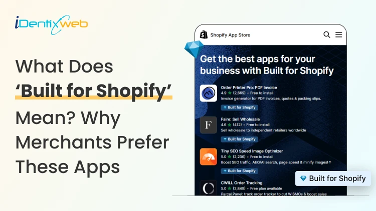
Built for Shopify Apps Benefits: What Merchants Gain from the Badge
Built for Shopify apps give merchants a stronger quality signal when choosing apps. They are evaluated against Shopify’s standards for performance, design, integration, usability, and ongoing compliance. Benefits for 'Built for Shopify' apps include smoother admin workflows, simple storefront integration, better performance safeguards, and easier app discovery. The Shopify App Store gives merchants thousands of ways to add features that Shopify does not provide by default. The difficult part is deciding which app to install to make your life easier. That is where the Built for Shopify badge helps. It is Shopify's highest level of recognition for apps that meet its quality standards. Built for Shopify apps have their benefits, but it's more than that. That being said, I would not just choose an app because it has the badge. I would use it as a strong first filter, then compare functionality, pricing, reviews, support, permissions, and compatibility. What does Built for Shopify mean? Built for Shopify, often shortened to BFS, is Shopify's quality program for apps distributed through the Shopify App Store. Apps that earn the status must meet requirements such as performance, integration, design, App Store compliance, merchant adoption, reviews, and category-specific criteria. Shopify describes Built for Shopify as the highest level of recognition and achievement an app can reach. The badge appears on qualifying app listings and app cards in search results and category pages. Merchants can also filter App Store results to show only Built for Shopify apps. Above is an app, Delivery Date & Pickup Stellar. You can see it has a Built for Shopify badge just below its name. I’ve worked closely with Shopify merchants and been involved in developing Shopify apps around real store requirements. I know how much difference a well-built app can make to day-to-day store management. Built for Shopify apps: Benefits for merchants 1. You get a faster way to shortlist better apps Several apps offer similar features. The Built for Shopify badge helps you to filter apps that are helpful in a specific category. Instead of comparing every app only by listing content, pricing, and reviews, you can use the badge to quickly identify apps that meet Shopify's standards. It makes the selection process much easier. 2. You reduce the risk of choosing an app that hurts store performance Every app you install can affect your storefront or Shopify admin experience. Built for Shopify apps must meet Shopify's performance requirements. This includes limits around storefront and admin Web Vitals. For you as a merchant, this means the app has been evaluated against measurable performance standards rather than relying only on the developer's claims. 3. You get an app that feels more familiar inside Shopify Built for Shopify apps are expected to follow Shopify's UX and design standards. This includes clear navigation, responsive layouts, familiar controls, and admin behavior. For you, that can mean less time figuring out where settings are located and a smoother experience for team members navigating through the admin panel. 4. You can manage more of the app without leaving Shopify One of the biggest benefits of choosing a Built for Shopify app is better Shopify integration. Shopify expects the primary functionality of an embedded BFS app to work inside the Shopify admin where applicable. That means you are less likely to depend on completely separate dashboards for everyday tasks. If you use multiple apps, this will make daily store management more organized and easier to follow. 5. You get cleaner storefront installation and removal Apps that add storefront features can create problems if they make unnecessary changes to your theme. Built for Shopify requirements encourage apps to use Shopify's current extension architecture, including theme app extensions. These extensions are made to integrate more easily with themes and are removed when the app is uninstalled. For you, that means less risk of being left with unnecessary storefront elements after removing an app. 6. You choose apps that already have real merchant usage An app cannot qualify for the Built for Shopify badge without meeting Shopify's merchant adoption and review requirements. That means the app must already have real usage across active stores before it can earn the badge. For you, this provides confidence that the app has been used by actual merchants. 7. You get a quality signal that Shopify continues to review The Built for Shopify badge does not stay forever with the app. Shopify continues to monitor requirements and reviews BFS apps over time. If an app stops meeting the requirements, it can lose its status. This makes the badge more useful because it reflects ongoing compliance with Shopify's standards. Built for Shopify requirements merchants should understand AreaWhat Shopify checksWhy it matters to merchantsPrerequisitesApp Store compliance, Partner standing, installs, reviews, recent ratingGives Shopify merchant usage and quality signals to evaluatePerformanceAdmin Web Vitals, storefront impact, relevant checkout performancePlaces measurable limits around app performanceIntegrationEmbedded workflows, App Bridge, Shopify-based processesKeeps important workflows connected to ShopifyDesignFamiliar UX, responsive layouts, clear navigationMakes everyday app use more predictableCategory criteriaRequirements specific to an app's functionChecks whether apps use Shopify's expected functionality for their categoryOngoing complianceAutomated checks and recurring reviewsRequires apps to continue meeting current standards The exact criteria depend partly on what the app does. For example, a product review app does not necessarily have the same functional requirements as a fulfillment, subscription, returns, or product bundles app. This is why I would avoid one checklist as the complete BFS standard. Shopify maintains detailed developer documentation and updates category criteria as its platform changes. Should I install only ‘Built for Shopify’ apps I will advise this to merchants: A Built for Shopify app is not always the right choice for your store. It might lack an important feature, cost more than your budget, or request permissions you do not want to grant. The badge also should not be interpreted as a guarantee of perfect support, zero bugs, higher conversion rates, stronger SEO rankings, or specific revenue growth. Those outcomes are outside the scope of what Shopify says the BFS badge certifies. I’m also not saying a non-BFS app is automatically a bad app. A newer app might not yet meet the standard for the BFS badge, but it can definitely help your store grow. If budget is a major factor, compare options in my guide to free Shopify apps rather than choosing by badge alone. How to find Built for Shopify apps The simplest method is to look for the Built for Shopify badge on an app listing. You can also use the BFS filter on Shopify App Store search and category pages. That badge should be visible directly on the App Store listing, which makes it easy to verify before installing. Final takeaway The strongest benefit of Built for Shopify apps is the standards behind the badge. Shopify evaluates qualifying apps for performance, design, integration, merchant adoption, App Store compliance, and relevant category requirements. It also reviews these apps over time instead of giving a permanent badge. For merchants, I would use the badge as a shortcut to a better shortlist, not as permission to skip due diligence. Start with BFS apps when suitable options exist, then compare feature fit, permissions, reviews, pricing, support, and compatibility before making the final choice. At Identixweb, we provide Shopify app development services for merchants who need functionality that an existing public app cannot fully cover. FAQs 1. What does Built for Shopify mean? The Built for Shopify badge identifies Shopify apps that meet Shopify's highest quality standards. Shopify evaluates qualifying apps across performance, design, integration, prerequisites, and relevant category-specific requirements. 2. What are the main Built for Shopify requirements? Current requirements include Shopify App Store compliance, good Partner standing, merchant adoption and review criteria, performance thresholds, Shopify admin integration, design standards, simple installation practices, and category-specific rules. 3. Can an app lose the Built for Shopify badge? Yes. Shopify reviews BFS apps and monitors several requirements on an ongoing basis. Apps that stop meeting the criteria and fail to correct the issues can lose Built for Shopify status. 4. Are Built for Shopify apps always better than non-BFS apps? Not in every situation. The badge is a strong quality signal, but merchants should still compare features, pricing, support, permissions, integrations, reviews, and compatibility before choosing an app.

Vineet Nair
7 Min • 9 May 2025
1689 Views

Bhavesha Ghatode
12 Min • 8 May 2025
1821 Views
Vineet Nair
6 Min • 7 May 2025
1852 Views
Vineet Nair
7 Min • 6 May 2025
1769 Views

Vineet Nair
9 Min • 2 May 2025
1854 Views
Bhavesha Ghatode
9 Min • 30 April 2025
2002 Views

Bhavesha Ghatode
9 Min • 28 April 2025
7506 Views

Vineet Nair
9 Min • 24 April 2025
1870 Views
Bhavesha Ghatode
9 Min • 21 April 2025
2027 Views

Vineet Nair
6 Min • 18 April 2025
1853 Views
Vineet Nair
4 Min • 15 April 2025
1432 Views

Bhavesha Ghatode
11 Min • 14 April 2025
1946 Views