Blog
Gather knowledge about the latest insights, updates, tips, and tricks in the Ecommerce industry.
5 Min • 20 March 2026
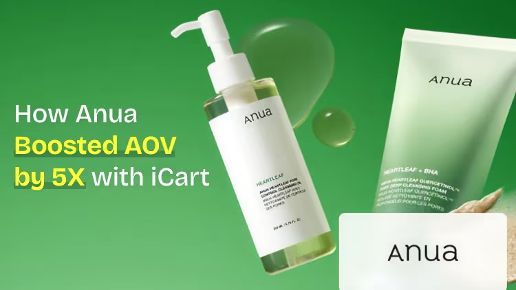
How Anua Unlocked 5X AOV Growth with iCart’s Smart Cart Features
delivery customization Challenges Solutions drive results Scale business delivery customization Challenges Solutions drive results Scale business delivery customization Challenges Solutions drive results Scale business delivery customization Challenges Solutions drive results Scale business Anua is a globally recognized Korean skincare brand known for its minimalist philosophy and focus on gentle yet effective formulations. Built on the idea of simplifying skincare routines, Anua develops products that deliver visible results while avoiding harsh or irritating components, making them suitable for sensitive skin types. Initially using a traditional full cart experience, Anua transitioned to iCart’s side cart solution in August 2025, to create a more seamless and engaging shopping journey. This shift allowed customers to easily explore complementary skincare products without disrupting their browsing flow, making it more intuitive to discover items that fit into a complete routine. By surfacing relevant recommendations directly within the cart, the brand enhanced product visibility across its range. Challenges Before implementing iCart’s side cart solution, Anua faced limitations with their existing full cart experience, which created friction in the customer journey. The traditional cart setup redirected users away from product pages, interrupting their browsing flow and reducing opportunities to explore additional products. As a skincare brand built around routines rather than single-item purchases, this made it difficult to effectively showcase complementary products and encourage customers to build complete regimens. Additionally, the lack of in-cart personalization and strategic upsell opportunities meant that customers were often unaware of related products that could enhance their skincare results. This limited the brand’s ability to increase average order value (AOV) and fully leverage its diverse product range. Anua needed a more dynamic and intuitive cart experience that could seamlessly introduce relevant recommendations while maintaining a smooth and engaging shopping journey. ❌ Cart Value Barriers Low average order value (AOV) due to single-item focus Most customers completed purchases with one primary product instead of building multi-step routines. Cart abandonment near shipping thresholds Customers were not clearly informed or motivated to reach free shipping or discount thresholds. Missed savings opportunities Customers were unaware of potential value in purchasing bundled routines or multiple complementary products. ❌ Absence of Progress-Based Incentives No free shipping or discount progress bar Customers were not motivated to increase their cart value due to lack of visible incentives. Missing tiered rewards system There were no structured milestones (e.g., “Spend more to unlock offers”), reducing upsell opportunities. ❌ Ineffective Cart UI/UX (Pre-Side Cart) Full-page cart disrupted shopping flowCustomers had to leave their browsing journey, increasing friction and drop-offs. No quick add/remove functionality Users couldn’t easily modify their cart or add suggested products without navigating away. Solution To overcome these challenges, Anua implemented iCart’s side cart solution to transform their traditional cart into a high-converting, interactive experience. By replacing the full-page cart with a seamless side cart, the brand ensured that customers could continue browsing while viewing their cart, significantly reducing friction in the shopping journey. Additionally, features like product recommendations & progress bars for free shipping and discounts motivated customers to increase their cart value. By combining personalization, incentive-driven messaging, and a user-friendly interface, Anua successfully turned their cart into a powerful revenue-driving touchpoint rather than just a checkout step. To maximize their cart effectiveness, they implemented two powerful features: ✅ Progress Bar with Multi-Reward Incentives Implemented a tiered progress bar to encourage higher cart value Customers are guided with a clear message like “Add $3.10 to unlock secret offer,” motivating them to continue adding products. Generated over $5M+ in revenue through incentive-driven cart progression Used product-based rewards to align with customer intent Instead of generic discounts, Anua incentivized purchases with relevant skincare items like Dark Spot Pads and mini serums. Built visual motivation for routine expansion As customers add products, they can clearly track progress toward unlocking multiple rewards, encouraging them to build a complete skincare routine. ✅ Product Recommendations Implemented “Frequently Bought Together” recommendations Customers adding a single product (e.g., toner) are shown complementary items like serums, moisturizers, or pads to complete their routine. Generated over 275K revenue through in-cart recommendations Encouraged full skincare regimen building Instead of isolated purchases, the cart suggests step-by-step product combinations aligned with common skincare routines. Increased product discovery at the final stage By surfacing relevant items directly in the cart, Anua ensured customers explore more of their catalog without leaving the checkout flow. Results Achieved in Last 180 Days 22932 Total Store Orders 45101 Total iCart Orders 5X iCart Generated AOV 65.70% Upsell Affected Conversion Rate These improvements reflect a clear shift in customer behavior on Anua’s store. Cart abandonment reduced as shoppers discovered complementary skincare products and felt encouraged to build complete routines. Engagement also increased, with customers interacting more with in-cart recommendations and exploring relevant product pairings. Results & Impact And...Results is Our Main Clarification By implementing iCart’s cart drawer, product recommendations, and progress bar, Anua transformed its cart into a high-performing conversion touchpoint. Shopping Experience Enhancement The improved cart experience encouraged customers to discover complementary products and understand the value of sustainable beauty routines. For instance, the clear presentation of subscription savings alongside one-time purchase options helped customers make more informed decisions about their long-term hair care needs. As Anua continues to optimize its cart experience, the brand is closely monitoring: Routine-based purchasing behavior - tracking how customers move from single items to multi-step regimens Engagement with in-cart recommendations - measuring interaction with suggested products Cart value progression - analyzing how incentives influence higher spending [related_cases_slider] Ready to Write Your Success Story? Try icart App Join successful businesses like Anua and Master your delivery scheduling Delight customers with precise timing Grow your special occasion orders Expand your delivery reach
Read Blog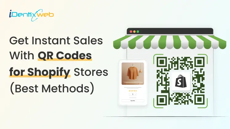
10 Min • 25 June 2026
Get Instant Sales with QR Codes for Your Shopify Store (Best Methods to Add)
A customer scanning a code on your packaging or printed flyer can land on a pre-loaded checkout in seconds. I have added a QR code in the Shopify store in under two minutes, and Shopify now offers more native options than ever before. Whether you want a free Shopify QR code generator, a product-specific Shopcode, or a dynamic code with full scan analytics, I have covered every QR code Shopify merchants need in 2026. What makes a QR code Shopify's most underused growth tool? A QR code for Shopify is a scannable 2D barcode that links customers directly to a specific page in your store. It can be a product listing, a pre-loaded checkout, or a discount landing page. Every modern smartphone reads one through the camera app with no additional download required. The numbers back this up. A GS1 US consumer survey found that 79% of shoppers are more likely to purchase a product with a scannable QR code. For Shopify merchants specifically, the opportunity is clear. Every QR code Shopify merchants place in the physical world is a direct link to a sale. There are two types of QR codes you should know about before choosing a method: Static QR codes encode a fixed URL. Once printed, the destination cannot be changed. Good for permanent product pages. Dynamic QR codes point to a redirect URL you control. You can update the destination without reprinting, and you get scan analytics, including scans, unique visitors, and location data. Method 1: Free Shopify QR code generator Shopify's free QR code generator lets you create a code in about 60 seconds with no Shopify account required. Enter a URL, your email address, and the tool sends you a downloadable code file. Best for: Quick one-off codes for your homepage, a specific product page, a sale collection, or a campaign URL. Key limitation: These are static codes. Once printed, the destination URL is locked. If the URL changes, you need to reprint. Steps: Go to Shopify's free QR code generator. Select your content type. The four options are website URL, phone number, SMS, and plain text. Website URLs are the most useful for store traffic. Paste your destination URL: product page, collection, homepage, or discount URL. Enter your email address. Click Send QR code. Download from your inbox and deploy. The code never expires and has no scan limit. For a single campaign or permanent signage, this Shopify QR code generator's free option is all you need. Method 2: Shopcodes, Shopify's native QR code creator Shopcodes is Shopify's native QR code creator. Of all the Shopify QR code creator options available, Shopcodes is the most tightly integrated. Unlike the free generator, Shopcodes ties codes to specific products and lets you attach a discount code to the scan destination. Best for: Product-specific codes that send customers straight to a product page or a pre-loaded checkout. Key limitation: Shopcodes generates standard codes with limited visual customization. You cannot add brand colors or logos to the code itself. Steps to install and create a Shopcode: From your Shopify admin, go to Apps and search for Shopcodes. Click Install, then Install app. Open the Shopcodes app and click Create Shopcode. Enter an internal title for the code. Under Scan Destination, choose one of the following: > Link to a product page: Send the customer to the product listing. > Link to checkout page with product in cart: Skips browsing entirely and puts the product in the customer's cart. If you selected checkout, optionally choose a specific variant. To attach a discount code, select one from the Discount section. Note: the discount attachment option only appears when you select the checkout destination, not the product page option. Click Save, then Download. Downloaded codes come as a zip file containing a PNG for digital use and an SVG for print. For events, packaging inserts, or pop-up displays, the SVG is the version to give your printer. Method 3: Third-Party Shopify QR code generator apps When you need dynamic codes, bulk generation, or UTM tracking that flows into Google Analytics, I would always suggest a third-party app. Best for: Marketing campaigns with multiple destinations, branded packaging, and bulk code creation across a large product catalog. Here are three Shopify QR code apps that I have tried and tested. o2o – QR Codes Unlimited: Dynamic codes with customizable branding, bulk creation, discount integration, and detailed scan analytics. Free plan available. Spice QR Codes Generator: All codes are dynamic by default. Automatically generates UTM codes so scans show up correctly in Google Analytics. Also adds QR codes to invoices, packing slips, and post-purchase emails automatically. QodeVault QR Code Generator: Built for merchants who need bulk generation and real-time scan analytics across large catalogs. For more on building a high-converting page that captures traffic after the scan, read my guide on Shopify product page optimization for merchants. Shopify gift card QR code Every Shopify gift card automatically generates a unique QR code identifier. When a customer receives a digital gift card by email, Shopify adds a unique QR identifier into the card that can be scanned at POS. Here is how the Shopify gift card QR code works: A customer purchases or receives a digital gift card from your store. Shopify emails the gift card with a redemption code and, if you have activated Apple Wallet Passes, an Add to Apple Wallet button. The Apple Wallet pass displays your store information, the gift card's active balance, and a unique QR code. At your physical store or event, staff can scan the QR code using a 2D scanner or the camera on an iPad running Shopify POS. How to activate Apple Wallet Passes for your gift cards: Go to Shopify Admin > Settings > Payments. Scroll to the Apple Wallet Passes section and click Customize. Check Activate Apple Wallet Passes for gift cards. Optionally, customize the text, colors, and banner image that appear on the pass. Click Save. For a complete guide to setting up gift cards and understanding how they work, see my guide on how Shopify gift cards work in 2026. 6 high-converting ways to use QR codes in your store 1. Product packaging for repeat purchases Place a QR code on your packaging that links to a pre-loaded checkout with the same product in the cart. Attach a discount code to the Shopcode to reward repeat purchases. Shopcode app handles this natively. Check out my complete guide to creating a discount code in Shopify in 2026. 2. Pop-up events and in-person markets Running an event with limited stock on hand? Place a QR code at your booth that links to the full product collection on your Shopify store. Customers who want a different size or color can order on the spot without you needing to carry every variant. Shopify POS handles the in-person sales, and the QR code handles overflow orders. My detailed guide to Shopify POS covers how to set up the hardware and sync inventory across both channels. 3. Printed flyers and direct mail for discount campaigns Flyers and direct mail benefit from QR codes because they eliminate the need to type a URL. Customers can scan the code, and the discount is already applied at checkout. Merchants can use a dynamic code from a third-party app, so they can update the destination if a campaign extends or the discount changes. 4. Store window displays to sell after hours A "Scan to shop" QR code in your window display lets your store make sales even when the doors are closed. Anyone walking by who stops to look can scan and browse the full collection on their phone. Display a dynamic QR code here so you can change the destination for seasonal campaigns. 5. Out-of-stock products to capture interest When a product runs out, place a QR code near it or on any empty shelf display. Link it to a waitlist form or to similar in-stock products. The interested shopper does not have to leave empty-handed. You capture the intent instead of losing it. To wrap it up, here are the QR code best practices I use Minimum print size: A QR code needs to be at least 2 cm x 2 cm to scan reliably. For large format signage, size up proportionally. Smaller codes on packaging should still meet the minimum. Quiet zone: Keep a clear white border around the code equal to at least four modules (the small squares that make up the code). Contrast: A high contrast between the dark modules and the background is required. The safest option I have experience with is a dark code on a light background. Avoid reversing it to light on dark unless your code generator tests for readability. Add a CTA near every code: "Scan to shop," "Scan for 15% off," or "Scan to reorder" tells the customer why they should scan. Test on multiple devices before printing: Print a test copy at actual size and scan it with at least two different phones. What scans perfectly on a high-end device can fail on an older one. Use UTM parameters for trackability: Add UTM source, medium, and campaign tags to your destination URL. Dynamic QR code apps handle this automatically. For static codes, build the UTM URL manually using Google's Campaign URL Builder before generating the code. FAQs 1. Are Shopify QR codes free? Yes. Shopify has a free QR Code Generator that anyone can use, and it allows unlimited usage with no hidden costs or limitations. For Shopify merchants, the official Shopcodes app is also free 2. How do I create a QR code in Shopify? For a general QR code, use Shopify’s free QR Code Generator, select the data type like website URL, phone number, SMS, or plain text, add the details, enter your email, and generate the code. For a product-based QR code inside Shopify, install Shopcodes, go to Apps > Shopcodes > Create Shopcode, choose whether it should open the product page or checkout with the product in cart, then download the QR code. 3. Does Shopify have a QR code? Yes. Shopify has Shopcodes, an official Shopify app that creates scannable QR codes connected to specific products. These QR codes can send customers to a product page or directly to checkout, and Shopify also supports scan and conversion tracking through Shopify Analytics. 4. What is the best free Shopify QR code generator? Shopify's own free QR code generator tool is the easiest option. It is completely free, requires no account, and delivers the code to your email in under a minute. The only limitation is that it creates static code. For dynamic codes with scan analytics, you will need the Shopcodes app or a third-party Shopify QR code generator app. 5. What is a Shopify gift card QR code? Every Shopify digital gift card includes a unique QR identifier that can be scanned at Shopify POS. When you activate Apple Wallet Passes in Shopify Settings, gift card emails include an "Add to Apple Wallet" button. The wallet pass displays the balance and a QR code that staff can scan to apply the gift card at checkout. 6. Are Shopify QR codes dynamic or static? Shopify's free QR code generator creates static codes only. Shopcodes creates static codes tied to a specific product destination. Third-party apps like o2o and Spice QR Codes Generator create dynamic codes by default, which means you can update the destination URL after printing and track scan analytics. 7. Can I track who scans my Shopify QR code? With dynamic QR codes from third-party apps, you get scan data including total scans, unique scanners, scan timing, and geographic data. Shopcodes provides a basic analytics report inside your Shopify admin, showing scans and conversions. Static codes from the free Shopify QR code generator tool provide no native tracking.
6 Min • 27 June 2026
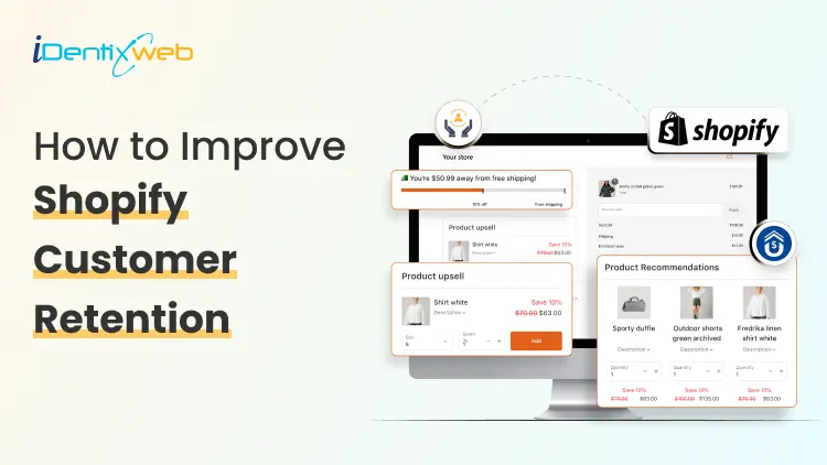
How to Improve Shopify Customer Retention After Checkout
Running a successful Shopify store isn't just about acquiring new customers; it's about keeping them coming back. While many merchants focus heavily on driving traffic and increasing sales, the real opportunity lies in what happens after the checkout process. Shopify customer retention has become one of the most important growth strategies for eCommerce businesses. Even a small increase in customer retention can have a substantial impact on your long-term revenue and profitability. In this guide, we will explore practical strategies to improve Shopify Customer Retention after checkout and turn one-time buyers into loyal customers. Why Post-Purchase Experience Matters Many store owners consider the customer journey complete once an order is placed. In reality, checkout is just the beginning of the relationship. The period immediately after purchase is when customers are most engaged with your brand. They're excited about their order, more receptive to recommendations, and more likely to interact with your store. Creating a positive post-purchase experience helps: Increase repeat purchases Build brand loyalty Improve customer satisfaction Generate positive reviews Boost customer lifetime value Improve overall shopify store conversion over time When customers enjoy every interaction with your brand, they're much more likely to return. 10 Strategies to improve Shopify Customer Retention after checkout 1. Offer Relevant Post-Purchase Upsells One of the easiest ways to increase both revenue and customer satisfaction is by showing relevant product recommendations immediately after checkout. Unlike traditional upsells that interrupt the buying process, post-purchase offers appear after the payment has been completed. This creates a frictionless shopping experience while providing customers with genuinely useful product suggestions. For Shopify merchants looking to implement this strategy, apps like SellMore Post Purchase Upsell make it simple to create personalized one-click post-purchase offers without disrupting the checkout experience. Instead of pushing unrelated products, merchants can recommend complementary items that naturally enhance the customer's original purchase. 2. Personalize Follow-Up Emails Generic email campaigns rarely build lasting relationships. Customers appreciate communication that feels relevant rather than promotional. Instead, send personalized emails based on: Purchase history Customer preferences Browsing behavior Previous interactions Seasonal buying patterns Useful post-purchase emails include: Order confirmation Shipping updates Product usage tips Cross-sell recommendations Replenishment reminders Exclusive loyalty offers 3. Build a Loyalty Program Rewarding repeat customers encourages them to return. A well-designed loyalty program may include: Points for purchases Referral rewards Birthday discounts VIP membership tiers Early access to new collections Exclusive member-only promotions Loyalty programs create emotional connections with customers while giving them a reason to continue shopping with your brand. This strategy directly supports stronger Shopify customer retention by making repeat purchases more rewarding. 4. Deliver Outstanding Customer Support Customer service has a lasting impact on retention. Offering multiple support channels such as live chat, email, and social media helps customers feel supported throughout their journey. Respond quickly to: Product questions Shipping concerns Refund requests Exchange inquiries Technical issues 5. Optimize Order Tracking Experience Customers don't enjoy uncertainty after placing an order. Reducing post-purchase anxiety builds trust and improves the overall shopping experience. Satisfied customers are much more likely to return for future purchases. Provide: Real-time tracking Delivery notifications Estimated arrival dates Shipment updates Easy access to tracking information 6. Collect Customer Feedback Your customers can provide valuable insights for improving your store. After delivery, ask customers to leave: Product reviews Star ratings Shopping experience feedback Suggestions for improvement Use this information to: Improve product pages Fix friction points Enhance customer support Optimize fulfillment Listening to customers demonstrates that you value their opinions, which strengthens Shopify Customer Retention over time. 7. Create Educational Content Customers often need guidance after purchasing. Educational content reduces returns while increasing customer confidence in their purchase. When customers get maximum value from their products, they're more likely to become repeat buyers. Helpful content may include: Product tutorials Setup guides Care instructions Styling tips Video demonstrations FAQs 8. Encourage Repeat Purchases with Smart Timing Timing matters. Instead of sending promotions randomly, analyze customer purchasing cycles. Sending offers when customers are most likely to buy improves engagement without overwhelming them. Examples include: Replenishment reminders Seasonal recommendations Anniversary discounts Limited-time offers New product launches This approach contributes to both Shopify Customer Retention and improved shopify store conversion. 9. Surprise Customers with Small Extras Unexpected gestures create memorable experiences. Small surprises often generate positive reviews and encourage repeat business. Customers remember thoughtful experiences far longer than discounts alone. Consider including: Thank-you cards Discount codes for the next purchase Free samples Exclusive gifts Personalized notes 10. Analyze Customer Retention Metrics You can't improve what you don't measure. Track important metrics such as: Repeat purchase rate Customer lifetime value (CLV) Average order value (AOV) Purchase frequency Churn rate Email engagement Upsell acceptance rate Review these metrics regularly to identify opportunities for improvement. Common Mistakes That Hurt Customer Retention Avoid these common pitfalls: Ignoring customers after checkout Sending excessive promotional emails Offering irrelevant upsells Slow customer support Poor shipping communication Complicated return policies Lack of personalization Addressing these issues creates a smoother customer experience and encourages repeat purchases. Final Thoughts By improving the post-purchase experience, personalizing communication, implementing loyalty initiatives, offering relevant upsells, and providing exceptional customer support, you can significantly improve Shopify Customer Retention while increasing customer lifetime value. Small improvements made after checkout often produce larger returns than constantly chasing new customers. As your retention strategy matures, you'll likely see stronger customer loyalty, higher average order values, and better shopify store conversion, creating a sustainable foundation for long-term business growth. Frequently Asked Questions (FAQs) 1. What is Shopify Customer Retention? Shopify customer retention refers to the strategies and practices used to encourage existing customers to return and make additional purchases from your Shopify store. It focuses on improving customer loyalty, satisfaction, and long-term value. 2. Why is customer retention important for Shopify stores? Retaining existing customers is generally more cost-effective than acquiring new ones. Repeat customers often spend more, purchase more frequently, and contribute to higher lifetime value, making retention essential for sustainable growth. 3. How do post-purchase upsells improve customer retention? Relevant post-purchase upsells provide customers with complementary products that enhance their original purchase. When these offers are personalized and useful, they improve the shopping experience while increasing customer satisfaction and repeat purchase rates. 4. Can post-purchase apps help improve Shopify store conversion? Yes. Well-designed post-purchase upsell apps can increase average order value, improve customer engagement, and contribute to better shopify store conversion by maximizing each completed transaction without interrupting checkout. 5. What are the best ways to increase repeat purchases? Some of the most effective methods include personalized email marketing, loyalty programs, excellent customer support, timely product recommendations, educational content, post-purchase upsells, and proactive communication throughout the customer journey. 6. How can I measure customer retention on Shopify? Track key metrics such as repeat purchase rate, customer lifetime value (CLV), average order value (AOV), purchase frequency, churn rate, and customer satisfaction scores. Monitoring these metrics helps you evaluate and improve your retention strategy.
11 Min • 30 June 2026
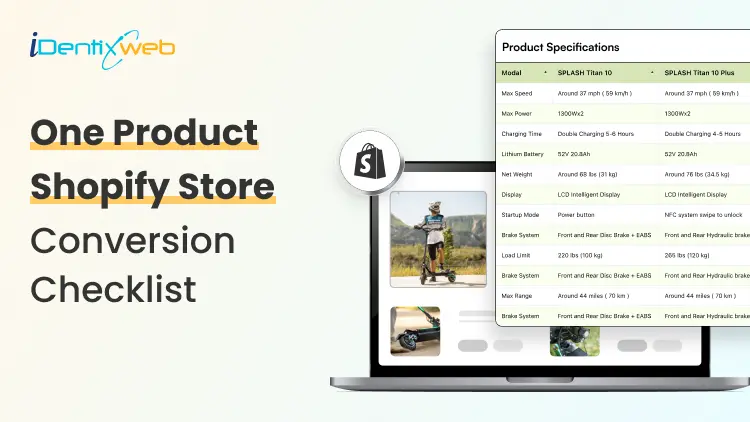
One Product Shopify Store Conversion Checklist for Better Sales
Running a one product Shopify store sounds simple. You sell one main product, build one focused landing page, and drive traffic to one clear offer. But simplicity does not automatically mean higher sales. In fact, a one-product store has less room for mistakes. If the product page is confusing, the offer is weak, the CTA is hidden, or the checkout experience feels risky, customers may leave without buying. A one product Shopify store works best when the full shopping journey is built around one goal: helping the customer understand why this product is worth buying now. This checklist will help you optimize your shopify single product store for better conversions, stronger customer trust, and higher average order value. What is a one product Shopify store? A one product Shopify store is a Shopify store that focuses on selling one main product instead of a large catalog. The product can have variants, bundles, accessories, refills, or add-ons, but the core business is built around one hero product. For example, your store may sell: One skincare device with different color options One fitness product with bundle packs One kitchen gadget with accessories One pet product with refill packs One digital product or subscription offer The biggest advantage of a one-product store is focus. You do not need to guide visitors through multiple categories or hundreds of product choices. Instead, you can create one strong sales journey around one product, one problem, and one solution. A well-built shopify single product store can convert well because it reduces decision fatigue and keeps the customer’s attention on one clear buying decision. Why conversion optimization matters more for one product stores In a multi-product store, a visitor may browse multiple categories, compare products, and still buy something else. But in a one product Shopify store, the customer either buys your main product or leaves. That makes conversion optimization more important. Every small detail matters, such as: How fast your page loads How clear your product promise is How strong your images are How visible your CTA button is How trustworthy your reviews look How easy checkout feels How well your offer handles objections 1. Make Your Above-the-Fold Section Clear The first screen of your store decides whether visitors stay or leave. When someone lands on your one product Shopify store, they should understand three things within a few seconds: What the product is What problem it solves Why they should care Your above-the-fold section should include: A clear headline A short benefit-driven subheading High-quality product image or video Product rating or trust badge Strong CTA button Price or offer highlight One key differentiator Avoid vague headlines like: “Upgrade Your Lifestyle Today” Instead, use a specific headline like: “Remove Pet Hair From Your Sofa in Seconds” This tells the customer exactly what the product does and why it matters. For a Shopify single product store, clarity is more powerful than cleverness. Your customer should not have to scroll or guess what you sell. 2. Use Product Images That Sell the Outcome Your product images should do more than show the product. They should show the value of the product. Strong product visuals include: Clean product shots Lifestyle images Before-and-after visuals Close-up detail shots Size comparison images Product-in-use photos Packaging images Short demo videos or GIFs If your product solves a visible problem, before-and-after images can be powerful. If your product has premium materials, show close-up textures. If your product is compact, show it in a real hand, bag, kitchen, desk, or bathroom setup. For a one product Shopify store, your visuals need to replace the in-store experience. Customers cannot touch the product, so your images must answer their doubts visually. 3. Promote the Right Upsell After Purchase With SellMore Once a customer buys your product, the sales journey does not have to end there. This is where post-purchase upselling can help. For a one product Shopify store, upselling needs to be simple and relevant. Since you sell one main product, your best upsell offers may include: Refill packs Product accessories Extended warranty Gift packaging Priority shipping Care kit Bundle upgrade Second item at a discount Subscription refill offer You can use SellMore Post Purchase Upsell to show one-click upsell, cross-sell, bundle, checkout, post-purchase, thank you page, and order status page offers. The app also includes upsell funnels, AI-driven recommendations, and detailed analytics to track offer performance. This is useful because the customer has already completed the main purchase. Instead of disturbing the buying decision before checkout, you can show a relevant add-on after the order is placed. 4. Write Benefit-First Product Copy A common mistake in one-product stores is writing only feature-based copy. Features explain what the product has. Benefits explain why the customer should care. Example: Feature: Made with stainless steelBenefit: Built to last longer and resist rust during daily use Feature: 10-hour battery lifeBenefit: Use it all day without charging again and again Your product page should include both, but the benefits should lead. For a Shopify single product store, your copy should feel like a guided sales conversation. It should answer the questions customers are already thinking but may not ask directly. 5. Add a Strong Product Story A one-product brand needs a story because the whole store is built around one offer. Your product story can answer: Why was this product created? What problem inspired it? Who is it made for? What makes it different? Why is it better than common alternatives? This does not need to be long. Even a short brand story can make your store feel more real. Example: “We created this product after seeing how many pet owners struggled with hair on clothes, sofas, and car seats. Most rollers worked once and then became useless. So we designed a reusable cleaner that works every day without waste.” This type of story gives customers a reason to connect emotionally with your product. It also makes your one product Shopify store feel less like a dropshipping page and more like a real brand. 6. Use One Main CTA Across the Page Your store should not confuse customers with too many actions. For a one-product store, the main action is usually: Buy Now Add to Cart Try It Today Get Yours Now Shop Now Use one main CTA style across your page. Keep it visible above the fold and repeat it after important sections. Best CTA placement: Hero section After benefits section After reviews After pricing or bundle section Near FAQs Sticky mobile bottom bar Avoid using too many competing buttons like “Learn More,” “Explore,” “Contact Us,” and “Read Blog” in the main sales flow. A one product Shopify store should guide visitors toward purchase, not distract them. 7. Build Trust Before Asking for the Sale Trust is one of the biggest conversion factors for a one product Shopify store. Because the store sells only one product, customers may ask: Is this product real? Will it work for me? Is the store trustworthy? What if I do not like it? How long will shipping take? Can I return it? Are the reviews genuine? Add trust signals throughout the page, not only at the bottom. Important trust elements include: Customer reviews Star ratings Video testimonials User-generated content Secure payment badges Money-back guarantee Clear return policy Shipping timeline Brand story Contact details FAQ section Real product images Do not hide important trust information. If shipping takes 5-8 days, say it clearly. If returns are available within 30 days, mention it near the CTA. If your product has a warranty, show it before checkout. 8. Add Reviews That Answer Real Objections Generic reviews like “Great product!” are not enough. Your reviews should answer objections. For example: “I thought it would be too small, but the size is perfect.” “Shipping took 5 days and the packaging was good.” “I have tried other products, but this one actually worked.” “The setup took less than two minutes.” “I bought one for myself and ordered another for my sister.” These reviews help new customers feel more confident because they answer practical doubts. Use different review formats: Text reviews Photo reviews Video reviews Before-and-after reviews Reviews by use case Reviews by customer type For a Shopify single product store, reviews should not just prove that people bought the product. They should prove that people got the result they expected. 9. Optimize Your Store for Mobile Buyers Most shoppers will likely view your store on mobile, especially if you run ads from Instagram, TikTok, Facebook, or YouTube Shorts. Your mobile experience should be fast, clean, and thumb-friendly. Mobile conversion checklist: CTA button is visible without zooming Product images load fast Text is easy to read Reviews are easy to scroll Sticky add-to-cart button is enabled Checkout buttons are easy to tap No popups blocking the screen Product price is visible Variant selection is simple FAQ accordion is easy to open Do not design only for desktop. Many one-product stores look beautiful on desktop but feel crowded on mobile. Check your page on a real phone before publishing. Scroll like a customer. Tap every button. Try adding the product to cart. Test checkout. If anything feels slow or confusing, fix it. 10. Improve Page Speed and Loading Experience Page speed directly affects conversions. A slow product page can increase bounce rate and reduce sales. For a one product Shopify store, speed matters even more because many visitors come from paid ads. Every slow-loading second can waste ad spend. Speed optimisation checklist: Compress images before uploading Use WebP images where possible Avoid too many third-party apps Remove unused scripts Use lightweight sections Limit autoplay videos Test your theme speed Avoid heavy sliders Use lazy loading for lower-page images Do not overload the store with animations just to make it look premium. A clean, fast-loading page usually converts better than a slow, fancy page. 11. Add Scarcity and Urgency Carefully Urgency can improve conversions, but fake urgency can damage trust. Good urgency examples: “Sale ends tonight” “Only 12 left in stock” “Order today for dispatch tomorrow” “Limited launch offer” “Free gift available for first 100 orders” Bad urgency examples: Countdown timer that resets every time Fake low-stock alerts “Only 3 left” for weeks Too many flashing banners Use urgency only when it is true. For a Shopify single product store, trust is more valuable than short-term pressure. Customers are more likely to buy when urgency feels real and the offer feels fair. 12. Keep Navigation Simple Your navigation should support conversion, not distract from it. For a one-product store, your menu can include: Product Reviews How It Works FAQs Track Order Contact Avoid adding too many links to blogs, collections, unrelated pages, or external profiles in the main navigation. Your homepage and product page may even be the same page. That is completely fine for a one product Shopify store if the page includes everything customers need to make a buying decision. The goal is simple: keep visitors moving toward checkout. FAQs About One Product Shopify Store Conversion 1. Is a One Product Shopify Store good for beginners? Yes, a one product Shopify store can be good for beginners because it is easier to manage than a large catalog store. However, the product page, offer, and marketing need to be strong because the entire store depends on one main product. 2. How do I increase sales on a shopify single product store? To increase sales on a Shopify single product store, improve your product images, headline, CTA, reviews, page speed, mobile layout, and checkout experience. You can also use post-purchase upsells to increase average order value after the first purchase. 3. What should a one-product store homepage include? It should include a clear hero section, product benefits, product images, reviews, pricing, FAQs, guarantee, shipping details, and a strong CTA. The page should guide customers from problem awareness to purchase without distractions. 4. Can I add upsells to a One Product Shopify Store? Yes, you can add upsells such as accessories, refills, warranties, bundles, gift packaging, or second-unit discounts. Post-purchase upsells work especially well because they appear after the customer completes the main order. 5. What is the biggest mistake in a shopify single product store? The biggest mistake is assuming one product means one simple page with very little information. Customers still need clear benefits, proof, trust signals, shipping details, return policy, and strong reasons to buy.

Bhavesha Ghatode
7 Min • 9 April 2025
1821 Views

Bhavesha Ghatode
10 Min • 4 April 2025
1681 Views

Bhavesha Ghatode
11 Min • 1 April 2025
1701 Views

Bhavesha Ghatode
4 Min • 28 March 2025
1692 Views

Ritika Tyagi
8 Min • 27 March 2025
1295 Views

Bhavesha Ghatode
5 Min • 26 March 2025
1755 Views

Ritika Tyagi
8 Min • 25 March 2025
1744 Views

Bhavesha Ghatode
12 Min • 20 March 2025
1981 Views

Bhavesha Ghatode
6 Min • 19 March 2025
1941 Views

Bhavesha Ghatode
10 Min • 13 March 2025
1948 Views

Bhavesha Ghatode
12 Min • 11 March 2025
1844 Views

Bhavesha Ghatode
7 Min • 7 March 2025
1856 Views