The Product Catalog feature lets you easily create a table displaying specific products or collections in your Shopify store.
Follow these steps to create a Product Catalog Table:
1. Go to your Shopify Admin.
2. Open the TablePress app. On the app dashboard, click the “Add Table” button at the top-right corner.
3. Select “Create a Product Catalog.”
4. You’ll be redirected to the Product Catalog page, where you can create the product table and customize its design.
5. After creating the table and completing the design, save the settings.
6. Copy the shortcode provided and paste it wherever you want the table to appear on your site.
Details on the Product Catalog Page
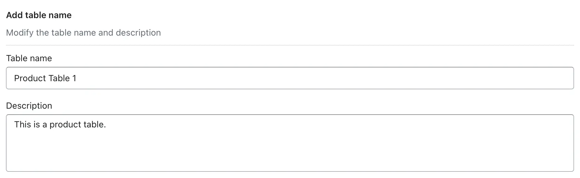
1. Add Table Name:
-> In this option, you can enter the name of the table that you want to create, and that table name will be displayed as a heading in the table above. You can also write a description—for example, if you want to add any line or note for that table, you can write it in the description, and it will be displayed in your store.
Table Name:
The Table Name is the title of your table and is displayed both inside the app and on your storefront. It helps customers immediately understand what the table is about, such as a size chart, measurement guide, or comparison table. A clear and descriptive table name improves readability, builds trust, and ensures customers can quickly identify the purpose of the table while browsing your store.
Examples:
- Men T-Shirt Size Chart
- Women Jeans Measurement Guide
- Shoes Size Conversion Chart
- Product Comparison Table – Laptops
Description
The Description appears below the table name on the storefront and provides additional information or instructions to help customers use the table correctly. You can use this space to explain how to read the table, mention measurement units, specify product categories, or give helpful guidance for choosing the right size or product. A well-written description reduces confusion and helps customers make confident purchase decisions.
Example:
- Use this size chart to find the correct T-shirt size based on chest and length measurements in inches.
- This guide helps you compare waist and hip measurements to choose the best jeans fit.
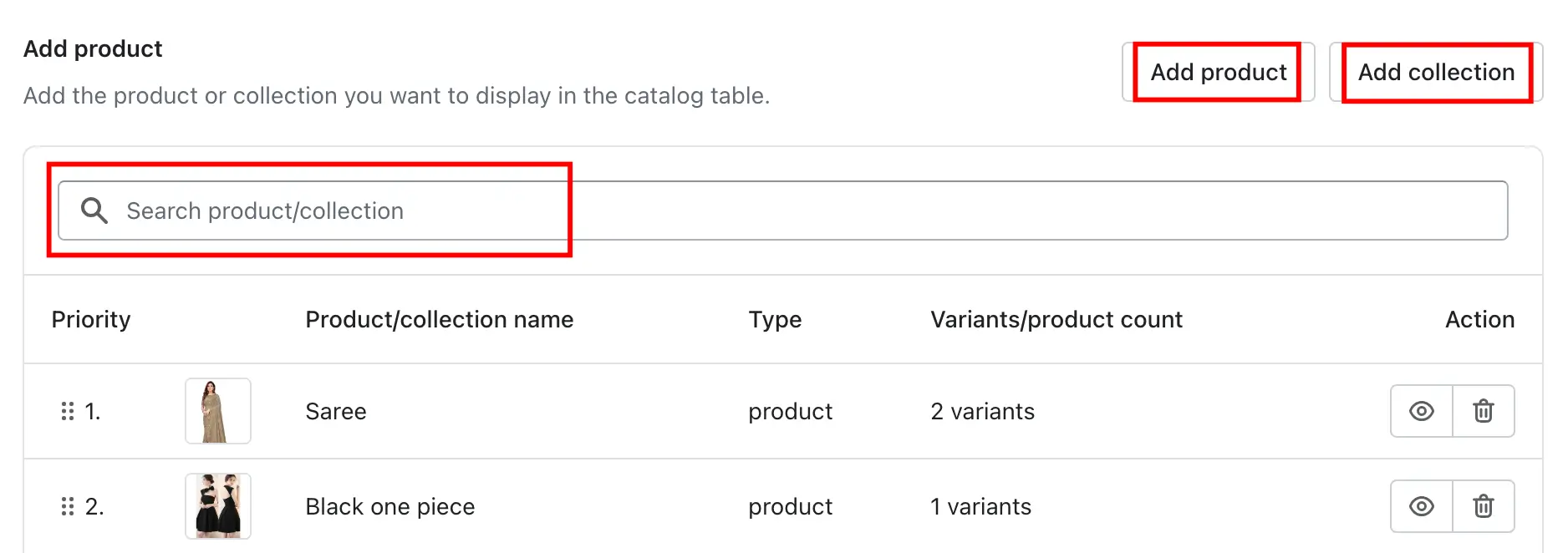
2. Add Products or Collections:
This feature allows you to add specific products or entire collections to your catalog table, making it easy to display relevant items to your customers. You can manually add individual products, include complete collections, or search for products by name to quickly find what you need. Once added, the selected products will appear in the table on your storefront, helping customers view product details in an organized and structured format.
Please check the description below to learn how we can add it:
-> Click “Add Product” to add individual products, or use “Add Collection” to include entire collections.
-> You can also search for products to add to the table.
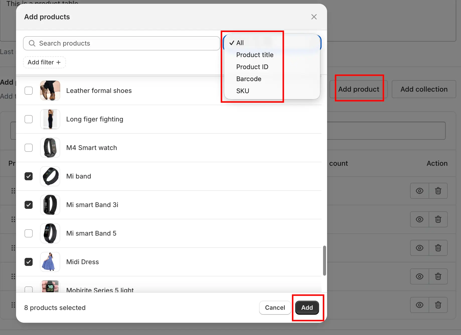
Add Products Using Filters
The Add Products popup allows you to quickly find and add products to your catalog table using powerful filtering options. Instead of manually searching one product at a time, you can use the Add Filter option to narrow down products based on specific criteria such as Categories, Collections, Product Types, Tags, and Vendors. Once a filter is applied, all matching products are displayed instantly, and you can select multiple products at once and add them directly to the table. This makes it faster and easier to manage large inventories and ensures only relevant products appear in your table.
Search Products Using “Search by All”
The Search by All feature helps you quickly find products when adding them to a catalog table. By default, the search is set to All, which means the app will search across multiple product fields at the same time. You can also narrow your search by selecting a specific option such as Product Title, Product ID, Barcode, or SKU. This is especially useful for stores with large inventories, as it allows you to locate products accurately using the information you already have. Once the results appear, you can select multiple products and add them directly to the table by clicking the Add button.
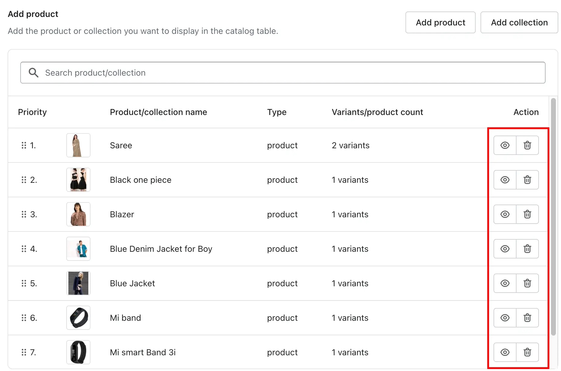
-> After adding products or collections, the app displays a complete list of available products. From this list, you can choose exactly which products should appear in the table. This gives you full control over product visibility and ensures that only relevant items are shown to customers.
-> You can also manage products directly from the table by hiding or deleting them as needed. Hiding a product temporarily removes it from the storefront without deleting it from the app, while deleting permanently removes it from the table. This flexibility helps you keep your catalog table updated and aligned with your store’s current offerings.
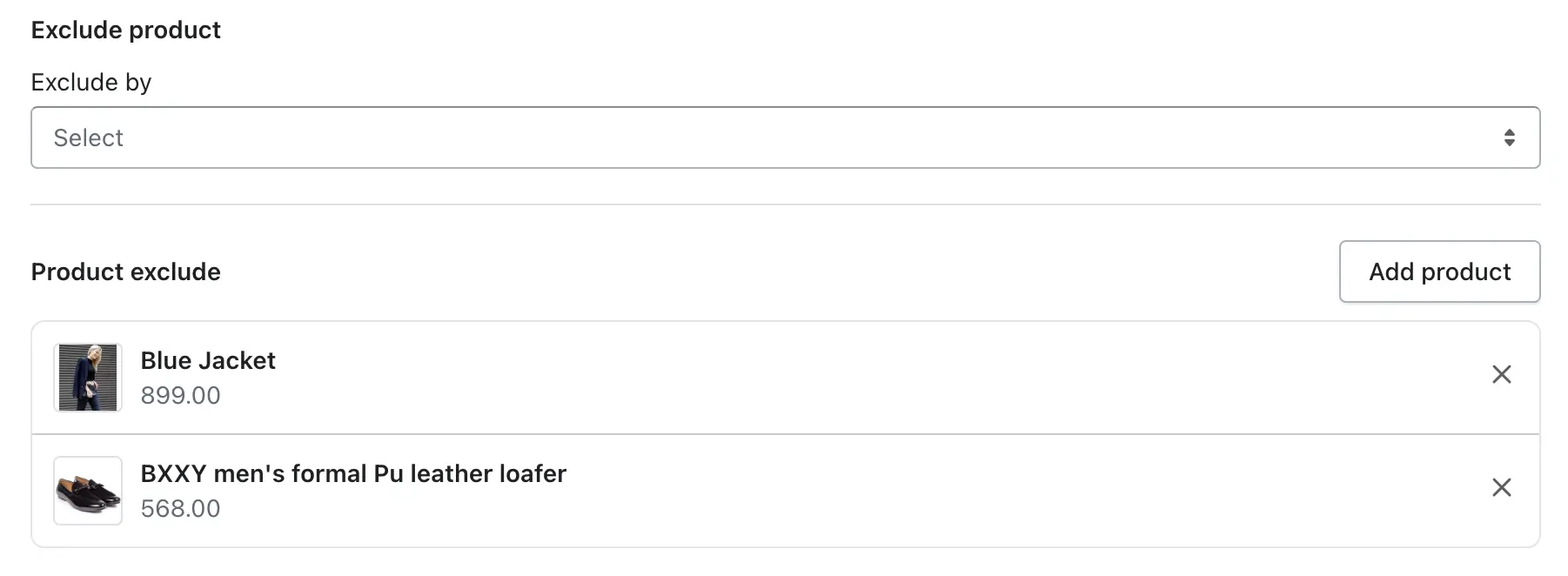
2. Exclude By
The Exclude By option lets you choose how products should be excluded from the catalog table. Based on your selection, the app will hide products that match the chosen criteria. You can exclude products using the following options:
- Vendor – Exclude all products from a specific vendor or brand
- Specific Product – Exclude selected individual products
- Tag – Exclude products that contain specific Shopify tags
This gives you flexible control over which products should not appear in the table.
Add Products to Exclude
To exclude products from the catalog table, click the Add product button in the Exclude Product section. This opens the Add products popup, where you can search for products using the search bar, refine results using the Add filter option, or use the Search by All dropdown to find products by title, ID, SKU, or barcode. Once the relevant products are displayed, simply select the products you want to exclude and click the Add button. The selected products will be added to the exclude list and will no longer appear in the table on the storefront, even if they belong to an included collection.
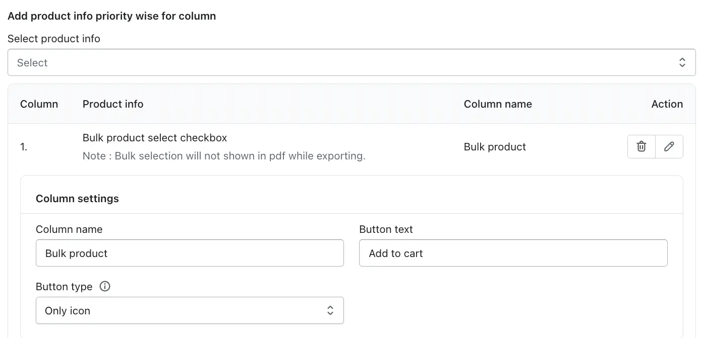
3. Customize Product Information (Columns):
This feature allows you to control which product information appears as columns in the catalog table and in what order they are displayed. By clicking Select product info, you can choose the specific product details you want to show in the table. The selected options are added as table columns and are displayed in priority order from top to bottom, helping customers easily view the most important product information first. This gives you full flexibility to customize the table layout based on your store’s needs.
Available Product Info Options
1. Bulk product select checkbox
The Bulk Product Select Checkbox allows customers to select multiple products from the table and perform a bulk action, such as adding them to the cart at once. This column is fully customizable through Column Settings, giving you control over naming, button text, and how icons and text are displayed.
-> Column Name
The Column Name defines the heading shown at the top of this column on the storefront table. You can rename it to match your store’s language or purpose.
Example uses:
Bulk Product
Select Products
Choose Items
This helps customers clearly understand that this column is used for selecting multiple products.
-> Button Text
The Button Text controls the label of the action button used with bulk selection (for example, adding selected products to the cart).
Common examples:
Add to cart
Add selected items
Buy selected
Clear button text improves usability and encourages customers to complete the action.
-> Button type
These options control how icons and text appear inside the column. You can choose the style that best fits your table design and user experience.
a) No Icon
Only text is displayed in the column, without any icon.
Best for: Minimal or text-focused table layouts.
b) Only Icon
Only the icon is shown, without any text.
Best for: Compact tables where space is limited or when the icon meaning is obvious.
c) Left Icon and Text
The icon appears on the left side of the text.
Best for: Clear visual guidance and better readability. This is the most commonly used option.
d) Right Icon and Text
The icon appears on the right side of the text.
Best for: Matching specific design layouts or right-aligned actions.
Important Note
Bulk product selection will not appear in PDF exports.
This feature is designed for interactive use on the storefront only and is excluded when exporting tables as PDFs.
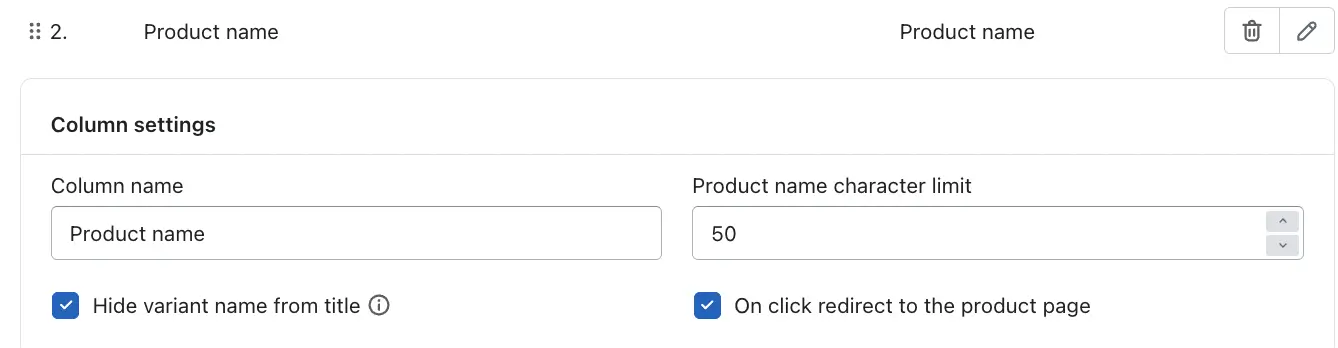
2. Product Name
The Product Name column displays the title of each product in the catalog table, helping customers easily identify the item. Using the Column Settings, you can customize how the product name appears and behaves on the storefront. You can change the Column Name to adjust the table heading, set a Product name character limit to control how long product titles appear, and enable clickable navigation so customers can quickly visit the product detail page. These options help keep the table clean, readable, and user-friendly.
-> Column Name
This field lets you change the column heading shown on the storefront table.
Example:
Product Name
Item Name
Product Title
-> Product Name Character Limit
This option limits the number of characters displayed for the product name in the table. Longer titles are automatically trimmed to maintain a neat layout.
Example:
Set to 50 → Only the first 50 characters of the product name are shown
-> Hide Variant Name from Title
When enabled, the variant name (such as size or color) is removed from the product title displayed in the table.
Example:
Shows: Men’s T-Shirt
Hides: Men’s T-Shirt – Large / Blue
-> On Click Redirect to the Product Page
When enabled, clicking the product name will redirect customers directly to the product’s detail page.
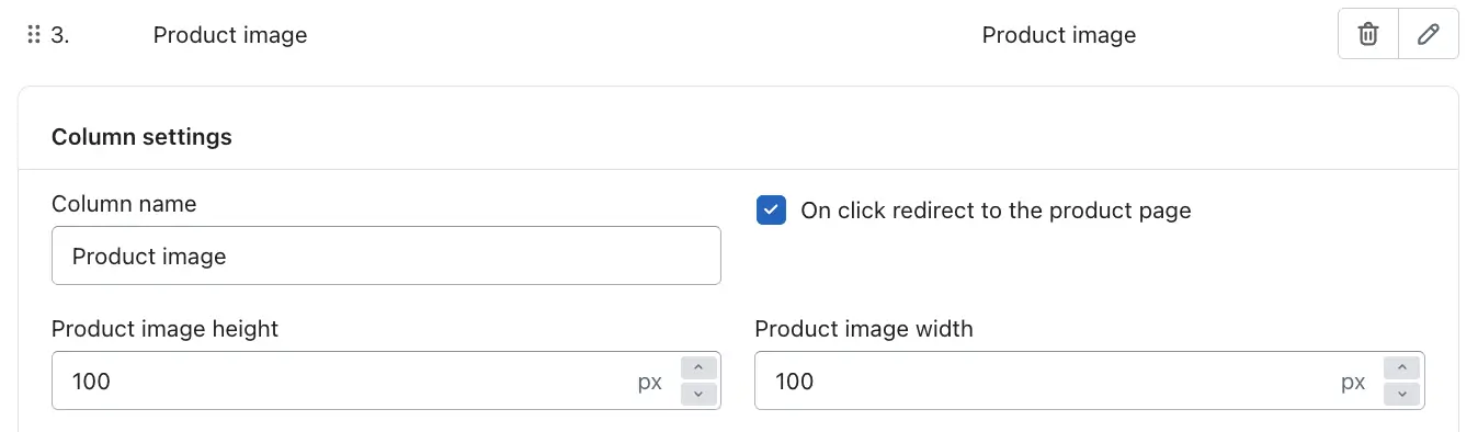
3. Product Image
The Product Image column displays the product’s featured image in the catalog table, helping customers visually identify products at a glance. From the Column Settings, you can customize the column heading, control image size, and enable clickable navigation to the product page. These options allow you to maintain a clean table layout while improving visual appeal and user interaction.
-> Column Name
This field lets you change the column heading displayed at the top of the table.
Example:
Product Image
Image
Preview
-> Product Image Height
This option sets the height of the product image in pixels.
Example:
Set to 100 px → Images appear with a height of 100 pixels
-> Product Image Width
This option controls the width of the product image in pixels.
Example:
Set to 100 px → Images appear with a width of 100 pixels
-> On Click Redirect to the Product Page
When enabled, clicking on the product image will redirect customers to the product’s detail page.
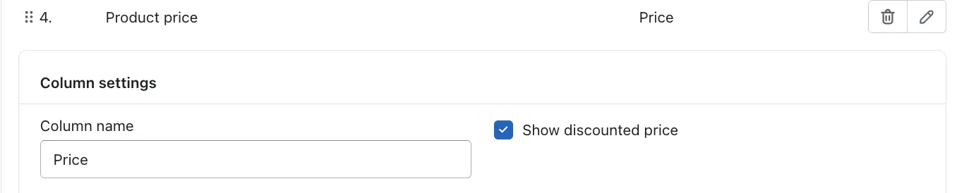
4. Product Price
The Product Price column displays the price of each product directly in the catalog table, allowing customers to easily compare costs before making a purchase. From the Column Settings, you can customize the column heading and choose whether to display discounted prices. This feature helps improve price transparency and supports better buying decisions.
-> Column Name
This option allows you to change the column title shown at the top of the table.
Example:
Price
Product Price
Cost
-> Show Discounted Price
When enabled, the table displays the discounted price (sale price) for products that are on sale instead of only showing the regular price.
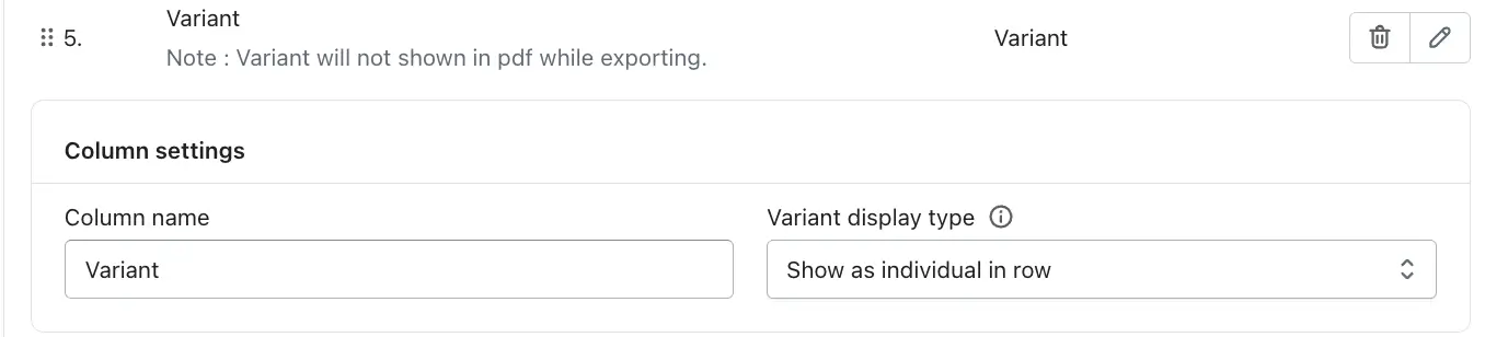
5. Variant
The Variant column allows customers to view and select product variants such as size, color, or material directly from the catalog table. This makes it easier for shoppers to choose the correct variant without opening the product page. From the Column Settings, you can customize the column heading and control how variants are displayed in the table.
Please note that variants are not included when exporting the table as a PDF, as this feature is designed for interactive use on the storefront.
-> Column Name
This option lets you change the column heading displayed on the storefront.
Example:
Variant
Size / Color
Options
-> Variant Display Type
This setting controls how variants are shown in the table.
Show as individual in row
Each variant is displayed separately within the table, allowing customers to clearly view and select specific variant options for each product.
Show in Dropdown
The Show in Dropdown option displays all available product variants inside a dropdown menu within the table instead of listing each variant in separate rows.
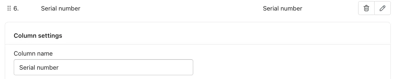
6. Serial Number
The Serial Number column automatically displays a sequential number for each product row in the catalog table. This helps customers and store admins easily identify, reference, and compare products in an organized order. The numbering is generated automatically based on the table order and updates dynamically if products or rows are reordered.
-> Column Name
This option allows you to change the column heading displayed at the top of the table.
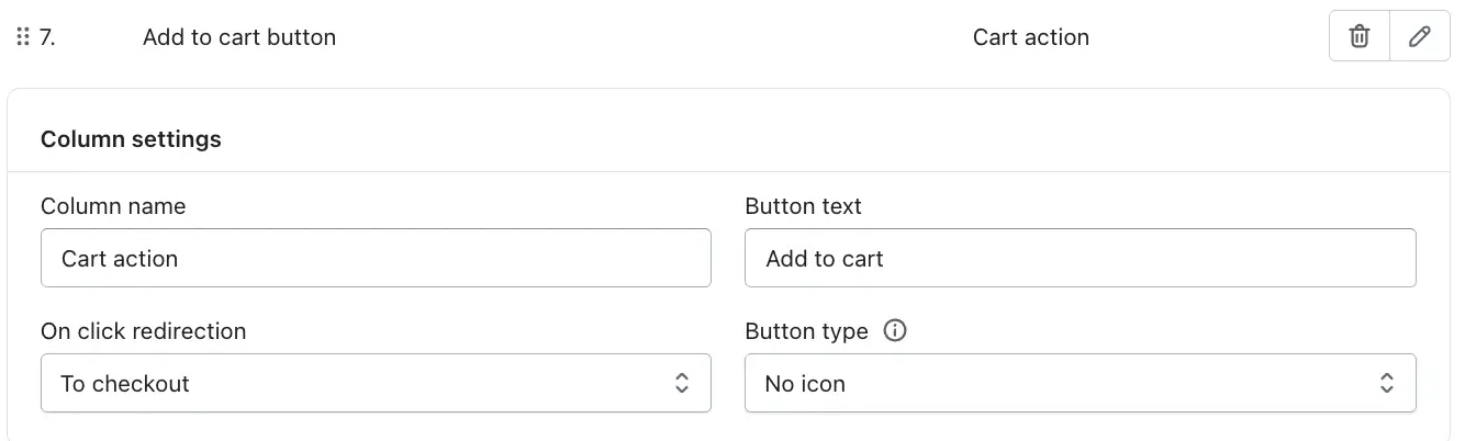
7. Add to Cart Button
The Add to Cart Button column allows customers to take action directly from the catalog table by adding products to the cart or navigating to other relevant pages.
-> Column Name
This option controls the column heading displayed at the top of the table.
-> Button Text
This field lets you customize the label shown on the button.
-> On Click Redirection
This setting defines what happens when a customer clicks the button.
a) To product page (Works in PDF)
Redirects customers to the product detail page.This option works when the table is exported as a PDF.
b) To website
Redirects customers to a custom or external website URL.
c) To cart
Adds the product to the cart and redirects the customer to the cart page.
d) To checkout
Adds the product to the cart and takes the customer directly to checkout.
-> Button Type
This option controls how the button appears visually.
a) No icon – Displays text only
b) Only icon – Displays only the icon without text
c) Left icon and text – Icon appears before the text
d) Right icon and text – Icon appears after the text
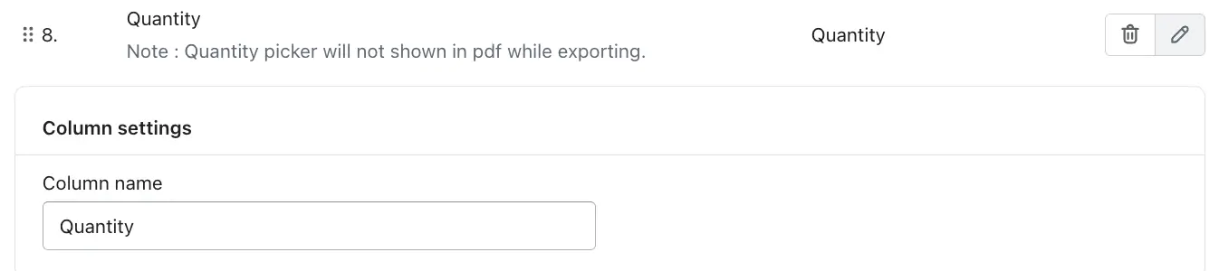
8. Quantity
The Quantity column allows customers to select the number of units they want to purchase for each product directly from the catalog table. This makes it easy for shoppers to adjust quantities without visiting the product page, especially when purchasing multiple items. The quantity selector works together with the Add to Cart and Total Price features to provide a smooth buying experience.
Please note that the quantity picker is not included when exporting the table as a PDF, as it is an interactive storefront feature.
-> Column Name
This option lets you customize the column heading displayed at the top of the table.
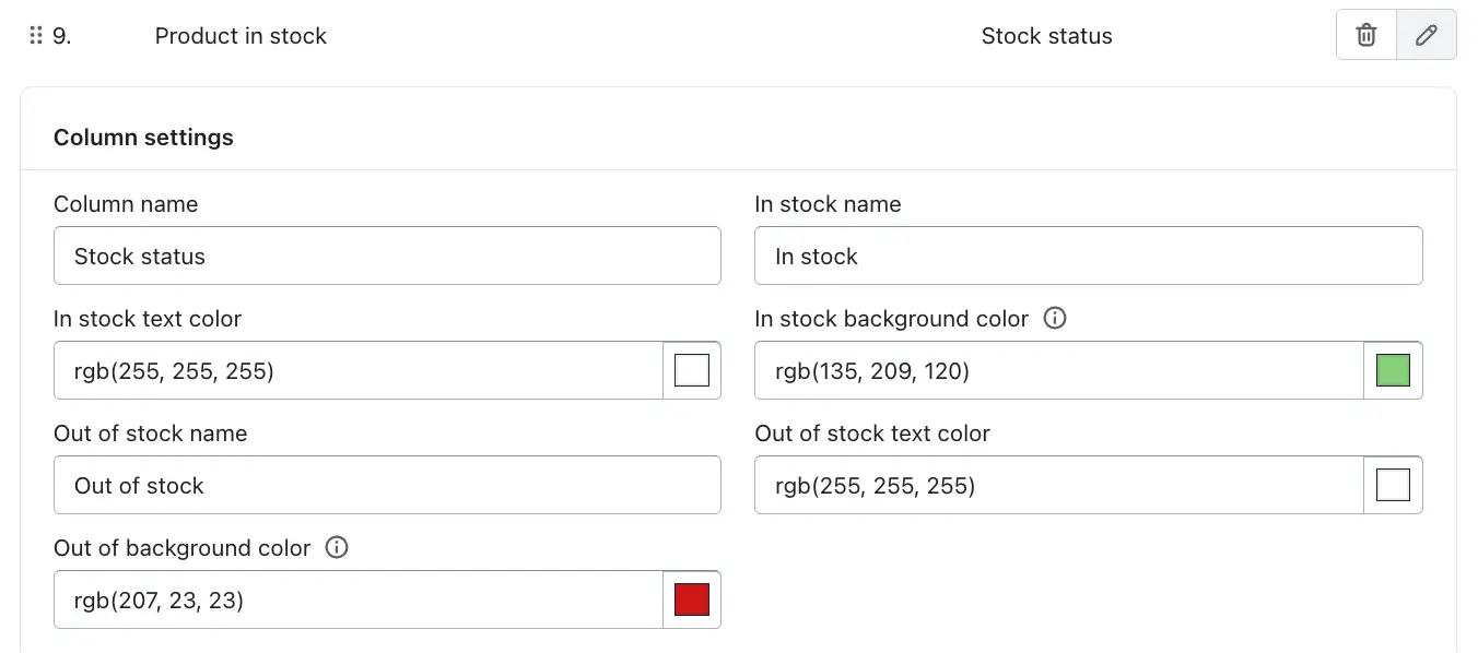
9. Product in Stock
The Product in Stock column displays the real-time availability status of each product in the catalog table. It helps customers quickly identify whether an item is available for purchase or currently unavailable, reducing confusion and improving purchase decisions. This status is visually highlighted using customizable text labels and colors for better clarity on the storefront.
-> Column Name
Defines the heading shown for the stock status column in the table.
-> In Stock Name
Sets the text displayed when a product is available for purchase.
-> In Stock Text Color
Controls the text color for the In stock label.
-> In Stock Background Color
Defines the background color for available products, usually set to a positive or success color.
-> Out of Stock Name
Sets the text shown when a product is unavailable.
-> Out of Stock Text Color
Controls the text color for the Out of stock label.
-> Out of Stock Background Color
Defines the background color for unavailable products, usually a warning or error color.
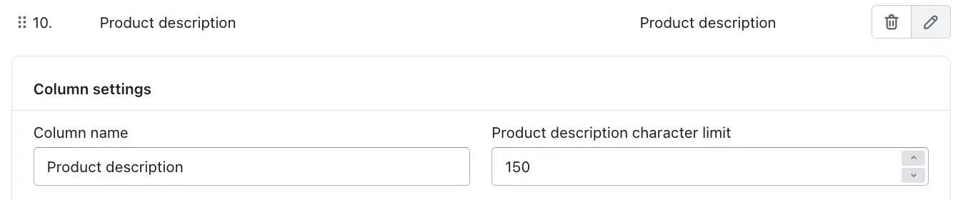
10. Product Description
The Product Description column displays a short summary of each product directly in the product table. This allows customers to quickly understand key details about a product without needing to open the product page.
-> Column Name
This defines the header title of the column shown in the table.
-> Product Description Character Limit
This setting controls the maximum number of characters displayed from the product description.
Example:
150 characters → Only the first 150 characters of the product description will be shown.
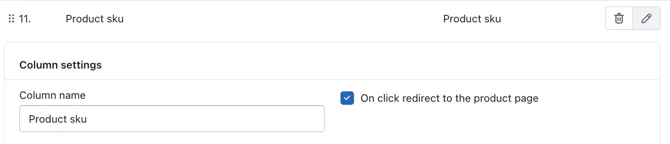
11. Product SKU
The Product SKU column displays the Stock Keeping Unit (SKU) for each product in the table. SKUs are unique identifiers used to manage inventory, track products, and differentiate between similar items or variants.
-> Column Name
This setting defines the header label shown for the SKU column in the table.
-> On Click Redirect to the Product Page
When this option is enabled, clicking on the SKU value will redirect the customer to the respective product’s detail page.
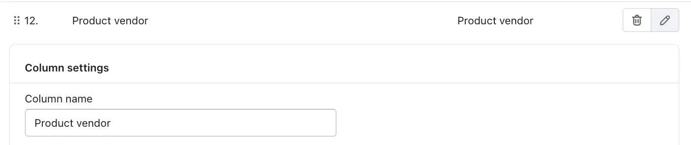
12. Product Vendor
The Product Vendor column displays the vendor or brand name associated with each product. This information is pulled directly from the product’s vendor setting and helps identify who supplies or manufactures the product.
-> Column Name
This field allows you to customize the column header shown in the product table.
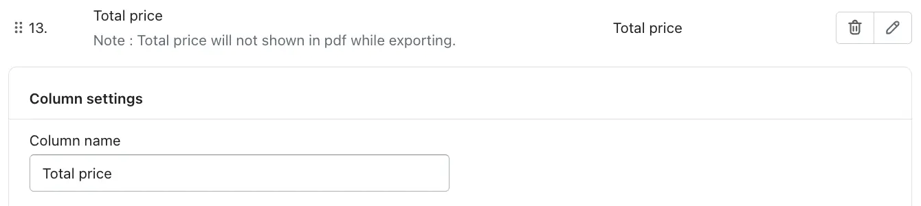
13. Total Price
The Total Price column displays the final calculated price for each product row, based on the selected quantity and the product’s unit price. This helps customers instantly see how much they will pay before adding items to the cart or proceeding to checkout.
-> Column Name
This field allows you to customize the column header displayed in the product table.
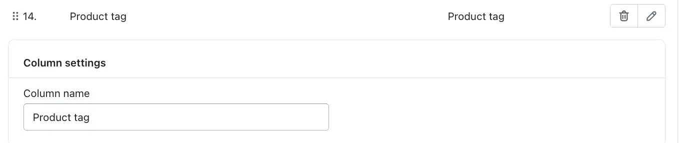
14. Product Tag
The Product Tag column displays the tags assigned to a product in your store. Product tags are typically used to categorize, filter, and identify products based on attributes such as type, style, season, promotion, or any custom label you have added in the product settings.
-> Column Name
Allows you to customize the column heading shown in the product table.
Drag and drop the columns to reorder them as desired.
After selecting the product information options, you can easily reorder the table columns using drag and drop. Each selected product info item (such as Product Image, Product Name, Price, Quantity, or Add to Cart button) can be moved up or down to set its display priority. Simply click and hold the column name, then drag it to your desired position in the list. The order you set here determines how the columns appear from left to right on the storefront table, allowing you to highlight the most important product details first. This flexibility helps you create a clean, user-friendly table layout that improves product comparison and enhances the shopping experience.
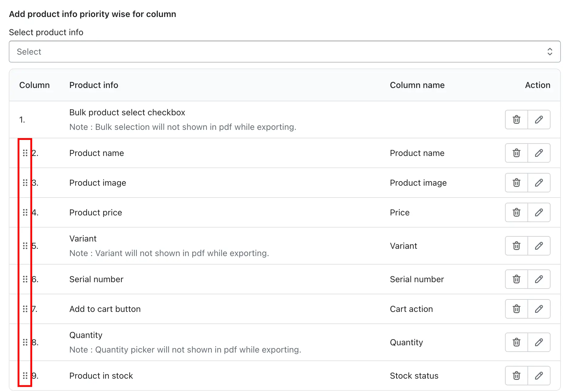
-> You can edit or delete columns anytime.
-> When editing a column, you can:
- Rename the column.
- Set a product name character limit.
Table design
You can also design this table as you like. All the same design options are available for the product catalog.
Copy Shortcode
The Copy Shortcode feature is designed to make it quick and easy to display your created product table anywhere on your Shopify store without any technical setup.
A shortcode is a small piece of pre-generated code that represents your table. When this shortcode is placed on a page, Shopify automatically renders the full product table at that location.
How the Copy Shortcode Feature Works
- Generate the shortcode automatically
When you create or edit a table, the app automatically generates a unique shortcode for that specific table. - Copy the shortcode
Click on the copy icon shown in the Copy Shortcode section.
The shortcode is instantly copied to your clipboard.
You don’t need to manually select or edit the code. - Paste the shortcode where needed
Paste the copied shortcode into any supported content area of your Shopify store where you want the table to appear.
Show Table Title
This option allows you to show or hide the table title above the product table. When enabled, the title is displayed as the main heading of the table; when disabled, the table is shown without any heading text.
Example:
Enable this option to display a title like “Product Comparison Table” above the table.
Table Title Font Size
This setting controls the size of the table title text using pixel values. Increasing the value makes the title more prominent, while decreasing it makes the title appear smaller and more subtle.
Example:
Setting the font size to 24px makes the table title clearly visible and well-emphasized.
Table Title Font Color
This option lets you choose the color of the table title text using an RGB value or color picker. It helps the title visually align with your store’s branding.
Example:
Using rgb(0, 0, 0) displays the table title in black.
Show Table Description
This option allows you to show or hide the table description displayed below the table title. The description provides additional context or instructions related to the table content.
Example:
Enable this option to display a short line like “Use the table below to select products and quantities.”
Table Description Font Size
This setting controls the size of the description text in pixels. It is usually smaller than the title to maintain a clear visual hierarchy.
Example:
Setting the font size to 16px keeps the description easy to read without overpowering the title.
Table Description Font Color
This option allows you to set the color of the table description text using an RGB value or color picker, ensuring consistency with the table title and overall page design.
Example:
Using rgb(0, 0, 0) displays the description text in black.
Header
Allow Column Sorting
This option enables sorting on table columns. When turned on, customers can click on a column header to sort the table data in ascending or descending order based on that column, making it easier to compare products or values.
Example:
Clicking on the Price column sorts products from lowest to highest or vice versa.
Fix Header
This option keeps the table header visible while scrolling through the table content. The header remains fixed at the top so column names are always visible, even when viewing long tables.
Example:
When scrolling down a large product list, the column titles stay visible at the top of the table.
Header Background Color
This setting allows you to change the background color of the table header row. It helps visually separate the header from the table data rows.
Example:
Using rgb(135, 209, 120) applies a light green background to the header.
Header Font Color
This option controls the color of the text inside the header cells, ensuring good contrast and readability against the background color.
Example:
Using rgb(0, 0, 0) displays the header text in black.
Header Font Size
This setting defines the size of the header text in pixels. Adjusting the font size helps balance readability and design consistency with the rest of the table.
Example:
Setting the font size to 14px keeps the header text clean and easy to read.
Search
Search Feature
This option enables or disables the search bar for the table. When enabled, customers can quickly search through all table data to find specific products or values. When disabled, the table is displayed without any search input.
Example:
A customer types a product name or SKU into the search bar to instantly filter matching rows.
Search Full Width
This option controls the layout of the search bar. When enabled, the search input stretches across the full width of the table area; when disabled, it appears in a more compact size.
Example:
Enabling this option displays a wide search bar aligned with the table width.
Search Title
This setting allows you to add a label or heading above the search bar to describe its purpose to customers.
Example:
Setting the search title to “Find data” displays this text above the search field.
Search Placeholder Text
This option defines the placeholder text shown inside the search input before the customer starts typing. It guides users on what they can search for.
Example:
Using “Search here” shows this text inside the search bar until input is entered.
No Records Text
This setting controls the message displayed when the search returns no matching results. It informs customers that their search did not find any data.
Example:
When no rows match the search, the message “No matching records found” is shown.
Loading Records Text
This option defines the message displayed while the table data is loading or being filtered. It helps communicate that the system is processing the request.
Example:
While data is loading, the text “Loading…” is displayed.
Pagination
Pagination Feature
This option enables or disables pagination for the table. When enabled, the table data is divided into multiple pages instead of showing all rows at once, making large tables easier to navigate.
Example:
If the table contains many products, pagination displays page numbers like 1, 2, 3 instead of loading all rows together.
Pagination Per Page
This setting controls how many rows are displayed on each page of the table. Changing this value adjusts the amount of data shown before moving to the next page.
Example:
Setting this value to 10 shows 10 rows per page.
Pagination Font Size
This option defines the size of the pagination text, such as page numbers and navigation controls, using pixel values.
Example:
A font size of 14px keeps the pagination text clear and readable.
Pagination Font Color
This setting allows you to change the color of the pagination text to match your table design or store branding.
Example:
Using rgb(135, 209, 120) applies a green color to the pagination text.
Pagination Background Color
This option controls the background color of the pagination area, helping it stand out from the table content.
Example:
Using rgb(135, 209, 120) applies a matching green background to the pagination section.
Pagination Length Change
This option allows customers to change how many rows are displayed per page directly from the table. When enabled, a dropdown is shown with different row count options.
Example:
Customers can select 10, 25, or 50 rows per page from the pagination dropdown.
General Feature
Row Hover Highlight
This setting adds a visual highlight effect when a user moves the mouse pointer over a table row. The highlight makes it easier to track which row is being viewed, especially in tables with many columns or dense data. It improves usability by clearly separating the active row from the rest of the table while browsing.
Example:
When a customer hovers over a product row, the row background subtly changes color to indicate focus.
Vertical Scroll Height
This option enables vertical scrolling within the table instead of expanding the table height endlessly. When activated, the table is displayed within a fixed-height area, and a scrollbar appears if the number of rows exceeds the visible space. This helps keep the page layout clean and prevents very long tables from pushing other content too far down the page.
Example:
A table with 100 products shows a scrollbar and remains within a fixed height on the page.
Table Information
This setting displays informational text below or above the table that summarizes the data currently being shown. It usually includes details such as how many entries are visible and the total number of records available. This gives users clarity about the size of the dataset they are viewing.
Example:
Text like “Showing 1 to 10 of 50 entries” appears below the table.
Alternating Row Colors
This option applies different background colors to alternating rows, improving readability and reducing eye strain. By visually separating rows, users can more easily follow data across wide tables with multiple columns.
Example:
Odd rows appear in light blue while even rows remain white.
Odd Row Color
This setting allows you to choose the background color for odd-numbered rows when alternating row colors are enabled. It helps define the primary highlight shade used throughout the table.
Example:
Setting the odd row color to rgb(206, 240, 255) applies a soft blue tone to those rows.
Even Row Color
This option controls the background color for even-numbered rows, creating contrast with the odd rows and maintaining visual balance.
Example:
Using rgb(255, 255, 255) keeps even rows white.
Table Background Color
This setting defines the background color of the entire table container. It affects the overall look and ensures the table blends well with the surrounding page design.
Example:
A white background gives the table a clean and minimal appearance.
Table Border Color
This option controls the color of the table borders, including the outer boundary and internal grid lines. Subtle border colors help separate data without making the table look cluttered.
Example:
Using rgb(186, 191, 195) adds a light grey border around the table.
Table Border Style
This setting allows you to choose how the table borders are rendered, such as solid, dashed, dotted, or unset. Different styles can be used to match your theme’s visual style.
Example:
A solid border creates a clear and defined table outline.
Cell Padding
This option defines the spacing inside each table cell, measured in pixels. Proper padding improves readability by preventing text and elements from appearing cramped or too spread out.
Example:
A padding value of 3px results in a compact table layout suitable for dense data.
Table Data Font Family
This setting lets you select the font used for all table data, ensuring visual consistency with your store’s typography and branding.
Example:
Choosing Poppins applies a modern and clean font style to the table content.
Table Data Alignment
This option controls how text and values are aligned within each table cell, such as left, center, or right alignment. Proper alignment improves data scanning and readability.
Example:
Left alignment makes product names and descriptions easier to read.
Table Data Font Size
This setting defines the font size of the table content in pixels. Adjusting the size ensures the text remains readable across different screen sizes without overpowering the layout.
Example:
Using 14px provides a balanced and readable text size.
Table Data Font Color
This option controls the color of the table text, helping maintain contrast and accessibility while matching your store’s design.
Example:
Black text (rgb(0, 0, 0)) ensures high readability on light backgrounds.
Add to Cart button setting.
These options help make the Add to Cart button in your TablePress product catalog visually appealing and consistent with your store branding. Customers can easily identify the button and add products directly from the catalog table.
This section allows you to customize the appearance and style of the Add to Cart button in your product catalog table. You can adjust the button to match your store’s design and branding.
1. Button Icon
Choose the icon that will appear on the Add to Cart button. This icon helps users quickly identify the button’s function. Common options include a shopping cart or an arrow icon.
2. Button Text Font Family
Select the font for the button text, such as Poppins, Arial, or other fonts, to match your store’s overall typography and maintain design consistency.
3. Button Text Size
Set the size of the button text in pixels (px) to make it easily readable and visually balanced with other elements on your page.
4. Button Text Color
Choose the color of the text on the button. This ensures proper contrast with the background and enhances visibility.
For example, rgb(0, 0, 0) represents black.
5. Button Background Color
Set the background color of the button to make it visually appealing and noticeable. For instance, rgb(255, 255, 255) represents white.
6. Button Border Color
Customize the color of the button border to match your store’s design or highlight the button, providing structure and definition.
7. Button Border Style
Define the style of the button border, such as solid, dashed, dotted, or unset if no specific style is needed, to shape the overall appearance of the button.
For more detailed instructions on designing the table, please check the Table Design Guide.
After creating and designing the table, you can export the product catalog using the Export button located at the top-right corner of the Product Catalog page.
When you click the button, your created product catalog will be displayed as a PDF. You can also open the products and add them to the cart directly from the PDF.