Ecommerce
Gather knowledge about the latest insights, updates, tips, and tricks in the Ecommerce industry.
5 Min • 29 April 2026
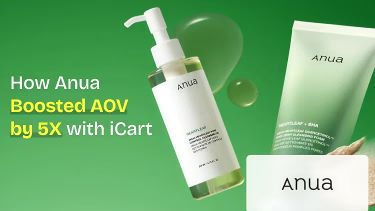
How Anua Unlocked 5X AOV Growth with iCart’s Smart Cart Features
delivery customization Challenges Solutions drive results Scale business delivery customization Challenges Solutions drive results Scale business delivery customization Challenges Solutions drive results Scale business delivery customization Challenges Solutions drive results Scale business Anua is a globally recognized Korean skincare brand known for its minimalist philosophy and focus on gentle yet effective formulations. Built on the idea of simplifying skincare routines, Anua develops products that deliver visible results while avoiding harsh or irritating components, making them suitable for sensitive skin types. Initially using a traditional full cart experience, Anua transitioned to iCart’s side cart solution in August 2025, to create a more seamless and engaging shopping journey. This shift allowed customers to easily explore complementary skincare products without disrupting their browsing flow, making it more intuitive to discover items that fit into a complete routine. By surfacing relevant recommendations directly within the cart, the brand enhanced product visibility across its range. Challenges Before implementing iCart’s side cart solution, Anua faced limitations with their existing full cart experience, which created friction in the customer journey. The traditional cart setup redirected users away from product pages, interrupting their browsing flow and reducing opportunities to explore additional products. As a skincare brand built around routines rather than single-item purchases, this made it difficult to effectively showcase complementary products and encourage customers to build complete regimens. Additionally, the lack of in-cart personalization and strategic upsell opportunities meant that customers were often unaware of related products that could enhance their skincare results. This limited the brand’s ability to increase average order value (AOV) and fully leverage its diverse product range. Anua needed a more dynamic and intuitive cart experience that could seamlessly introduce relevant recommendations while maintaining a smooth and engaging shopping journey. ❌ Cart Value Barriers Low average order value (AOV) due to single-item focus Most customers completed purchases with one primary product instead of building multi-step routines. Cart abandonment near shipping thresholds Customers were not clearly informed or motivated to reach free shipping or discount thresholds. Missed savings opportunities Customers were unaware of potential value in purchasing bundled routines or multiple complementary products. ❌ Absence of Progress-Based Incentives No free shipping or discount progress bar Customers were not motivated to increase their cart value due to lack of visible incentives. Missing tiered rewards system There were no structured milestones (e.g., “Spend more to unlock offers”), reducing upsell opportunities. ❌ Ineffective Cart UI/UX (Pre-Side Cart) Full-page cart disrupted shopping flowCustomers had to leave their browsing journey, increasing friction and drop-offs. No quick add/remove functionality Users couldn’t easily modify their cart or add suggested products without navigating away. Solution To overcome these challenges, Anua implemented iCart’s side cart solution to transform their traditional cart into a high-converting, interactive experience. By replacing the full-page cart with a seamless side cart, the brand ensured that customers could continue browsing while viewing their cart, significantly reducing friction in the shopping journey. Additionally, features like product recommendations & progress bars for free shipping and discounts motivated customers to increase their cart value. By combining personalization, incentive-driven messaging, and a user-friendly interface, Anua successfully turned their cart into a powerful revenue-driving touchpoint rather than just a checkout step. To maximize their cart effectiveness, they implemented two powerful features: ✅ Progress Bar with Multi-Reward Incentives Implemented a tiered progress bar to encourage higher cart value Customers are guided with a clear message like “Add $3.10 to unlock secret offer,” motivating them to continue adding products. Generated over $5M+ in revenue through incentive-driven cart progression Used product-based rewards to align with customer intent Instead of generic discounts, Anua incentivized purchases with relevant skincare items like Dark Spot Pads and mini serums. Built visual motivation for routine expansion As customers add products, they can clearly track progress toward unlocking multiple rewards, encouraging them to build a complete skincare routine. ✅ Product Recommendations Implemented “Frequently Bought Together” recommendations Customers adding a single product (e.g., toner) are shown complementary items like serums, moisturizers, or pads to complete their routine. Generated over 275K revenue through in-cart recommendations Encouraged full skincare regimen building Instead of isolated purchases, the cart suggests step-by-step product combinations aligned with common skincare routines. Increased product discovery at the final stage By surfacing relevant items directly in the cart, Anua ensured customers explore more of their catalog without leaving the checkout flow. Results Achieved in Last 180 Days 22932 Total Store Orders 45101 Total iCart Orders 5X iCart Generated AOV 65.70% Upsell Affected Conversion Rate These improvements reflect a clear shift in customer behavior on Anua’s store. Cart abandonment reduced as shoppers discovered complementary skincare products and felt encouraged to build complete routines. Engagement also increased, with customers interacting more with in-cart recommendations and exploring relevant product pairings. Results & Impact And...Results is Our Main Clarification By implementing iCart’s cart drawer, product recommendations, and progress bar, Anua transformed its cart into a high-performing conversion touchpoint. Shopping Experience Enhancement The improved cart experience encouraged customers to discover complementary products and understand the value of sustainable beauty routines. For instance, the clear presentation of subscription savings alongside one-time purchase options helped customers make more informed decisions about their long-term hair care needs. As Anua continues to optimize its cart experience, the brand is closely monitoring: Routine-based purchasing behavior - tracking how customers move from single items to multi-step regimens Engagement with in-cart recommendations - measuring interaction with suggested products Cart value progression - analyzing how incentives influence higher spending [related_cases_slider] Ready to Write Your Success Story? Try icart App Join successful businesses like Anua and Master your delivery scheduling Delight customers with precise timing Grow your special occasion orders Expand your delivery reach
Read Blog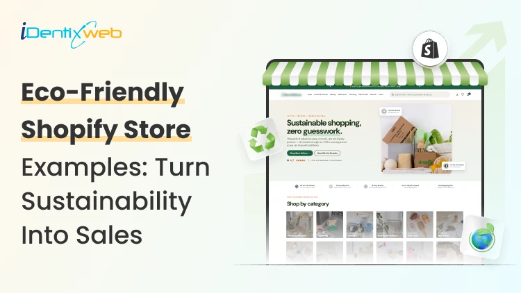
8 Min • 4 June 2026
Shopify Eco-Friendly Store Examples: Turn Sustainability Into Sales in 2026
A shopper lands on your store, reads "sustainable" in your headline. They then see materials or shipping processes that are clearly not sustainable. They bounce. I've watched these kill conversions on otherwise beautiful stores. A Shopify eco-friendly store works when the values show up everywhere a customer looks: This has to be the products, the packaging, the checkout, and the shipping email. Not just the About page. The brands below get this right, and I'll break down exactly which Shopify features they lean on so you can copy the parts that fit your store. Here's a TL;DR if you are scanning: The best Shopify eco-friendly stores pair a clear sustainability story with operational proof. They use recycled or low-waste packaging, offer eco-friendly delivery options like carbon-neutral shipping, sell genuinely sustainable products, and back claims with visible certifications. Values plus receipts. The real question: What makes Shopify eco-friendly stores convert? Plenty of stores slap "eco" on the logo and call it done. Buyers in this niche are sceptical, and for good reason. Greenwashing trained them to look harder. Three things separate a store that sells from a store that just looks green. First, specificity: "made from 100% recycled ocean plastic" beats "environmentally conscious materials" every time. Second, proof you can see: certifications, carbon labels, and material breakdowns on the product page. Third, consistency across the funnel, so the sustainability promise survives all the way to the unboxing. Shopify gives you the tools for all three. The trick is knowing which ones to turn on. If you're still figuring out how to build a Shopify store from scratch, get the foundation right before layering in sustainability features. 9 Shopify eco-driendly store examples worth studying I picked these for variety across product categories, and because each one does something specific, you can borrow. Allbirds: Carbon Labels as a Selling Point Allbirds prints a carbon footprint number on every product, the way food packaging shows calories. It reframes the whole purchase. The shoe isn't just comfortable, it's accountable. The lesson for your Shopify eco-friendly store: turn an invisible value into a visible number. You can do this with Shopify product metafields to store a carbon figure, then surface it on the product template. Tentree: Built-In Purchase Incentive Tentree plants ten trees per order. Customers register their items to track the trees they funded. It's a loyalty loop disguised as a mission. The structure matters here. A repeatable post-purchase reason to come back is worth more than a one-time discount. Pela: Compostable Products, Honest Limits Pela sells compostable phone cases and openly explains what "compostable" does and doesn't mean. That honesty builds trust faster than overclaiming. Package Free Shop: Zero-Waste as the Whole Identity Package Free built the entire brand around eliminating waste. Their packaging features and sustainability eco-friendly options aren't a section of the site; they're the product. Worth studying if your differentiation is operational rather than product-based. United By Blue: One Concrete Promise For every product sold, United By Blue removes a pound of trash from oceans and waterways. One clear, countable promise. Customers know exactly what their money does. Cariuma: Material Transparency Cariuma breaks down every material in its sneakers and the sourcing behind it. The product pages read like a spec sheet for conscience. It works because it respects the buyer's intelligence. Grove Collaborative: Subscription Meets Sustainability Grove runs a refill and subscription model for household goods. Recurring revenue plus reduced packaging waste. For consumable eco products, this model is hard to beat. A Shopify subscription app makes it straightforward to set up your business. Bombas: Give-Back Built Into Every Sale Bombas donates an item for each one purchased. The give-back is the brand, not a campaign. Customers repeat the story for you, which lowers your acquisition cost. Finisterre: Repair Over Replace Finisterre offers repairs and resale to keep gear out of landfills. Selling longevity instead of churn is a bold position, and it deepens loyalty in a way discounts can't. Eco-Friendly Products Shopify Stores Can Sell Profitably You don't need to manufacture your own line to run a credible store. The categories that move well right now span clean beauty, compostable home goods, ethical apparel, reusable kitchen items, and sustainable pet products. Here's a full list of the 10 best eco-friendly products to sell if you're sourcing rather than making. If you're sourcing rather than making, vet suppliers hard. Ask for material certifications in writing. Ask where raw materials come from. A supplier who can't answer is a red flag you'll pay for later in refund requests and bad reviews. Shopify Packaging and Sustainability Eco-Friendly Options Packaging is where most "green" stores quietly break their promise. Shopify itself runs sustainability programs you can plug into. Shopify's Sustainability Fund and its carbon-offset commitments give you a platform-level story to reference, and the Shop app surfaces eco-friendly merchants to shoppers who filter for them. On your end, the packaging features and sustainability eco-friendly options come from how you fulfill, not from a single setting. A few moves that hold up: Switch to recycled, recyclable, or compostable mailers and inserts, then photograph them for your product and FAQ pages. Add a packaging note at checkout using checkout UI extensions or order-confirmation content so customers know what's coming. Skip the filler. Right-sized boxes cut both waste and shipping costs, which protects your margin while serving the mission. Show the packaging in your product photography. An unboxing that matches the promise turns first-time buyers into reviewers. Eco-friendly delivery options Shopify merchants can offer Shipping is the carbon-heavy part of ecommerce, and it's also where you can offer a visible green choice at checkout. Shopify Shipping with carbon offsets built in. Shopify purchases offsets for every order fulfilled through Shopify Shipping at no extra cost to you. You can advertise carbon-neutral delivery honestly. That's a real claim backed by the platform. Understanding how to manage shipping and delivery across your Shopify store is the first step to configuring this correctly. Third-party apps for expanded options. Apps like EcoCart Green Protection let customers add carbon-neutral shipping at checkout. Sustainable returns apps cut the waste from reverse logistics, which becomes a real problem once your volume grows. Slower delivery tiers as a nudge. Offer a "low-carbon" delivery option at checkout. Many eco-conscious shoppers will pick it gladly if the price reflects the savings. Visibility at the point of decision. A carbon-neutral badge on the cart page converts better than a paragraph buried in your shipping policy. Turn Shopify sustainability into repeat sales Values get the first sale. Systems get the second. The brands above all built a reason to return: tree tracking, give-back counts, refill subscriptions, and repair services. Use Shopify's native tools to reinforce the loop. Shopify Email can send a post-purchase note showing the impact of the order. A loyalty app can reward customers for choosing the low-carbon shipping tier or returning packaging. Shopify Flow can automate a thank-you with the customer's running impact total after each order. The point is to make sustainability feel like an ongoing relationship. That's what converts a values-driven shopper into a repeat buyer. A Shopify eco friendly store earns trust by proving its claims at every step, from the product page through the packaging to the delivery confirmation. Pick the two or three tactics above that fit your products and ship them this month. FAQs 1. What makes a Shopify eco friendly store different from a regular store? A Shopify eco friendly store pairs sustainability messaging with operational proof across every touchpoint. They show customers certified products, recycled packaging, carbon-neutral shipping options, and transparent material sourcing. 2. Can I add eco-friendly delivery options to Shopify without using Shopify Shipping? Yes. Apps like EcoCart let customers opt into carbon-neutral shipping at checkout, even if you use third-party carriers. 3. How do I display eco-friendly product information on my Shopify store? Use Shopify product metafields to store material type, certifications, carbon footprint, and end-of-life details. Then display these fields on your product template so buyers see proof before adding to cart. 4. What are the best eco-friendly products Shopify stores are selling right now? Clean beauty, compostable home goods, ethical apparel, reusable kitchen items, and sustainable pet products consistently move well. Niche down within these categories and ensure your suppliers can provide material certifications in writing. 5. How does Shopify packaging relate to sustainability for my eco friendly store? Packaging is where most "green" stores lose credibility. If your product is sustainable but arrives in virgin plastic, customers notice and review it. Switch to recycled or compostable materials, photograph them for your FAQ and product pages, and add a packaging note to order confirmations. 6. Do customers actually choose eco-friendly delivery options when offered? Yes. If you make the choice visible at the point of decision. A carbon-neutral badge on the cart page, paired with a slower delivery tier at a lower price, converts well with eco-conscious shoppers.
9 Min • 19 June 2026
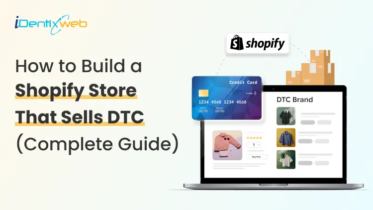
Shopify for DTC Websites: The 2026 Playbook for Direct-to-Consumer Brands
Direct-to-consumer ecommerce sales in the US hit $239.75 billion last year [Source: Emarketer]. Brands that sell directly now own the margin, the data, and the relationship. Shopify for DTC websites has become the default operating system for brands that want to build that kind of business from the ground up, or shift away from marketplaces. Why is Shopify built for DTC websites? Shopify was built with B2C selling in mind from day one. You get a hosted, scalable storefront with checkout, payments, analytics, and fulfillment tools bundled together. For DTC, that means you are launching on infrastructure that already understands how direct selling works. The bigger reason DTC brands migrate to Shopify? Ownership. Every order on a marketplace like Amazon leaves customer data behind. On Shopify, first-party data flows directly to you. You know who bought it, when, what, and how often. You can build email sequences, loyalty programs, and personalization around that data without asking a platform's permission. Shopify's app ecosystem extends this advantage. Tools for subscriptions, post-purchase upsells, SMS recovery, and loyalty rewards integrate natively. For a look at how DTC brands can build their marketing engine further, check out my guide on Shopify marketing strategies for merchants. How to scale an Amazon brand to a Shopify DTC store? Scaling an Amazon brand to Shopify DTC is one of the highest-leverage moves a product seller can make right now. The first thing that changes is the margin. Amazon charges referral fees, fulfillment fees, and advertising costs that can push total selling costs to 30-50% of revenue. A Shopify DTC store cuts those intermediary costs significantly. The same product sold directly can carry 20-30 points more gross margin. The second thing that changes is the data. Amazon sellers operate with aggregate data and no customer email list. Every Shopify DTC order generates a customer profile you own. You can email, retarget, and build loyalty flows around that customer for years. Many Amazon sellers run both channels simultaneously. Once you connect Shopify to Amazon through the Marketplace Connect app, you can sync inventory, orders, and catalog from one dashboard. Here’s my complete breakdown on connecting Shopify to Amazon with proven methods. Here’s one practical step many sellers miss that I have experienced. > Before launching the DTC store, make sure your brand identity can carry a standalone site. Amazon product listings focus on features and ratings. A Shopify DTC store needs a brand story, lifestyle visuals, and a homepage that communicates who the product is for in the first five seconds. Strong brand work is what separates an Amazon catalog clone from a store that customers actually trust. Shopify B2B vs DTC: Key differences that affect your build AspectDTC Shopify StoreB2B Shopify StoreTarget customerIndividual consumers buying for personal useBusinesses, wholesalers, distributors, or professional buyersStore architectureBuilt around a simple product discovery and purchase journeyBuilt around account-based buying, bulk ordering, and repeat purchasingPricingPublic pricing visible to everyoneCustomer-specific pricing, custom price lists, or negotiated ratesCheckout flowStreamlined for one-time or repeat consumer purchasesMay include minimum order quantities, draft orders, payment terms, and approval workflowsPersonalizationProduct recommendations, upsells, loyalty programs, and email/SMS flowsPersonalized catalogs, company-specific prices, account permissions, and order historyDesign focusLifestyle visuals, editorial layouts, reviews, social proof, and brand storytellingFast product search, quantity selectors, reorder options, and account-level navigationFeature requirementsUpsells, bundles, subscriptions, loyalty, reviews, and abandoned cart recoveryCompany profiles, custom price lists, MOQ, bulk ordering, draft orders, and B2B login accessBest user experienceQuick, emotional, brand-led shopping experienceEfficient, practical, account-led buying experienceStore setup recommendationWorks well as a standalone public storefrontOften works better as a separate wholesale/B2B storefront or gated portalWhen combining bothCan work if the audience overlap is small and the UX is carefully plannedCombining B2B and DTC in one theme can confuse both audiences and reduce usabilityBest approachUse Shopify Markets for geographic or regional DTC segmentationUse a separate URL, login flow, or Shopify Plus B2B setup for professional buyers Shopify Plus DTC: Methodology and best practices for website design & development Use Shopify Plus features that improve revenue Shopify Plus gives DTC brands advanced tools that standard Shopify plans do not offer. But the goal is not to use every Plus feature. The goal is to understand which features directly improve checkout, AOV, speed, and customer experience. Checkout extensibility Checkout extensibility is one of the biggest advantages of Shopify Plus. With Checkout Blocks and Shopify Functions, brands can add upsell banners, custom fields, and conditional checkout logic without heavily depending on custom code. For DTC brands focused on increasing average order value, checkout and post-purchase upsells should be a serious part of the build strategy. Theme-based store vs headless store Many DTC brands overthink the headless decision. For stores under $5M in annual revenue, a well-built Liquid theme with a fast, mobile-first layout is usually a better choice than a complex headless setup. Shopify’s Hydrogen and Oxygen framework is powerful, but it needs a dedicated engineering team to maintain. For most growing DTC brands, a premium custom theme, lean development, and strong performance optimization is the smarter path. Mobile-first store design Mobile-first design is no longer optional. A large share of Shopify traffic now comes from mobile, so every key buying action should be easy on a small screen. High-converting Shopify stores usually include sticky add-to-cart buttons, one-thumb checkout flows, swipe-friendly product galleries, and clean mobile product pages. Speed and performance optimization Store speed affects both SEO and conversion. Every extra second of load time can hurt the buying experience and reduce sales. Keep the theme lightweight, reduce unnecessary JavaScript, compress images, and regularly remove apps that are slowing down the storefront. For a detailed look at the tech stack, see my breakdown of the Shopify tech stack across design, marketing, and operations layers. Full-service DTC digital marketing for Shopify e-commerce I experienced one major thing last year. DTC brands that treat paid ads, email, SEO, and CRO as separate workflows lost revenue. The margin pressure in direct selling makes channel efficiency a survival requirement, not a nice-to-have. A full-service DTC digital marketing approach on Shopify means integrating all growth channels around a single data layer. Here is what that looks like in practice. Paid acquisition on Google and Meta drives top-of-funnel traffic. For DTC brands on Shopify, Google Shopping campaigns run by a well-structured product catalog perform consistently across most categories. Meta retargeting helps owners to attract shoppers who browsed but did not buy. My guide on Shopify PPC covers campaign architecture, bid strategy, and how to avoid the most common budget mistakes. Email and SMS are where DTC brands retain the margin they spent to acquire. A post-purchase flow that delivers value is the single highest channel for the best ROI return that most stores are not running properly. I normally connect Klaviyo with Shopify customer data and make this automation accessible without a developer. Shopify's URL structure and collection architecture are SEO-friendly when set up correctly. Blog content, collection page optimization, and structured data schema all help owners over time. For stores that want to migrate, this matters a lot. My Shopify SEO migration guide covers how to move platforms without losing rankings. Small improvements in checkout completion rate, add-to-cart rate, and returning customer rate will multiply your returns. What Shopify for DTC websites looks like in 2026 AI-driven personalization has definitely become important in 2026. Shopify's native recommendation engine, Shopify Magic $ Sidekick, and third-party tools now surface personalized product suggestions that lift AOV by 15-30% across well-configured stores. For DTC brands, personalization also helps with loyalty. Shoppers who run a store understand that their preferences return more often than agencies. Third-party cookies are disappearing, and because of that, DTC brands are building quiz flows, preference centers, and sign-up incentives that capture customers. Brands running these campaigns own data that no marketplace can replicate. Agentic commerce is emerging as the next DTC surface. Shopify's Spring 2026 Edition introduced Catalog API. This helps developers build an end-to-end agentic experience without approvals. DTC brands that optimize for AI discovery now, through structured product data, will capture early share in this channel before competition intensifies. My breakdown of booming Shopify trends covers the ones worth executing this year versus the ones worth watching. Building your DTC brand on Shopify in 2026: Where to start Shopify for DTC websites works best when the foundation is right. Audit your brand identity, product photography, and core positioning first. A DTC site that converts is built around a clear value proposition. Choose a theme that matches your current revenue stage. Invest in custom design when the business needs it. Build your marketing channels in sequence: organic and email first, then paid. Connect Shopify to any existing marketplace channels to maintain sales while the DTC store grows. The brands that scale on Shopify DTC are the ones with the best customer experience, the cleanest checkout, and a full-funnel marketing system that helps to increase your ROI. FAQs 1. What is Shopify for DTC websites? Shopify for DTC means using the Shopify platform to sell directly to end consumers through a brand-owned online store, without relying on marketplaces. It gives brands control over pricing, customer data, and the purchase experience. 2. How do I scale an Amazon brand to Shopify DTC? Start by connecting both platforms using Shopify Marketplace Connect to sync inventory and orders. Build a Shopify storefront with original lifestyle content, a setup to capture emails, and a post-purchase flow. Gradually shift ad spend toward driving traffic to the store as the DTC channel builds its own customer base. 3. What is the difference between Shopify B2B and DTC? DTC Shopify stores serve individual consumers with public pricing, streamlined checkout, and personalization features. B2B Shopify setups use customer-specific price lists and minimum order quantities. Shopify Plus supports both setups. 4. Do I need Shopify Plus for a DTC website? Shopify Plus is not required to launch a DTC store, but it unlocks checkout extensibility, Shopify Functions, and B2B features that DTC brands need. Most stores should start on a standard Shopify plan and upgrade when annual revenue increases. 5. What does a full-service DTC digital marketing agency do on Shopify? A full-service agency handles design, development, SEO, paid acquisition, email and SMS automation, and CRO as an integrated system. A good agency ties all growth activities together to build on Shopify's analytics infrastructure. 6. What DTC trends should Shopify brands focus on in 2026? The biggest trends in 2026 are AI-powered personalization, third-party data collection, agentic commerce through AI platforms, mobile-first checkout optimization, and subscription or bundling models for recurring revenue. Focus on two or three of these and execute them well before adding more.
11 Min • 29 June 2026
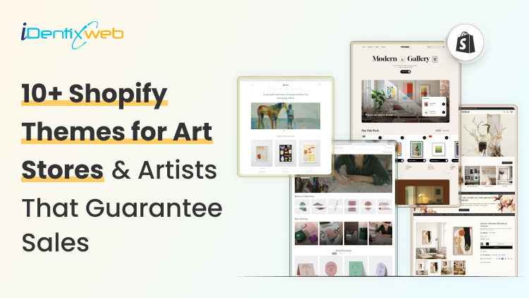
Best Shopify Artist Portfolio Theme for 2026: Free and Premium Options That Actually Work
The best Shopify artist portfolio theme depends on what the artist sells and how they want visitors to experience their work. Studio is the best free option for new artists. Publisher works well for artists who use storytelling, while Dawn is best for speed and simple product catalogs. For paid themes, Paper is ideal for prints and posters, Pipeline is best for large art galleries, and Exhibit creates the closest online gallery experience. Motion suits artists using videos or process content. Impression is good for polished gallery-style stores, Monochrome fits premium visual storytelling, Focal is better for artists focused on product sales, and Prestige works best for luxury art brands and collector-focused stores. Most artists I have worked with picked a Shopify theme based on how it looked in a demo store. The two most prominent issues that I came across are how the product grid is not able to show their work, and there is no simple way to add an artist bio. Picking the right Shopify artist portfolio theme directly affects how collectors experience your work. After working with Shopify stores across every art niche, I have seen what separates themes that showcase art from themes that convert. Below you will find a breakdown of the best free and premium options for 2026, and which theme fits which type of artist What makes a theme work as a Shopify artist portfolio theme? An artist's portfolio theme has a unique job: it needs to hold attention, build trust in the artist, and guide the visitor toward either a purchase or a commission inquiry. In my experience, the themes worth your time share three qualities. First, they support large-format, high-resolution images without degrading quality on different screen sizes. Second, they include dedicated sections for artist stories, process content, and gallery-style navigation rather than standard category grids. Third, they load fast enough that image-heavy pages do not bounce visitors before the workloads. Portfolio-first or shop-first: Which one do you need? Before picking a theme, I always ask the artist to answer an honest question about their business model. A portfolio-first theme prioritizes visual presentation and storytelling. Navigation is minimal, and the homepage functions like a gallery landing page. These are best for artists selling original paintings, fine art prints, illustration commissions, or photography. A shop-first theme prioritizes browsing and conversion. Collections are front and center. Filtering, sorting, and quick-add buttons are built in. These work best for artists selling a higher volume of products, print-on-demand merch, stationery, or a catalog of prints in multiple sizes and frame options. Most solo artists need about 70% portfolio and 30% shop. If you are still deciding between building your own store or using a marketplace, my comparison of Shopify vs. Etsy is worth reading first. 10+ best Shopify artist portfolio themes in 2026 1. Studio (Free) Studio is Shopify's own theme built specifically for artists and creators, and it is the strongest free starting point available in 2026. It comes with collection-based navigation, creator filters, a dedicated artist profile section, and colorful accent options to frame high-resolution images. I love how its sticky navigation keeps your work accessible as visitors scroll. Best for: Painters, illustrators, jewelry makers, and emerging artists building their first portfolio store. Watch out for: Studio uses a fairly common design that many artists share. You will need strong photography and intentional brand colors to stand out from other Studio stores. Price: Free Rating: 44% 2. Publisher (Free) Publisher is built for brands that lead with narrative, which makes it a natural fit for artists. Its high-contrast layouts and design put editorial content first. Product cards have rollover effects and zoom, and the contextual navigation keeps your brand story visible throughout the buying journey. Best for: Abstract artists, conceptual illustrators, and fine art photographers. Publisher works especially well for artists who maintain a strong content or journaling presence alongside their shop. Price: Free Rating: 50% 3. Dawn (Free) Dawn is Shopify's default theme and one of the fastest loading options in the entire theme store. It is not designed exclusively for artists, but its clean grid, full-width image support, and excellent Core Web Vitals scores make it a smart choice for artists who want to launch fast, test the market, and upgrade later. Best for: Artists entering print-on-demand, photographers selling a large catalog of prints, and anyone launching a first store who needs speed over style. See my full list of the best Shopify Dawn theme examples for merchants to research on Dawn storefronts. Price: Free Rating: 36% 4. Paper (Paid) Paper is built for artists who sell posters, fine art prints, and paintings, where the image quality and the checkout experience have to be effortless. Its optimized performance means high-resolution images load instantly rather than making visitors wait. Smooth animations feel intentional rather than gimmicky. Combined listings let you group size and frame variants cleanly, which is a real advantage for print sellers. Best for: Artists selling prints in multiple sizes, poster shops, art print studios, and anyone whose product variants (size, paper type, framing) need a clean presentation system. Price: $320 (one-time) Rating: 96% 5. Pipeline (Paid) I consistently recommend Pipeline for anyone building a Shopify art gallery, and for good reason. Advanced subcollection filtering lets you organize a large catalog of works by medium, subject, size, or series without overwhelming visitors. High-resolution images with hotspots and rollover effects let collectors examine details before committing. Best for: Multi-artist galleries, solo artists with a deep catalog organized across series or collections, and any store positioning itself as a premium or collectable art destination. Price: $360 (one-time) Rating: 97% 6. Exhibit For me, Exhibit is the theme closest to a real gallery experience in Shopify's store. Its versatile grids and carousels let you arrange collections with the same thoughtfulness you would apply to a physical hanging. Best for: Artists and galleries that want the online experience to mirror a gallery visit. Exhibit works especially well for limited edition works, sculptures, and any artist whose pricing sits in the mid-to-high collector range. You can find real examples of how successful art stores use layouts like this in my Shopify art store examples for merchants. Price: $350 (one-time) Rating: 100% 7. Motion (Paid) Fluid animations, embedded media sections, and before-and-after sliders make Motion the strongest choice for artists who document their creative process through video. If you publish studio tour videos, time-lapses, or process reels alongside your finished work, Motion gives you a native way to integrate that content. Best for: Artists actively using video to build their audience, painters who want to show technique, muralists, and ceramicists. Price: $420 (one-time) Rating: 97% 8. Impressions (Paid) Impression is one of the newer art-focused themes in Shopify's theme store, and it fits this list because it is created with a gallery mindset. I especially like its flexible page-building options because artists can create collection pages, artist story sections, and product-led layouts without needing custom development. Best for: Galleries, illustrators, visual artists, and solo artists who want a polished art-store layout without overcomplicating the buying journey. Price: $340 (one-time) Rating: 100% 9. Monochrome (Paid) Monochrome is built for artists who want the artwork to do most of the talking. The design is minimal, refined, and focused on immersive visual storytelling. Its bold typography, smooth sliders, image galleries, and clean product layouts make it especially useful for stores where the visual mood matters as much as the product itself. I like it for artists who want a premium portfolio feel without making the store look too decorative. Best for: Fine art photographers, contemporary artists, ceramicists, design-led studios, and artists with a strong visual identity. Price: $320 (one-time) Rating: 96% 10. Focal (Paid) Focal is not a pure gallery-style theme, but it works well for artists who sell across multiple product types. Its custom color sections, visual landing page layouts, image zoom, image hotspots, lookbooks, and sticky add-to-cart features make the shopping experience feel more active. I would recommend it more for artists who want to grow sales, not just showcase a portfolio. Best for: Print sellers, art merchandise stores, stationery artists, home decor artists, and creators with a growing product catalog. Price: $320 (one-time) Rating: 93% 11. Prestige (Paid) Prestige is the strongest option here for artists selling at a premium. It is designed for high-end brand appeal, and that matters when your artwork needs to feel rare, valuable, and carefully presented. I would not choose Prestige for a serious fine art brand because it can create the right luxury atmosphere. Best for: Premium art studios, fine art photographers, high-end galleries, limited edition print sellers, and artists selling collector-focused work. Price: $400 (one-time) Rating: 91% See my complete breakdown of Prestige Shopify theme for merchants in 2026. Why Shopify for artists outperforms marketplaces? Shopify gives artists full ownership Unlike Etsy or other marketplaces, Shopify lets artists control their brand, customer data, pricing, and store experience. There is no direct competition besides your listing In a marketplace, similar artists and products appear next to your work. On Shopify, the entire store experience is focused only on your art. Your theme becomes part of your brand story The Shopify theme you choose shapes how collectors experience your artwork, giving you more control over presentation and perception. You can add storytelling directly to product pages Artists can place bio sections, artwork stories, or creative notes near the purchase point, helping collectors connect with the piece. Metafields make artwork details easier to display This is my personal favourite benefit. You can store and show details like edition number, medium, dimensions, year, and other artwork-specific information cleanly. Sections Every Shopify Artist Portfolio Theme Needs Artist bio with a face: Collectors buy from people, not stores. A dedicated about page with your photo, your process, and your background converts browsers into buyers more reliably than any feature-rich product page Series or collection organization: Organize your work the way a gallery would, by series, medium, or body of work. Pipeline and Exhibit handle this natively. Studio handles it with some setup. Commission inquiry flow: If you accept commissions, make it obvious and frictionless. A simple contact form with a "Commission Inquiry" subject line pre-filled is enough. App blocks in themes let you embed this directly on your about page or in a dedicated commissions section. Clear ‘Available’ vs. ‘Sold’ signaling: For original work sellers, nothing frustrates a serious collector more than falling in love with a piece and discovering it was sold months ago. Use product status, stock levels, or a "Sold" collection to manage this cleanly. Here’s how I would choose a Shopify portfolio theme for artists in 2026 I always advise artists to run through these questions before committing to a theme. What is your primary product type? Original paintings, fine art prints, POD merchandise, and digital downloads each benefit from different theme structures. How large is your current catalog? Under 30 products: Studio, Publisher, or Exhibit. 30 to 150 products: Pipeline or Paper. Over 150 products: Pipeline or a well-structured Motion setup. How important is video to your brand? If you publish content regularly, Motion justifies its price immediately. If the video is occasional, most other themes handle embedded media well enough. What is your budget? Free themes handle real volume when set up correctly. Do not upgrade to premium purely for the aesthetic if your catalog and audience are not there yet. FAQs 1. What is the best free Shopify artist portfolio theme? Studio is the strongest free Shopify artist portfolio theme in 2026. It was designed specifically for artists and creators, with artist profile sections, collection-based navigation, and flexible image layouts. 2. What is the best Shopify theme for an art gallery? Pipeline is the best Shopify theme for an art gallery that needs to organize a large collection with a professional presentation. Exhibit is the best option to create a gallery-style atmosphere. For galleries just launching, Studio (free) provides a solid foundation before a premium investment makes sense. 3. Can you use Shopify for artists selling original work? Shopify works well for artists selling original paintings, sculptures, prints, and commissions. The key is configuring product pages to clearly show availability, edition status, and dimensions. Themes like Exhibit and Pipeline are particularly well-suited because their layouts match how original art buyers prefer to browse and evaluate pieces. 4. Which is better for artists, Shopify or Etsy? Shopify gives you full control over branding, pricing, customer data, and the store experience. Etsy gives you a built-in marketplace audience, but takes a percentage of every sale and limits how your brand looks and feels. See my full Shopify vs. Etsy comparison for a side-by-side breakdown. 5. How many products can a Shopify artist portfolio theme handle? Free themes like Studio handle catalogs up to about 100 products comfortably before navigation and filtering become limiting. Premium themes like Pipeline are designed to organize much larger catalogs, with advanced subcollection filtering and sorting built in. For an original-work artist selling unique pieces one at a time, even a 20-product store benefits from a theme with strong presentation rather than filtering.

Vineet Nair
9 Min • 13 May 2026
92 Views

Vineet Nair
9 Min • 1 July 2026
140 Views

Sajini Annie John
3 Min • 15 May 2026
106 Views
Vineet Nair
10 Min • 8 May 2026
95 Views
Vineet Nair
10 Min • 1 July 2026
124 Views

Vineet Nair
8 Min • 8 May 2026
112 Views
")
Sajini Annie John
2 Min • 15 May 2026
120 Views

Vineet Nair
8 Min • 7 May 2026
118 Views

Sajini Annie John
5 Min • 6 May 2026
110 Views

Vineet Nair
7 Min • 6 May 2026
105 Views

Sajini Annie John
6 Min • 5 May 2026
113 Views

Vineet Nair
6 Min • 5 May 2026
122 Views