Blog
Gather knowledge about the latest insights, updates, tips, and tricks in the Ecommerce industry.
5 Min • 20 March 2026
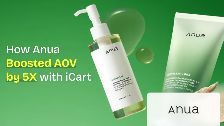
How Anua Unlocked 5X AOV Growth with iCart’s Smart Cart Features
delivery customization Challenges Solutions drive results Scale business delivery customization Challenges Solutions drive results Scale business delivery customization Challenges Solutions drive results Scale business delivery customization Challenges Solutions drive results Scale business Anua is a globally recognized Korean skincare brand known for its minimalist philosophy and focus on gentle yet effective formulations. Built on the idea of simplifying skincare routines, Anua develops products that deliver visible results while avoiding harsh or irritating components, making them suitable for sensitive skin types. Initially using a traditional full cart experience, Anua transitioned to iCart’s side cart solution in August 2025, to create a more seamless and engaging shopping journey. This shift allowed customers to easily explore complementary skincare products without disrupting their browsing flow, making it more intuitive to discover items that fit into a complete routine. By surfacing relevant recommendations directly within the cart, the brand enhanced product visibility across its range. Challenges Before implementing iCart’s side cart solution, Anua faced limitations with their existing full cart experience, which created friction in the customer journey. The traditional cart setup redirected users away from product pages, interrupting their browsing flow and reducing opportunities to explore additional products. As a skincare brand built around routines rather than single-item purchases, this made it difficult to effectively showcase complementary products and encourage customers to build complete regimens. Additionally, the lack of in-cart personalization and strategic upsell opportunities meant that customers were often unaware of related products that could enhance their skincare results. This limited the brand’s ability to increase average order value (AOV) and fully leverage its diverse product range. Anua needed a more dynamic and intuitive cart experience that could seamlessly introduce relevant recommendations while maintaining a smooth and engaging shopping journey. ❌ Cart Value Barriers Low average order value (AOV) due to single-item focus Most customers completed purchases with one primary product instead of building multi-step routines. Cart abandonment near shipping thresholds Customers were not clearly informed or motivated to reach free shipping or discount thresholds. Missed savings opportunities Customers were unaware of potential value in purchasing bundled routines or multiple complementary products. ❌ Absence of Progress-Based Incentives No free shipping or discount progress bar Customers were not motivated to increase their cart value due to lack of visible incentives. Missing tiered rewards system There were no structured milestones (e.g., “Spend more to unlock offers”), reducing upsell opportunities. ❌ Ineffective Cart UI/UX (Pre-Side Cart) Full-page cart disrupted shopping flowCustomers had to leave their browsing journey, increasing friction and drop-offs. No quick add/remove functionality Users couldn’t easily modify their cart or add suggested products without navigating away. Solution To overcome these challenges, Anua implemented iCart’s side cart solution to transform their traditional cart into a high-converting, interactive experience. By replacing the full-page cart with a seamless side cart, the brand ensured that customers could continue browsing while viewing their cart, significantly reducing friction in the shopping journey. Additionally, features like product recommendations & progress bars for free shipping and discounts motivated customers to increase their cart value. By combining personalization, incentive-driven messaging, and a user-friendly interface, Anua successfully turned their cart into a powerful revenue-driving touchpoint rather than just a checkout step. To maximize their cart effectiveness, they implemented two powerful features: ✅ Progress Bar with Multi-Reward Incentives Implemented a tiered progress bar to encourage higher cart value Customers are guided with a clear message like “Add $3.10 to unlock secret offer,” motivating them to continue adding products. Generated over $5M+ in revenue through incentive-driven cart progression Used product-based rewards to align with customer intent Instead of generic discounts, Anua incentivized purchases with relevant skincare items like Dark Spot Pads and mini serums. Built visual motivation for routine expansion As customers add products, they can clearly track progress toward unlocking multiple rewards, encouraging them to build a complete skincare routine. ✅ Product Recommendations Implemented “Frequently Bought Together” recommendations Customers adding a single product (e.g., toner) are shown complementary items like serums, moisturizers, or pads to complete their routine. Generated over 275K revenue through in-cart recommendations Encouraged full skincare regimen building Instead of isolated purchases, the cart suggests step-by-step product combinations aligned with common skincare routines. Increased product discovery at the final stage By surfacing relevant items directly in the cart, Anua ensured customers explore more of their catalog without leaving the checkout flow. Results Achieved in Last 180 Days 22932 Total Store Orders 45101 Total iCart Orders 5X iCart Generated AOV 65.70% Upsell Affected Conversion Rate These improvements reflect a clear shift in customer behavior on Anua’s store. Cart abandonment reduced as shoppers discovered complementary skincare products and felt encouraged to build complete routines. Engagement also increased, with customers interacting more with in-cart recommendations and exploring relevant product pairings. Results & Impact And...Results is Our Main Clarification By implementing iCart’s cart drawer, product recommendations, and progress bar, Anua transformed its cart into a high-performing conversion touchpoint. Shopping Experience Enhancement The improved cart experience encouraged customers to discover complementary products and understand the value of sustainable beauty routines. For instance, the clear presentation of subscription savings alongside one-time purchase options helped customers make more informed decisions about their long-term hair care needs. As Anua continues to optimize its cart experience, the brand is closely monitoring: Routine-based purchasing behavior - tracking how customers move from single items to multi-step regimens Engagement with in-cart recommendations - measuring interaction with suggested products Cart value progression - analyzing how incentives influence higher spending [related_cases_slider] Ready to Write Your Success Story? Try icart App Join successful businesses like Anua and Master your delivery scheduling Delight customers with precise timing Grow your special occasion orders Expand your delivery reach
Read Blog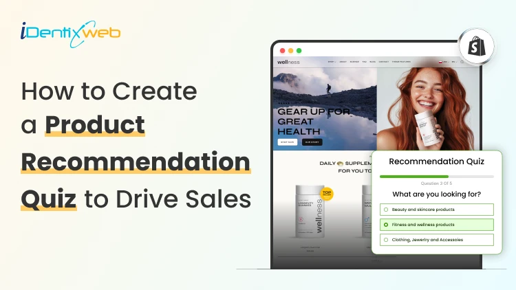
9 Min • 21 July 2026
Product Recommendation Quiz Setup for Shopify Stores: The Complete Guide
To set up a product recommendation quiz on Shopify, define the possible outcomes, connect each outcome to relevant products, and install a quiz-builder app. Create a set of 6 questions or less, map answers to recommendations, design a personalized results page, and embed the quiz through your theme editor. Your best-selling product isn't always the right product for every shopper. A generic collection page makes them do the work: scroll, compare, and choose. Product recommendation quiz setup for Shopify stores flips that around, turning a handful of questions into a personal shopping assistant that points each visitor straight to what fits them. Store owners who get real lift from a quiz treat it as a small system with a plan behind it, not just a widget bolted onto the homepage. What does a product recommendation quiz do for a Shopify store? A product recommendation quiz is a set of questions on your Shopify store that maps a shopper's answers to specific products. Below is a great example I came across of the skincare brand Ogee. Instead of browsing a full catalog, the shopper answers a few questions and lands on a personalized page. For stores with fewer products, or products where fit really matters (skin type, size, taste, budget, who the gift is for), a Shopify product quiz works great. Skincare, supplements, pet food, apparel sizing, fragrance, and gifting are the categories where this shows up most. My guide on how Shopify stores use gamification to win more customers covers spin-to-win offers, tiered rewards, and other mechanics that pair well with a product quiz. Plan before you build a product recommendation quiz The biggest setup mistake I see is starting with questions instead of outcomes. Before you write a single question, decide what result each shopper can land on and which products belong to each result. Here's the order that I follow: List your possible outcomes. A skincare store might use "Dry skin," "Oily skin," and "Combination skin." A gift shop might use "Gift for a partner," "Gift for a parent," and "Gift for a coworker." For each outcome, decide which products or collections should appear on the results page. Only after that's locked in, write the questions that sort shoppers into the right outcome. Four to eight outcomes is usually plenty. More than that and your product mapping gets hard to maintain as your catalog changes. Choosing a Shopify quiz app or quiz builder You don't need to hand-code a quiz. The Shopify App Store has a dedicated quiz app category. The right apps should let you connect answers to specific products without a developer. Here are four of the best Shopify product recommendation builder apps to consider. 1. Product Recommendation Quiz by RevenueHunt Best for: Growing brands that need advanced product matching and customer segmentation Key features: AI-powered quiz builder Conditional product recommendation logic Email capture and customer tagging Customizable product results pages GA4 and Meta Pixel integration Multi-language and multi-currency support Klaviyo, Omnisend, Zapier and webhook integrations Pricing: A free plan is available. Paid plans start at $39 per month. Shopify rating: 4.9/5 from 400+ reviews, as of July 2026. 2. Quiz Kit: Product Quiz Maker Best for: Established brands that want to test and optimize quiz performance Key features: AI-assisted quiz generation AI Shopping Assistant Drag-and-drop quiz editor A/B testing and funnel analytics Custom CSS and JavaScript control Email marketing and analytics integrations Pricing: Single paid plan available at $59/month. Shopify rating: 4.8/5 from 150+ reviews, as of July 2026. 3. Lantern AI Quiz Builder Best for: Merchants who want to launch an AI-generated quiz quickly Key features: Fast AI-generated quizzes Product matching and routine recommendations Logic jumps and advanced quiz flows Personalized discount incentives Dynamic quiz and results-page content A/B testing and conversion tracking Multi-language support More than 30 integrations Pricing: Single paid plan available at $39/month. Shopify rating: 4.9/5 from 100+ reviews, as of July 2026. 4. VQB: AI Product Quiz Builder Best for: Stores selling personalized, made-to-order or highly configurable products Key features: Product, variant and regimen recommendations Made-to-order product configuration AI generation and manual product tagging Dynamic and custom results pages Page, embedded and pop-up quiz formats A/B testing and drop-off analysis Klaviyo and Omnisend segmentation Support for 23 languages Pricing: The free plan is available. Paid plan starts at $30/month. Shopify rating: 5.0/5 from 50+ reviews, as of July 2026. Don’t Let Personalization End With the Quiz A product quiz helps customers find the right starting product. Most carts only show products... iCart can show revenue-boosting offers. Try Free Till 100 Orders iCart’s AI-powered recommendations continue that journey by automatically suggesting relevant add-ons and complementary products directly inside the cart. Product recommendation quiz setup for Shopify stores: Step-by-step Step 1: Define the goal Pick one primary goal. I work with one of the three below Recommend products Capture leads, Segment shoppers into personas. Trying to do all three at once usually weakens all three, because your questions, design, and results page all pull in different directions depending on the goal. Step 2: Build your question flow Write one idea per question. Use text-based questions for facts like budget, image-based questions for style or taste. Keep the total under ten questions for a product recommendation quiz. Step 3: Link answers to products In your quiz app, open the product mapping or logic settings and connect each answer to products/collections. Set a hero recommendation plus one or two alternates per outcome, so the results page never forces a single option on every shopper who lands in that bucket. Step 4: Design the welcome and results pages Design your welcome page. This is where you state how long the quiz takes and what the shopper gets in return. For example, something like "2 minutes, 8 questions, your personalized routine." The results page is where the sale happens. Give the outcome a name instead of showing a plain product list. Add a line explaining why each product was picked, and put a direct add-to-cart button right on the recommendation. Step 5: Decide how and when you ask for email Most quiz apps let you place an email or SMS field before or after the results appear. Showing the results first and asking for email, in exchange for a discount, converts better. By the time you ask, the shopper has already seen the value. Step 6: Embed the quiz in your theme On Online Store 2.0 themes, most quiz apps install as an app embed or app block. This way you can drop the quiz into a dedicated page, or a banner on a collection page directly from the theme editor. Step 7: Test, then publish Take the quiz yourself, start to finish, on both desktop and mobile before it goes live. Check that every answer path leads to a connected product and confirm the email or SMS integration is working. Where to place your quiz in your Shopify quiz funnel In my experience, these places consistently pull the most quiz-takers: Homepage hero or banner, especially for a limited window around launch. Main navigation link, so returning visitors can find it any time they want a fresh recommendation. Exit-intent popup on collection pages, aimed at browsers who look stuck. Product page banner, something like "Not sure which one fits? Take the 2-minute quiz." Dedicated landing page for paid social traffic. Quizzes tend to perform well as interactive and creative because they invite a click instead of asking for one. Email to your existing list, both to re-engage subscribers and to refresh their preference data. Real Shopify product quiz examples worth studying Function of Beauty I love this product recommendation quiz because it directly tells me how many steps I need to finish the quiz. The cosmetics industry is one of the best places to add a quiz, and The Function of Beauty takes full advantage of it. Josh Cellers What I love about this is that Josh Cellers gives the customers a tasting experience in the form of a quiz. I also like its honest questions regarding everyday routines. This is perfect to build customer relationships. Beardman The first thing I noticed before taking this quiz was that it takes 2 minutes. People are more likely to take the quiz if they know its time limit. Their results page with recommended products is also fantastic. This is a great store for merchants to study. The Sill Much of The Sill’s success depends on its short quiz completion time. The Sill’s quiz asked me just 3 questions before recommending products to me. According to Typeform’s survey, quizzes with fewer than 6 questions had the best completion rate. Jones Road Beauty Complexion quizzes are popular among beauty brands. Jones Road Beauty’s product recommendation quiz is one of the best examples in this industry. One piece of advice. I would recommend using picture choices here because asking customers about their skin complexion is difficult. Turn product discovery into a personalized shopping experience A product recommendation quiz can turn a common shopping flow into a clear, personalized buying journey. Start with defined outcomes, keep the questions focused, and map every answer to relevant products. Create a results page that explains why each recommendation fits the shopper. A well-planned Shopify product quiz gives you valuable preference data and creates more opportunities to convert visitors into customers. FAQs 1. Can you make a quiz on Shopify? Yes, you can create a quiz on Shopify using a quiz-builder app or a custom-developed solution. A dedicated quiz app is best for using conditional logic, matching answers with products, displaying personalized recommendations and adding suggested items to the cart. 2. How to set up a product recommendation quiz for Shopify stores? To set up a product recommendations quiz, install a quiz app from the Shopify App Store. Build your quiz inside the app, then embed it as an app block or app embed through your theme editor. Most Online Store 2.0 themes support this without custom code. 3. Which quiz platform works best for Shopify stores? RevenueHunt Product Recommendation Quiz is a strong choice for most Shopify stores. It offers a no-code and AI-assisted builder, supports personalized product recommendations and includes a free plan. Octane AI is more suitable for larger DTC brands that need advanced AI features, image-based analysis, personalized result content and sophisticated customer-data workflows.
8 Min • 3 July 2026
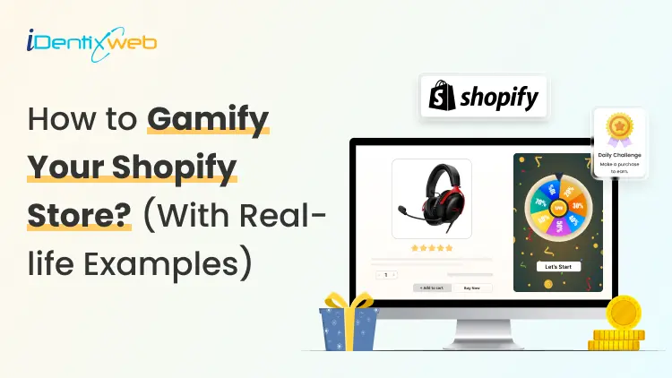
How Do Shopify Stores Use Gamification to Win More Customers
Shoppers in 2026 get overwhelmed by discount emails and static pop-ups. That also includes me 😶 Most click away without a second thought. But some Shopify stores are doing something different… They are turning the shopping experience into a game, and buyers keep coming back because of it. Understanding how Shopify stores use gamification is the first step to building a store that converts better and retains customers longer. This blog is to help you understand the power of gamification with real-life Shopify store gamification examples that I have researched. I will also educate you on the best Shopify gamification apps and pop up builders that I use in stores. What is gamification in a Shopify store? Gamification means adding game mechanics to your store experience so shoppers feel motivated to act, earn, and return. Points, progress bars, spin wheels, quizzes, badges, and tiered challenges are all gamification tools. The goal is to make every interaction feel rewarding, so shoppers buy more and come back. The market backs this up. In ecommerce specifically, gamified popups convert between 8-15% of visitors, while standard discount popups convert between 3-5%. Why gamification works especially well in 2026 Third-party cookies are mostly gone Most browsers block them by default, so the behavioral data is difficult to get. Gamification, especially quizzes and interactive sign-up flows, gives you first-party and zero-party data your competitors cannot buy. When a shopper answers four questions in a product finder quiz, you learn their preferences directly. Shoppers are desensitized to static offers A flat "15% off for your email" discount barely gets clicks anymore. A spin wheel where the prize is unknown? This will immediately get clicks. This is the same principle that makes slot machines in Vegas compelling. Not knowing the reward is often more motivating than a guaranteed one. Exit popups fail on mobile Standard exit-intent popups cannot fire on mobile because there is no cursor to track. Stores that use gamified teasers, small interactive elements that sit on the screen until tapped, capture mobile leads easily. How do Shopify stores use gamification: 5 proven examples 1. Gamified popups: Spin wheels, scratch cards, & mystery discount A gamified popup puts a game at the first moment a new visitor lands. Instead of showing a static form, you show a spin wheel or scratch card that requires a small interaction to reveal the reward. As per Sleeknote's report, spin-to-win popups averaged 8.67% conversion compared to 3.70% for standard popups. In my experience, scratch cards and mystery reveals work especially well for premium or minimalist brands. The shopper swipes or clicks to reveal their offer, and the earned reward feels more valuable because they worked for it. Fishwife uses an awesome mystery discount popup. Checkout my guide to adding a pop-up on Shopify for a full breakdown of how to configure a pop-up on your store. 2. Cart drawer progress bars and tiered rewards Gamification does not stop at the pop-up. Inside the cart, progress bars are one of the highest-ROI mechanics available. A cart drawer progress bar shows shoppers exactly how close they are to a reward: "You are $12 away from free shipping". Shoppers see a clear goal and feel the pull toward the finish line. A three-tier reward system works well for most stores. Each tier targets a different shopper type without squeezing margins. Anua, the Shopify skincare brand, uses a great three-tier reward system in their cart. This helps to increase AOV because shoppers always see the next reward, and most feel close enough to hit it with one extra item. Turn Your Shopify Cart Into a Mini Reward System Most carts only show products... iCart can show revenue-boosting offers. Try Free Till 100 Orders If you want to gamify the cart experience, iCart helps you add progress bars, free shipping goals, product upsells, free gifts, and cart-based offers inside the cart drawer. For a full setup guide, check out my guide on Shopify cart drawer gamification and tiered rewards that lift AOV. 3. Product discovery quizzes Quizzes are most valuable for stores with complex catalogs. A shopper who completes a five-question quiz about their lifestyle, budget, and preferences hands you a detailed preference profile you can use across every future channel: email, retargeting, and on-site recommendations. For Shopify DTC brands and beauty, skincare, or supplement stores, zero-party data is now essential. Without it, personalization relies on purchase history alone. With it, you know what shoppers want before they buy the first time. 4. Loyalty program tiers & badges Most people do not realize that loyalty programs are the most common form of gamification. Points, tiers, and badges keep shoppers engaged between purchases. A flat points program with no tier progression earns 1.8 times less ROI than one with tiers. Also, tier progression feels like leveling up. Shoppers close to Gold status find a way to qualify, the same way gamers push for a new rank. Starbucks' rewards system is a great example of a loyalty program used to gamify your store. For stores just getting started, my guide to setting up the best Shopify loyalty program walks through point structures and tier naming. 5. Countdown timers and time-based challenges Countdown timers and time-limited challenges create urgency. For example, "Buy in the next 2 hours for 20% off" gives shoppers a hard deadline. A timer with 90 minutes on the clock stops a browser mid-scroll in a way that a permanent banner never does. Countdown timers placed on cart pages are especially effective at reducing abandonment since the shopper has already signaled intent. See my full breakdown on the ‘While Supplies Last’ strategy for examples and tips to create urgency. Best popup builder/ Shopify gamification apps in 2026 Popup BuilderKey Gamification FeaturesWhy Choose ItSleeknoteSpin-to-win, scratch cards, seasonal calendars, daily offers, multi-step quizzesA strong all-around option for stores that want multiple gamified popup formats in one platform. It also bills by visitor instead of page view, so repeat shoppers do not unnecessarily increase costs.OptiMonkPersonalized gamified offers based on cart value, product categories, and customer tagsIdeal for Shopify stores that want offers triggered by real customer and store data, not just basic page behavior.OdicciInteractive quizzes, preference-based templates, data capture for email personalizationA good fit if your main goal is collecting shopper preferences and using that data for Klaviyo segmentation and personalization.WheelioSpin-to-win popups, Klaviyo integration, Mailchimp integrationBest for stores that want a quick, low-cost spin wheel setup without needing a full gamification platform. To wrap it up: Which gamification should I go with? Gamification mechanicWorks best forSpin wheelsFashion, beauty, lifestyle, and home goods stores with discount-driven shoppers. QuizzesStores with complex catalogs or health and wellness products where personalization drives purchases. Progress barsVirtually every store selling physical products. They operate in every session without any explicit interaction, so they never feel intrusive to shoppers who dislike pop-ups.Tiered loyaltyHigh-frequency stores selling coffee, supplements, pet food, or skincare see the strongest engagement because shoppers earn points fast enough to feel genuinely rewarded.Challenges and countdownsChallenges and countdowns work as a layer on top of any other mechanic. Run them around product launches, Black Friday, or slow-sales windows that need a revenue push. FAQs 1. What is gamification in a Shopify store? Gamification in a Shopify store means adding game mechanics to the shopping experience. Shopify store gamification examples include spin-to-win popups, cart progress bars, product discovery quizzes, tiered loyalty programs, and time-limited referral challenges. 2. What is the difference between gamified popups and standard popups? Standard popups usually ask shoppers to sign up or claim a discount. Gamified popups add interaction, such as spin wheels, quizzes, scratch cards, or reward unlocks, which makes the offer feel more engaging and will increase email sign-ups. 3. What are the best Shopify gamification apps in 2026? The best Shopify gamification apps in 2026 include Sleeknote for the strongest all-around popup and gamification suite, OptiMonk for on-site personalization, Odicci for quiz-based zero-party data capture, and Wheelio for a single-purpose spin wheel. 4. What is the best popup builder for gamification on Shopify in 2026? The best popup builder for gamification on Shopify in 2026 is Sleeknote for most mid-size ecommerce stores. It combines spin wheels, scratch cards, seasonal calendars, and multi-step quizzes in one platform, handles mobile compliance to avoid Google interstitial penalties, and integrates natively with Shopify and Klaviyo. 5. How do Shopify stores use gamification? Shopify stores use gamification to encourage actions like email sign-ups, product discovery, referrals, repeat purchases, and higher cart values. Common examples include spin-to-win discounts, product finder quizzes, free shipping progress bars, loyalty tiers, referral challenges, and countdown-based offers.
8 Min • 24 July 2026
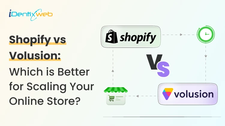
Shopify vs Volusion: The Full 2026 Comparison (And Where BigCommerce Fits In)
Shopify is a much better choice as compared to Volusion because of its superior features. Shopify offers unlimited products, a much larger app and theme ecosystem, stronger POS tools, and no GMV-based sales caps. Volusion is suitable for smaller stores that prefer simpler operations. Shopify vs Volusion comes up constantly when store owners start comparing ecommerce platforms. The gap between them has only gotten wider in 2026. Volusion still works for a small, specific type of merchant. Shopify has spent the past year adding AI-driven selling tools, a much bigger app store, and pricing built for real growth. I'll walk through pricing, features, and reliability for both platforms, and I'll show you exactly where BigCommerce lands if you're weighing all three. Shopify vs Volusion at a glance If you want the short version: Shopify is the better pick for almost every new store in 2026. Volusion still makes sense for merchants already running on it who don't want the hassle of switching or who genuinely need its low-transaction-fee structure at low sales volume. Here's the quick breakdown before we get into details. #ShopifyVolusionBigCommerceStarting price$39/mo ($29 annual)$35/mo$39/mo ($29 annual)Product limitUnlimited, all plans100 on entry planUnlimited, all plansPlatform transaction feesYes, unless using Shopify PaymentsNo gateway maintenance fee with preferred providers; 1.25%–0.35% on non-preferred gateways, depending on plan 0% with Embedded Payment Providers; 2%, 1% or 0.6% with Open Payment Providers, depending on plan App marketplace16,000+ apps84 marketplace listings, including integrations and services1,200+ appsSales cap per planNoneYes, by GMVYes, by GMV Shopify vs Volusion pricing compared Shopify costs more upfront. It does remove the sales caps that Volusion's plans have. Volusion is cheaper at the entry level and skips platform transaction fees entirely, but it locks lower tiers behind strict yearly revenue limits. Here's how the current plans stack up. Shopify Plans in 2026 PlanMonthly costAnnual costNotesStarter$5/moN/ABuy Button and social selling only, no full storefrontBasic$39/mo$29/moFull store, unlimited productsGrow$105/mo$79/moFormerly called the "Shopify" planAdvanced$399/mo$299/moLower card rates, more staff accountsPlusFrom $2,300/mo3-year termEnterprise checkout and B2B tools If you want a complete pricing breakdown, my guide to Shopify pricing breaks down which plan actually fits your store size. Volusion pricing in 2026 PlanMonthly costMax GMV/yearProduct limitStaff accountsPersonal$35/mo$50K1001Professional$79/mo$100K5,0005Business$299/mo$400KUnlimited15PrimeCustomUnlimitedUnlimitedUnlimited Pricing changes over time on every platform, so treat these numbers as a snapshot and confirm current rates before you commit. Volusion vs Shopify vs BigCommerce: Where does BigCommerce fit? BigCommerce sits in an interesting spot between the two. It matches Shopify's unlimited products and staff accounts, but it shares Volusion's feature of capping plans by yearly sales volume. If you're deciding between Shopify, Volusion, or BigCommerce, BigCommerce is usually the pick for merchants who want more built-in functionality and don't mind installing fewer apps overall. BigCommerce pricing in 2026 PlanMonthly costAnnual costGMV thresholdCore$39/mo$29/moAuto-upgrades above $30KGrowth$105/mo$79/moAuto-upgrades above $100KScale$399/mo$299/mo0.9% overage above $33,333/moPerformanceCustom pricingStarts at $1,499/month, billed annually Custom BigCommerce added a new Open Payment Provider Fee on self-service plans: 2% on Core, 1% on Growth, and 0.6% on Scale, charged on orders processed through a gateway outside its approved list (Stripe, PayPal/Braintree, Adyen, and Checkout.com are exempt). I don’t think BigCommerce's old "we never charge transaction fees" pitch against Shopify fully holds anymore unless you stick to an approved processor. I cover the full breakdown in my BigCommerce vs Shopify comparison if you want to weigh it against Shopify specifically. Features compared: Apps, payments, themes, and POS Shopify's app ecosystem is the biggest gap between all three platforms. Shopify's App Store now lists more than 16,000 apps. Volusion has more than 80 native integrations. BigCommerce lands in the middle with over 1,000+ marketplace apps and stronger native features that reduce how many apps you need in the first place. I noted a few other differences as well: > Payment gateways Shopify integrates with more than 100 payment providers. BigCommerce supports over 130 payment solutions, including 21 Embedded Payment Providers that avoid its Open Payment Provider Fee. Volusion also supports several established gateways. > Point of sale Shopify has the most developed POS ecosystem, with hardware you can buy directly and a POS Pro add-on for multi-location retail. Volusion's POS support exists but is far less polished. > Themes Shopify has the largest overall theme ecosystem, with 1,000+ free and premium themes. BigCommerce offers a smaller selection of free and paid themes, while Volusion provides 24 no-cost themes but has a more limited overall third-party theme ecosystem. Platform reliability and company history Shopify is publicly traded, has been profitable for several years, and continues investing heavily in its platform. Volusion filed for Chapter 11 in 2020 and was acquired by Newfold Digital, the company behind Bluehost and HostGator, in 2021. It's continued operating since under new leadership, and it's still PCI DSS compliant with a full security program in place, but that history is worth knowing if platform longevity factors into your decision. BigCommerce is also publicly traded and posted its first full year of GAAP profitability in 2026, which gives it a similar stability profile to Shopify. None of this means Volusion is unsafe to build on today. It means you're choosing a platform with a smaller team and a narrower recovery margin if things go wrong again. Shopify, Volusion, or BigCommerce: Which one is better? Choose Shopify if: You're starting a new store and want the largest app and theme selection. You plan to sell through multiple channels. You want built-in POS for a physical retail location. You expect meaningful growth and don't want a sales cap slowing you down. Pick Volusion if: Your sales volume is modest and predictable, and avoiding transaction fees matters more than app selection. You don't need a built-in blog or a large third-party app catalog. Choose BigCommerce if: You want more features built in in exchange for installing fewer apps. Your store has strong B2B or wholesale requirements. You're comfortable managing GMV thresholds and the new payment provider fee structure. Migrating to Shopify in 2026 If you are on Volusion and planning to migrate to Shopify, it’s easier than most merchants expect. You'll want to export your product catalog, customer records, and order history from Volusion, then map that data into Shopify's format before import. Rebuilding your theme and setting up 301 redirects for every changed URL protects the SEO equity you've already built. Most small to mid-sized stores complete this in two to four weeks. I've written a full walkthrough covering migrating from Volusion to Shopify step by step, from backup through launch. If BigCommerce is the platform you're leaving instead, my BigCommerce to Shopify migration guide covers that path in the same level of detail. The bottom line Shopify vs Volusion isn't really a close contest anymore. Shopify wins on apps, themes, payment flexibility, and growth. On the other hand, BigCommerce is a legitimate alternative if you want more built-in in exchange for a smaller app catalog. Volusion still has a place for merchants already comfortable there or who do not want transaction-fee-free sales. Whichever direction you go, run the numbers on your actual sales volume and app needs before committing. The up-front price rarely tells the whole story. FAQs 1. How to migrate from Volusion to Shopify? Export your products and customer records from Volusion, format them using Shopify’s CSV templates, and import them into your new Shopify store. For order history, custom fields or a large catalogue, use a Shopify migration app, then rebuild your theme, configure payments and shipping. Add 301 redirects and test the store before transferring your domain. 2. Who is Shopify's biggest competitor? WooCommerce is Shopify’s biggest competitor when measured by overall website adoption. BigCommerce is one of Shopify’s closest direct competitors in the hosted SaaS ecommerce market because both provide managed hosting, built-in commerce tools and plans for growing and enterprise businesses. 3. How much does it cost to migrate to Shopify? Shopify does not charge a fixed migration fee. A small store can migrate manually with CSV files at no additional cost beyond its subscription, which starts at $39 per month or $29 per month with annual billing. Migration apps will charge according to the number of products, customers and orders transferred, while Shopify Partners set their own prices for custom migrations. 4. Is Shopify better than Volusion in 2026? For most ecommerce businesses, Shopify is a better choice because it supports unlimited products across its main plans and offers more than 16,000 apps for extending store functionality. Volusion is a good fit for smaller stores, but its lower plans limit the number of products you can sell and how much revenue your store can generate

Bhavesha Ghatode
9 Min • 31 July 2025
946 Views

Vineet Nair
9 Min • 30 July 2025
1122 Views

Bhavesha Ghatode
14 Min • 29 July 2025
1079 Views

Bhavesha Ghatode
9 Min • 28 July 2025
1117 Views

Vineet Nair
10 Min • 26 July 2025
1113 Views

Bhavesha Ghatode
10 Min • 25 July 2025
1060 Views

Vineet Nair
7 Min • 24 July 2025
1046 Views

Bhavesha Ghatode
12 Min • 23 July 2025
1125 Views

Vineet Nair
7 Min • 22 July 2025
1110 Views

Vineet Nair
8 Min • 21 July 2025
1058 Views

Vineet Nair
9 Min • 19 July 2025
1113 Views

Bhavesha Ghatode
10 Min • 18 July 2025
1279 Views