Blog
Gather knowledge about the latest insights, updates, tips, and tricks in the Ecommerce industry.
5 Min • 20 March 2026
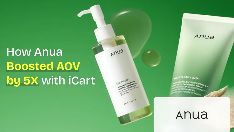
How Anua Unlocked 5X AOV Growth with iCart’s Smart Cart Features
delivery customization Challenges Solutions drive results Scale business delivery customization Challenges Solutions drive results Scale business delivery customization Challenges Solutions drive results Scale business delivery customization Challenges Solutions drive results Scale business Anua is a globally recognized Korean skincare brand known for its minimalist philosophy and focus on gentle yet effective formulations. Built on the idea of simplifying skincare routines, Anua develops products that deliver visible results while avoiding harsh or irritating components, making them suitable for sensitive skin types. Initially using a traditional full cart experience, Anua transitioned to iCart’s side cart solution in August 2025, to create a more seamless and engaging shopping journey. This shift allowed customers to easily explore complementary skincare products without disrupting their browsing flow, making it more intuitive to discover items that fit into a complete routine. By surfacing relevant recommendations directly within the cart, the brand enhanced product visibility across its range. Challenges Before implementing iCart’s side cart solution, Anua faced limitations with their existing full cart experience, which created friction in the customer journey. The traditional cart setup redirected users away from product pages, interrupting their browsing flow and reducing opportunities to explore additional products. As a skincare brand built around routines rather than single-item purchases, this made it difficult to effectively showcase complementary products and encourage customers to build complete regimens. Additionally, the lack of in-cart personalization and strategic upsell opportunities meant that customers were often unaware of related products that could enhance their skincare results. This limited the brand’s ability to increase average order value (AOV) and fully leverage its diverse product range. Anua needed a more dynamic and intuitive cart experience that could seamlessly introduce relevant recommendations while maintaining a smooth and engaging shopping journey. ❌ Cart Value Barriers Low average order value (AOV) due to single-item focus Most customers completed purchases with one primary product instead of building multi-step routines. Cart abandonment near shipping thresholds Customers were not clearly informed or motivated to reach free shipping or discount thresholds. Missed savings opportunities Customers were unaware of potential value in purchasing bundled routines or multiple complementary products. ❌ Absence of Progress-Based Incentives No free shipping or discount progress bar Customers were not motivated to increase their cart value due to lack of visible incentives. Missing tiered rewards system There were no structured milestones (e.g., “Spend more to unlock offers”), reducing upsell opportunities. ❌ Ineffective Cart UI/UX (Pre-Side Cart) Full-page cart disrupted shopping flowCustomers had to leave their browsing journey, increasing friction and drop-offs. No quick add/remove functionality Users couldn’t easily modify their cart or add suggested products without navigating away. Solution To overcome these challenges, Anua implemented iCart’s side cart solution to transform their traditional cart into a high-converting, interactive experience. By replacing the full-page cart with a seamless side cart, the brand ensured that customers could continue browsing while viewing their cart, significantly reducing friction in the shopping journey. Additionally, features like product recommendations & progress bars for free shipping and discounts motivated customers to increase their cart value. By combining personalization, incentive-driven messaging, and a user-friendly interface, Anua successfully turned their cart into a powerful revenue-driving touchpoint rather than just a checkout step. To maximize their cart effectiveness, they implemented two powerful features: ✅ Progress Bar with Multi-Reward Incentives Implemented a tiered progress bar to encourage higher cart value Customers are guided with a clear message like “Add $3.10 to unlock secret offer,” motivating them to continue adding products. Generated over $5M+ in revenue through incentive-driven cart progression Used product-based rewards to align with customer intent Instead of generic discounts, Anua incentivized purchases with relevant skincare items like Dark Spot Pads and mini serums. Built visual motivation for routine expansion As customers add products, they can clearly track progress toward unlocking multiple rewards, encouraging them to build a complete skincare routine. ✅ Product Recommendations Implemented “Frequently Bought Together” recommendations Customers adding a single product (e.g., toner) are shown complementary items like serums, moisturizers, or pads to complete their routine. Generated over 275K revenue through in-cart recommendations Encouraged full skincare regimen building Instead of isolated purchases, the cart suggests step-by-step product combinations aligned with common skincare routines. Increased product discovery at the final stage By surfacing relevant items directly in the cart, Anua ensured customers explore more of their catalog without leaving the checkout flow. Results Achieved in Last 180 Days 22932 Total Store Orders 45101 Total iCart Orders 5X iCart Generated AOV 65.70% Upsell Affected Conversion Rate These improvements reflect a clear shift in customer behavior on Anua’s store. Cart abandonment reduced as shoppers discovered complementary skincare products and felt encouraged to build complete routines. Engagement also increased, with customers interacting more with in-cart recommendations and exploring relevant product pairings. Results & Impact And...Results is Our Main Clarification By implementing iCart’s cart drawer, product recommendations, and progress bar, Anua transformed its cart into a high-performing conversion touchpoint. Shopping Experience Enhancement The improved cart experience encouraged customers to discover complementary products and understand the value of sustainable beauty routines. For instance, the clear presentation of subscription savings alongside one-time purchase options helped customers make more informed decisions about their long-term hair care needs. As Anua continues to optimize its cart experience, the brand is closely monitoring: Routine-based purchasing behavior - tracking how customers move from single items to multi-step regimens Engagement with in-cart recommendations - measuring interaction with suggested products Cart value progression - analyzing how incentives influence higher spending [related_cases_slider] Ready to Write Your Success Story? Try icart App Join successful businesses like Anua and Master your delivery scheduling Delight customers with precise timing Grow your special occasion orders Expand your delivery reach
Read Blog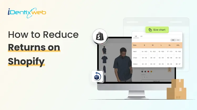
7 Min • 28 June 2026
How to Reduce Returns on Shopify: A Complete Guide for Store Owners
Returns on Shopify are one of the quietest profit leaks in ecommerce. The sale shows up in your dashboard, you feel good for a minute, and then the refund request hits a week later. Shipping is paid both ways, the product comes back used or damaged, and the margin you thought you earned is gone. The good news? Most returns on Shopify are preventable. They come down to a few fixable things: unclear product pages, weak sizing info, delivery confusion, and a return policy that does more harm than help. This guide walks you through each lever, in plain language, so you can keep more of every sale you earn. Why Returns on Shopify Hurt More Than You Think A return is never just a refund. Every product that comes back carries hidden costs that stack up fast: Two-way shipping - you often pay outbound and return labels. Restocking labour - someone has to inspect, clean, repackage, and shelve it. Lost inventory value - around 40% of returned items can no longer be sold as new. Customer support time - back-and-forth emails, refund processing, and follow-ups. Lost trust - a bad return experience can stop a customer from buying again. Industry data from Shopify suggests reverse logistics now eats up around 30% of operational costs for many online stores. Cutting your return rate by even three or four points can free up serious cash you can put back into product, ads, or growth. The Top Reasons Customers Return Products on Shopify Before you fix returns on Shopify, you need to know why they happen. The numbers are surprisingly consistent across studies: The product did not match the description or photos Wrong size or fit Quality below expectations Changed mind or buyer's remorse Wrong item shipped Damaged in transit "Bracketing" - buying multiple sizes to keep one Did you notice something? Almost every reason on this list traces back to a gap between expectation and reality. Close that gap, and your shopify order return volume drops with it. 9 Proven Ways to Reduce Returns on Shopify Here are the nine levers that move the needle most. You do not need to do all of them at once. Start with the two or three that match your top return reasons. 1. Write Product Descriptions That Set Honest Expectations Most product pages are written like ad copy. They list features and lean on adjectives. The pages that actually reduce returns read more like an honest friend describing the product. Cover the boring details people actually care about: Exact measurements (length, width, depth, weight) Materials and what they feel like Care instructions and washing guidance What the product is not, or who it is not for 2. Add a Clear Shopify Size Chart to Every Apparel Product If you sell anything that has to fit a body, your shopify size chart is the single biggest return-reduction tool you have. Around 45% of apparel returns happen because of sizing alone. Fix that one thing and you can cut your return rate almost in half. A strong size chart does three things: Shows actual garment measurements, not just S/M/L labels Lists values in both inches and centimetres Includes a short "how to measure" guide with a visual The problem? Building a clean, mobile-friendly size chart in Shopify by hand is painful. You end up with broken tables on phones, ugly styling, or charts that do not update across products. This is where a dedicated table app makes life easier, you build the chart once and reuse it everywhere. 3. Set Clear Delivery Expectations Before Checkout A shocking number of returns are not about the product at all. They are about delivery. The order arrives late, on the wrong day, or after the event the customer needed it for. They do not want it anymore, so back it goes. Show estimated delivery dates clearly on the product page, in the cart, and at checkout. Let customers pick a slot when it makes sense cakes, flowers, perishables, gifts, and big-ticket items all benefit from this. 4. Use High-Quality Photos and Video From Multiple Angles One photo is never enough. Customers buy with their eyes, and when reality does not match the image, the product comes straight back. A solid product gallery includes: Front, back, and side views on a clean background Close-ups that show texture and stitching Lifestyle shots that show scale and context A short video (15-30 seconds) of the product in real use A Shopify guide on returns notes that user-generated photos and videos build the strongest trust because they show the product as buyers actually receive it. 5. Let Real Customer Reviews Do the Talking Reviews are the closest thing to a try-on experience your store has. Encourage them, sort them, and surface the ones that mention fit, quality, and use case. Make reviews work harder for you by: Asking for photo reviews after delivery Adding filters like "runs small" or "true to size" Highlighting reviews from people with similar body types or use cases Replying to negative reviews honestly, it builds trust 6. Improve Packaging and Quality Control Before Shipping Around 5-12% of returns are caused by damage in transit or the wrong item being shipped. Both are entirely within your control. Tighten the basics: Inspect every order before it leaves the warehouse Use protective packaging that suits the product weight and shape Double-check size, colour, and variant against the order Add a small "how to use" insert for products with a learning curve 7. Offer Exchanges Before Refunds When a customer wants to return, your first response should not be "refund issued". It should be "would an exchange work?" Save the sale by making exchanges easier than refunds: Offer free shipping on exchanges Provide a small store credit bonus (5-10%) for choosing exchange Suggest the next size or a similar product right inside the return flow Let customers swap colours, sizes, or variants without re-ordering Frequently Asked Questions 1. What is a good customer return rate on Shopify? Most Shopify stores see return rates between 17% and 20%. Apparel stores can hit 30-40%, while electronics often stay under 10%. A healthy target is to land below your category average and trend downward each quarter. 2. How do I check my return rate in Shopify? Inside your Shopify admin, go to Analytics > Reports and open the "Orders and returns by product" report. You can also calculate it manually: divide the number of returned items by the number of items sold in the same window, then multiply by 100. 3. How do I edit the order status page on Shopify? Go to Settings > Checkout > Order status page in your Shopify admin. You can add additional scripts, custom messages, FAQs, and post-purchase content. Many merchants use this space to add tracking widgets, support links, and upsell offers. 4. How can I reduce sizing-related returns on Shopify? Add a clear size chart with actual measurements, include a "how to measure" guide, surface fit-related reviews, and consider a size recommendation quiz. 5. What is bracketing and how do I stop it? Bracketing is when a customer buys multiple sizes or colours intending to return all but one. You can reduce it by offering strong sizing tools, accurate fit reviews, and gentle policy nudges like a restocking fee on multi-size orders. Final Thoughts Returns on Shopify will never hit zero, and that is fine. The goal is not perfection. It is reducing the avoidable ones. Start with the two or three changes that match your biggest return reasons. Add a size chart if you sell apparel. Rewrite your top product descriptions. Edit your order status page. Offer exchanges before refunds. Each of these small fixes compounds, and three months from now, your return rate will look noticeably healthier.
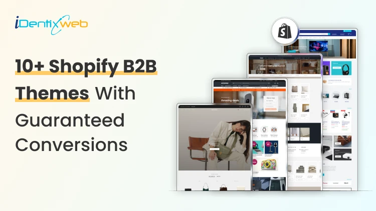
10 Min • 1 July 2026
Best B2B Shopify Theme for 2026: Free and Paid Options for Wholesale Brands
Picking the wrong B2B Shopify theme can negatively impact your wholesale operation. I have seen it happen a lot of times this year. The good news is that Shopify's B2B ecosystem has grown significantly in 2026. B2B features like company profiles, custom catalogs, and volume pricing are no longer only for Shopify Plus. Merchants on Basic, Grow, and Advanced plans can now access many native wholesale tools directly. Your theme choice, though, still matters. The right B2B Shopify theme creates a buying experience that business customers trust and return to. Being a Shopify expert, I have tried and tested many wholesale themes. In this article, I will add the best ones that have brought sales to my clients over the years. 10+ features every B2B Shopify theme must have 1. Fast predictive search and faceted filtering Wholesale buyers search by SKU, variant, category, and spec. A theme without strong filtering wastes their time and yours. 2. Bulk add-to-cart or quick order list Buyers placing orders of 200+ units cannot add items one by one. A quick order form or table view is essential. 3. Login-gated pricing display Wholesale pricing should only be visible to approved buyers. The theme must support hiding prices or showing custom prices based on customer account status. 4. Volume pricing table display The theme should surface pricing tiers clearly on product pages. Buyers need to see how the price changes at 10, 50, and 500 units without asking a sales rep. 5. App compatibility for wholesale workflows Confirm the theme works with the wholesale apps you plan to use. Some B2B Shopify themes have conflicts with third-party pricing or quick order apps. Checkout my complete breakdown on the best Shopify wholesale apps for B2B merchants in 2026. Best B2B Shopify themes for 2026 Trade: Best free B2B Shopify theme Developer: Shopify | Price: Free | Best for: New and early-stage wholesale stores Trade is the only free theme on the Shopify Theme Store built specifically for B2B merchants. Shopify designed it from scratch around wholesale workflows. The layout is clean, and product grids load fast. I love how its navigation is structured for catalog browsing. For merchants starting their Shopify wholesale business without a large budget, Trade is the most logical starting point. Key strengths: Built-in quick order form, compatibility with Shopify's native B2B features (company profiles, volume pricing, quantity rules), and customizable contact forms for capturing wholesale account inquiries. Rating: 31% Hyper: Best overall B2B Shopify theme Developer: FoxEcom | Price: $400 | Best for: High-growth wholesale and hybrid B2B stores For me, this theme is built around three problems that kill wholesale conversions: Buyers who take too many clicks to evaluate products Pricing tiers that are invisible until checkout Catalog structures that break down at high SKU counts. Hyper solves the first problem with collection list grids and featured product tabs that let buyers evaluate multiple items. Comparison tables for product specifications sit inside those category cards, reducing the back-and-forth that wastes buyers' time. The second problem is addressed through profile-based pricing display, which shows each buyer their specific pricing tier immediately on login. For distributors managing thousands of products, the semantic search and advanced filtering handle SKU discovery at scale. Key strengths: Native bulk ordering, minimum order enforcement, quick order forms, multi-currency support, volume pricing display, and cart drawer controls that are best-in-class. Rating: 99% Warehouse: Best Shopify B2B theme for large catalogs Developer: Maestrooo | Price: $320 | Best for: Distributors, manufacturers, and industrial suppliers with 1,000+ SKUs Warehouse is built to handle large catalogs. Enterprises managing tens of thousands of SKUs, complex variant structures, and multi-category inventories consistently name Warehouse as the most operationally reliable theme for their scale. Key strengths: The collection page experience is the standout feature. Advanced filtering, predictive search, sticky navigation, and mega menus with promotional tiles work together to give wholesale buyers fast, organized product discovery. I think where Warehouse requires extra work is in customer-group pricing and login gating. The theme does not include native controls for these. You need Shopify's B2B features or a dedicated Shopify B2B pricing app to implement account-specific pricing on top of the Warehouse foundation. Rating: 85% Enterprise: Best Shopify theme for hybrid B2B + DTC stores Developer: Clean Canvas | Price: $420 | Best for: Brands running retail and wholesale from one storefront Enterprise solves a specific problem: merchants who sell to consumers and wholesale buyers from the same store without wanting to build two separate storefronts. The theme handles both use cases in a single layout. Key strengths: Conversion-focused merchandising combines well with bulk ordering tools. This theme also integrates smoothly with Shopify B2B apps for account-level pricing, company profiles, and custom catalog visibility. For brands using Shopify Plus or Advanced as their plan, Enterprise works well on both, though Plus gives access to the full native B2B feature set. Rating: 94% Normcore: Best minimalist Shopify wholesale theme Developer: SalesHunterThemes | Price: $320 | Best for: B2B sellers with focused product lines and repeat buyers Normcore proves that a minimalist theme can support wholesale operations. Its setup is organized around repeat purchasing rather than new buyer discovery. Key strengths: Quick order lists and bulk add-to-cart are built in, which removes the need for third-party order apps. The mobile experience is optimized for wholesale browsing. For B2B stores where buyers return weekly or monthly with predictable orders, Normcore's layout reduces cognitive load and speeds up checkout. Rating: 100% Ignite: Best Shopify B2B theme for search-first stores Developer: FoxEcom | Price: $360 | Best for: Hybrid B2B stores with dense, specification-heavy catalogs Ignite follows a marketplace-style layout similar to how Amazon organizes product discovery. This helps buyers navigate through filters and structured product grids. For B2B stores where buyers know exactly what they need and want to find it in three clicks, Ignite is the most efficient layout available. Key strengths: The Enhanced Search feature handles dense catalogs with strong product title structuring and category hierarchies. SEO-optimized product pages and collection structures make Ignite one of the better themes for organic visibility alongside B2B functionality. Rating: 100% Prestige: Best Shopify Plus wholesale theme for premium brands Developer: Maestrooo | Price: $400 | Best for: High-end brands running premium wholesale alongside DTC Prestige combines the benefits of both luxury presentation and B2B function. Most wholesale themes sacrifice design quality for operational efficiency. Prestige does not make that trade-off. Key strengths: High-resolution imagery, editorial layouts, and refined typography are combined with full Shopify B2B app integration and tiered pricing support. Rating: 91% Keystone: Best paid Shopify B2B theme for wholesale-first stores Developer: Brickspace Lab | Price: $440 | Best for: Wholesale stores that want built-in B2B selling tools without depending too much on extra apps Keystone is built specifically around B2B storefronts, bulk buying, and account-driven selling. It has a built-in quick ordering, account limits, order minimums, upsells, bundles, and product recommendations. Key strengths: Built-in quick order list, order minimum support, account limits, slide-out cart, sticky cart, product filtering, enhanced search, mega menu, swatch filters, customizable contact forms, and Shopify Plus quantity pricing support. Rating: 100% Canopy: Best Shopify B2B theme for large carts and inventory-heavy stores Developer: Clean Canvas | Price: $420 | Best for: Wholesale stores, food suppliers, retail distributors, and merchants with large inventories Canopy is a strong option for B2B stores where buyers usually add multiple products to the cart in one session. It is Amazon-inspired, feature-rich, and optimized for large-scale selling, with a prominent search bar and always-visible cart sidebar for stores with large carts and inventories. Key strengths: Prominent search, advanced product filters, predictive search, quick order list, quick view, sticky cart, slide-out cart, mega menu, product filtering and sorting, promo tiles, stock counter, and recommended products. Rating: 95% Xtra: Best affordable premium B2B Shopify theme Developer: Someone You Know | Price: $100 | Best for: Small and mid-sized B2B stores that want premium features at a lower cost For merchants who want more than a free theme but do not want to spend $300–$400 upfront, Xtra is a practical choice. It is especially useful for stores that need quick ordering, product specifications, upsells, and strong catalog navigation without adding too many third-party apps. Key strengths: Quick order list, bulk upsells, quick view, product specifications, slide-out cart, sticky cart, product filtering, enhanced search, mega menu, swatch filters, recommended products, countdown timer, and Shopify Plus quantity pricing support. Rating: 98% Empire: Best marketplace-style Shopify B2B theme for large catalogs Developer: Pixel Union | Price: $360 | Best for: Large catalog stores, industrial suppliers, electronics sellers, and marketplace-style B2B storefronts Empire is another theme that is built for big catalogs. Shopify positions it as a theme optimized for large catalogs with advanced filters, shoppable images, product comparison, and a bold mega menu. That makes it useful for B2B stores where buyers need to move through multiple categories, compare products, and find exact items quickly. Key strengths: Advanced product filtering, enhanced search, mega menu, product comparison, quick order list, quick view, product badges, promo tiles, recommended products, slide-out cart, sticky header, swatch filters, and multi-currency/multi-language support. Rating: 79% Read my complete breakdown on things to look out for before choosing a Shopify theme this year. Choose the right B2B Shopify theme in 2026 The B2B Shopify theme landscape in 2026 is better than it has ever been. The key shift worth mentioning this year is that B2B functionality on Shopify is no longer only for Plus merchants. The platform has opened up enough that merchants on standard plans can run wholesale operations with the right theme. Your theme choice is about finding the structure that matches your buyers' behavior, not about finding the most feature-rich option on the market. FAQs 1. What is the best free B2B Shopify theme? Trade is the best free B2B Shopify theme. It is built by Shopify specifically for wholesale merchants and includes a quick order form, login-gating support, and compatibility with Shopify's native B2B features. 2. Which Shopify wholesale theme is best for large catalogs? Warehouse by Maestrooo is the most reliable Shopify wholesale theme for stores with large product catalogs. Its advanced filtering, predictive search, mega menus, and high-speed collection pages are built to handle thousands of SKUs without degrading the buyer experience. 3. Do I need Shopify Plus to use a B2B theme effectively? No. As of 2026, Shopify's native B2B features, including company profiles, custom catalogs, and volume pricing, are available on Basic, Grow, and Advanced plans. Most B2B themes work well on all plan levels. 4. How much does a good Shopify B2B theme cost? Free themes like Trade are available at no cost. Premium B2B Shopify themes range from $320 (Warehouse, Normcore) to $400 (Hyper, Enterprise, Prestige). These are one-time fees with lifetime licenses for the purchasing store.
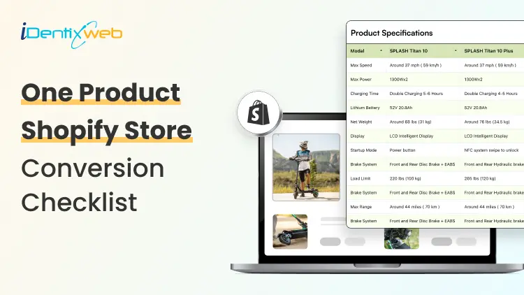
11 Min • 30 June 2026
One Product Shopify Store Conversion Checklist for Better Sales
Running a one product Shopify store sounds simple. You sell one main product, build one focused landing page, and drive traffic to one clear offer. But simplicity does not automatically mean higher sales. In fact, a one-product store has less room for mistakes. If the product page is confusing, the offer is weak, the CTA is hidden, or the checkout experience feels risky, customers may leave without buying. A one product Shopify store works best when the full shopping journey is built around one goal: helping the customer understand why this product is worth buying now. This checklist will help you optimize your shopify single product store for better conversions, stronger customer trust, and higher average order value. What is a one product Shopify store? A one product Shopify store is a Shopify store that focuses on selling one main product instead of a large catalog. The product can have variants, bundles, accessories, refills, or add-ons, but the core business is built around one hero product. For example, your store may sell: One skincare device with different color options One fitness product with bundle packs One kitchen gadget with accessories One pet product with refill packs One digital product or subscription offer The biggest advantage of a one-product store is focus. You do not need to guide visitors through multiple categories or hundreds of product choices. Instead, you can create one strong sales journey around one product, one problem, and one solution. A well-built shopify single product store can convert well because it reduces decision fatigue and keeps the customer’s attention on one clear buying decision. Why conversion optimization matters more for one product stores In a multi-product store, a visitor may browse multiple categories, compare products, and still buy something else. But in a one product Shopify store, the customer either buys your main product or leaves. That makes conversion optimization more important. Every small detail matters, such as: How fast your page loads How clear your product promise is How strong your images are How visible your CTA button is How trustworthy your reviews look How easy checkout feels How well your offer handles objections 1. Make Your Above-the-Fold Section Clear The first screen of your store decides whether visitors stay or leave. When someone lands on your one product Shopify store, they should understand three things within a few seconds: What the product is What problem it solves Why they should care Your above-the-fold section should include: A clear headline A short benefit-driven subheading High-quality product image or video Product rating or trust badge Strong CTA button Price or offer highlight One key differentiator Avoid vague headlines like: “Upgrade Your Lifestyle Today” Instead, use a specific headline like: “Remove Pet Hair From Your Sofa in Seconds” This tells the customer exactly what the product does and why it matters. For a Shopify single product store, clarity is more powerful than cleverness. Your customer should not have to scroll or guess what you sell. 2. Use Product Images That Sell the Outcome Your product images should do more than show the product. They should show the value of the product. Strong product visuals include: Clean product shots Lifestyle images Before-and-after visuals Close-up detail shots Size comparison images Product-in-use photos Packaging images Short demo videos or GIFs If your product solves a visible problem, before-and-after images can be powerful. If your product has premium materials, show close-up textures. If your product is compact, show it in a real hand, bag, kitchen, desk, or bathroom setup. For a one product Shopify store, your visuals need to replace the in-store experience. Customers cannot touch the product, so your images must answer their doubts visually. 3. Promote the Right Upsell After Purchase With SellMore Once a customer buys your product, the sales journey does not have to end there. This is where post-purchase upselling can help. For a one product Shopify store, upselling needs to be simple and relevant. Since you sell one main product, your best upsell offers may include: Refill packs Product accessories Extended warranty Gift packaging Priority shipping Care kit Bundle upgrade Second item at a discount Subscription refill offer You can use SellMore Post Purchase Upsell to show one-click upsell, cross-sell, bundle, checkout, post-purchase, thank you page, and order status page offers. The app also includes upsell funnels, AI-driven recommendations, and detailed analytics to track offer performance. This is useful because the customer has already completed the main purchase. Instead of disturbing the buying decision before checkout, you can show a relevant add-on after the order is placed. 4. Write Benefit-First Product Copy A common mistake in one-product stores is writing only feature-based copy. Features explain what the product has. Benefits explain why the customer should care. Example: Feature: Made with stainless steelBenefit: Built to last longer and resist rust during daily use Feature: 10-hour battery lifeBenefit: Use it all day without charging again and again Your product page should include both, but the benefits should lead. For a Shopify single product store, your copy should feel like a guided sales conversation. It should answer the questions customers are already thinking but may not ask directly. 5. Add a Strong Product Story A one-product brand needs a story because the whole store is built around one offer. Your product story can answer: Why was this product created? What problem inspired it? Who is it made for? What makes it different? Why is it better than common alternatives? This does not need to be long. Even a short brand story can make your store feel more real. Example: “We created this product after seeing how many pet owners struggled with hair on clothes, sofas, and car seats. Most rollers worked once and then became useless. So we designed a reusable cleaner that works every day without waste.” This type of story gives customers a reason to connect emotionally with your product. It also makes your one product Shopify store feel less like a dropshipping page and more like a real brand. 6. Use One Main CTA Across the Page Your store should not confuse customers with too many actions. For a one-product store, the main action is usually: Buy Now Add to Cart Try It Today Get Yours Now Shop Now Use one main CTA style across your page. Keep it visible above the fold and repeat it after important sections. Best CTA placement: Hero section After benefits section After reviews After pricing or bundle section Near FAQs Sticky mobile bottom bar Avoid using too many competing buttons like “Learn More,” “Explore,” “Contact Us,” and “Read Blog” in the main sales flow. A one product Shopify store should guide visitors toward purchase, not distract them. 7. Build Trust Before Asking for the Sale Trust is one of the biggest conversion factors for a one product Shopify store. Because the store sells only one product, customers may ask: Is this product real? Will it work for me? Is the store trustworthy? What if I do not like it? How long will shipping take? Can I return it? Are the reviews genuine? Add trust signals throughout the page, not only at the bottom. Important trust elements include: Customer reviews Star ratings Video testimonials User-generated content Secure payment badges Money-back guarantee Clear return policy Shipping timeline Brand story Contact details FAQ section Real product images Do not hide important trust information. If shipping takes 5-8 days, say it clearly. If returns are available within 30 days, mention it near the CTA. If your product has a warranty, show it before checkout. 8. Add Reviews That Answer Real Objections Generic reviews like “Great product!” are not enough. Your reviews should answer objections. For example: “I thought it would be too small, but the size is perfect.” “Shipping took 5 days and the packaging was good.” “I have tried other products, but this one actually worked.” “The setup took less than two minutes.” “I bought one for myself and ordered another for my sister.” These reviews help new customers feel more confident because they answer practical doubts. Use different review formats: Text reviews Photo reviews Video reviews Before-and-after reviews Reviews by use case Reviews by customer type For a Shopify single product store, reviews should not just prove that people bought the product. They should prove that people got the result they expected. 9. Optimize Your Store for Mobile Buyers Most shoppers will likely view your store on mobile, especially if you run ads from Instagram, TikTok, Facebook, or YouTube Shorts. Your mobile experience should be fast, clean, and thumb-friendly. Mobile conversion checklist: CTA button is visible without zooming Product images load fast Text is easy to read Reviews are easy to scroll Sticky add-to-cart button is enabled Checkout buttons are easy to tap No popups blocking the screen Product price is visible Variant selection is simple FAQ accordion is easy to open Do not design only for desktop. Many one-product stores look beautiful on desktop but feel crowded on mobile. Check your page on a real phone before publishing. Scroll like a customer. Tap every button. Try adding the product to cart. Test checkout. If anything feels slow or confusing, fix it. 10. Improve Page Speed and Loading Experience Page speed directly affects conversions. A slow product page can increase bounce rate and reduce sales. For a one product Shopify store, speed matters even more because many visitors come from paid ads. Every slow-loading second can waste ad spend. Speed optimisation checklist: Compress images before uploading Use WebP images where possible Avoid too many third-party apps Remove unused scripts Use lightweight sections Limit autoplay videos Test your theme speed Avoid heavy sliders Use lazy loading for lower-page images Do not overload the store with animations just to make it look premium. A clean, fast-loading page usually converts better than a slow, fancy page. 11. Add Scarcity and Urgency Carefully Urgency can improve conversions, but fake urgency can damage trust. Good urgency examples: “Sale ends tonight” “Only 12 left in stock” “Order today for dispatch tomorrow” “Limited launch offer” “Free gift available for first 100 orders” Bad urgency examples: Countdown timer that resets every time Fake low-stock alerts “Only 3 left” for weeks Too many flashing banners Use urgency only when it is true. For a Shopify single product store, trust is more valuable than short-term pressure. Customers are more likely to buy when urgency feels real and the offer feels fair. 12. Keep Navigation Simple Your navigation should support conversion, not distract from it. For a one-product store, your menu can include: Product Reviews How It Works FAQs Track Order Contact Avoid adding too many links to blogs, collections, unrelated pages, or external profiles in the main navigation. Your homepage and product page may even be the same page. That is completely fine for a one product Shopify store if the page includes everything customers need to make a buying decision. The goal is simple: keep visitors moving toward checkout. FAQs About One Product Shopify Store Conversion 1. Is a One Product Shopify Store good for beginners? Yes, a one product Shopify store can be good for beginners because it is easier to manage than a large catalog store. However, the product page, offer, and marketing need to be strong because the entire store depends on one main product. 2. How do I increase sales on a shopify single product store? To increase sales on a Shopify single product store, improve your product images, headline, CTA, reviews, page speed, mobile layout, and checkout experience. You can also use post-purchase upsells to increase average order value after the first purchase. 3. What should a one-product store homepage include? It should include a clear hero section, product benefits, product images, reviews, pricing, FAQs, guarantee, shipping details, and a strong CTA. The page should guide customers from problem awareness to purchase without distractions. 4. Can I add upsells to a One Product Shopify Store? Yes, you can add upsells such as accessories, refills, warranties, bundles, gift packaging, or second-unit discounts. Post-purchase upsells work especially well because they appear after the customer completes the main order. 5. What is the biggest mistake in a shopify single product store? The biggest mistake is assuming one product means one simple page with very little information. Customers still need clear benefits, proof, trust signals, shipping details, return policy, and strong reasons to buy.

Bhavesha Ghatode
6 Min • 7 August 2025
919 Views

Bhavesha Ghatode
9 Min • 6 August 2025
924 Views
![Starting a Food Truck Business in Just 6 Simple Steps [2025]](https://www.identixweb.com/wp-content/uploads/2025/08/01-08-Fri-Blog-Starting-a-Food-Truck-Business-in
Just-6-Simple-Steps-2025-1.webp "Starting a Food Truck Business in Just 6 Simple Steps [2025]")
Vineet Nair
10 Min • 6 August 2025
983 Views

Bhavesha Ghatode
10 Min • 5 August 2025
965 Views

Vineet Nair
11 Min • 5 August 2025
1072 Views

Bhavesha Ghatode
12 Min • 4 August 2025
1035 Views

Vineet Nair
7 Min • 1 August 2025
972 Views

Bhavesha Ghatode
9 Min • 31 July 2025
927 Views

Vineet Nair
9 Min • 30 July 2025
1104 Views

Bhavesha Ghatode
14 Min • 29 July 2025
1060 Views

Bhavesha Ghatode
9 Min • 28 July 2025
1095 Views

Vineet Nair
10 Min • 26 July 2025
1098 Views