Blog
Gather knowledge about the latest insights, updates, tips, and tricks in the Ecommerce industry.

5 Min • 20 March 2026
How Anua Unlocked 5X AOV Growth with iCart’s Smart Cart Features
delivery customization Challenges Solutions drive results Scale business delivery customization Challenges Solutions drive results Scale business delivery customization Challenges Solutions drive results Scale business delivery customization Challenges Solutions drive results Scale business Anua is a globally recognized Korean skincare brand known for its minimalist philosophy and focus on gentle yet effective formulations. Built on the idea of simplifying skincare routines, Anua develops products that deliver visible results while avoiding harsh or irritating components, making them suitable for sensitive skin types. Initially using a traditional full cart experience, Anua transitioned to iCart’s side cart solution in August 2025, to create a more seamless and engaging shopping journey. This shift allowed customers to easily explore complementary skincare products without disrupting their browsing flow, making it more intuitive to discover items that fit into a complete routine. By surfacing relevant recommendations directly within the cart, the brand enhanced product visibility across its range. Challenges Before implementing iCart’s side cart solution, Anua faced limitations with their existing full cart experience, which created friction in the customer journey. The traditional cart setup redirected users away from product pages, interrupting their browsing flow and reducing opportunities to explore additional products. As a skincare brand built around routines rather than single-item purchases, this made it difficult to effectively showcase complementary products and encourage customers to build complete regimens. Additionally, the lack of in-cart personalization and strategic upsell opportunities meant that customers were often unaware of related products that could enhance their skincare results. This limited the brand’s ability to increase average order value (AOV) and fully leverage its diverse product range. Anua needed a more dynamic and intuitive cart experience that could seamlessly introduce relevant recommendations while maintaining a smooth and engaging shopping journey. ❌ Cart Value Barriers Low average order value (AOV) due to single-item focus Most customers completed purchases with one primary product instead of building multi-step routines. Cart abandonment near shipping thresholds Customers were not clearly informed or motivated to reach free shipping or discount thresholds. Missed savings opportunities Customers were unaware of potential value in purchasing bundled routines or multiple complementary products. ❌ Absence of Progress-Based Incentives No free shipping or discount progress bar Customers were not motivated to increase their cart value due to lack of visible incentives. Missing tiered rewards system There were no structured milestones (e.g., “Spend more to unlock offers”), reducing upsell opportunities. ❌ Ineffective Cart UI/UX (Pre-Side Cart) Full-page cart disrupted shopping flowCustomers had to leave their browsing journey, increasing friction and drop-offs. No quick add/remove functionality Users couldn’t easily modify their cart or add suggested products without navigating away. Solution To overcome these challenges, Anua implemented iCart’s side cart solution to transform their traditional cart into a high-converting, interactive experience. By replacing the full-page cart with a seamless side cart, the brand ensured that customers could continue browsing while viewing their cart, significantly reducing friction in the shopping journey. Additionally, features like product recommendations & progress bars for free shipping and discounts motivated customers to increase their cart value. By combining personalization, incentive-driven messaging, and a user-friendly interface, Anua successfully turned their cart into a powerful revenue-driving touchpoint rather than just a checkout step. To maximize their cart effectiveness, they implemented two powerful features: ✅ Progress Bar with Multi-Reward Incentives Implemented a tiered progress bar to encourage higher cart value Customers are guided with a clear message like “Add $3.10 to unlock secret offer,” motivating them to continue adding products. Generated over $5M+ in revenue through incentive-driven cart progression Used product-based rewards to align with customer intent Instead of generic discounts, Anua incentivized purchases with relevant skincare items like Dark Spot Pads and mini serums. Built visual motivation for routine expansion As customers add products, they can clearly track progress toward unlocking multiple rewards, encouraging them to build a complete skincare routine. ✅ Product Recommendations Implemented “Frequently Bought Together” recommendations Customers adding a single product (e.g., toner) are shown complementary items like serums, moisturizers, or pads to complete their routine. Generated over 275K revenue through in-cart recommendations Encouraged full skincare regimen building Instead of isolated purchases, the cart suggests step-by-step product combinations aligned with common skincare routines. Increased product discovery at the final stage By surfacing relevant items directly in the cart, Anua ensured customers explore more of their catalog without leaving the checkout flow. Results Achieved in Last 180 Days 22932 Total Store Orders 45101 Total iCart Orders 5X iCart Generated AOV 65.70% Upsell Affected Conversion Rate These improvements reflect a clear shift in customer behavior on Anua’s store. Cart abandonment reduced as shoppers discovered complementary skincare products and felt encouraged to build complete routines. Engagement also increased, with customers interacting more with in-cart recommendations and exploring relevant product pairings. Results & Impact And...Results is Our Main Clarification By implementing iCart’s cart drawer, product recommendations, and progress bar, Anua transformed its cart into a high-performing conversion touchpoint. Shopping Experience Enhancement The improved cart experience encouraged customers to discover complementary products and understand the value of sustainable beauty routines. For instance, the clear presentation of subscription savings alongside one-time purchase options helped customers make more informed decisions about their long-term hair care needs. As Anua continues to optimize its cart experience, the brand is closely monitoring: Routine-based purchasing behavior - tracking how customers move from single items to multi-step regimens Engagement with in-cart recommendations - measuring interaction with suggested products Cart value progression - analyzing how incentives influence higher spending [related_cases_slider] Ready to Write Your Success Story? Try icart App Join successful businesses like Anua and Master your delivery scheduling Delight customers with precise timing Grow your special occasion orders Expand your delivery reach
Read Blog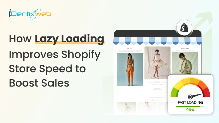
8 Min • 11 July 2026
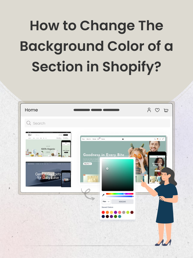
How to Enable Shopify Lazy Load (2026 Step-by-Step Guide)
Images are always the heaviest thing on a Shopify page. Loading every one of them the moment a page opens is what affects the store’s speed. Shopify lazy load is the fix. It tells the browser to download images only as a shopper scrolls toward them. The first screen loads fast, and your visitors stop staring at a blank layout. I have helped design enough Shopify stores to know the mistakes owners make during optimization. I will walk you through the whole thing the way I actually do it. You will learn what lazy loading is, how to check what your theme already does, and how to enable lazy loading in your store. What is lazy loading? Lazy loading is a technique that delays loading images, videos, and other heavy files until they are about to appear on screen. Instead of fetching every image the instant a page opens, the browser downloads only what a visitor can see, then pulls in the rest as they scroll. Less to download up front means a faster store speed and lower data usage, which matters most on mobile. When a page loads, the browser reads the HTML and queues every <img> tag for download. Grabbing all of them at once slows everything down. Lazy loading tells the browser to hold off on the images below the fold, the ones a shopper cannot see yet. One thing worth knowing is that you no longer need to be technical to enable lazy loading. But there are a few things I do before I add lazy loading in the store. First, check if your Shopify theme already lazy loads Most themes built on Online Store 2.0, including Dawn, Craft, Sense, and Refresh, ship with lazy loading on below-the-fold images by default. Adding it again on top duplicates the attribute. Here is the 20-second check I do: Open a collection or product page that has images below the fold. Right-click any image you have to scroll to reach, then click Inspect. Look at the <img> tag in the panel that opens. If you see lazyload and you did not add it yourself, your theme already handles it. Here's how I checked if lazy loading is enabled in the Shopify store, Houseplant. So if your theme is modern and you have already added lazy load, leave it alone. If you are on an older theme or building custom sections, here’s how you can set it up. How to set up Shopify lazy load in your theme? If your theme does not lazy load, or you are editing custom sections, you add the loading="lazy" attribute to the image tags in your Liquid files. The best method in 2026 is to render images with Shopify's image_tag filter, which handles lazy loading, responsive sizing, and dimensions for you. Whatever route you take, duplicate your theme first, so you have a safe rollback if something breaks. Go to Online Store > Themes, click Actions next to your live theme, and choose Duplicate. Work on this copy. To enable lazy loading in Shopify across the whole store, you edit the theme's section and snippet files. Go to Online Store > Themes > Actions > Edit code, then search your files for <img. Common places to look: snippets/card-product.liquid for the product cards used across collections and recommendations sections/featured-collection.liquid for homepage product rows sections/main-collection-product-grid.liquid for collection page grids Add loading="lazy" to the image tags that render below-the-fold content, then save and preview. For example: <img src="{{ section.settings.image | image_url: width: 800 }}" loading="lazy" alt="Product Image"> Pair lazy loading with correctly sized files too. My Shopify image size guide covers the dimensions that keep files light. Which images should you lazy load? The one rule that matters most: do not lazy load anything a shopper sees the instant the page opens. Below are the images you should definitely add the lazy load attribute. Product gallery images Recommended and recently viewed products Blog body images Footer images and badges Lazy loading and Core Web Vitals in 2026 Core Web Vitals are Google’s way of measuring how fast, stable, and responsive your Shopify store feels to visitors. Google currently measures three main Core Web Vitals: 1. Largest Contentful Paint (LCP) LCP measures how quickly the main content at the top of the page appears. This is often your hero banner, product image, or large heading. A good LCP score is under 2.5 seconds. Your main hero image should not be lazy-loaded because customers need to see it immediately. Instead, load the hero image normally and lazy-load images farther down the page. 2. Cumulative Layout Shift (CLS) CLS measures whether content unexpectedly moves while the page is loading. A good CLS score is under 0.1. For example, a customer may try to tap a product button, but an image suddenly loads above it and pushes the button downward. This creates a frustrating shopping experience. 3. Interaction to Next Paint (INP) INP measures how quickly your store responds after a customer clicks, taps, or interacts with something. A good INP score is under 200 milliseconds. Check your scores by visiting ‘pagespeed.web.dev’ and entering your store URL. What this means for your Shopify store Lazy loading works best when you: Load hero images and other above-the-fold content immediately. Lazy-load product images and content farther down the page. Add width and height values to prevent layout movement. Avoid loading too many large images at the same time. Test important pages after making changes. In my experience, collection pages often benefit the most because they usually contain many product images. Do you need a lazy load Shopify app? For images alone, you usually do not need an app. Native browser lazy loading works everywhere, and Shopify's image_tag filter applies it for you. Where a lazy load Shopify app earns its place is in bundling. The good ones compress files, add video facades, defer non-critical scripts, and fix Core Web Vitals. This is useful if you do not want to touch code. If you are weighing options, my guide on top Shopify tools for growth combines image optimization with speed fixes. My honest take after doing this for a living: reach for native lazy loading first, add a well-reviewed speed app only if you need the extra features. If you do want apps for this. I would recommend 3 that I have worked with. 1. Tiny SEO Speed Image Optimizer Tiny SEO offers lazy loading alongside image compression, resizing, alt-text optimization, broken-link management, and other SEO tools. It is a suitable option for merchants looking for an all-in-one image and store optimization app. 2. Avada AI SEO Suite Optimizer Avada combines lazy loading with image optimization, code minification, SEO audits, structured data, and redirects. It can be useful for merchants who want to improve both store speed and technical SEO from one dashboard. 3. WEBP Image Optimizer+Speed SEO This app compresses images, converts JPG and PNG files to WebP, and provides built-in lazy loading. It is worth considering if large image files are the main reason your product or collection pages load slowly. How to test that lazy loading is working Start with DevTools: Open a page with below-the-fold images, right-click, and choose Inspect. Go to the Network tab and, if you like, filter by Img. Refresh the page and scroll slowly from the top. If image requests fire as you scroll instead of all at once, lazy loading is working. I tested it on Netlfix.shop, which is Netflix’s merch store built on Shopify Get Shopify lazy load right Get lazy load in your Shopify store right by letting your theme and the image_tag filter handle the media. Check what your theme already does before you write a single line of code, test with DevTools and PageSpeed Insights. Reach for an app or a developer when you genuinely need more than images handled. FAQs 1. Does Shopify lazy load images by default? Most modern Online Store 2.0 themes apply loading="lazy" to below-the-fold images automatically. Older themes may not. To confirm, right-click an image you have to scroll to see, choose Inspect, and check the <img> tag for loading="lazy". 2. How to lazy load images in Shopify? Shopify themes usually support lazy loading through the loading="lazy" attribute or the Shopify image_tag Liquid filter. To add lazy loading manually, go to Shopify Admin → Online Store → Themes → … → Edit code, open the relevant section or snippet, and find the image code. Add loading="lazy" to a standard image tag—<img src="image.jpg" loading="lazy" width="800" height="600">—or use Shopify Liquid: {{ image | image_url: width: 800 | image_tag: loading: 'lazy' }} 3. What is lazy loading? Lazy loading is a technique that delays loading images and other media until they are close to appearing on the customer’s screen. It reduces the amount of content loaded initially, helping Shopify pages open faster and use less bandwidth. 4. Which is the best lazy load Shopify app? Tiny SEO Speed Image Optimizer is one of the best lazy-loading apps for Shopify because it combines smart lazy loading with image compression, resizing, alt-text optimization, and other speed features.
7 Min • 28 June 2026
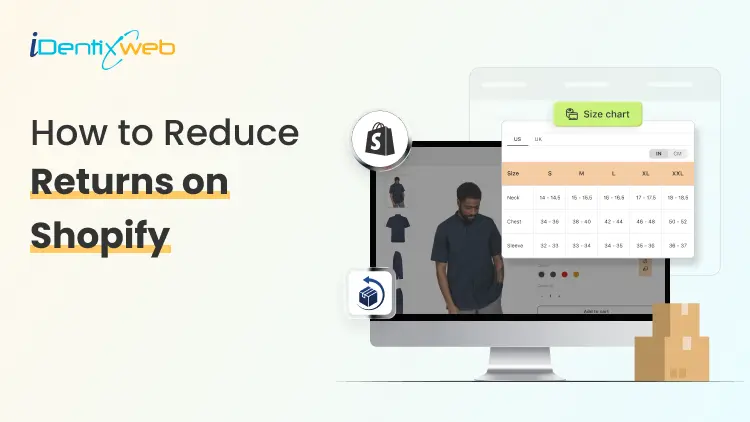
How to Reduce Returns on Shopify: A Complete Guide for Store Owners
Returns on Shopify are one of the quietest profit leaks in ecommerce. The sale shows up in your dashboard, you feel good for a minute, and then the refund request hits a week later. Shipping is paid both ways, the product comes back used or damaged, and the margin you thought you earned is gone. The good news? Most returns on Shopify are preventable. They come down to a few fixable things: unclear product pages, weak sizing info, delivery confusion, and a return policy that does more harm than help. This guide walks you through each lever, in plain language, so you can keep more of every sale you earn. Why Returns on Shopify Hurt More Than You Think A return is never just a refund. Every product that comes back carries hidden costs that stack up fast: Two-way shipping - you often pay outbound and return labels. Restocking labour - someone has to inspect, clean, repackage, and shelve it. Lost inventory value - around 40% of returned items can no longer be sold as new. Customer support time - back-and-forth emails, refund processing, and follow-ups. Lost trust - a bad return experience can stop a customer from buying again. Industry data from Shopify suggests reverse logistics now eats up around 30% of operational costs for many online stores. Cutting your return rate by even three or four points can free up serious cash you can put back into product, ads, or growth. The Top Reasons Customers Return Products on Shopify Before you fix returns on Shopify, you need to know why they happen. The numbers are surprisingly consistent across studies: The product did not match the description or photos Wrong size or fit Quality below expectations Changed mind or buyer's remorse Wrong item shipped Damaged in transit "Bracketing" - buying multiple sizes to keep one Did you notice something? Almost every reason on this list traces back to a gap between expectation and reality. Close that gap, and your shopify order return volume drops with it. 9 Proven Ways to Reduce Returns on Shopify Here are the nine levers that move the needle most. You do not need to do all of them at once. Start with the two or three that match your top return reasons. 1. Write Product Descriptions That Set Honest Expectations Most product pages are written like ad copy. They list features and lean on adjectives. The pages that actually reduce returns read more like an honest friend describing the product. Cover the boring details people actually care about: Exact measurements (length, width, depth, weight) Materials and what they feel like Care instructions and washing guidance What the product is not, or who it is not for 2. Add a Clear Shopify Size Chart to Every Apparel Product If you sell anything that has to fit a body, your shopify size chart is the single biggest return-reduction tool you have. Around 45% of apparel returns happen because of sizing alone. Fix that one thing and you can cut your return rate almost in half. A strong size chart does three things: Shows actual garment measurements, not just S/M/L labels Lists values in both inches and centimetres Includes a short "how to measure" guide with a visual The problem? Building a clean, mobile-friendly size chart in Shopify by hand is painful. You end up with broken tables on phones, ugly styling, or charts that do not update across products. This is where a dedicated table app makes life easier, you build the chart once and reuse it everywhere. 3. Set Clear Delivery Expectations Before Checkout A shocking number of returns are not about the product at all. They are about delivery. The order arrives late, on the wrong day, or after the event the customer needed it for. They do not want it anymore, so back it goes. Show estimated delivery dates clearly on the product page, in the cart, and at checkout. Let customers pick a slot when it makes sense cakes, flowers, perishables, gifts, and big-ticket items all benefit from this. 4. Use High-Quality Photos and Video From Multiple Angles One photo is never enough. Customers buy with their eyes, and when reality does not match the image, the product comes straight back. A solid product gallery includes: Front, back, and side views on a clean background Close-ups that show texture and stitching Lifestyle shots that show scale and context A short video (15-30 seconds) of the product in real use A Shopify guide on returns notes that user-generated photos and videos build the strongest trust because they show the product as buyers actually receive it. 5. Let Real Customer Reviews Do the Talking Reviews are the closest thing to a try-on experience your store has. Encourage them, sort them, and surface the ones that mention fit, quality, and use case. Make reviews work harder for you by: Asking for photo reviews after delivery Adding filters like "runs small" or "true to size" Highlighting reviews from people with similar body types or use cases Replying to negative reviews honestly, it builds trust 6. Improve Packaging and Quality Control Before Shipping Around 5-12% of returns are caused by damage in transit or the wrong item being shipped. Both are entirely within your control. Tighten the basics: Inspect every order before it leaves the warehouse Use protective packaging that suits the product weight and shape Double-check size, colour, and variant against the order Add a small "how to use" insert for products with a learning curve 7. Offer Exchanges Before Refunds When a customer wants to return, your first response should not be "refund issued". It should be "would an exchange work?" Save the sale by making exchanges easier than refunds: Offer free shipping on exchanges Provide a small store credit bonus (5-10%) for choosing exchange Suggest the next size or a similar product right inside the return flow Let customers swap colours, sizes, or variants without re-ordering Frequently Asked Questions 1. What is a good customer return rate on Shopify? Most Shopify stores see return rates between 17% and 20%. Apparel stores can hit 30-40%, while electronics often stay under 10%. A healthy target is to land below your category average and trend downward each quarter. 2. How do I check my return rate in Shopify? Inside your Shopify admin, go to Analytics > Reports and open the "Orders and returns by product" report. You can also calculate it manually: divide the number of returned items by the number of items sold in the same window, then multiply by 100. 3. How do I edit the order status page on Shopify? Go to Settings > Checkout > Order status page in your Shopify admin. You can add additional scripts, custom messages, FAQs, and post-purchase content. Many merchants use this space to add tracking widgets, support links, and upsell offers. 4. How can I reduce sizing-related returns on Shopify? Add a clear size chart with actual measurements, include a "how to measure" guide, surface fit-related reviews, and consider a size recommendation quiz. 5. What is bracketing and how do I stop it? Bracketing is when a customer buys multiple sizes or colours intending to return all but one. You can reduce it by offering strong sizing tools, accurate fit reviews, and gentle policy nudges like a restocking fee on multi-size orders. Final Thoughts Returns on Shopify will never hit zero, and that is fine. The goal is not perfection. It is reducing the avoidable ones. Start with the two or three changes that match your biggest return reasons. Add a size chart if you sell apparel. Rewrite your top product descriptions. Edit your order status page. Offer exchanges before refunds. Each of these small fixes compounds, and three months from now, your return rate will look noticeably healthier.
9 Min • 30 June 2026
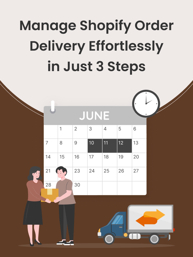
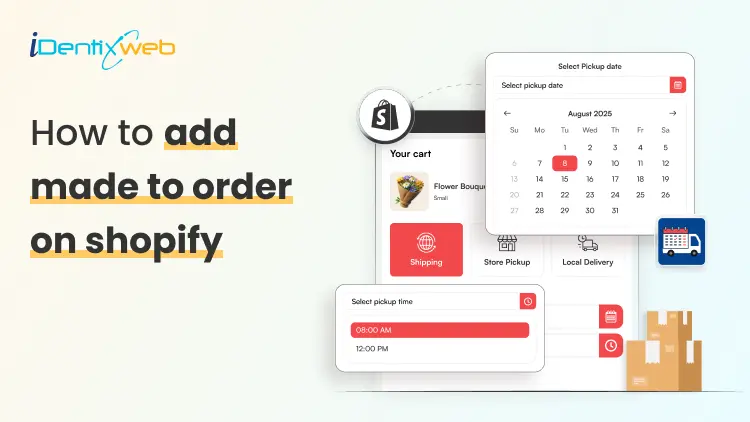
How to Set Up Delivery Scheduling for Made-to-Order Products on Shopify
Made-to-order products are a great fit for Shopify stores that sell custom, handmade, personalized, fresh, or production-based items. Instead of keeping every product ready in stock, you create the item after a customer places an order. This model works well for custom cakes, flower bouquets, handmade jewelry, engraved gifts, tailored clothing, personalized hampers, furniture, artwork, printed products, and many other custom items. But there is one challenge many merchants face: customers do not just want to know that the product is made for them. They also want to know when it will be ready. In this guide, we will cover how to add made to order on shopify, how to set up delivery scheduling, and how to manage production timelines without confusing your customers. What Does Made-to-Order Mean on Shopify? A made-to-order product is a product that is created only after the customer places an order. Unlike regular ready-stock products, these items usually need extra time for preparation, customization, packaging, or delivery planning. For example: A bakery prepares a custom cake after receiving the order. A florist creates a fresh bouquet for a selected date. A jewelry brand engraves initials after purchase. A clothing store stitches or customizes the item after order confirmation. A gift store prepares a personalized hamper based on selected products. The main point is simple: the product is not instantly ready to ship. It needs a clear production timeline and a clear delivery or pickup schedule. Shopify lets merchants create products, add variants such as size or color, and manage product details through the admin. Shopify’s own variant setup allows merchants to add options, values, images, prices, quantities, SKUs, and other product details for different variants. So when people search for how to add made to order on Shopify, they are usually looking for more than a product listing. They want a complete setup where customers understand the customization, production time, and delivery date before placing the order. Why Delivery Scheduling Matters for Made-to-Order Products Made-to-order products depend on timing. A customer ordering a birthday cake, wedding bouquet, custom gift, or event-based product cannot wait for a vague delivery estimate. They need confidence that the product will arrive on the right date. Delivery scheduling helps you: Show available delivery or pickup dates. Add preparation time before customers can choose a slot. Block holidays or unavailable dates. Limit orders per day or time slot. Manage same-day or next-day delivery with cutoff times. Give your team enough time to prepare each order properly. This is especially useful for stores selling fresh, personalized, or event-specific products. Without proper scheduling, customers may choose dates your team cannot fulfill. That creates pressure, delays, refund requests, and poor customer experience. A strong order scheduling Shopify setup solves this problem by connecting the customer’s preferred delivery time with your store’s real production capacity. Use Stellar Delivery Date & Pickup to Make Scheduling Easier For Shopify merchants who sell made-to-order products, the Delivery Date & Pickup Stellar app can make the scheduling process much easier. The app lets customers select a delivery date and time for local delivery, store pickup, and shipping directly from the cart or product page. It also supports estimated delivery date and time, same-day delivery cutoff time, time slot limits, blackout dates, holidays, and route planning. This is helpful because made-to-order stores often need more control than a normal shipping setup. For example, a bakery may want to accept only 20 cake orders per day. A florist may want to block Valentine’s Day slots once capacity is full. A handmade gift store may need three preparation days before showing available delivery dates. For made-to-order stores, this turns delivery scheduling from a manual follow-up task into a smoother buying experience. What You Need Before Setting Up Made-to-Order Products Before you start the setup, prepare the basics. This makes the product page clearer and reduces customer confusion. 1. Clear Product Details Write a product description that explains what is made to order, what customers can customize, and how long production takes. Include details like: Available customization options Materials or ingredients used Size, color, or design choices Production time Delivery or pickup instructions Return or cancellation policy for custom products 2. Product Images or Samples Even if the final product is custom, customers still need visual confidence. Add sample images, past order photos, mockups, or style references. 3. Production Timeline Decide how much time you need before an order can be delivered. For example: Custom cake: 2 days Handmade jewelry: 5–7 days Printed T-shirt: 3 days Custom furniture: 15–20 days Personalized hamper: 1–2 days This production time should be reflected in your delivery schedule. 4. Capacity Limits Do not accept more orders than your team can handle. Decide your daily or slot-wise limit. For example: 10 custom cakes per day 5 flower deliveries per time slot 20 gift hampers per day 3 furniture deliveries per week Stellar’s order limit feature lets merchants control how many orders can be accepted daily or per time slot for shipping, store pickup, and local delivery. How to Add Made to Order on Shopify and Schedule Delivery Dates Now let’s move to the practical setup. Step 1: Create a New Product in Shopify Go to your Shopify admin and open: Products > Add product Add your product title, description, images, price, category, and product status. For the product title, make it clear that the item is made to order. For example: Custom Birthday Cake - Made to Order Personalized Name Necklace - Made to Order Fresh Flower Bouquet - Made to Order Handmade Wooden Frame - Made to Order In the product description, mention that the item is prepared after purchase. Add the estimated production time and delivery instructions. Example: “This product is made after your order is placed. Please allow 3-4 working days for preparation. You can choose your preferred delivery date at checkout.” This small detail sets the right expectation before customers add the product to cart. Step 2: Add Product Variants for Basic Choices If your product has standard options, add them as variants. Variants are useful for choices like: Size Color Material Flavor Finish Style Quantity pack For example, a made-to-order cake may have variants for size and flavor. A personalized bracelet may have variants for metal color and chain length. Shopify allows merchants to add product options like size or color from the Variants section and add option values for the product. Keep your variants simple. Too many options can overwhelm customers. If you need detailed personalization, use custom fields or a product options app instead of creating too many variant combinations. Step 3: Add Customization Fields Made-to-order products often need customer input. For example: Name to engrave Message for cake Preferred flower color Uploaded image Gift note Custom measurement Design reference You can collect this information through product options, line item properties, or customization apps. The goal is to make sure the customer gives all required details before checkout. Use clear labels like: “Enter the name you want printed” “Upload your design file” “Add your cake message” “Choose your preferred delivery occasion” “Mention any special instruction” Also, add character limits where needed. This prevents long text that may not fit on the product. Step 4: Set Inventory Based on Your Production Model Inventory for made-to-order products can be tricky because you may not have finished stock ready. You may only have raw materials, production capacity, or supplier availability. Step 5: Add Production Time to Your Delivery Schedule This is where many Shopify stores make mistakes. They add made-to-order products but forget to adjust delivery availability. For example, if a custom cake needs two days to prepare, customers should not be able to select today or tomorrow as the delivery date. Set a preparation buffer before the first available delivery date. This protects your team and keeps expectations realistic. Example setup: Product ordered on Monday Preparation time: 2 days First available delivery date: Thursday Unavailable dates: Sunday and public holidays Time slots: 10 AM-12 PM, 2 PM-4 PM, 5 PM-7 PM Step 6: Use Cutoff Times for Same-Day or Next-Day Orders Cutoff time means the last time a customer can place an order for a certain delivery option. For example: Orders before 11 AM qualify for next-day delivery. Orders after 11 AM can only choose delivery from the following day. Same-day pickup is available only before 2 PM. Weekend delivery closes every Friday at 5 PM. Stellar Delivery Date & Pickup supports cutoff time settings so merchants can hide same-day delivery slots after a set deadline. This helps stores manage logistics more smoothly and show only realistic delivery slots. This is very useful for made-to-order products because production teams need time to prepare, pack, and dispatch orders. Step 7: Set Order Limits Per Day or Time Slot If your team can make only a fixed number of products per day, order limits are necessary. For example: Product TypeDaily LimitSlot LimitCustom cakes20 orders5 per slotFlower bouquets50 orders10 per slotHandmade gifts15 orders5 per slotTailored clothing5 ordersNot required Without order limits, too many customers may select the same date. That can lead to delays and quality issues. With a proper scheduling setup, customers only see dates and slots that your team can actually handle. Conclusion Setting up made-to-order products on Shopify is not just about adding a product and writing “custom” in the description. You need a complete process that covers customization, production time, inventory logic, delivery scheduling, cutoff times, capacity limits, and customer communication. When customers know what they can customize and when they can receive the product, they feel more confident placing the order. Your team also gets a clearer workflow for preparing and fulfilling each order on time. FAQs 1. How to add made to order on shopify? To add a made-to-order product on Shopify, create a product, mention “Made to Order” in the title or description, add variants or custom fields, set inventory based on your production model, and add delivery scheduling rules. 2. Can Shopify handle made-to-order products? Yes, Shopify can handle made-to-order products using product listings, variants, product options, inventory settings, and delivery scheduling apps. For advanced personalization or scheduling, apps make the process easier. 3. What is the best way to set delivery dates for made-to-order products? The best way is to use a delivery date picker with preparation time, cutoff time, blocked dates, and order limits. This ensures customers can select only realistic delivery or pickup dates. 4. Why is order scheduling shopify important for custom products? Order scheduling shopify is important because custom products need production time before delivery. A proper schedule helps merchants avoid overbooking, manage capacity, and give customers clear delivery expectations.
![How Bike Stores Using Shopify Are Winning [Complete 2026 Guide]](https://www.identixweb.com/wp-content/uploads/2025/11/17-11-Mon-Blog-Complete-Guide-to-Selling-Bikes-on-Shopify.webp "How Bike Stores Using Shopify Are Winning [Complete 2026 Guide]")
Vineet Nair
8 Min • 18 November 2025
516 Views
![The 20 Best Shopify Beauty Store Examples [Latest Update]](https://www.identixweb.com/wp-content/uploads/2025/11/14-11-Fri-Blog-The-20-Best-Shopify-Beauty-Stores.webp "The 20 Best Shopify Beauty Store Examples [Latest Update]")
Vineet Nair
10 Min • 17 November 2025
651 Views

Vineet Nair
9 Min • 13 November 2025
507 Views
![How to Create Shopify Bundles With & Without an App [2026]](https://www.identixweb.com/wp-content/uploads/2025/11/10-11-Mon-Blog-How-to-Create-Shopify-Bundles_-With-Without-a-Shopify-App.webp "How to Create Shopify Bundles With & Without an App [2026]")
Vineet Nair
6 Min • 11 November 2025
525 Views
![Black Friday Statistics: The Only Stats Merchants Need [2026]](https://www.identixweb.com/wp-content/uploads/2025/11/10-11-Mon-Blog-Top-Black-Friday-Stats-Every-Online-Merchant-Should-Know.webp "Black Friday Statistics: The Only Stats Merchants Need [2026]")
Vineet Nair
5 Min • 10 November 2025
539 Views

Vineet Nair
7 Min • 7 November 2025
744 Views

Vineet Nair
7 Min • 5 November 2025
427 Views

Vineet Nair
8 Min • 5 November 2025
554 Views

Vineet Nair
6 Min • 31 October 2025
595 Views

Vineet Nair
15 Min • 29 October 2025
707 Views
![Best Shopify Apps for Food & Drink Stores [2026 Edition]](https://www.identixweb.com/wp-content/uploads/2025/10/17-10-Fri-Blog-Best-Apps-for-Shopify-Food-Beverage-Stores.webp "Best Shopify Apps for Food & Drink Stores [2026 Edition]")
Vineet Nair
8 Min • 28 October 2025
653 Views

Vineet Nair
7 Min • 28 October 2025
646 Views