

Blog
Gather knowledge about the latest insights, updates, tips, and tricks in the Ecommerce industry.

5 Min • 20 March 2026
How Anua Unlocked 5X AOV Growth with iCart’s Smart Cart Features
delivery customization Challenges Solutions drive results Scale business delivery customization Challenges Solutions drive results Scale business delivery customization Challenges Solutions drive results Scale business delivery customization Challenges Solutions drive results Scale business Anua is a globally recognized Korean skincare brand known for its minimalist philosophy and focus on gentle yet effective formulations. Built on the idea of simplifying skincare routines, Anua develops products that deliver visible results while avoiding harsh or irritating components, making them suitable for sensitive skin types. Initially using a traditional full cart experience, Anua transitioned to iCart’s side cart solution in August 2025, to create a more seamless and engaging shopping journey. This shift allowed customers to easily explore complementary skincare products without disrupting their browsing flow, making it more intuitive to discover items that fit into a complete routine. By surfacing relevant recommendations directly within the cart, the brand enhanced product visibility across its range. Challenges Before implementing iCart’s side cart solution, Anua faced limitations with their existing full cart experience, which created friction in the customer journey. The traditional cart setup redirected users away from product pages, interrupting their browsing flow and reducing opportunities to explore additional products. As a skincare brand built around routines rather than single-item purchases, this made it difficult to effectively showcase complementary products and encourage customers to build complete regimens. Additionally, the lack of in-cart personalization and strategic upsell opportunities meant that customers were often unaware of related products that could enhance their skincare results. This limited the brand’s ability to increase average order value (AOV) and fully leverage its diverse product range. Anua needed a more dynamic and intuitive cart experience that could seamlessly introduce relevant recommendations while maintaining a smooth and engaging shopping journey. ❌ Cart Value Barriers Low average order value (AOV) due to single-item focus Most customers completed purchases with one primary product instead of building multi-step routines. Cart abandonment near shipping thresholds Customers were not clearly informed or motivated to reach free shipping or discount thresholds. Missed savings opportunities Customers were unaware of potential value in purchasing bundled routines or multiple complementary products. ❌ Absence of Progress-Based Incentives No free shipping or discount progress bar Customers were not motivated to increase their cart value due to lack of visible incentives. Missing tiered rewards system There were no structured milestones (e.g., “Spend more to unlock offers”), reducing upsell opportunities. ❌ Ineffective Cart UI/UX (Pre-Side Cart) Full-page cart disrupted shopping flowCustomers had to leave their browsing journey, increasing friction and drop-offs. No quick add/remove functionality Users couldn’t easily modify their cart or add suggested products without navigating away. Solution To overcome these challenges, Anua implemented iCart’s side cart solution to transform their traditional cart into a high-converting, interactive experience. By replacing the full-page cart with a seamless side cart, the brand ensured that customers could continue browsing while viewing their cart, significantly reducing friction in the shopping journey. Additionally, features like product recommendations & progress bars for free shipping and discounts motivated customers to increase their cart value. By combining personalization, incentive-driven messaging, and a user-friendly interface, Anua successfully turned their cart into a powerful revenue-driving touchpoint rather than just a checkout step. To maximize their cart effectiveness, they implemented two powerful features: ✅ Progress Bar with Multi-Reward Incentives Implemented a tiered progress bar to encourage higher cart value Customers are guided with a clear message like “Add $3.10 to unlock secret offer,” motivating them to continue adding products. Generated over $5M+ in revenue through incentive-driven cart progression Used product-based rewards to align with customer intent Instead of generic discounts, Anua incentivized purchases with relevant skincare items like Dark Spot Pads and mini serums. Built visual motivation for routine expansion As customers add products, they can clearly track progress toward unlocking multiple rewards, encouraging them to build a complete skincare routine. ✅ Product Recommendations Implemented “Frequently Bought Together” recommendations Customers adding a single product (e.g., toner) are shown complementary items like serums, moisturizers, or pads to complete their routine. Generated over 275K revenue through in-cart recommendations Encouraged full skincare regimen building Instead of isolated purchases, the cart suggests step-by-step product combinations aligned with common skincare routines. Increased product discovery at the final stage By surfacing relevant items directly in the cart, Anua ensured customers explore more of their catalog without leaving the checkout flow. Results Achieved in Last 180 Days 22932 Total Store Orders 45101 Total iCart Orders 5X iCart Generated AOV 65.70% Upsell Affected Conversion Rate These improvements reflect a clear shift in customer behavior on Anua’s store. Cart abandonment reduced as shoppers discovered complementary skincare products and felt encouraged to build complete routines. Engagement also increased, with customers interacting more with in-cart recommendations and exploring relevant product pairings. Results & Impact And...Results is Our Main Clarification By implementing iCart’s cart drawer, product recommendations, and progress bar, Anua transformed its cart into a high-performing conversion touchpoint. Shopping Experience Enhancement The improved cart experience encouraged customers to discover complementary products and understand the value of sustainable beauty routines. For instance, the clear presentation of subscription savings alongside one-time purchase options helped customers make more informed decisions about their long-term hair care needs. As Anua continues to optimize its cart experience, the brand is closely monitoring: Routine-based purchasing behavior - tracking how customers move from single items to multi-step regimens Engagement with in-cart recommendations - measuring interaction with suggested products Cart value progression - analyzing how incentives influence higher spending [related_cases_slider] Ready to Write Your Success Story? Try icart App Join successful businesses like Anua and Master your delivery scheduling Delight customers with precise timing Grow your special occasion orders Expand your delivery reach
Read Blog
10 Min • 21 August 2026
Shopify App Store Guidelines: Lessons for Merchants Building an App
Getting an app approved on the Shopify App Store starts long before you hit submit. The Shopify App Store guidelines shape how an app is built, authenticated, billed, designed, tested, marketed, and maintained after launch. If you are the merchant paying for that app, those guidelines should be your concern. After more than a decade around the Shopify app ecosystem, I have learned one lesson worth passing on to store owners: Merchants who only think about App Store requirements at the end of a build are the ones who end up with delays, rework, and surprise costs. The better move is to understand these standards before the first line of code. That way you can brief the project properly, ask your developer the right questions, and recognise finished work when you see it. This guide walks through the practical lessons I use when helping merchants get a Shopify app listed. Shopify App store guidelines are product requirements It is easy to treat Shopify's requirements as a checklist your developer ticks off at the end. I would encourage you to see them differently. Shopify evaluates whether an app is safe, functional, useful, clear for merchants, and compatible with the way its platform is designed to work. Its requirements cover policy, functionality, installation, security, billing, App Store listings, and category-specific functionality. Shopify can also update these requirements as its platform evolves. That means an app that passed review two years ago should not assume its old implementation is still enough. ⭐ The biggest lesson before I start: Compliance should be a part of the app development process. 1. Start with Shopify-native architecture A technically functional SaaS product does not automatically make a good Shopify app. A Shopify app needs to behave like part of Shopify. For new public apps, this starts with the platform itself. From April 1, 2025, new public apps must use the GraphQL Admin API rather than the legacy REST Admin API. One thing to watch on any build: teams often request more permissions than the core feature actually needs. That creates needless privacy exposure and raises flags during review. Shopify requires an app to request only the access scopes it needs to function, and sensitive scopes can need extra justification. When you go over the plan with your developer, ask exactly why each permission is on the list. The same principle applies to storefront apps. Apps that modify themes should use theme app extensions instead of directly modifying theme code. Shopify also expects clear setup instructions for app embeds and blocks. ⭐ The lesson: Build the app around Shopify’s architecture from the beginning. 2. Installation and billing should be core features It is natural for a build to pour most of its energy into the headline feature. Reviewers care just as much about everything around it, and installation is the first thing they touch. Shopify requires installation to begin from a Shopify-owned surface. OAuth should happen immediately after installation, and the merchant should land inside the app UI after accepting permissions. Here’s the complete journey I test: Install → OAuth → permissions → app UI → setup → uninstall → reinstall Ask your developer to run this on a clean development store, not the environment they have used for months, where old data can hide broken steps. Billing deserves similar testing. Apps distributed through the Shopify App Store generally need to use Shopify App Pricing or the Shopify Billing API for app charges. Merchants should also be able to move between plans without contacting support or reinstalling the app. Before submission, confirm the app has been tested for plan selection, upgrades, downgrades, subscription status, and usage charges where they apply. ⭐ Lesson: Insist that installation and billing get tested as carefully as the app's main features. A broken setup can stop the review on day one. 3. Build privacy and security before the review Do not take security lightly. If something happens, it is your store's reputation and your customers' data at risk. Apps need valid TLS/SSL certificates and secure authentication. Embedded apps should work without depending on third-party cookies. Shopify also expects the app to use session tokens correctly. Customer data requires even more attention. If your app needs access to protected customer data, determine that requirement early and apply for the appropriate access. Shopify evaluates whether requested customer information is genuinely required for the app’s functionality. I follow one simple lesson here: ⭐ The lesson here is this: If the app does not need a piece of data, do not collect it. It reduces technical risk, simplifies privacy management, and gives reviewers fewer unnecessary permissions to question. 4. Your listing is part of the product If you are launching a public app, the listing is part of the product. It is the first thing a prospective merchant reads before they trust your app with their store. The Shopify app store listing guidelines require the public listing to accurately represent what the app can actually do. Your name, pricing, screenshots, descriptions, supported languages, geographic restrictions, and claims all need to match the product. Avoid claims such as “the best,” “the first,” or “the only” unless Shopify’s requirements clearly allow and the statement can be substantiated. Testimonials and merchant reviews should not be inserted manually into listing content or images either. Images should focus on the actual product interface. Each image should add something new instead of repeating the same screen. This is also where more focus should be put on Shopify app store optimization. Shopify recommends an app card subtitle that explains merchant value, and the listing allows up to five relevant search terms, each a complete term with one clear idea. They specifically warns against forcing keywords into subtitles for search performance. I normally think about the merchant’s search intent: What problem are they trying to solve? What would they call that problem? What outcome does the app provide? Which features actually differentiate it? There is another reason listing quality matters in 2026. Shopify introduced app discovery through Sidekick. It can recommend, compare, and surface apps using information from App Store listings. Shopify advises developers to keep listing information accurate, clear, and structured for this experience. Your listing is now serving humans, App Store search, external search engines, and AI-assisted discovery. ⭐ The lesson here: Your app store listing should explain the app as clearly and accurately as the product itself. 5. Make the reviewer’s job easy Shopify requires a demo screencast showing onboarding and the core features described in the listing. Test credentials must remain valid and provide access to the complete feature set needed for review. I treat the reviewer like the app’s first merchant. Make sure the submission hands the reviewer: Clear installation instructions. Working test credentials. Exact steps required to activate important features. A concise screencast showing the full workflow. Notes explaining unusual configuration requirements. Any category-specific setup the reviewer needs. Then have someone test those instructions in a fresh store, ideally not the person who wrote them. The current Shopify app review process moves an app through 4 stages: Draft > Submitted > Reviewed > Published. An app that fails core requirements can be paused until fixes are submitted. Once the core requirements are satisfied, a reviewer can continue with deeper testing and request further changes. Shopify also now offers an AI self-review through its AI Toolkit. The tool can inspect a local codebase against App Store requirements that can be evaluated from code. It does not replace Shopify’s review team and cannot evaluate every live UX or listing requirement. ⭐ The lesson here: Give reviewers clear instructions, working credentials, and a complete path to test every important feature. 6. The most common rejections are often preventable I have experienced app rejection coming from a policy that is hard to understand. Usually, the causes are far less dramatic. Broken OAuth or installation flows. 404, 500, and other web errors. Inaccurate pricing. Billing implementation problems. Broken embedded behaviour. Missing testing instructions or credentials. Unfinished app functionality. Storefront apps that fail to use theme app extensions correctly. These are mostly QA problems. That is why a solid pre-submission check runs the app as a complete merchant journey rather than testing features in isolation. When you review a build, ask to see it run end to end, from install to uninstall. ⭐ The lesson here is: A thorough pre-submission QA check can prevent many of the issues that delay Shopify App Store approval. 7. Approval should be the starting line Publishing the app is a milestone, but it is not the end of development. Shopify continues to evaluate app quality. Performance, reliability, merchant experience, platform changes, API versions, privacy requirements, and listing accuracy need ongoing attention. If you are in this for the long run, ask your developer about Built for Shopify. Built for Shopify adds stricter quality standards around areas such as performance, integration, ease of use, safety, and proven merchant value. Qualifying apps can receive a badge, greater visibility, a search-ranking boost, and priority review for future apps from the developer. ⭐ The lesson here: Treat App Store approval as the beginning of ongoing improvement, not the final stage of app development. Here’s my complete guide on why merchants prefer Built for Shopify apps in 2026. What should merchants look for in a Shopify app development agency? If you are hiring an agency to turn an app idea into a Shopify product, ask deeper questions than “Can you build this feature?” Start by understanding what goes into Shopify custom app development. Ask the agency how they handle Shopify APIs, OAuth, billing, access scopes, protected customer data, app extensions, performance, App Store submissions, listing requirements, and post-launch API changes. An experienced Shopify app development team should be thinking about approval while the app architecture is still being discussed. Before making a hire, read my article on what to check before hiring a Shopify expert in 2026. Build for Shopify before you build for approval The biggest mistake I see merchants make is treating the Shopify App Store review as the final hurdle. It should shape the product from the start. Insist on Shopify-native APIs and installation that just works. Make sure billing is tested properly, customer data is protected, the listing is written around real value, and the reviewer is handed everything they need. Then keep improving after approval. That approach cuts avoidable rework and gets you something more valuable than an approved submission: a Shopify app that merchants can install, understand, and keep paying for. FAQs 1. What are the Shopify app store guidelines? Shopify App Store guidelines are the rules an app must follow to be listed on the Shopify App Store. They cover areas like security, functionality, billing, privacy, performance, and app listing content. 2. How much does it cost to develop a Shopify app? The cost depends on the app’s features, complexity, integrations, and whether it is a custom or public app. A simple app can cost a few thousand dollars, while a complex public app can require a much larger budget. 3. Can I build my own Shopify app? Yes. Shopify offers APIs, the Shopify CLI, App Bridge, and other tools for building an app. In practice it takes solid development knowledge across authentication, APIs, billing, webhooks, and security, so most merchants hire a developer, agency, or Shopify expert rather than building it in-house. 4. What are the different types of Shopify apps? The main types are public apps and custom apps. Public apps are built for multiple merchants, while custom apps are usually created for the specific needs of one merchant or organization.
10 Min • 27 August 2026
Is Your Shopify Store Slow After Installing Apps? Here’s What to Check
You may have experienced your Shopify store loading slowly just after you have installed a few apps. But owners need apps to run their store. Maybe the store needs product reviews, or they need upselling, a chatbot, a loyalty program, or an analytics app. Individually, each one solves a problem. But after a few installations, the store suddenly feels heavier. Product pages take longer to appear, buttons respond slowly, or content jumps around while loading. This is common when I audit Shopify stores, but I just don't immediately start deleting apps. If you're wondering why Shopify is so slow after adding apps, the first step is to identify what changed on the storefront. Shopify itself lists installed apps, theme code, and manually added third-party code among the major factors that can affect online-store performance. The right approach is to identify what is actually slowing the store, decide whether the app provides enough business value, and then optimize, or remove it. TL;DR: What should you check first? If a Shopify store became slow after installing apps, check: Whether the slowdown started at the same time as an app installation Which apps load JavaScript or CSS on the storefront Whether apps are loading on pages where they aren't needed Whether multiple apps perform the same function Whether app widgets are causing layout shifts Whether previously removed apps left legacy code in the theme There is no number on how many apps a merchant can use. I have seen stores with revenue > $1M use more than 20 apps. What matters is what those apps load and how efficiently they do it. First, I would confirm that the apps are the problem It's always easy to blame the newest app for a slow store. But a Shopify store can load slowly for several reasons at the same time. A theme update, new tracking pixel, oversized media, extra theme sections, or manually added JavaScript. Start with Shopify's own performance data. Go to: Shopify Admin → Online Store → Themes The Themes page includes a performance metric summary for the store's Core Web Vitals. More detailed performance reports are available under: You may not be able to see it if: Your online store is password-protected. The store does not yet have enough real visitor traffic to generate the metrics. You are trying to access the detailed reports without the required Reports staff permission. The detailed reports are available through: Shopify Admin → Analytics → Reports From there, you can search for: Largest Contentful Paint Interaction to Next Paint Cumulative Layout Shift Shopify's Web Performance reports can show performance over time, by page URL, and by page type. They also provide info on changes such as app installations, theme updates, and new code. This makes the report particularly useful when investigating a recent slowdown. One limitation is that this isn't instant monitoring. Shopify says Web Performance data can be delayed by up to 36 hours, so don't expect a change made five minutes ago to immediately appear in the real-user report. For a broader speed audit, my guide on how to speed up a Shopify store covers other common performance problems beyond apps. Know the three performance metrics that matter Shopify currently uses the same three Core Web Vitals Google focuses on: LCP, INP, and CLS. MetricWhat It MeasuresGood TargetWhat Apps Can AffectLCPHow quickly the main visible content loads≤ 2.5 secondsRender-blocking scripts, stylesheets, slow widgets, third-party resourcesINPHow quickly the page responds after interaction≤ 200 msHeavy JavaScript, long-running tasks, multiple interactive widgetsCLSHow much content unexpectedly shifts≤ 0.1Late-loading banners, reviews, popups, badges or other widgets You can check the target number by clicking each report I have mentioned earlier. Here’s my checklist on whether you feel Shopify app bloat in your current store. The complete checklist if you have Shopify App bloat 1. Separate the apps that load on the storefront or backend Not every Shopify app slows down the storefront. Some apps operate almost entirely inside Shopify Admin or in backend workflows. Others directly add content, JavaScript, CSS, tracking, popups, recommendations, reviews, or widgets to customer-facing pages. Start by separating installed apps into two groups: Storefront-impacting apps Examples of these apps include reviews, upsells, chat, personalization, recommendations, subscriptions, popup tools, search widgets, badges, analytics, and visual merchandising features. For example, Anua, a Korean Skincare brand, uses iCart, an upsell app, to show upselling products in their cart. Backend/admin apps Examples might include certain reporting, inventory, workflow, fulfillment, or administrative tools that don't need to render customer-facing code. This immediately narrows down where to investigate. 2. Look for too much JavaScript JavaScript is one of the first places I check if I feel too many apps are slowing down your store. Apps can use JavaScript for: Recommendations Sliders Popups Cart drawers Reviews Personalization Chat Analytics Event tracking Dynamic discounts Interactive widgets None of these features are bad, but Shopify states that poor INP is often caused by too much JavaScript coming from theme code, app code, third-party code, or tag managers. How to check it Open Chrome DevTools and inspect the Performance and Network panels. Look for: Long-running JavaScript tasks Unusually large script files The same third-party library loaded more than once If you notice these issues but the fixes involve editing theme code, it may be time to involve a developer. Small changes made without knowing how an app or theme works can sometimes affect store functionality or customer experience. A Shopify developer can help identify which scripts are necessary, remove unnecessary code safely, and optimize store performance. At Identixweb, we provide Shopify Speed Optimization Services to help merchants improve store performance without compromising the features their customers rely on. 3. Check whether apps load on pages where they aren't needed This is one of the most important checks I do. Imagine a product-review app. The full reviews widget may matter on product pages. But does all its JavaScript need to load on the homepage, blog articles, contact page, cart page, and every collection? The same question applies to: Product recommendations Size charts Wishlist tools Product badges Delivery widgets Cart tools Popup tools Ask your developer: Does this app load storefront assets globally or only where its functionality is used? That question can reveal a lot about how efficiently the app was built. 4. Review your app embeds Go into the Shopify Admin > Online Store > Edit Theme > App Embeds App embed blocks are commonly used for functionality such as: Chat bubbles Product badges Analytics Tracking SEO integrations Floating storefront elements You can activate or deactivate individual app embeds from the Theme Editor. Before disabling any app embed, check its features and how it affects customer experience, tracking, or store operations. Review the app name, understand its purpose, and confirm whether it is connected to tools like analytics. If you are unsure, test the change on a duplicate theme first instead of turning it off directly on your live store. An embed may power tracking, accessibility features, consent management, or another business-critical function. Instead, identify what each embed does and test changes individually. 5. Look for multiple apps doing the same job App overlap is the most common problem I encounter that slows down the store. For example, a store might have: An email app with a popup A separate popup app Each tool may have been added at a different point in the store's growth. For each installed app, document: Business purpose → feature actually used → storefront resources → monthly cost → overlapping apps Then decide whether one well-built tool could replace two or three separate apps. 6. Check whether an app is causing layout shifts Have you ever opened a product page and watched this happen? The title appears first, then the reviews widget loads, and after that a promotional bar appears. That is called a layout shift. Shopify considers a CLS of 0.1 or lower good. Late-loading app elements such as banners, reviews, badges, recommendations, and widgets can contribute to CLS when the page hasn't reserved enough space for them. Ask your developer to check apps that contribute to CLS. 7. Don't assume the app is the only problem Sometimes an app gets blamed because it was the most visible recent change. But Shopify identifies three major areas merchants should examine: Theme code Installed apps Manually added third-party code such as tag managers and tags. For example, you may install an app and simultaneously add a Meta pixel or add another analytics script through GTM. If speed drops, the app could be only one part of the problem. A safe way to audit Shopify apps Don't uninstall five apps and then check CoreWebVitals. Even if the score improves, you won't know which change caused it. Use this process instead. Step 1: Record a baseline Measure the CWV performance for: Homepage Collection page Popular product page Step 2: Back up your theme Duplicate the current theme before touching theme files or legacy app integrations. Step 3: Test one app at a time Where possible, disable an app embed or storefront feature individually. Keep everything else unchanged. Step 4: Run several tests This is what you want from your developer. Do not make a decision based on a single score. Shopify warns that a single Lighthouse run can vary by 5–10 points because of CPU and network conditions and recommends comparing median results from multiple runs. Step 5: Compare the right metric If the page loads slowly, investigate LCP. If clicks feel delayed, investigate INP. If widgets move content around, investigate CLS. Step 6: Remove or combine only after confirming the cause If an app provides little value, duplicates functionality, and creates measurable storefront overhead, then removal becomes a much easier business decision. Can't find which app is slowing your Shopify store? When multiple apps, theme changes, and third-party scripts are affecting your storefront, finding the exact cause of slow performance can be difficult. Identixweb’s Shopify Store Performance and Speed Optimization service helps identify performance bottlenecks, reduce unnecessary code and scripts, and improve storefront speed without removing functionality your store still needs. FAQs 1. Can installing too many Shopify apps make a store slower? Yes, particularly when an app adds customer-facing JavaScript, CSS, third-party requests, widgets, or tracking code. However, not every app affects the storefront, so the app's integration and resources matter more than simply whether it is installed. 2. What is a good Shopify speed score? Rather than relying on one speed score, merchants should monitor Shopify's Core Web Vitals. Shopify considers LCP of 2.5 seconds or less, INP of 200 ms or less, and CLS of 0.1 or less good performance thresholds. 3. How many Shopify apps are there? There isn't a useful universal number. A smaller number of poorly chosen apps will still create problems. Audit what each app loads, where it loads, and the value it provides instead of relying on app count alone. 4. How can I tell which Shopify app is slowing my store? Start with Shopify's Web Performance reports, then test the same homepage, product, and collection pages while disabling one storefront app feature or embed at a time. 5. Does uninstalling a Shopify app remove all its code? Not always. Older or manually integrated apps can leave theme changes behind. For apps built with Theme App Extensions, Shopify says that the app code is removed when the app is uninstalled.
11 Min • 15 September 2026
How to Migrate WooCommerce to Shopify in 2026 Without Losing Orders or SEO
Migrating from WooCommerce to Shopify can be done through Shopify’s Store Migration app, CSV imports, third-party migration tools, or a custom API setup. Products, customers, and selected order data can move, while themes, plugins, and URLs need rebuilding or redirecting. After migration, configure payments, shipping, taxes, and checkout, test orders and key store functions, and verify and monitor SEO. Moving from WooCommerce to Shopify involves more than transferring your products. You’ll also need to migrate customer and order data, recreate key store features, maintain important URLs, and make sure your search rankings are not affected during the move. If you're moving from WooCommerce to Shopify in 2026, keeping your existing store running while you prepare, migrate, and test the new Shopify store can help prevent data loss and launch-day issues. This guide walks through the migration process, with particular attention to products, customers, orders, functionality, redirects, and SEO. Why do store owners migrate from WooCommerce to Shopify? Most people we consult aren't unhappy with WooCommerce. It is a very capable e-commerce platform. They move because managing hosting, plugin updates, security, and ongoing maintenance becomes increasingly time-consuming. Shopify is a hosted platform, so hosting and much of the underlying maintenance are handled for you. Features such as Shop Pay, Shopify POS, and its app ecosystem can also simplify day-to-day operations. If you're still weighing it up, my WooCommerce vs Shopify guide walks you through the complete comparison. What moves when you migrate WooCommerce to Shopify Not everything in a WooCommerce store is migrated in the same way. Products, customers, and some order data can be transferred, while themes and plugins need to be rebuilt or replaced, and existing URLs need to be redirected. DataWhat happens during migrationProducts and variantsStore Migration app, CSV import, or a migration appCustomersCustomer CSV, Store Migration app, or a migration appOrdersMigration app or the Shopify API onlyReviewsA reviews app like Judge.me, Loox, or YotpoBlog posts and pagesMatrixify, or copied over by handCouponsA migration app, or rebuilt in DiscountsTheme and designRebuilt on a Shopify themePluginsReplaced with Shopify apps or native featuresURLsNew format, so you need 301 redirects What to do before you move from WooCommerce to Shopify Back up everything. Use your host's backup or a plugin like UpdraftPlus to perform a full data export. Record your URLs and traffic. Export your top landing pages from Google Search Console for the last 90 days. You'll need them for redirects. List every active plugin. These can become Shopify apps or native settings, depending on the functionality it was used for in your store. Check your product attributes. Shopify allows three options per product. Flag anything using four or more. Review and clean your data. Remove duplicate or outdated records where appropriate, review discontinued products, and standardize complicated variant names before importing your data. How to migrate from WooCommerce to Shopify step by step 1. Build your Shopify store Set up your Shopify store, but keep your WooCommerce store live while you work. You still need the old store for checking data, URLs, images, and functionality during the migration. Shopify lets you select WooCommerce during signup. It also creates a starter theme based on your existing store URL. The generated theme uses Dawn and recreates parts of your current storefront. 2. Decide what you are moving and how Make a list of everything that needs to move: products, variants, customers, historical orders, reviews, pages, blog content, discounts, and any other store data you still use. Then choose the migration method for each. Shopify's Store Migration app is currently in early access for certain stores and can import WooCommerce products from the original WooCommerce CSV. For everything else, you can use Shopify CSV imports where supported, a third-party migration tool like Cart2Cart or LitExtension, a custom API migration, or a Shopify migration agency. If you cannot manage the move, Identixweb can handle the migration for you. Our Shopify migration service helps move your store data, rebuild required functionality, map redirects, review SEO risks, and test the new Shopify store before launch. 3. Export and prepare your WooCommerce data WooCommerce has a built-in CSV exporter for products under Products > All Products > Export. You can choose the products, columns, categories, and whether to include custom metadata in the export. What happens next depends on your migration method. The Store Migration app will accept the WooCommerce product CSV without reformatting it. If you use Shopify's product CSV importer, the WooCommerce columns need to be mapped to Shopify's format first. For customers, export their data and format it using Shopify’s Customer CSV template. Import them through Shopify Admin > Customers > Import. Historical orders need a migration app such as Matrixify, LitExtension, or Ablestar WooCommerce Importer. This is because Shopify does not offer a native order CSV importer. 4. Migrate products, customers, and orders in that order Move your products first, customers second, and historical orders last. We recommend this sequence so imported orders can connect to the right products and customers. Validate each data set immediately after importing it rather than waiting until the entire migration is complete. After the product import, compare prices, SKUs, variants, inventory, weights, images, and descriptions against WooCommerce. Shopify specifically recommends reviewing product data after import because incorrect data like prices can affect the store immediately. 5. Rebuild your storefront and replace WooCommerce plugins Your WooCommerce theme does not become a Shopify theme, and your WordPress plugins do not become Shopify apps. Build the storefront on a Shopify theme and recreate the parts of your WooCommerce setup that customers actually use. Go through the plugin list you made earlier and match each important function with a Shopify feature, app, or custom solution. Don't migrate plugins one-to-one. Instead, identify what each WooCommerce plugin does and determine whether the same functionality can be handled by Shopify's native features, an app, or a custom solution. 6. Set up payments, shipping, taxes, and checkout Set up your locations, shipping zones and rates, payment provider, tax settings, checkout preferences, store policies, fulfillment process, and customer notifications. Don't assume your WooCommerce settings can simply be copied to Shopify. Review each payment, shipping, tax, checkout, and fulfillment setting based on how the new store will operate. 7. Testing Before launch, test the Shopify store from the customer's perspective. Place test orders, check successful and failed payments, refunds, cancellations, fulfillment, customer emails, navigation, search, forms, product variants, discount codes, and shipping rates. 8. Run a final data check and switch the domain If your WooCommerce store remained open during the migration, check for products, customers, and orders created after your first transfer. Compare record counts and spot-check important orders before you switch traffic to Shopify. Once the Shopify store is ready, connect or transfer your existing domain and make Shopify the live storefront. After the switch, test your old URLs again to make sure the redirects reach the correct Shopify pages rather than returning 404 errors. How to migrate products from WooCommerce to Shopify The best migration method depends on your catalog size, product complexity, and the data you need to preserve. You can use Shopify's supported migration options, CSV imports, a third-party migration tool, or an API-based migration. WooCommerce columnShopify columnNameTitleDescriptionBody (HTML)Attribute 1 name/value (s)Option1 Name / Option1 ValueSKUVariant SKURegular priceVariant PriceStockVariant Inventory QtyWeight (lbs)Variant Grams (multiply by 453.6)ImagesImage Src WooCommerce can hold several attribute values in one cell. Shopify wants one option value per row, so each variant needs its own line. Shopify also raised the cap to 2,048 variants per product, so catalogs with lots of sizes and colors fit easily now. The limit of three options per product didn't change. If a product uses four attributes, move the extras into product metafields or use a product options app. Watch your images too. Product images are imported from their WordPress URLs, so keep the old site online until the import finishes. Images inside descriptions still point at your WordPress server. Matrixify can move them into Shopify Files, or they'll break when you cancel hosting. How to migrate orders from WooCommerce to Shopify Shopify's native CSV import can't handle orders, and the Store Migration app skips them too. You'll need a migration app like Matrixify, LitExtension, Ablestar, or Cart2Cart, or a custom build on the Shopify API. Order history is worth moving. Your team keeps a full buying history for support, returns, and reporting. But the export can fool you. A few months ago, I was on a call with a store owner. He sells coffee gear and has run WooCommerce for about eight years. He wanted every order moved, and he'd already done the export himself. His file had around 1,900 orders. His dashboard showed more than 11,000. He assumed the export had timed out. His export plugin hadn't been updated in years and was still reading WooCommerce's old order tables. We dropped the plugin and pulled orders through the WooCommerce API with a migration app. The counts matched on the first run. We also talked about what he actually needed. Failed checkouts from earlier years weren't helping anyone. We completed and refunded orders from the last three years, kept his original order numbers, and archived a full export of the rest. Before the real import, we switched off staff order notifications. Otherwise, his inbox would have taken thousands of "new order" emails in one afternoon. A few rules I follow on every order migration: Filter by status and date. Decide which order statuses and date ranges you actually need before importing historical orders. Silence notifications first. Prevent staff from receiving thousands of new-order emails during the import. Account for guest orders. Guest shoppers may not exist as customer records in WooCommerce, so check how your chosen migration method handles customer information stored against guest orders. Plan for order numbers. Check how your migration method handles existing WooCommerce order numbers and how new Shopify order numbers will be generated. Protect your SEO with a 301 redirect map Your URLs will change, and there's no way around it. Shopify uses fixed paths, so a clean 301 redirect map is what protects your traffic. WooCommerce URLShopify URL/product/mug//products/mug/product-category/mugs//collections/mugs/about//pages/about/pourover//blogs/news/pourover Keep your product slugs identical to your Shopify handles, so each redirect is a simple prefix swap. Build the map from a site crawl plus your Search Console export. Import it in bulk under Content > Menus > View URL redirects. Cover blog posts and category pages, not just products. Missed blog URLs are the gap I see most often. After launch, submit your sitemap and watch Search Console for 404s. Migrate your store, not the issues A meaningful WooCommerce to Shopify migration is a chance to clean up old data, replace unnecessary plugins, and simplify your store setup. It also makes sure customers and search engines land where they should after the switch. If your store has years of order history, custom WooCommerce functionality, a large catalog, or organic traffic, treat the migration as a proper project. FAQs 1. How to migrate from WooCommerce to Shopify? Create your Shopify store, export and prepare your WooCommerce data, then migrate products, customers, and historical orders using Shopify’s supported import options or a migration app. After that, rebuild your storefront, replace WooCommerce plugins, configure payments and shipping, set up 301 redirects, test the store, and switch your domain to Shopify. 2. How to import products from WooCommerce to Shopify? Export your products from WooCommerce > Products > Export as a CSV file. You can import that file using Shopify’s Store Migration app, or reformat the data to Shopify’s product CSV structure and upload it through Shopify Admin > Products > Import. 3. Should I move from WooCommerce to Shopify? Consider moving to Shopify if you want a hosted ecommerce platform where hosting, maintenance, and the technical infrastructure are managed for you. If you depend heavily on WordPress, need backend customization, or want direct control over hosting and code, WooCommerce is a better fit. 4. How much will it cost to migrate my store from WooCommerce to Shopify? There is no fixed migration cost because it depends on your product count, customers, historical orders, functionality, design work, apps, and SEO requirements. DIY migrations can use CSV imports and migration tools at relatively low cost, while the charges of apps such as Matrixify and Ablestar depend on the data being migrated. 5. Can WooCommerce work together with Shopify? Yes, but WooCommerce and Shopify don't natively operate as one shared ecommerce backend. You can, for example, add Shopify Buy Buttons to a WordPress site or use third-party integrations to sync selected products, inventory, customers, or orders between the two platforms.
Sajini Annie John
11 Min • 15 April 2026
267 Views
Vineet Nair
7 Min • 15 April 2026
305 Views

Vineet Nair
7 Min • 15 April 2026
305 Views

Sajini Annie John
6 Min • 14 April 2026
271 Views
Sajini Annie John
1 Min • 14 April 2026
260 Views
Vineet Nair
6 Min • 14 April 2026
278 Views
Sajini Annie John
5 Min • 11 April 2026
267 Views

Sajini Annie John
10 Min • 10 April 2026
291 Views
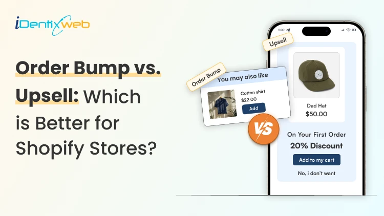
Vineet Nair
8 Min • 10 April 2026
294 Views
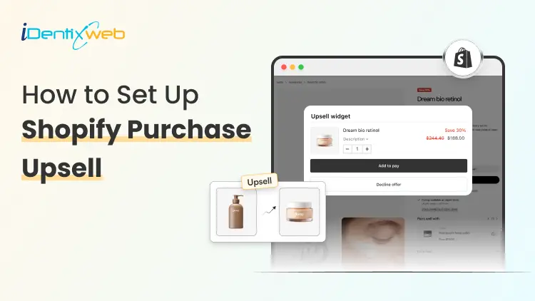
Sajini Annie John
1 Min • 7 April 2026
274 Views
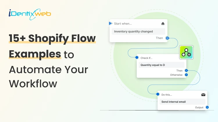
Vineet Nair
14 Min • 7 April 2026
386 Views
![How to Automate Shopify Post-purchase Email? [Examples + Tips to Convert]](https://www.identixweb.com/wp-content/uploads/2026/04/26-03-Thu-Blog-How-to-Streamline-Shopify-Post-purchase-Email-Flow_.webp "How to Automate Shopify Post-purchase Email? [Examples + Tips to Convert]")
Vineet Nair
9 Min • 6 April 2026
291 Views