Blog
Gather knowledge about the latest insights, updates, tips, and tricks in the Ecommerce industry.
5 Min • 20 March 2026
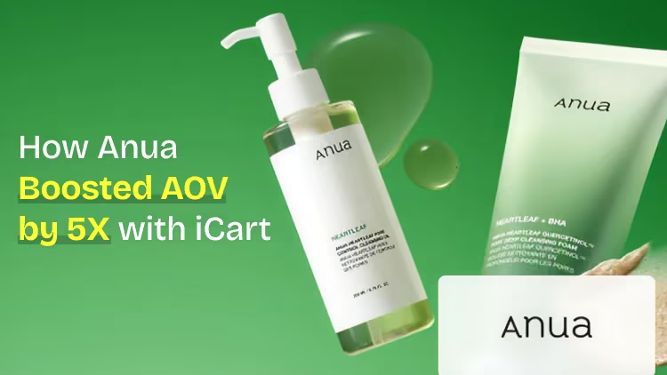
How Anua Unlocked 5X AOV Growth with iCart’s Smart Cart Features
delivery customization Challenges Solutions drive results Scale business delivery customization Challenges Solutions drive results Scale business delivery customization Challenges Solutions drive results Scale business delivery customization Challenges Solutions drive results Scale business Anua is a globally recognized Korean skincare brand known for its minimalist philosophy and focus on gentle yet effective formulations. Built on the idea of simplifying skincare routines, Anua develops products that deliver visible results while avoiding harsh or irritating components, making them suitable for sensitive skin types. Initially using a traditional full cart experience, Anua transitioned to iCart’s side cart solution in August 2025, to create a more seamless and engaging shopping journey. This shift allowed customers to easily explore complementary skincare products without disrupting their browsing flow, making it more intuitive to discover items that fit into a complete routine. By surfacing relevant recommendations directly within the cart, the brand enhanced product visibility across its range. Challenges Before implementing iCart’s side cart solution, Anua faced limitations with their existing full cart experience, which created friction in the customer journey. The traditional cart setup redirected users away from product pages, interrupting their browsing flow and reducing opportunities to explore additional products. As a skincare brand built around routines rather than single-item purchases, this made it difficult to effectively showcase complementary products and encourage customers to build complete regimens. Additionally, the lack of in-cart personalization and strategic upsell opportunities meant that customers were often unaware of related products that could enhance their skincare results. This limited the brand’s ability to increase average order value (AOV) and fully leverage its diverse product range. Anua needed a more dynamic and intuitive cart experience that could seamlessly introduce relevant recommendations while maintaining a smooth and engaging shopping journey. ❌ Cart Value Barriers Low average order value (AOV) due to single-item focus Most customers completed purchases with one primary product instead of building multi-step routines. Cart abandonment near shipping thresholds Customers were not clearly informed or motivated to reach free shipping or discount thresholds. Missed savings opportunities Customers were unaware of potential value in purchasing bundled routines or multiple complementary products. ❌ Absence of Progress-Based Incentives No free shipping or discount progress bar Customers were not motivated to increase their cart value due to lack of visible incentives. Missing tiered rewards system There were no structured milestones (e.g., “Spend more to unlock offers”), reducing upsell opportunities. ❌ Ineffective Cart UI/UX (Pre-Side Cart) Full-page cart disrupted shopping flowCustomers had to leave their browsing journey, increasing friction and drop-offs. No quick add/remove functionality Users couldn’t easily modify their cart or add suggested products without navigating away. Solution To overcome these challenges, Anua implemented iCart’s side cart solution to transform their traditional cart into a high-converting, interactive experience. By replacing the full-page cart with a seamless side cart, the brand ensured that customers could continue browsing while viewing their cart, significantly reducing friction in the shopping journey. Additionally, features like product recommendations & progress bars for free shipping and discounts motivated customers to increase their cart value. By combining personalization, incentive-driven messaging, and a user-friendly interface, Anua successfully turned their cart into a powerful revenue-driving touchpoint rather than just a checkout step. To maximize their cart effectiveness, they implemented two powerful features: ✅ Progress Bar with Multi-Reward Incentives Implemented a tiered progress bar to encourage higher cart value Customers are guided with a clear message like “Add $3.10 to unlock secret offer,” motivating them to continue adding products. Generated over $5M+ in revenue through incentive-driven cart progression Used product-based rewards to align with customer intent Instead of generic discounts, Anua incentivized purchases with relevant skincare items like Dark Spot Pads and mini serums. Built visual motivation for routine expansion As customers add products, they can clearly track progress toward unlocking multiple rewards, encouraging them to build a complete skincare routine. ✅ Product Recommendations Implemented “Frequently Bought Together” recommendations Customers adding a single product (e.g., toner) are shown complementary items like serums, moisturizers, or pads to complete their routine. Generated over 275K revenue through in-cart recommendations Encouraged full skincare regimen building Instead of isolated purchases, the cart suggests step-by-step product combinations aligned with common skincare routines. Increased product discovery at the final stage By surfacing relevant items directly in the cart, Anua ensured customers explore more of their catalog without leaving the checkout flow. Results Achieved in Last 180 Days 22932 Total Store Orders 45101 Total iCart Orders 5X iCart Generated AOV 65.70% Upsell Affected Conversion Rate These improvements reflect a clear shift in customer behavior on Anua’s store. Cart abandonment reduced as shoppers discovered complementary skincare products and felt encouraged to build complete routines. Engagement also increased, with customers interacting more with in-cart recommendations and exploring relevant product pairings. Results & Impact And...Results is Our Main Clarification By implementing iCart’s cart drawer, product recommendations, and progress bar, Anua transformed its cart into a high-performing conversion touchpoint. Shopping Experience Enhancement The improved cart experience encouraged customers to discover complementary products and understand the value of sustainable beauty routines. For instance, the clear presentation of subscription savings alongside one-time purchase options helped customers make more informed decisions about their long-term hair care needs. As Anua continues to optimize its cart experience, the brand is closely monitoring: Routine-based purchasing behavior - tracking how customers move from single items to multi-step regimens Engagement with in-cart recommendations - measuring interaction with suggested products Cart value progression - analyzing how incentives influence higher spending [related_cases_slider] Ready to Write Your Success Story? Try icart App Join successful businesses like Anua and Master your delivery scheduling Delight customers with precise timing Grow your special occasion orders Expand your delivery reach
Read Blog10 Min • 8 May 2026
Shopify Plus SEO: Rank Your Enterprise Store on Page 1
Shopify Plus gives enterprise brands a strong ecommerce base. But rankings do not come from the platform alone. I have seen many Shopify Plus stores with great products and strong branding still struggle on Google. The reason being their SEO system does not scale with the store. Common issues I experience is large catalogs create duplicate URLs, product schema breaks after theme changes, and international stores create the same content across multiple markets. Shopify Plus SEO is about fixing all of that. For enterprise ecommerce stores, every technical issue gets bigger because the store has more products, collections, scripts, and more stakeholders involved. As a Shopify Plus SEO expert, I look at SEO as a full growth system. It includes site structure, technical SEO, collection optimization, speed, schema, content, internal links, and conversion-focused user experience. Speed matters because slow pages hurt users, conversions, and organic growth. At Identixweb, we also offer Shopify speed optimization services and have helped 300+ merchants worldwide improve store performance. If you want your enterprise store to rank on page 1, you need to follow Shopify Plus SEO best practices. I have written this blog to do exactly that. What is Shopify Plus SEO? Shopify Plus search engine optimization is the process of optimizing an enterprise Shopify store so that search engines can crawl, understand, index, and rank its most important pages. It is different from basic Shopify SEO. A small Shopify store may focus on titles, descriptions, product images, and a few blog posts. A Shopify Plus store needs a deeper SEO setup because it operates on a much larger scale. For me, SEO services for Plus stores includes: Technical SEO audits Collection page SEO Product page optimization Store speed optimization Core Web Vitals improvement Structured data setup International SEO Blog and content hub strategy Crawl and indexation management Organic revenue tracking A good Shopify Plus SEO agency should understand both SEO and Shopify’s technical structure. That includes Liquid, Shopify themes, app scripts, collection filters, canonical tags, redirects, structured data, Shopify Markets, and performance issues. Shopify Plus SEO experts need to know where organic growth is getting blocked. Most of the time, the issue sits in one of four places: Google cannot crawl the right pages properly. Google can crawl the pages, but the content is weak. The pages are useful, but they load too slowly. The store has authority, but the internal structure does not pass it on well. Shopify Plus SEO best practices: Top 2026 trends Search has become intent-driven in 2026. AI Overviews are changing the search results page and affecting how people click. Google is getting better at understanding helpful content, product data, page experience, and topical authority. For Shopify Plus stores, these are the trends I would watch closely. 1. Core Web Vitals matter more for large stores Enterprise stores often carry heavy code. Review apps, personalization tools, upsell widgets, analytics tags, A/B testing tools, heatmaps, and third-party scripts can slow down the storefront. I recommended strong Core Web Vitals for both user experience and search performance. The recommended targets include LCP within 2.5 seconds, INP under 200 milliseconds, and CLS below 0.1. In my Shopify Plus audits, I usually check: Unused apps Heavy JavaScript Render-blocking CSS Oversized images Lazy loading setup App scripts loading sitewide Poor mobile performance Theme code bloat Slow collection and product templates SellMore, the only app Plus stores need Shopify Plus brands need smart offers across checkout, post-purchase, and thank-you pages without disturbing the buying flow. SellMore helps stores increase AOV with post-purchase upsells, cross-sells, product bundles, AI-driven recommendations, and detailed analytics. For high-volume Plus stores, that means more revenue from the same traffic without making the customer journey feel heavy. Speed optimization is part of Shopify Plus SEO best practices. A faster store gives users a better experience and gives Google a cleaner page to process. 2. Answer Engine Optimization (AEO) needs answer-first content AI search results reward content that answers questions clearly. Shopify Plus stores should not write only for traditional blue links. They should also structure content for direct answers. That means your pages should include: Clear definitions Short answer blocks Helpful FAQs Comparison sections Buying advice Product education Expert input Structured data For example, a collection page for ‘premium leather bags’ should explain materials, use cases, care tips, size options, and buying factors. Creating people-first content and highlighting experience, expertise, authoritativeness, and trustworthiness as key quality signals. 3. Collection pages are becoming SEO growth assets For enterprise stores, collection pages often bring more SEO value than product pages. Why? Because collection pages match broader buying intent. A customer searching “best running shoes for women” may not want one exact product. They want options. A strong collection page can rank for that search if it has the right structure, products, content, internal links, and schema. A high-performing Shopify Plus collection page should include: One clear H1 SEO-friendly title tag Helpful intro copy Product filters that do not create indexation issues Internal links to subcollections FAQ content Unique copy below the product grid Fast mobile loading Strong product merchandising 4. URL and indexation control are becoming more important In my experience, large Plus stores often create too many low-value URLs. Filtered collections, product variants, search pages, tags, pagination, and tracking parameters can all create crawl waste. A poor ecommerce URL structure can make crawlers retrieve duplicate content, miss useful content, or spend time on unnecessary pages. Google also recommends minimizing alternative URLs that return the same content and using descriptive URL paths. 5. E-E-A-T matters for ecommerce too Google and AI search engines want helpful, reliable content. For Shopify Plus stores, E-E-A-T can come from: Expert buying guides Real product testing Brand story Customer reviews Transparent policies Author bios for editorial content Trust badges Clear return and shipping details Original photos and videos Product comparison content Core SEO pillars for Plus stores 1. Technical SEO foundation When Shopify Plus SEO experts audit a store, they start with crawl behavior. Technical SEO is the first pillar because Google needs to access the right pages before anything else can work. A Shopify Plus technical SEO audit should check: Crawl errors Index coverage XML sitemap Robots.txt.liquid Canonical tags Redirect chains Broken links Duplicate content Pagination Collection filters Internal search URLs JavaScript-rendered content Theme code issues 2. Site architecture and internal linking A clean store structure helps both users and search engines. Your homepage should link to the main collections. Main collections should link to subcollections. Blogs should support collections. Product pages should link to related products and buying guides. A strong internal linking setup helps Google understand which pages matter most. 3. International SEO for Shopify Plus Many Shopify Plus brands sell across countries. International SEO needs careful setup because duplicate content can appear across markets. Key areas include: Shopify Markets setup Hreflang Localized content Currency display Country-specific URLs Local keyword intent Regional collection pages Duplicate content checks Local shipping and return details Search behavior changes by country. Product language changes by market. Buying objections also change by region. International SEO for enterprise brands should match local intent. 4. SEO analytics and reporting SEO should connect to revenue. Traffic alone does not tell the full story. Always track ecommerce KPIs like organic sessions, revenue, and conversion rate, top landing pages, collection page rankings, indexed & non-indexed pages, crawl errors, Core Web Vitals, and CTR. Use Google Search Console to track clicks, impressions, ranking movement, and indexation issues. Use GA4 to connect organic traffic with revenue and conversion behavior. Limitations for Shopify Plus SEO Shopify Plus is powerful, but it still has SEO limitations. Knowing these limits helps you plan better. 1. Shopify URL structure has fixed rules Shopify uses fixed URL paths such as: /products/ /collections/ /pages/ /blogs/ You cannot fully customize URL structure like you can on some open-source platforms. That means Shopify Plus works smarter with handles, redirects, internal links, canonicals, and collection structure. 2. Duplicate product URLs can appear at scale Shopify products can appear across multiple collections when you have a large-scale store. That can create different paths to the same product. Canonical tags usually help, but internal linking still matters. I prefer linking to the clean product URL wherever possible. For example: /products/product-name. Instead of relying only on collection-based product paths. Clean internal linking helps Google understand the preferred version faster. 4. Apps can slow down SEO performance Shopify Plus brands often use many apps, and that's not an issue, to be honest. Apps can support reviews, search, loyalty, subscriptions, upsells, personalization, shipping, analytics, and product discovery. But every app can add scripts. If you have apps with overlapping features it can slow down the store. Remove what you do not use. Limit what you need. Load scripts only where they matter. 5. JavaScript-heavy content can create issues Some custom themes rely heavily on JavaScript.Google can process JavaScript, but important SEO content should still be easy to access. If collection copy, product details, internal links, or reviews depend too much on delayed scripts, Google may not process them as cleanly as expected. For Shopify Plus stores, I prefer keeping important SEO content available in the HTML wherever possible. Implement Shopify Plus SEO the right way Shopify Plus SEO best practices only work best when every part of the store supports the same goal. Your technical setup helps Google crawl the right pages. Collection pages target high-value search intent. Product pages build buyer confidence. Your structured data helps Google understand your products. Speed improvements keep users engaged. Your content builds authority. Identixweb, one of the top Shopify Plus SEO agencies that helps Shopify merchants improve store performance through speed optimization, theme improvements, app script management, and mobile-focused fixes. For Shopify Plus stores, that performance layer can make a real difference in SEO, user experience, and conversions. Also read Shopify VS Shopify Plus: Which One Is Right for You? 10+ Successful Shopify Plus Websites You Need to See in 2026 The Best Shopify Plus Apps Enterprise Stores Need in 2026 10+ Reasons to Shift from Shopify to Shopify Plus: When & How to Upgrade? FAQ 1. What is Shopify Plus SEO? It is the process of optimizing an enterprise Shopify store so Google can crawl, index, understand, and rank its most important pages. It covers technical SEO, collection page SEO, product page optimization, site speed, structured data, internal linking, and international SEO. 2. Do I need Shopify Plus SEO experts to handle SEO? Yes. If your store has a large catalog, custom themes, heavy apps, or complex filters. Shopify Plus SEO experts understand both search engines and Shopify’s technical setup, so they can fix crawl issues, speed problems, duplicate URLs, schema errors, and collection page gaps without hurting the store experience. 3. What are the top tools for Shopify Plus? I would suggest Google Search Console, GA4, PageSpeed Insights, Screaming Frog, Semrush or Ahrefs, Google Merchant Center, and Shopify’s built-in SEO settings. 4. Which is the best Shopify Plus SEO agency? Identixweb, Go Fish Digital, OuterBox, Eastside Co are some top agencies providing SEO services for enterprise stores.
3 Min • 9 May 2026
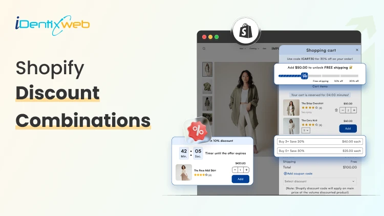
Shopify Discount Combinations: 8 Ways to Combine Offers Without Losing Margins
Running promotions feels great until you check your margins and realize you gave away the store. The real challenge with Shopify discount combinations isn't attracting buyers; it's structuring offers that move product and protect profitability. This guide breaks down 8 proven strategies for combining discounts on Shopify, when to use each one, and the guardrails that keep your numbers healthy. Why Discount Combinations Are a Double-Edged Sword Shopify's native discount engine has grown significantly. You can now stack automatic discounts, apply Shopify discount codes at checkout, and layer product-level deals with order-level offers. That flexibility is powerful but it creates risk. A customer who stacks a 20% automatic discount, a 15% Shopify discount code, and a free shipping threshold can trigger a combined discount that wipes out your gross margin entirely. Without intentional structure, promotions become a liability. The goal: combine discounts in ways that increase average order value (AOV) and customer lifetime value (LTV), not just transaction volume. 8 Strategies for Shopify Discount Combinations That Protect Margins 1. Tiered Volume Discounts + Free Shipping Threshold What it is: Offer percentage discounts that increase with order quantity (buy 2, save 10%; buy 4, save 20%), layered with a free shipping unlock above a minimum order value. Why it works: Each tier rewards larger purchases. Free shipping acts as the final nudge without compounding the percentage discount it costs you a fixed fulfillment amount rather than a percentage of revenue. Margin protection tip: Set your free shipping threshold above the break-even point for your average shipping cost. If standard shipping runs $8, set the threshold where that $8 represents less than 3-4% of the order total. How to set it up: Use Shopify's native tiered pricing through variants or a dedicated Shopify discount app like iCart to create quantity break rules. Pair with a free shipping automatic discount triggered by cart total. 2. Bundle Discount + Loyalty Code What it is: Offer a fixed discount on a curated product bundle, then allow loyal customers to apply a one-time Shopify discount code on top but only if the code is amount-based rather than percentage-based. Why it works: Bundles already improve margins by moving multiple SKUs in one transaction. An amount-based loyalty code ($5 off, $10 off) has a known, capped cost. A percentage code layered on a bundle, however, compounds. Margin protection tip: Never allow percentage-based codes to stack with percentage-based bundles. Swap one leg to a fixed-dollar format. Your margin floor becomes predictable. How to set it up: Create the bundle as a dedicated product or use a bundling app. In Shopify's discount settings, set the loyalty code to "fixed amount" and apply it at the order level, not the product level.
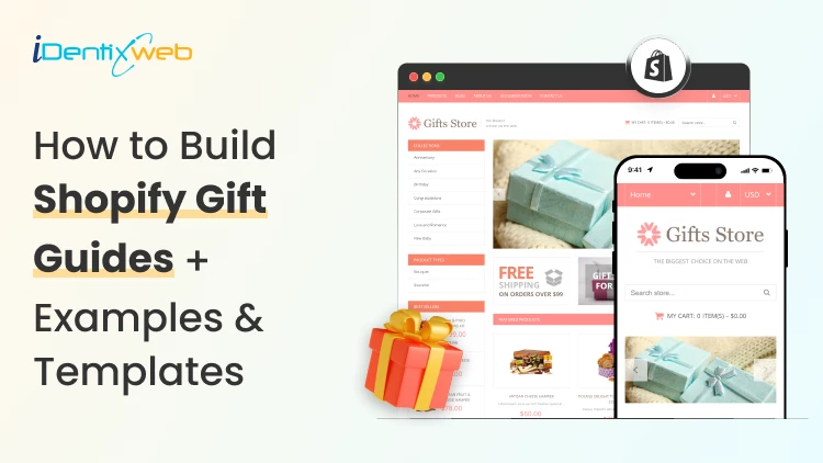
9 Min • 13 May 2026
How to Build Shopify Gift Guides in 2026? + Examples & Templates
Imagine 2 weeks before Christmas, buyers are looking for gifts in your Shopify store. Customers have been scrolling for more than 15 minutes. They finally give up and leave without buying. What your customers need at this point is a Shopify gift guide. I've built gift guides for Shopify stores ranging from first-time launches to brands clearing seven figures in Q4. The pattern is always the same. Stores that build gift guides during the holiday season make the buying decision easier for customers. What follows is the full playbook: How to build a guide that converts, real store examples to copy, a free template you can use, and the cart customization most stores skip. What is a Shopify gift guide? A Shopify gift guide is a curated page that helps shoppers buy for someone else, not themselves. It groups your products by who they're for, what they cost, or what they signal. Why it works: Gift shoppers don't know what they want. They know who they're buying for, roughly what they can spend, and that they're running out of time. A good guide answers all three in one scroll. Holiday gift spending in the previous year averaged $890 per person in the USA, which is massive. Generally, when I create a holiday gift guide, I work on 5 types of guides. Five types of Shopify gift guides By recipient. For Her, For Him, For Kids, For Coworkers. Best for stores with a broad SKU mix. By price. Under $25, Under $50, Under $100, Splurge. Best for new stores with thin catalogs because it pads out a guide with what you already have. By interest. For foodies, For travellers, For home chefs. Best for niche or lifestyle brands. By occasion. Christmas, Mother's Day, Valentine's Day, Weddings. Best for stores that want one evergreen page, which they refresh each season. By format. Collection page (best for SEO and ongoing traffic), blog post (best for storytelling and shares), dedicated landing page (best for paid traffic), interactive gift finder quiz (best for stores with 50+ SKUs). Most stores I work for create Shopify gift guides by occasion. Holiday gift guides are the most popular ones. How to create a holiday gift guide on Shopify in 7 steps Step 1: Define who you're solving for The person stressed about buying a gift for their mother-in-law has different needs than someone shopping for their best friend. For example, you can write one sentence as the title of the guide: "My guide helps [specific buyer] find [specific kind of gift] without [specific stress]." Step 2: Pull last year's data For established stores, pull your best-sellers list, filter for low return rates and healthy margins. Those are your best picks to add to the guide. For new stores, pull category best-sellers from Shopify Trends, TikTok Shop, and Amazon Movers & Shakers in your niche. Match what's already moving. Step 3: Pick the right page type A Shopify collection page is good for SEO and long-term traffic. A blog post is best for sharing and email content. A landing page is the preferred choice for Meta and Google Shopping ads because you control the layout pixel-by-pixel. Build the right type of page first for your guide. Step 4: Write copy that sells the gift "100% organic cotton" tells me about the product. "The sweater she'll wear every Sunday until 2030" tells me about the gift. These are the good copies that sell your gift guide. Step 5: Design for thumb-scrolling Over 70% of sales on Shopify stores are mobile. Big images, two products per row max on mobile, sticky "Add to Cart," price visible above the fold for every product. Your Shopify gift guide should be accessible for mobile users. Step 6: Stack bundles, upsells, and a free gift offer Shoppers overspend on gifts during holidays. Bundles and upsells let them feel generous without overthinking. Free gift with purchase pushes them past your AOV target. I use iCart Cart Drawer Cart Upsell for the cart drawer on most builds because it shows the progress bar in real time ("You're $12 away from your free gift"), handles tiered rewards, and runs one-click upsells without sending shoppers to a separate page. Step 7: Promote across email, SMS, social, and ads A four-touch sequence outperforms a single launch blast every time. Tease 7 days out, launch, mid-campaign refresh with a different angle, last-call 48 hours before your shipping cutoff. Shopify gift guide examples worth stealing from Magic Spoon runs a holiday gift guide built around bundle pricing. You can add a "Gift the Box" section where every bundle includes a free gift message card. Copy this if you sell consumables like office supplies, food or educational products. Brooklinen creates the guide by recipient with category names like "For the Host" and "For the New Homeowner." You can move every product card to show a use case in two words on your gift guide page. Bombas runs a clean "Gifts Under $25" collection that also works as their entry-level upsell. What you can do is add a footer banner that says "Free gift wrapping over $50." This tiny detail can massively lift your AOV. A free Shopify gift guide template you can copy today Hero section Headline: "Gifts for the [recipient] who [characteristic]." Subhead: "Hand-picked. Ready in 2 days. Free shipping over $[X]." CTA: "Shop the guide." Filter bar (sticky) Shop by recipient | Shop by price | Shop by interest Featured picks row 3 hero products, badged "Our Top Pick" / "Sells Out Fast" / "New This Year." Category blocks (repeat 3–5 times) Block headline: "[Recipient or theme]." 6 products in a 3x2 grid on desktop, 2x3 on mobile. Price visible. One-line copy per product. Bundle highlight 2–3 bundles with anchor pricing ("Worth $120. Yours for $89."). Free gift with purchase callout Banner above the fold and inside the cart. "Spend $75, get a free [gift]." Email capture Mid-page: "Get last-call alerts before our shipping cutoff." FAQ block (with FAQ schema) 4–6 questions covering shipping, returns, gift wrap, gift messages. How does a Shopify free gift with purchase offer increase revenue? Free gift with purchase is the most underused strategy I use for Shopify stores. It's cheap to run, easy to set up, and gift shoppers love it because it feels like extra generosity for free. Three triggers worth setting up: Cart value threshold. "Spend $75, get a free gift wrap kit." Works because gift shoppers are already pushing past their personal AOV. A free add-on at $75 pulls $50 carts up. Specific product trigger. "Buy any candle, get a free matchbook." Best for hero products you want to push. Tiered. "$50 unlocks a free sample. $100 unlocks the sample plus a tote." Tiered offers turn the cart into a game. For setup, Shopify's native rules cover basic triggers, but the cleanest execution I've seen comes from cart-drawer apps that show the offer in real time. I use iCart Cart Drawer Cart Upsell for most guides because it handles gift-with-purchase rules without sending shoppers to a separate page. The progress bar alone moves AOV more than any banner I've tested. Mistakes I see Shopify stores make with gift guides Launching late: If you are creating a Shopify gift guide for Christmas, make sure you build it by November 1. I see a lot of stores creating guides in December. It affects their conversions. No price filter. A shopper with a $30 budget will not scroll past three $200 products to find your $25 candle. Make sure to add a price filter at the top. Hero image of the products: If you are creating a bundle, make sure to show images of the separate products along with a hero image of the products altogether. No shipping cutoff on the page. Gift buyers are calendar-driven. They want the gifts on specific dates, for example, on Christmas Day. Shipping cutoff helps merchants set realistic expectations for delivery. Removing the guide after the holidays. Pivot the guide to "self-gifting" or "post-holiday treats". This way, you get another 10 days of revenue from the same page. When to launch your Shopify gift guide? For new stores, Christmas is a good start. It's the easiest one to ship and the highest revenue. Launch your guide at least 2 months before the big date. Below are some of the busiest holidays that I would recommend creating a holiday gift guide for. Christmas and Hanukkah: live by November 1, push hard from November 20 through December 18 Valentine's Day: live by January 15, push February 1 through February 12 Mother's Day: live by April 15, push the week of Father's Day: live by late May Back-to-school: live by late July Create your first gift guide this week The brands that win on Shopify with guides are ones that make gifting feel obvious. A simple collection page, a price filter that actually works, and a free gift offer that pushes shoppers past their default cart size will definitely increase your holiday sales. FAQs 1. What is a Shopify gift guide? A Shopify gift guide is a curated page on your store that groups products by recipient, price, interest, or occasion to help shoppers buy for someone else. You can build one as a collection page, blog post, landing page, or interactive quiz, depending on your catalog size and traffic source. 2. How to create a holiday gift guide? Pick your audience first, pull your best-selling products from analytics, and group them into 3–5 clear categories like price tiers or recipient types. Build it as a Shopify collection page or landing page with mobile-first design, bundle offers, and a free gift with purchase callout to lift AOV. Launch your gift guide at least 2 months prior to the holiday. 3. How to create a Christmas gift guide for shoppers? Build it around the three questions every Christmas shopper asks: who is this for, what can I spend, and will it arrive in time. Add a sticky filter bar with recipient and price options, show your shipping cutoff date on the hero section and in the cart, and bundle gift wrap or gift notes directly into the page.
")
Sajini Annie John
5 Min • 23 May 2026
9 Views

Sajini Annie John
6 Min • 23 May 2026
9 Views

Vineet Nair
9 Min • 22 May 2026
11 Views

Vineet Nair
10 Min • 21 May 2026
19 Views
: How Much Shopify Takes Per Sale?")
Sajini Annie John
5 Min • 20 May 2026
20 Views
")
Vineet Nair
8 Min • 20 May 2026
16 Views
")
Vineet Nair
9 Min • 15 May 2026
27 Views

Vineet Nair
10 Min • 14 May 2026
31 Views

Sajini Annie John
5 Min • 13 May 2026
32 Views
Vineet Nair
9 Min • 13 May 2026
33 Views

Vineet Nair
8 Min • 11 May 2026
50 Views

Sajini Annie John
7 Min • 9 May 2026
53 Views