Author: Sajini Annie John
Gather knowledge about the latest insights, updates, tips, and tricks in the Ecommerce industry.
5 Min • 20 March 2026
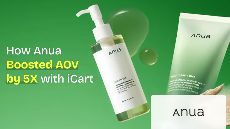
How Anua Unlocked 5X AOV Growth with iCart’s Smart Cart Features
delivery customization Challenges Solutions drive results Scale business delivery customization Challenges Solutions drive results Scale business delivery customization Challenges Solutions drive results Scale business delivery customization Challenges Solutions drive results Scale business Anua is a globally recognized Korean skincare brand known for its minimalist philosophy and focus on gentle yet effective formulations. Built on the idea of simplifying skincare routines, Anua develops products that deliver visible results while avoiding harsh or irritating components, making them suitable for sensitive skin types. Initially using a traditional full cart experience, Anua transitioned to iCart’s side cart solution in August 2025, to create a more seamless and engaging shopping journey. This shift allowed customers to easily explore complementary skincare products without disrupting their browsing flow, making it more intuitive to discover items that fit into a complete routine. By surfacing relevant recommendations directly within the cart, the brand enhanced product visibility across its range. Challenges Before implementing iCart’s side cart solution, Anua faced limitations with their existing full cart experience, which created friction in the customer journey. The traditional cart setup redirected users away from product pages, interrupting their browsing flow and reducing opportunities to explore additional products. As a skincare brand built around routines rather than single-item purchases, this made it difficult to effectively showcase complementary products and encourage customers to build complete regimens. Additionally, the lack of in-cart personalization and strategic upsell opportunities meant that customers were often unaware of related products that could enhance their skincare results. This limited the brand’s ability to increase average order value (AOV) and fully leverage its diverse product range. Anua needed a more dynamic and intuitive cart experience that could seamlessly introduce relevant recommendations while maintaining a smooth and engaging shopping journey. ❌ Cart Value Barriers Low average order value (AOV) due to single-item focus Most customers completed purchases with one primary product instead of building multi-step routines. Cart abandonment near shipping thresholds Customers were not clearly informed or motivated to reach free shipping or discount thresholds. Missed savings opportunities Customers were unaware of potential value in purchasing bundled routines or multiple complementary products. ❌ Absence of Progress-Based Incentives No free shipping or discount progress bar Customers were not motivated to increase their cart value due to lack of visible incentives. Missing tiered rewards system There were no structured milestones (e.g., “Spend more to unlock offers”), reducing upsell opportunities. ❌ Ineffective Cart UI/UX (Pre-Side Cart) Full-page cart disrupted shopping flowCustomers had to leave their browsing journey, increasing friction and drop-offs. No quick add/remove functionality Users couldn’t easily modify their cart or add suggested products without navigating away. Solution To overcome these challenges, Anua implemented iCart’s side cart solution to transform their traditional cart into a high-converting, interactive experience. By replacing the full-page cart with a seamless side cart, the brand ensured that customers could continue browsing while viewing their cart, significantly reducing friction in the shopping journey. Additionally, features like product recommendations & progress bars for free shipping and discounts motivated customers to increase their cart value. By combining personalization, incentive-driven messaging, and a user-friendly interface, Anua successfully turned their cart into a powerful revenue-driving touchpoint rather than just a checkout step. To maximize their cart effectiveness, they implemented two powerful features: ✅ Progress Bar with Multi-Reward Incentives Implemented a tiered progress bar to encourage higher cart value Customers are guided with a clear message like “Add $3.10 to unlock secret offer,” motivating them to continue adding products. Generated over $5M+ in revenue through incentive-driven cart progression Used product-based rewards to align with customer intent Instead of generic discounts, Anua incentivized purchases with relevant skincare items like Dark Spot Pads and mini serums. Built visual motivation for routine expansion As customers add products, they can clearly track progress toward unlocking multiple rewards, encouraging them to build a complete skincare routine. ✅ Product Recommendations Implemented “Frequently Bought Together” recommendations Customers adding a single product (e.g., toner) are shown complementary items like serums, moisturizers, or pads to complete their routine. Generated over 275K revenue through in-cart recommendations Encouraged full skincare regimen building Instead of isolated purchases, the cart suggests step-by-step product combinations aligned with common skincare routines. Increased product discovery at the final stage By surfacing relevant items directly in the cart, Anua ensured customers explore more of their catalog without leaving the checkout flow. Results Achieved in Last 180 Days 22932 Total Store Orders 45101 Total iCart Orders 5X iCart Generated AOV 65.70% Upsell Affected Conversion Rate These improvements reflect a clear shift in customer behavior on Anua’s store. Cart abandonment reduced as shoppers discovered complementary skincare products and felt encouraged to build complete routines. Engagement also increased, with customers interacting more with in-cart recommendations and exploring relevant product pairings. Results & Impact And...Results is Our Main Clarification By implementing iCart’s cart drawer, product recommendations, and progress bar, Anua transformed its cart into a high-performing conversion touchpoint. Shopping Experience Enhancement The improved cart experience encouraged customers to discover complementary products and understand the value of sustainable beauty routines. For instance, the clear presentation of subscription savings alongside one-time purchase options helped customers make more informed decisions about their long-term hair care needs. As Anua continues to optimize its cart experience, the brand is closely monitoring: Routine-based purchasing behavior - tracking how customers move from single items to multi-step regimens Engagement with in-cart recommendations - measuring interaction with suggested products Cart value progression - analyzing how incentives influence higher spending [related_cases_slider] Ready to Write Your Success Story? Try icart App Join successful businesses like Anua and Master your delivery scheduling Delight customers with precise timing Grow your special occasion orders Expand your delivery reach
Read Blog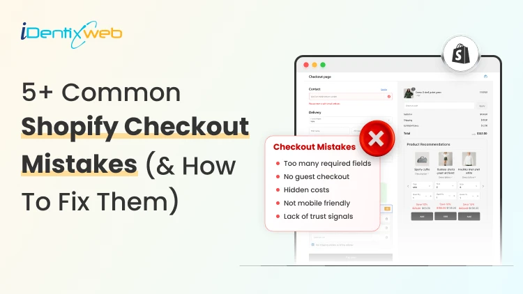
7 Min • 30 April 2026
5+ Common Shopify Checkout Mistakes (& How to Fix Them to Drives Sales)
Since the start of 2026, I have worked with many new Shopify stores, spending hours improving their storefront. But when I check their Shopify checkout page, I often find the real problem there. The buyer likes the product > Adds it to the cart > reaches the Shopify checkout page > Abandons the cart. Merchants do not realize it, but they make common Shopify mistakes in the checkout page. They need to customize the Shopify checkout page to decrease the cart abandonment rate. In this blog, I will explain the top Shopify problems that come up at the checkout page and how to permanently fix them. What are the benefits of customizing your Shopify checkout page? 1. Builds trust before payment Checkout is where shoppers become more careful. They are about to share their address, payment details, and personal information. A branded checkout helps reduce doubt through trusted payment methods, their icons, and shipping & return policy links. 2. Reduces checkout friction Every extra field in your checkout form adds friction. A high-converting Shopify checkout page helps shoppers complete the order without overthinking. 3. Makes the payment clearer Stores often lose sales because buyers discover extra costs too late. Checkout customization helps you clearly show: Shipping cost Taxes Delivery estimate Return policy Payment options Showing these details upfront helps the shoppers to complete the checkout. 4. Improves mobile checkout experience 79% of shoppers use their smartphones to shop. If your mobile checkout feels hard to use, you will lose orders even if your product page looks good. A customized Shopify checkout page helps your mobile shoppers to add items to their cart and complete checkout on their phones. Before we get into the mistakes, here’s one thing I suggest to Shopify merchants. If you want to fix checkout-related issues and increase AOV, you can use an app like SellMore. It helps you add post-purchase upsells, thank-you page offers, checkout upsells for Shopify Plus stores, bundles, and AI product recommendations, so your checkout flow stays clean while still creating more revenue opportunities. 5+ Common Shopify Checkout Mistakes (& How to Fix Them)? Mistake 1: Asking for too much information Many new Shopify store owners ask for details they do not really need. For example, a second address line in the checkout page is unnecessary. Buyers want speed. They do not want to fill out a long form just to place one order. Why does it hurt your checkout? Long forms make the checkout feel complicated. Buyers will feel the store is asking too much too soon. For example, if you sell fashion, beauty, accessories, or home products, you may not need a phone number unless your shipping partner requires it. My expert take on how to fix it I follow this rule whenever I optimize a checkout page. I keep only the fields needed for: Payment Delivery Order confirmation Customer support Make optional fields truly optional. Also, avoid asking for a phone number unless it helps with delivery or support. Mistake 2: Showing shipping costs too late Hidden shipping cost is one of the most common Shopify mistakes I see. A shopper may like the product price on the product page. They may add it to the cart. But if the price that appears at the checkout page feels different, they will leave. This happens way too often. My expert take on how to fix it Show shipping information earlier in the buying journey. Good places to show shipping details: Product page Cart page Announcement bar Shipping policy Checkout page Mention free shipping rules, flat-rate shipping, delivery timelines, or location-based charges if applicable. Mistake 3: Offering limited payment options Payment trust can make or break your checkout process. Some prefer PayPal, Shop Pay, Apple Pay, or Google Pay. In some countries, local payment methods matter more than global ones. Why does it hurt your checkout? A buyer may like your product, but if they do not see a payment option they trust, they may not complete the order. I once worked for a client in India, and their checkout rate increased once I added Google Pay. My expert take to fix it? Enable payment methods based on your target market. For example, if you are a US-focused Shopify store, consider: Shop Pay, Apple Pay, or Shopify Payments. For other regions, check which local payment methods your audience already uses. Mistake 4: Weak trust signals near checkout Buyers need small signs that your store is safe. A simple checkout is good, but it should also answer basic trust questions like: Can I return the product? When will it arrive? Who do I contact if something goes wrong? Is my payment safe? Is this a real store? My take on increasing trust at checkout Add clear policy links, trust badges, and support details where possible. These are the things I always focus on: Return policy Shipping policy Privacy policy Contact page Support email Order confirmation details Mistake 5: Ignoring mobile checkout I have talked about this in the benefits section as well. Mobile checkout is where many stores lose buyers. Merchants build their checkout on the desktop, but mobile is where the majority of your customers will come. Issues like small buttons, cluttered spacing, and hard-to-see text fields are common Shopify mistakes on the checkout page How to fix issues with mobile checkout? Place a full test order from your phone. Test the full flow: Add a product > Open the cart > Apply a discount > Enter shipping details > Select payment > Reach the final step > Check the thank-you page If you see issues with any of the steps, cuztomize the Shopify checkout page UI/UX on your phone immediately. Mistake 6: No progress indicator at checkout page I have seen this increase the checkout completion rate a lot. A shopper should always know where they are in the checkout flow. Not adding a progress bar at the top of the page will create doubt in their mind about how many steps are remaining. My expert take to fix it? Add a simple checkout progress bar at the top of the page to help shoppers understand how many steps are left. I usually break down this progress bar into multiple tiers, like contact information, shipping details, payment, and review. The customer fills each field and sees their progress on the page. Do not let customers bounce at checkout It’s already difficult to get traffic in 2026 because of tough competition, thanks to AI. You need to make the most of your traffic. Most Shopify mistakes at checkout are small. They usually come from: extra fields, hidden shipping, weak payment options, and poor mobile flow. But these small problems are the ones that impact sales. By the end of 2026, if I had to fix one area before sending traffic to a new Shopify store, I would start with checkout. Customize your checkout page immediately and convert your traffic into sales. FAQs 1. How to customize the checkout page in Shopify? You can customize your checkout page from Shopify admin > Settings > Checkout > Configurations > Customize or you can use apps like SellMore to modify your checkout page. 2. Do merchants need a Plus plan to modify their checkout page? No. Merchants on Basic plan or higher can access the checkout and accounts editor for branding changes like logo, colors, fonts, and layout. But Shopify Plus is required for advanced checkout customization, such as adding eligible apps to the information, shipping, and payment pages or using the Checkout Branding API. 3. What are the common mistakes Shopify merchants make at checkout? The most common Shopify checkout mistakes are asking for too many details, hiding shipping costs, offering limited payment options, missing trust signals, ignoring mobile checkout, and not testing the checkout flow before launch. 4. What are the best Shopify apps to customize your checkout? SellMore and Shopify Checkout Blocks are two great apps merchants can use to customize their checkout page.
6 Min • 5 May 2026
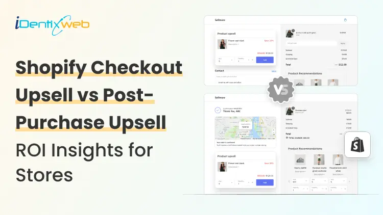
Shopify Checkout Upsell vs Post-Purchase Upsell: Which ROI Insights to Look at?
Most new Shopify stores try to grow revenue by getting more traffic. I look at it differently. Traffic matters, but your profit often improves faster when you increase the value of each order. A shopper who reaches the checkout already trusts your product enough to buy. Now it's your job to make these shoppers complete the payment. A Shopify checkout upsell strategy has helped merchants show an offer at the checkout page. A post-purchase upsell helps you show an offer after the payment is complete. Both can increase AOV, but they do not work the same way. In this blog, I will help you understand the difference between the two with data-driven insights. The first insight I would get into is upselling in general. Shopify’s upselling guide says the probability of selling to an existing customer is 60% to 70%, compared with 5% to 20% for selling to a new customer. What is the Shopify checkout upsell? A Shopify checkout page upsell is an offer shown during the checkout process before the buyer places the order. The customer has already added products to the cart. They are entering shipping, contact, or payment details. At this stage, the Shopify checkout upsell page needs to be quick, relevant, and easy to accept. Source: SellMore App Demo I use apps like SellMore to customize the checkout pages. It’s important to note that only Plus stores can customize checkout pages. I use Shopify checkout upsell apps like SellMore to customize my checkout page with: Gift wrap Shipping protection Product warranty Priority delivery Add-on product Limited-time checkout offer For example, if a customer buys a skincare product, a checkout upsell can offer a travel-size version, refill pack, or applicator. If a customer buys electronics, the offer can be a case, charger, or extended warranty. I have written a complete breakdown of Shopify checkout upsell strategies for merchants. Shopify ROI stats for checkout upsells The average documented ecommerce cart abandonment rate is 70.22%, so any Shopify checkout upsell should protect checkout clarity first and increase AOV without adding friction. Shopify checkout upsell can increase AOV because they appear when buying intent is high. One benchmark puts checkout upsell boosts around 6% to 14% [Source: Zipchat] Shopify upsell at checkout also carries conversion risk. Insights estimates a possible 3% to 8% conversion drop when checkout offers create friction [Source: Zipchat] Across ecommerce upsell funnels, one benchmark reports an average ecommerce upsell conversion rate of 19.8% and an average order value increase of 31.4%. But stores should treat this as a broad upsell benchmark rather than a checkout-only number. Want to add upsells at checkout? Here’s a step-by-step guide to add upsells at checkout in your store. What is Shopify post purchase upsell? A Shopify post-purchase upsell is an offer shown after the customer completes payment. The original order is already placed. The buyer does not need to restart checkout. In many post-purchase flows, the buyer can accept the offer with one click. Merchants also call this a thank-you page upsell. This is what I regularly include in post purchase upsell. Upgrade to a bundle Refills & subscription Add a limited-time second product Add accessories related to the first order For example, if a customer buys protein powder, the post-purchase offer can be a shaker bottle. If a customer buys pet food, the offer can be treats or a repeat delivery pack. If a customer buys a dress, the offer can be matching jewelry or a handbag. Here’s a complete breakdown of upsell in cart vs checkout vs thank you page for merchants. Shopify insights for post purchase upsell Shopify stores like Kettle & Fire saw a 41% increase in average revenue per customer after using post-purchase upsells and cross-sells. Vogue Business reported that retailers saw up to 40% increase in ROI from post-purchase tech. The insights are not just related to shopping flow. Post-purchase emails are a strong upsell channel as well. Shopify reports an average 61.68% open rate, 3.97% click rate, and 0.54% placed order rate for post-purchase email campaigns. Shopify also reports that first-time buyers are 27% likely to return, but after a second or third purchase, the return probability grows to 54%. A relevant post-purchase upsell can help move customers toward that second purchase faster. Overview of Shopify upsell at checkout & post-purchase Upsell TypeBest ForProsConsCheckout UpsellShopify Plus stores, brands selling small add-ons, accessories, warranties, gift wrap, shipping protection, bundles, and product upgrades.High purchase intent because the buyer is already at checkout.Good for increasing AOV before payment.Works well for simple add-ons that support the main product.Can distract buyers before payment.Too many offers can make checkout complicated.Advanced checkout upsell control may need Shopify Plus. Post-Purchase UpsellNew Shopify stores, consumable products, refills, bundles, accessories, beauty, skincare, supplements, food and beverage, pet products, and repeat-purchase products.Does not interrupt the original checkout.Safer for testing because the first order is already placed.Works well for one-click offers, bundles, refills, and second-product discounts.Some buyers may ignore offers after payment.Needs strong product matching to convert.Heavy discounts can reduce profit margin. Go with the best Shopify ROI insights for upselling If you are just starting your store in 2026, I would start with post-purchase upsells. They are easier to test, safer for conversion, and useful for learning which products buyers want after the first purchase. If your store has strong checkout traffic and access to deeper checkout customization, a Shopify checkout upsell is a better option. My simple rule as a Shopify expert for stores in 2026 is this: Keep checkout and post-purchase pages simple and track ROI by profit, not just upsell revenue. FAQs 1. Can I customize my checkout with basic Shopify plans? Yes. But with limits. Basic Shopify merchants can use some Checkout Blocks features on the Thank You and Order Status pages, while placing blocks directly on checkout pages requires Shopify Plus. 2. Should I choose upsells at post purchase or checkout at Shopify? For a new Shopify store, I would start with post-purchase upsells because the original order is already completed. Checkout upsells work better when your offer is small, relevant, and does not distract buyers before payment. 3. Can upsells at checkout give me profits? Yes. Checkout upsells can increase profit when the add-on has a strong margin. I would track AOV lift, checkout conversion rate, product margin, and refund rate together instead of looking only at upsell revenue. 4. Which are the best apps for Shopify checkout and post purchase upsells? I have two choices here. Checkout Blocks and SellMore. Both apps are tried and tested and can help you customize your checkout and post-purchase pages.
6 Min • 1 May 2026
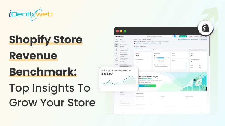
Shopify Store Revenue Benchmarks: Best Insights to Grow Your Store in 2026
I have been auditing Shopify stores for years. Although the first few things I always look at are conversion rate, AOV, orders, sessions, repeat customers, and fulfillment speed, Shopify store revenue benchmarks are where I focus on the most. A store doing strong monthly sales can still leak money if ads are expensive, AOV is low, or customers do not come back. Shopify store revenue benchmarks help you compare your store against similar stores. You can see where your store stands, what needs work, and which metric can unlock the next revenue jump. How to see benchmarks on the Shopify admin panel? Go to Shopify Admin > Analytics > Reports. Benchmark comparisons are available inside charts for selected reports. Click the Comparison menu and choose Benchmarks. Shopify compares your store with similar stores based on order volume, primary market country, and product categories sold over the past 30 days. The median shows the middle point. The 25th percentile shows weaker performance. The 75th percentile shows stronger performance. I suggest new stores use the median as a reality check and the 75th percentile as the growth target. Shopify benchmark reports can cover online store conversion, sessions, average order value, orders, total sales, customer retention rate, time to fulfill, time to ship, and time to deliver. Monthly Shopify store revenue benchmarks for Stores Monthly revenue benchmarks are tricky because Shopify stores vary a lot. For example, a handmade jewelry store and an electronics store cannot share the same revenue target. Product price, traffic source, repeat purchase rate, and margin change everything. Still, revenue ranges help new Shopify store owners understand where they stand. Insight 1: Growing stores need better systems Shopify stores between $5,000 and $25,000/month are in between what I would call the ‘winning’ section. What they need is proper email flows, product bundles, cart offers, customer reviews, and better merchandising. At this stage, cart optimization also becomes important. Tools like iCart Cart Drawer Cart Upsell can help Shopify stores show product bundles, cart offers, upsells, and progress bars inside the cart experience without making the buying journey feel heavy. Insight 2: New stores usually sit in the testing stage A new Shopify store's revenue benchmarks are between $0 and $1,000/month. This is because they are testing product demand, pricing, traffic, and trust signals. If I were a new store in 2026, I would not worry too much about revenue. I would focus on the product page and how easy it is for customers to complete checkout. Insight 3: Revenue starts when sales become consistent Stores around $1,000 to $5,000/month have some working traffic but still need stronger conversion and retention. A good tip here from my experience is this: The main goal here is simple. Find what is already selling and improve that path. Insight 4: Serious growth starts after the revenue formula works A simple formula explains Shopify revenue: Monthly revenue = Sessions × Conversion rate × Average order value When I use shopify store revenue benchmarks, I always connect them with this formula because revenue improves only when sessions, conversion rate, and average order value move in the right direction. For example, 10,000 visitors, a 2% to 3% conversion rate, and a strong AOV can create a clear revenue forecast. I would advice new stores in 2026 to fix conversion and AOV first because traffic gets expensive fast. Insight 5: Top stores operate in a different league Clean Commit’s analysis of top Shopify stores found lower-revenue benchmark stores around $141,000/month, mid-revenue stores around $300,000/month, and top-performing stores around $3.4M/month. Don't panic by looking at these numbers. Do not compare your store with these brands too early. Instead, use them to study patterns that you can apply to your store. Insight 6: Revenue without profit can mislead you High revenue from your store doesn't matter if you are not making a profit. A store making $10,000/month can still struggle if product costs, ads, shipping, returns, and app costs are too high. I always tell Shopify store owners to benchmark gross revenue and profit together. Remember that revenue shows demand, and profit shows business health. Key performance benchmarks to focus on in 2026 Revenue grows when the right performance metrics improve. Here are the Shopify average ecommerce conversion rate benchmark numbers and store metrics I check first. Insight 7: Shopify conversion rate is the first signal Shopify says global ecommerce conversion rates often sit around 2% to 3%, but the number changes by industry, device, price point, and traffic source. Littledata found the average Shopify conversion rate was 1.4%. Stores above 3.2% entered the best 20%, and stores above 4.7% entered the best 10%. A low conversion rate usually points to weak product pages, poor mobile experience, missing trust badges, or low-quality traffic. Insight 8: Mobile conversion needs special attention Littledata also found that mobile Shopify conversion averaged 1.2%, while desktop conversion averaged 1.9%. Most Shopify traffic comes from mobile, so I always check the mobile product page before the desktop. The add-to-cart button, images, reviews, price, delivery info, and cart drawer must feel easy on a small screen. Insight 9: AOV shows how well your store sells more per order Growth Suite reported the average Shopify store AOV in 2026 is around $85 to $95, while the top 20% stores sit above $120. AOV improves when shoppers buy bundles, add related products, unlock free shipping, or accept relevant cart offers. Small AOV improvements can lift monthly revenue without buying more traffic. Learn from these insights to grow your store revenue Shopify store revenue benchmarks are useful when you use them the right way. Do not chase one perfect number. Compare your store against similar stores first. Check monthly revenue, conversion rate, AOV, retention, and fulfillment together. If your traffic is good but sales are weak, fix conversion. If conversion is good but revenue feels low, improve AOV. If first orders are strong but repeat sales are poor, work on retention. The best Shopify stores always use benchmarks, find the gap, fix one metric, and repeat the process every month. FAQs 1. How to access benchmarks on Shopify? To access benchmarks on Shopify, go to Shopify Admin > Analytics > Reports and open a report that supports benchmark comparison. Click the Comparison menu and select Benchmarks to compare your store data with similar Shopify stores. 2. Which Shopify store revenue benchmarks should I look for to grow my store? Focus on revenue-related benchmarks like total sales, orders, AOV, online store conversion rate, sessions, customer retention rate, and fulfillment speed. 3. What is a good Shopify ecommerce conversion rate benchmark? A good Shopify ecommerce conversion rate benchmark is usually around 2% to 3%, but it depends on your product type, pricing, traffic source, and industry. If your store is below this range, start by improving your product pages, mobile experience, trust signals, cart flow, and checkout experience.

Sajini Annie John
August 29, 2022
6116 Views

Sajini Annie John
July 22, 2022
7437 Views
")
Sajini Annie John
June 17, 2022
7051 Views

Sajini Annie John
June 3, 2022
8216 Views

Sajini Annie John
May 27, 2022
8647 Views

Sajini Annie John
April 22, 2022
7183 Views

Sajini Annie John
April 13, 2022
7261 Views
")
Sajini Annie John
April 8, 2022
7922 Views

Sajini Annie John
March 31, 2022
7898 Views

Sajini Annie John
March 3, 2022
10734 Views

Sajini Annie John
February 16, 2022
6369 Views

Sajini Annie John
January 24, 2022
7911 Views