

The Image with Text widget in Sellmore allows you to enhance your post-purchase upsell flow by displaying banners, QR codes, or trust badges. You can combine images with headlines, body text, and buttons to promote offers, build trust, or share links easily, all without needing coding skills. This widget appears on key pages like Checkout and Thank You, and you can customize it directly in the Sellmore app. To use the widget, select one of three types: Image with Text, QR Code, or Trust Badges, and customize the settings accordingly.
Upload your images, add text, and configure the button if needed. Remember to keep your messages clear and concise, and ensure your images are high-quality and appropriately sized for optimal performance. Regularly update the widget for time-sensitive promotions and test QR codes before going live to ensure they direct to the correct URLs.
Whether you want to promote a special offer, build buyer confidence, or share a QR code link — this widget does it all. In this guide, you’ll learn how it works, what each setting does, and how to use it the right way.
How This Feature Works
The Image with Text widget appears on your post-purchase upsell flow — the page a customer sees right on the Checkout, Post-Purchase, Thank You, and Order Status pages. You add this widget to your upsell or thank-you page layout inside the Sellmore app.
You simply choose the widget type, upload your image, fill in your text, and save. It shows up live on your store without needing any coding or design skills.
The widget has 3 different types, each built for a different purpose:
Each type has its own settings, which you can customize based on your store needs.
Feature Settings Explained
Below is a breakdown of every setting inside the widget. Each section matches one of the three widget types.
Widget Type All Types
Widget Type Selector
This is the very first setting you’ll see. It controls what kind of widget you’re building. Pick one of the three options — Image with Text, QR Code, or Trust Badges — and the settings below will change to match your selection.
When to use it: Start here every time. Think about your goal — promote something → Image with Text. Share a link → QR Code. Build trust → Trust Badges.
Widget Heading Text
A title of the widget that you will appear at the left-hand side where other widgets are listed that helps to identify the widget from the name.
Widget Title Text
The main bold title of your widget. This is the first thing your customer reads. Make it clear and attention-grabbing. For example: “Get 20% Off Your Next Order!”
🖼️ Type 1: Image with Text Settings Widget Type 1
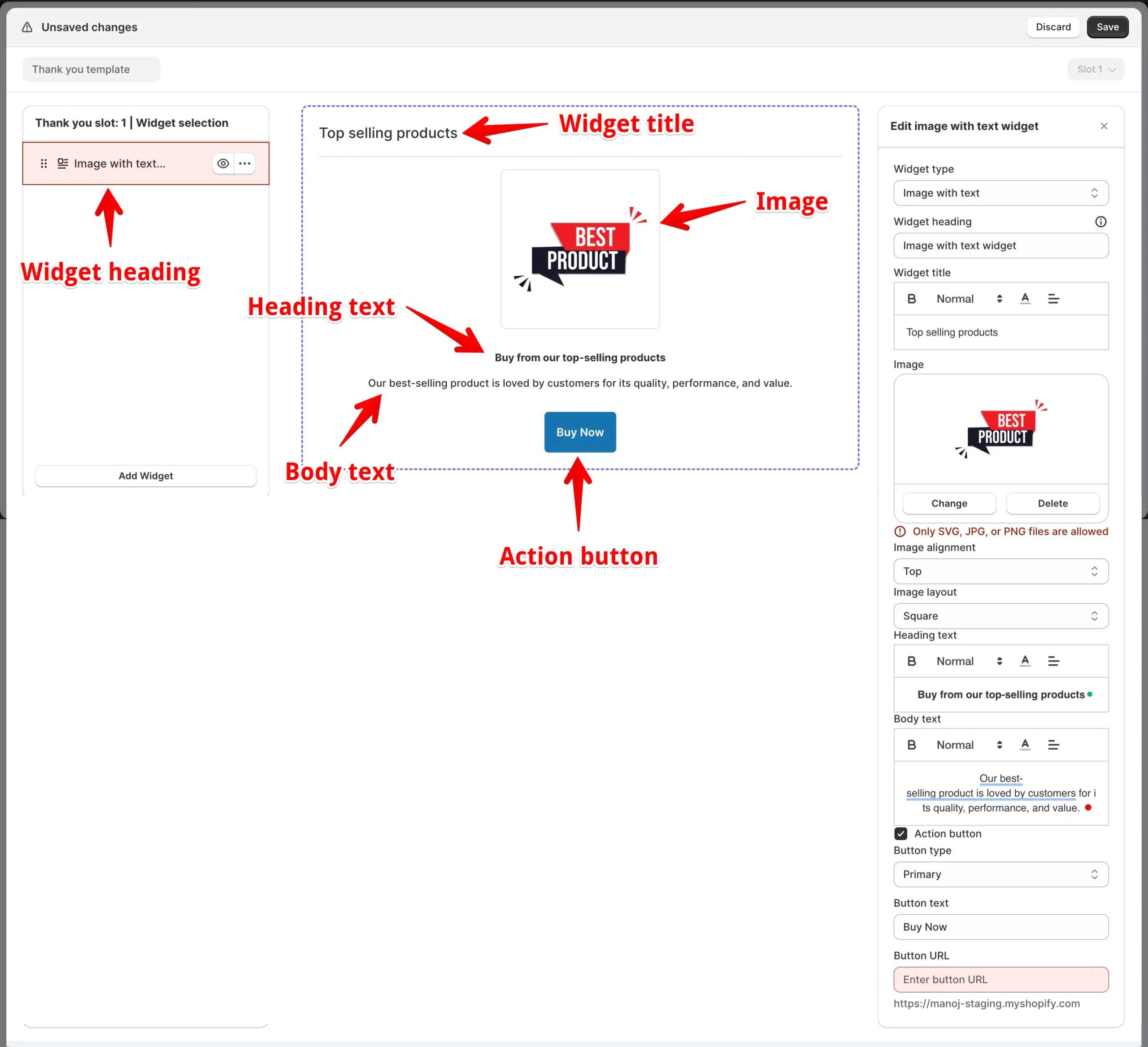
Image Upload
Upload the banner or product image you want to show. Use a high-quality image that matches your offer. Recommended formats: JPG or PNG. Keep file size small to ensure fast loading.
Image Alignment Layout
Controls where your image appears relative to the text. You have 6 options:
- Left — Image on the left, text on the right (side by side)
- Right — Image on the right, text on the left
- Top — Image above the text
- Bottom — Image below the text
- Top Full Width — Image spans the full width at the top
- Bottom Full Width — Image spans the full width at the bottom
Image Layout Shape
Changes the visual shape of the image. Choose Square for a classic rectangular look, or Circle for a rounded, softer appearance. Circle works well for profile or product icons. Square is better for banners and promotional images.
Heading Text Text
This is the large headline displayed alongside or below your image. It should clearly communicate the benefit or message of your banner. Example: “Free Shipping on Orders Over ₹500!”
Body Text Text
A short paragraph to give more details about your offer or message. Keep it brief — 1–3 sentences are ideal. Customers usually read quickly at this stage, so be clear and direct.
Action Button (Checkbox) Toggle
Check this box if you want to show a clickable button on the widget. Uncheck it if you only need an image and text. When checked, three extra settings appear:
- Button Type — Choose between Primary (solid filled), Secondary (outlined), or Plain (text-only link style)
- Button Text — The label shown on the button, like “Shop Now” or “Claim Offer”
- Button URL — The link the button opens when clicked. This could be a product page, collection, or any URL on your store
📱 Type 2: QR Code Settings Widget Type 2
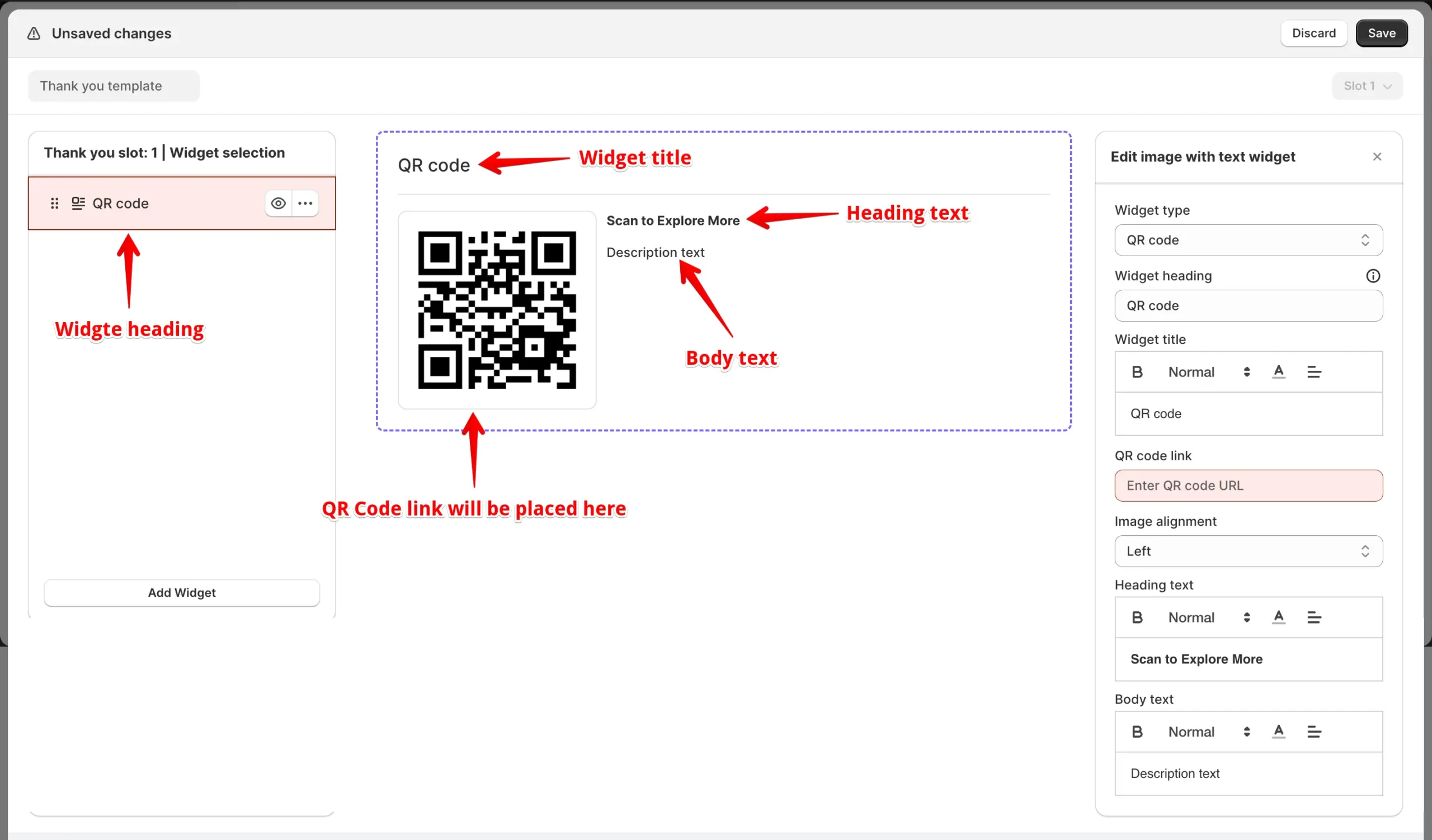
When you select the QR Code type, the app automatically converts a URL you enter into a scannable QR code. This is a simple and powerful way to drive traffic to any page without needing a button click.
QR Code Link URL
Paste the full URL you want the QR code to point to. This can be a product page, a landing page, your app download link, or any other web address. The app auto-generates the QR code image from this URL — no extra tools needed.
Image Alignment Layout
Controls where the QR code image appears relative to the text. Options are Left, Right, Top, Bottom. For QR codes, “Left” or “Top” usually works best so the code is easy to spot and scan.
Heading Text Text
Displayed prominently near the QR code. Use this to repeat or strengthen your main call to action. Example: “Scan This Code to Join Our Loyalty Program.”
Body text Text
Add a supporting description beneath the heading. Briefly explain what the customer will find when they scan. Keep it to 1–2 short sentences.
💡 Useful for:
- Redirecting users to landing pages
- Sharing mobile-friendly offers
- Offline to online promotions
🛡️ Type 3: Trust Badges Settings Widget Type 3
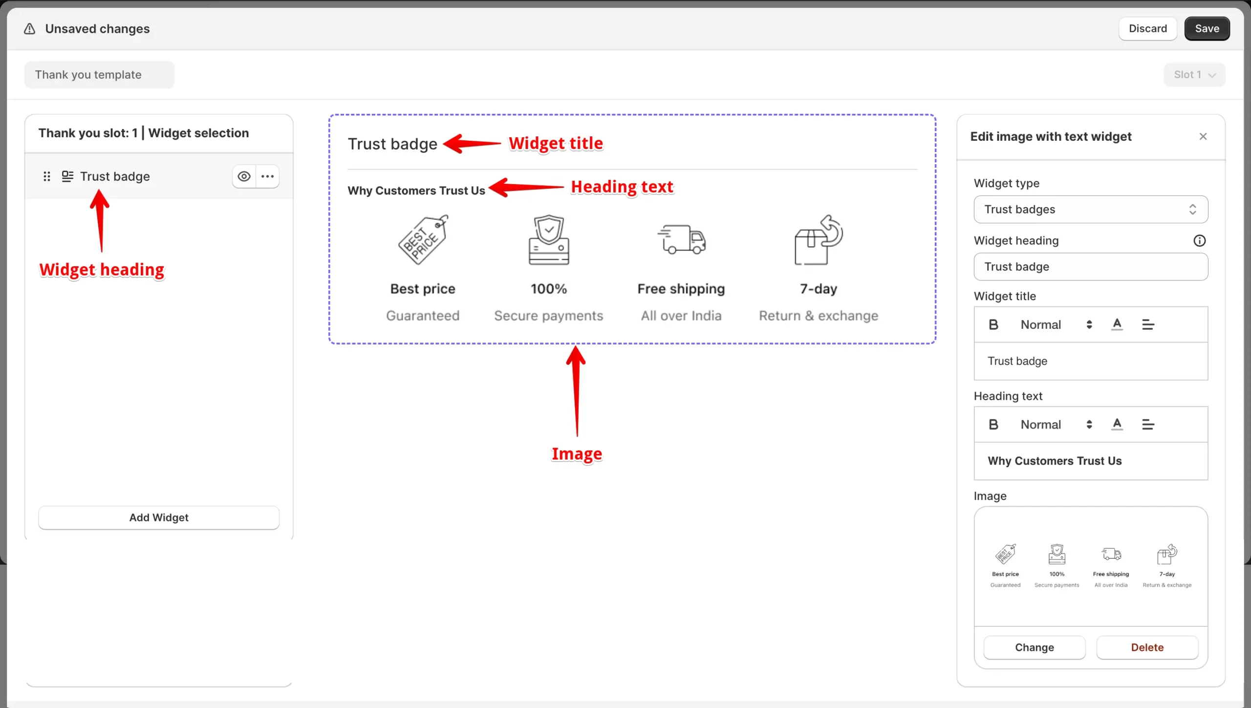
The Trust Badges type is designed to show security and reliability icons on your post-purchase page. These reassure customers that their purchase was safe and that your store is trustworthy.
Image (Trust Badge Upload) Upload
Upload one or more trust badge images — such as SSL certificates, money-back guarantee icons, payment icons, or award logos. Upload each badge as a separate image file. Keep images small and clean so they display neatly on any screen. PNG format with a transparent background works best.
Common Use Cases
Here are real ways you can use the Image with Text widget every day:
Promote a Flash Sale
Show a bold banner image with a discount code right after checkout. Use the Action Button to link directly to the sale collection.
Drive App Downloads
Use the QR Code type with a link to your app store page. Customers can scan it instantly from the thank-you page.
Build Post-Purchase Trust
Display your money-back guarantee badge and secure payment icons using Trust Badges. This reassures first-time buyers and reduces refund anxiety.
Announce a Loyalty Program
Use Image with Text to tell customers about your rewards program right after they buy. Add a button linking to the sign-up page.
Tips & Best Practices
2. Keep your body text under 30 words. Customers skim post-purchase pages — brevity wins.
3. For the Action Button, use clear action words like “Claim Offer,” “Shop Now,” or “Get My Discount” instead of generic “Click Here.”
4. Use “Top Full Width” alignment for promotional sale banners — it grabs attention first.
5. For Trust Badges, upload PNG files with transparent backgrounds so they blend cleanly with your page design.
6. Test your QR code link by scanning it on your own phone before making it live.
7. If you’re promoting a limited-time offer, update the widget regularly so it always shows a relevant, active deal.


