Blog
Gather knowledge about the latest insights, updates, tips, and tricks in the Ecommerce industry.
5 Min • 20 March 2026
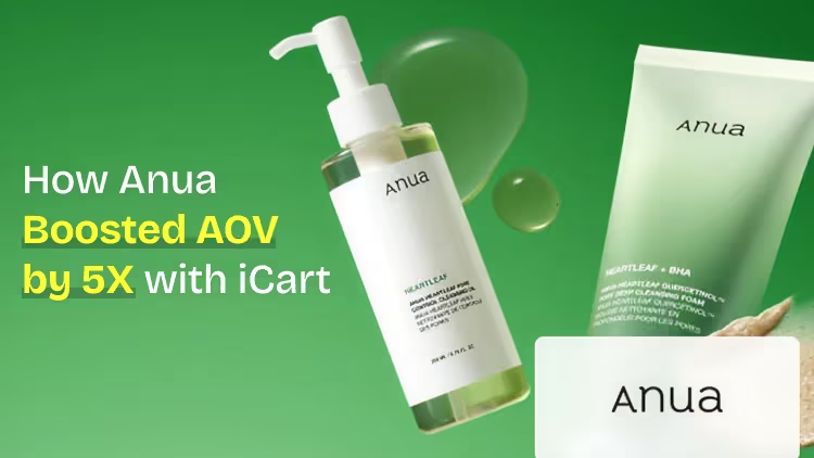
How Anua Unlocked 5X AOV Growth with iCart’s Smart Cart Features
delivery customization Challenges Solutions drive results Scale business delivery customization Challenges Solutions drive results Scale business delivery customization Challenges Solutions drive results Scale business delivery customization Challenges Solutions drive results Scale business Anua is a globally recognized Korean skincare brand known for its minimalist philosophy and focus on gentle yet effective formulations. Built on the idea of simplifying skincare routines, Anua develops products that deliver visible results while avoiding harsh or irritating components, making them suitable for sensitive skin types. Initially using a traditional full cart experience, Anua transitioned to iCart’s side cart solution in August 2025, to create a more seamless and engaging shopping journey. This shift allowed customers to easily explore complementary skincare products without disrupting their browsing flow, making it more intuitive to discover items that fit into a complete routine. By surfacing relevant recommendations directly within the cart, the brand enhanced product visibility across its range. Challenges Before implementing iCart’s side cart solution, Anua faced limitations with their existing full cart experience, which created friction in the customer journey. The traditional cart setup redirected users away from product pages, interrupting their browsing flow and reducing opportunities to explore additional products. As a skincare brand built around routines rather than single-item purchases, this made it difficult to effectively showcase complementary products and encourage customers to build complete regimens. Additionally, the lack of in-cart personalization and strategic upsell opportunities meant that customers were often unaware of related products that could enhance their skincare results. This limited the brand’s ability to increase average order value (AOV) and fully leverage its diverse product range. Anua needed a more dynamic and intuitive cart experience that could seamlessly introduce relevant recommendations while maintaining a smooth and engaging shopping journey. ❌ Cart Value Barriers Low average order value (AOV) due to single-item focus Most customers completed purchases with one primary product instead of building multi-step routines. Cart abandonment near shipping thresholds Customers were not clearly informed or motivated to reach free shipping or discount thresholds. Missed savings opportunities Customers were unaware of potential value in purchasing bundled routines or multiple complementary products. ❌ Absence of Progress-Based Incentives No free shipping or discount progress bar Customers were not motivated to increase their cart value due to lack of visible incentives. Missing tiered rewards system There were no structured milestones (e.g., “Spend more to unlock offers”), reducing upsell opportunities. ❌ Ineffective Cart UI/UX (Pre-Side Cart) Full-page cart disrupted shopping flowCustomers had to leave their browsing journey, increasing friction and drop-offs. No quick add/remove functionality Users couldn’t easily modify their cart or add suggested products without navigating away. Solution To overcome these challenges, Anua implemented iCart’s side cart solution to transform their traditional cart into a high-converting, interactive experience. By replacing the full-page cart with a seamless side cart, the brand ensured that customers could continue browsing while viewing their cart, significantly reducing friction in the shopping journey. Additionally, features like product recommendations & progress bars for free shipping and discounts motivated customers to increase their cart value. By combining personalization, incentive-driven messaging, and a user-friendly interface, Anua successfully turned their cart into a powerful revenue-driving touchpoint rather than just a checkout step. To maximize their cart effectiveness, they implemented two powerful features: ✅ Progress Bar with Multi-Reward Incentives Implemented a tiered progress bar to encourage higher cart value Customers are guided with a clear message like “Add $3.10 to unlock secret offer,” motivating them to continue adding products. Generated over $5M+ in revenue through incentive-driven cart progression Used product-based rewards to align with customer intent Instead of generic discounts, Anua incentivized purchases with relevant skincare items like Dark Spot Pads and mini serums. Built visual motivation for routine expansion As customers add products, they can clearly track progress toward unlocking multiple rewards, encouraging them to build a complete skincare routine. ✅ Product Recommendations Implemented “Frequently Bought Together” recommendations Customers adding a single product (e.g., toner) are shown complementary items like serums, moisturizers, or pads to complete their routine. Generated over 275K revenue through in-cart recommendations Encouraged full skincare regimen building Instead of isolated purchases, the cart suggests step-by-step product combinations aligned with common skincare routines. Increased product discovery at the final stage By surfacing relevant items directly in the cart, Anua ensured customers explore more of their catalog without leaving the checkout flow. Results Achieved in Last 180 Days 22932 Total Store Orders 45101 Total iCart Orders 5X iCart Generated AOV 65.70% Upsell Affected Conversion Rate These improvements reflect a clear shift in customer behavior on Anua’s store. Cart abandonment reduced as shoppers discovered complementary skincare products and felt encouraged to build complete routines. Engagement also increased, with customers interacting more with in-cart recommendations and exploring relevant product pairings. Results & Impact And...Results is Our Main Clarification By implementing iCart’s cart drawer, product recommendations, and progress bar, Anua transformed its cart into a high-performing conversion touchpoint. Shopping Experience Enhancement The improved cart experience encouraged customers to discover complementary products and understand the value of sustainable beauty routines. For instance, the clear presentation of subscription savings alongside one-time purchase options helped customers make more informed decisions about their long-term hair care needs. As Anua continues to optimize its cart experience, the brand is closely monitoring: Routine-based purchasing behavior - tracking how customers move from single items to multi-step regimens Engagement with in-cart recommendations - measuring interaction with suggested products Cart value progression - analyzing how incentives influence higher spending [related_cases_slider] Ready to Write Your Success Story? Try icart App Join successful businesses like Anua and Master your delivery scheduling Delight customers with precise timing Grow your special occasion orders Expand your delivery reach
Read Blog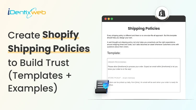
10 Min • 3 June 2026
How to Write a Kickass Shopify Shipping Policy (Examples + Free Template)
A customer is always one click away from buying. They scroll down, look for shipping cost and delivery time, find nothing, and leave. I've watched this exact drop-off play out in heatmaps on stores I've worked with, and it's one of the most fixable conversion leaks out there. A Shopify shipping policy is the page that answers "how much will this cost me and when will it arrive?" before a customer has to ask. At minimum, it should state your order processing time, shipping rates, delivery estimates, and how you handle returns and lost packages. Get those four things right, and you'll cut support emails, reduce chargebacks, and give buyers the confidence to check out. I've written and rewritten dozens of these. Below are the Shopify shipping policy templates I actually use, real examples worth copying, and the exact steps to publish your policy in your Shopify admin. Why does a Shopify shipping policy affect your bottom line? Shipping questions are the number one thing customers email about. "Where's my order?" "Do you ship to New York?" "Why is shipping so expensive?" Every one of these questions is a sales opportunity that you missed. A clear Shopify shipping policy works as a salesperson. It sets expectations so nobody feels misled when an order takes seven days instead of two. Around two-thirds of online shoppers have said return policies have impacted their purchase [2026 Source: FedEx Survey]. A missing or vague policy kills conversions you never see in your reports. The 7 things every Shopify shipping policy must cover 1. Order processing time This is the gap between "order placed" and "package shipped." Most stores need one to three business days. State it clearly and separately from delivery time, because customers conflate the two and then feel cheated. 2. Shipping rates and free shipping threshold Spell out what the shipping costs are. Flat rate, real-time carrier rates, free over a threshold, whatever you run. A free shipping bar at checkout also nudges customers to hit that threshold without you having to lift a finger.. 3. Delivery estimates by region Give a range in timings, not a promise. "Standard shipping arrives in 3 to 7 business days" protects you better than "ships in 3 days." Break it out by domestic and international if your timelines differ. Here's a complete breakdown of how to display the estimated delivery date directly on your product pages in Shopify. 4. Shipping destinations and restrictions List where you ship and where you don't. If you can't ship certain products (lithium batteries, liquids, oversized items) to specific regions, say so here. 5. Order tracking Tell customers when they'll get a tracking number and where it comes from. Shopify sends shipping confirmation emails automatically once you mark an order as fulfilled, so set the expectation that the email is on its way. 6. Lost, delayed, and damaged packages This is the section most merchants forget, and it's the one that saves you. State who is responsible once the carrier takes over, how long a customer should wait before reporting a missing package, and what you'll do about damage. 7. Returns, exchanges, and refunds Shipping and returns are joined in a customer's mind. Either cover your return basics here or link to a dedicated return policy page so the loop closes. Your policy says "X Business Days." Stellar lets customers pick the exact day Giving customers a date picker at checkout to choose their preferred delivery date increases your conversions. Stellar adds a scheduling calendar directly to your product pages and checkout, so customers commit to a date they want rather than wondering when the box will show up. Losing orders because buyers want flexible delivery? A simple calendar at checkout fixes that. Start Your Free Plan Fewer "where's my order" emails, fewer missed deliveries, and a checkout experience that feels more like ordering from a pro. It's free to start and carries the Built for Shopify badge, so it works cleanly with your existing setup. Shopify shipping policy templates (Copy and paste) Pick the one that matches how you ship, swap in your real numbers, and you're done. Replace anything in brackets. ✅ Free shipping policy template Shipping Policy We offer free standard shipping on all orders within [country]. No minimum purchase required. Processing time: Orders are processed within [1 to 2] business days. Orders placed on weekends or holidays ship the next business day. Delivery time: Standard shipping arrives in [3 to 7] business days after processing. Tracking: You'll receive a tracking number by email as soon as your order ships. Questions? Contact us at [email], and we'll respond within [24 hours]. ✅ Flat rate shipping policy template Shipping Policy We charge a flat rate of [$5.99] for shipping on all domestic orders, regardless of order size. Processing time: Orders are processed within [1 to 3] business days. Delivery time: Most orders arrive within [4 to 8] business days after they ship. International: We ship to [list regions]. International flat rate is [$15], and delivery takes [10 to 21] business days. Customs duties and import taxes are the customer's responsibility. Tracking: A tracking link is emailed to you once your order leaves our warehouse. ✅ Tiered / free-over-threshold template Shipping Policy Order totalShipping costUnder [$50][$5.99] flat rate[$50] and overFree standard shipping Processing time: [1 to 2] business days. Delivery time: Standard shipping arrives in [3 to 6] business days. Expedited: Need it faster? Choose expedited shipping at checkout for [$14.99], delivered in [2 to 3] business days. Tracking: Tracking details are sent by email upon fulfilment. ✅ International shipping policy template International Shipping Policy We ship worldwide. Here's what to expect outside [home country]: Rates: Calculated at checkout based on destination and weight. Delivery time: [10 to 21] business days, depending on your country and local customs processing. Customs and duties: Import duties, taxes, and customs fees are not included in your order total and are the customer's responsibility. These are charged by your local customs office on delivery. Tracking: International tracking is provided, but may update slowly once a package leaves [home country]. Restrictions: We can't ship [restricted items] to [restricted regions]. ✅ Comprehensive all-in-one template Shipping Policy Thanks for shopping with [store name]. Here's everything you need to know about how we ship your order. Order processing: All orders are processed within [1 to 3] business days, excluding weekends and holidays. You'll get a confirmation email with tracking once your order ships. Domestic shipping rates and times MethodCostEstimated deliveryStandard[$4.99] or free over [$50][3 to 7] business daysExpedited[$14.99][2 to 3] business days International shipping: We ship to [list regions]. Rates are calculated at checkout. Delivery takes [10 to 21] business days. Customs duties and import taxes are the customer's responsibility. Lost or delayed packages. If your tracking hasn't been updated in [7] business days, email us at [email]. For packages marked delivered but not received, please check with neighbors and your local carrier first, then contact us within [7] days. Damaged orders. If your order arrives damaged, email a photo to [email] within [48 hours] of delivery, and we'll arrange a replacement or refund. Returns: See our [Return Policy] for full details on returns and exchanges. Real Shopify shipping policy examples worth studying Templates get you 90% there. Looking at how real stores phrase things gets you the rest. Brands like Allbirds and Gymshark keep their policies short and scannable, leading with free shipping thresholds and clear delivery windows in plain language. Here’s a Shopify shipping policy example of Allbirds. The lesson: front-load the information customers care about most, which is almost always cost and timing. On the other end, stores selling fragile or high-value goods write longer policies with explicit damage-claim windows and signature-on-delivery terms. If you sell furniture, electronics, or anything breakable, borrow that detail. The extra specificity prevents the disputes that eat your margin. How to add your Shipping policy on Shopify? (5 Steps) ✅ Open your policy settings. From your Shopify admin, go to Settings > Policies. You'll see fields for refund, privacy, terms of service, and shipping policy. ✅ Paste and save your policy Drop your finished template into the shipping policy field. The built-in editor lets you add headings, bold text, bullet points, and tables, so format it for skimming. Click Save, and Shopify automatically creates a hosted page at yourstore.com/policies/shipping-policy. ✅ Link it in your footer Go to Content > Menus, open your footer menu, click Add menu item, name it "Shipping Policy," and search for the policy to link it. ✅ Surface it at key moments Shopify already shows a shipping policy link on product pages and in the cart for most current themes. Add it to your FAQ page and order confirmation emails too, since that's where shipping questions actually come up. One note on shipping policy generators: free tools can spit out a starting draft, but they produce generic language that rarely matches how you actually ship. Use one as a rough draft if you want, then edit in your real processing times, rates, and contact details before you publish. Mistakes that make a shipping policy for Shopify backfire Promising speed you can't hit is the big one. "Ships in 24 hours" sounds great until you're slammed and ship your products in three days. Use ranges and pad them slightly. Burying the policy is another. A perfect policy that nobody can find does nothing. It belongs in the footer, on product pages, and one click from checkout. Leaving out the lost-package and damage sections. That's where disputes live, and a vague policy means you eat everyone. Spell out the rules before you need them. Your shipping policy for Shopify should grow with you Treat your Shopify shipping policy page as a living document. As you add international shipping, change carriers, or run free-shipping promotions, update the policy the same day so it never contradicts what customers see at checkout. A Shopify shipping policy that matches reality is one of the cheapest trust signals you can build. It pays you back every time a customer reads it instead of emailing you. FAQs 1. Does Shopify require a shipping policy? Shopify doesn't force you to have one, but you should treat it as required. It builds trust, cuts support emails, and gives you a document to point to during disputes. Most payment processors also expect clear shipping terms when a customer files a chargeback. 2. How to add a shipping policy in Shopify? Go to Settings > Policies > Shipping policy in your Shopify admin, paste your policy into the shipping policy field, and save. Shopify hosts the page automatically and links it to your checkout. 3. How to add a shipping policy to your store menu? From the Shopify left navigation, go to Content > Menus and add it to your footer menu for extra visibility. 4. Can I use a free shipping policy generator for Shopify? You can, and it's a fine way to get a first draft. Just don't publish the output as-is. Generators produce generic language, so edit in your real processing times, rates, delivery windows, and contact info before it goes live. 5. What should a Shopify shipping policy include? Cover processing time, shipping rates, delivery estimates, destinations and restrictions, tracking, lost or damaged package handling, and returns. Those seven points answer almost every shipping question a customer has before they buy. 6. Should I offer free shipping on my Shopify store? Free shipping lifts conversions, but only if the math works. The common move is a free-shipping threshold set slightly above your average order value, which nudges customers to add one more item and protects your margin while still advertising "free shipping."
14 Min • 5 June 2026
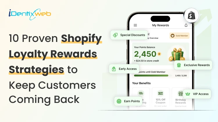
10 Proven Shopify Loyalty Rewards Strategies to Keep Customers Coming Back
It's late. You're scrolling through your Shopify analytics. Your last 100 customers cost you $4,800 in ad spend. Most were bought once and disappeared. Meanwhile, your competitors are sending email campaigns with "You've earned 500 points" subject lines. Their repeat-purchase rate is 47%. Yours is 12%. That's the loyalty gap. And in 2026, it's the difference between a store that scales and one that bleeds. This guide isn't about which app to install. It's about the 10 Shopify loyalty reward strategies that actually move retention numbers. These are the ones I've watched work across 50+ DTC brands, plus the mistakes that keep most loyalty programs flat. Let's get into them. Why a Strong Shopify Loyalty Rewards Strategy Beats Loyalty Software Most stores launch Shopify loyalty rewards programs, set “1 point per $1,” and walk away. Six months later, they wonder why the redemption rate is at 8%, and the repeat-purchase rate hasn't moved. The app isn't the problem. The strategy is. A points program without a tier structure earns 1.8x less ROI than one with tiers. A program without email reminders sees 49% of members never use it (Source: Statista). A reward worth less than $5 at the first tier gets ignored. The strategies below fix those gaps. Use them in order, and you'll outperform stores that just installed an app and hoped for the best. Strategy 1: Pick the Right Reward Model Before Launching The biggest mistake Shopify merchants make with Shopify loyalty rewards is choosing the wrong reward structure. Points are one of six valid reward models, and the wrong fit kills participation. Match your reward model to your product's purchase frequency and average order value (AOV): Points work for high-frequency, mid-AOV stores (skincare, supplements, coffee, pet food). Customers earn enough points fast to feel rewarded. Tiered VIP programs work for stores with 30%+ repeat-purchase rates. They turn casual buyers into status-driven loyalists. Store credit / cashback works for high-AOV brands (jewelry, furniture, electronics) where points feel abstract but $25 back feels real. Referral programs work for any store with a strong word-of-mouth product. Skincare and apparel see 20%+ referral rates when the incentive is right. Paid memberships work for premium brands where customers will pay $50-$100/year for VIP perks. Songmont made $110K in 14 days using this model. Gamification works for younger audiences (Gen Z) and stores with frequent product drops. Spin wheels, badges, and missions drive between-purchase engagement. Action step: Look at your last 90 days of orders. Your repeat-purchase window averages under 60 days, so start with a points-based Shopify loyalty rewards model. If it's over 90 days, start with tiered VIP. If you're high-AOV with infrequent purchases, start with store credit. Strategy 2: Set Reward Values That Actually Feel Worth It One of the fastest ways to kill engagement in Shopify loyalty rewards programs is offering rewards that feel too small. The reward feels insignificant, and they forget the program exists. The minimum reward value that drives action is $5 at the first redemption tier. Below that, you're underselling the customer's effort to track and redeem. Here's a tested earn-and-burn ratio that works for most Shopify stores: Earn: 1 point per $1 spent Welcome bonus: 200 points for signing up First reward: 500 points = $5 off (achievable after one $300 order or via signup + small purchase) Mid-tier reward: 1,000 points = $15 off (better-than-linear value to encourage saving) Premium reward: 2,500 points = $50 off + free shipping Notice the non-linear scaling. The premium reward gives more value per point than the first reward. This is intentional. It pulls customers up the ladder. Action step: Calculate your gross margin. Cap point liability at 3-5% of revenue. If your margin is 60%, a $5 reward at 500 points means you're giving up $5 on every $300 of customer spend, well within healthy limits. Strategy 3: Build VIP Tiers That Actually Mean Something Flat Shopify loyalty rewards programs almost always underperform tiered systems by 1.8x in ROI. But most tier structures are theater. They have names like "Silver, Gold, Platinum" but the perks are nearly identical. Real tiers create real status differences. Here's a tier structure that drives behavior: TierThresholdReal PerksMember (default)Sign up1x points, birthday bonusSilver$250/year spend1.5x points, free shipping over $50, early access to salesGold$750/year spend2x points, free shipping any order, exclusive products, surprise giftsPlatinum$1,500/year spend3x points, free returns, dedicated support line, annual gift The key isn't the names. It's making each tier feel meaningfully different. Free shipping at Silver. Exclusive products at Gold. Dedicated support at Platinum. Each tier needs at least one perk that a customer will brag about. Action step: Survey your top 10 customers. Ask: "What's one perk you'd love that we don't currently offer?" Build that into your top tier. Strategy 4: Email Your Members 3 Times They'll Actually Open In most Shopify loyalty rewards programs, active redeemers spend 3.1x more than passive members. Most loyalty programs send a generic welcome email and stop. The members who never use the program never get pulled back in. Three emails do the heaviest lifting: 1. The point-balance reminder (every 30 days) "You have 480 points. That's almost enough for $5 off your next order." Specific number. Specific value. Specific next action. 2. The tier-upgrade nudge (when 80% of the way to the next tier) "You're $147 away from Gold status. Gold members get 2x points and free shipping on every order." Loss aversion + concrete benefit. This email has the highest click-through rate of any loyalty trigger. 3. The reward-expiry warning (14 days before) "Your $25 reward expires April 30. Use it on your next order before it disappears." Urgency + specific deadline. Recovers 30-40% of customers who would have churned silently. Action step: Set up these three flows in Klaviyo (or your email tool) before you do anything else. They'll generate more revenue than any other loyalty optimization. If you haven't connected Klaviyo to your store yet, our step-by-step Klaviyo Shopify integration guide covers both setup methods, what data syncs, and how to verify the connection. Strategy 5: Reward Actions Beyond Just Purchases Most Shopify loyalty rewards programs only reward purchases. That misses 70% of the engagement opportunity. Customers do many valuable things between purchases. Reward those, and you build engagement that compounds: Account creation → 100 points (low-cost, high-acquisition signal) Email signup → 50 points (builds your most valuable channel) Birthday → 200 points (drives a "thank you" purchase) Product review → 50 points (UGC fuels conversion) Photo review → 150 points (better UGC, better social proof) Social follow → 25 points (low-effort engagement) Referral that converts → 500 points (highest LTV channel) Anniversary of first purchase → 100 points (retention nudge) The 70/30 rule applies: 70% of points should be earned via purchases, 30% via engagement actions. More than 30% from engagement, and you devalue purchases. Less than 30% and you miss the engagement compounding effect. A note on tooling: combining loyalty, reviews, and referrals into a single workflow is what makes this strategy practical. Platforms like Yuko bundle all three into one dashboard, so a customer earning points for a photo review is the same record as the customer earning points for a referral, no syncing, no broken attribution. Whatever tool you use, keep these three reward channels under one roof. Action step: Audit your current earning rules. If you only reward purchases, add 3-4 engagement actions this week. Start with reviews and referrals - both pay back immediately. Strategy 6: Make Redemption Frictionless at Checkout A Shopify loyalty rewards system where customers can't redeem points at checkout is a system nobody uses. The best Shopify stores embed loyalty into the checkout flow itself, so customers see their available rewards at the moment of purchase. No copy-paste codes. No emails. No friction. Three checkout integrations matter: Point balance display on cart page - customers see "You have $15 in rewards" before they hit checkout One-click redemption - clicking a reward auto-applies the discount, no code typing Tier progress bar - "Spend $34 more to unlock Gold benefits" pulls customers to add to cart Stores that implement checkout-level loyalty see redemption rates climb from 8-12% (industry average) to 25-35%. That's not a small lift; that's the difference between a program that works and one that doesn't. Action step: Test your own checkout. Try redeeming a reward as a customer. If it takes more than 2 clicks or requires copy-pasting a code, fix it before launching any other strategy. Strategy 7: Use Tier Status as a Marketing Channel In mature Shopify loyalty rewards programs, VIP members become the highest-value customers. Treat them like a focus group, not a discount audience. Here's what high-performing Shopify stores do with their top tiers: Early product drops - Gold and Platinum members get 24-48 hour exclusive access Beta product testing - Send free samples to top-tier members in exchange for honest feedback Private community - A Slack, Discord, or Circle community just for top spenders Founder access - Quarterly Q&A calls with the founder for Platinum members Custom packaging - Branded thank-you notes or premium packaging for top-tier orders These perks cost almost nothing to deliver but generate two outcomes that drive massive ROI: higher repeat-purchase rates and organic word-of-mouth. A customer who spends $1,500/year and gets a personal video from the founder doesn't churn. They become a advocates. Action step: Identify your top 50 customers by lifetime value. Send them a personal email this week, thanking them. Watch what happens to their next-90-day spend. Strategy 8: Set Smart Point Expiration (Not Too Short, Not Too Long) Points that never expire become a financial liability on your balance sheet. Points that expire in 30 days kill redemption and frustrate customers. The goldilocks zone for most Shopify stores is 6-12 month expiration, with two clear rules: Reset the timer on activity - If a customer earns or redeems points, their full balance gets a fresh expiration date. This rewards engagement instead of punishing it. Send 3 expiration warnings - 30 days out, 14 days out, and 3 days out. Customers who get all three reminders redeem at 4x the rate of those who get one. Why expiration matters financially: unused points sit on your balance sheet as unredeemed liability. A store with 50,000 members earning 100 points/month creates $50,000+ in potential payouts. Without expiration, that liability grows forever. With smart expiration, it stays manageable. The B2B ecommerce industry holds $48 billion in unredeemed loyalty points liability (Source: Statista). Don't add to that number unnecessarily. Action step: Set your point expiration to 12 months from last activity (earn or burn). Add the 3-warning email sequence. Review your point liability quarterly. Strategy 9: Build Referrals Into the Reward Stack Referrals are one of the highest-performing channels inside modern Shopify loyalty rewards ecosystems. Customers acquired via referral spend 16% more and have 18% lower churn than customers from any other channel. Yet most loyalty programs treat referrals as a side feature. Make them the core. A referral program that works has four components: 1. A two-sided reward - both the referrer and the friend get something. Lopsided rewards feel selfish. The referrer gets $20 in store credit. The friend gets 20% off their first order. Both win. 2. A pre-written share message - make it easy for the customer to share. Most won't write their own. "I love [Brand Name]'s [product]. You get 20% off your first order with my link, and I get $20 toward my next order. [link]" 3. Multi-channel sharing - email, SMS, WhatsApp, Instagram DM, Facebook Messenger. Different customers share on different platforms. 4. Anti-fraud protection - IP matching, email-domain checks, and per-user codes prevent self-referrals and coupon site abuse. Most Shopify stores stitch referrals together with separate apps for loyalty, reviews, and referral tracking. That fragmentation creates attribution problems. Unified platforms like Yuko keep all four components - two-sided rewards, share messages, multi-channel sharing, anti-fraud in one workflow, so a referral that converts updates the same customer record as their points and reviews. Action step: If your current referral reward is under $20 (or 20% off), raise it. The cost feels high until you calculate the LTV of a referral customer. Then it feels cheap. Our guide to Shopify fraud protection and high-risk orders explains how to identify and flag these before they hit your margins. Strategy 10: Track the Three Numbers That Actually Matter Most stores measure loyalty programs by signups. That's the wrong number. Three metrics tell you whether your program is working: 1. Active redemption rate Members who've redeemed at least once in the last 90 days, divided by total members. Target: 25-35%. Below 15% = your program isn't sticky. 2. Member vs. non-member CLV Average lifetime value of loyalty members compared to non-members. Target: 1.5-3x higher for members. Below 1.5x = your tiers don't matter. 3. Repeat purchase rate of members Percentage of members who've made 2+ purchases. Target: 50%+. Industry average is 28%. Your members should be far above average. Track these monthly. If any drops below target, the strategies above tell you what to fix: Active redemption low? → Strategy 4 (email reminders) and Strategy 6 (checkout friction) CLV gap small? → Strategy 3 (better tier perks) and Strategy 7 (top-tier marketing) Repeat rate low? → Strategy 1 (wrong reward model) and Strategy 2 (reward values too small) Action step: Build a simple dashboard with these three numbers. Review them monthly. Treat them as the KPIs your program lives or dies by. How These 10 Strategies Work Together Each strategy on its own moves the needle a little. Together, they compound. A store that picks the right reward model (Strategy 1), sets meaningful values (Strategy 2), builds real tiers (Strategy 3), sends three emails (Strategy 4), rewards engagement (Strategy 5), removes checkout friction (Strategy 6), markets to top tiers (Strategy 7), uses smart expiration (Strategy 8), runs strong referrals (Strategy 9), and tracks the right metrics (Strategy 10) consistently outperforms a store that just installed an app. The brands earning 4.8x ROI from loyalty aren't running better software. They're running better strategies on the same software. Common Mistakes That Sabotage These Strategies Even merchants who follow the framework above can fall into these traps. Watch for them: Launching everything at once - pick 3 strategies for month one, add 2 more each month. Trying to deploy all 10 immediately overwhelms your team and confuses customers. Discounting too aggressively - if your loyalty program stacks on top of every other promotion, you'll erode margin. Set rules: loyalty rewards don't stack with sale items, or only one discount applies per order. Forgetting to communicate value - customers don't know they're VIP unless you tell them. Make tier status visible in account pages, order confirmations, and email signatures. Letting the program run on autopilot - review your KPIs monthly. Adjust earn rates, reward values, and tier thresholds quarterly. A program you don't tune declines steadily. Treating loyalty as separate from your brand - your loyalty program should feel like an extension of your brand, not a generic widget. Match colors, voice, and tone. The Bottom Line Shopify loyalty rewards programs aren't a 2026 trend - they're a 2026 survival strategy. Acquisition costs aren't dropping. Ad targeting isn't getting easier. The Shopify brands that win this year will be the ones that turn one-time buyers into repeat customers automatically, while they sleep. The good news: you don't need a bigger budget to do this. You need a better strategy. The 10 above will move your customer retention numbers further than any new app, any new ad campaign, or any new product launch. Start with three strategies this week: Strategy 4 (the three emails), Strategy 6 (frictionless checkout), and Strategy 10 (the three KPIs). Those three alone will generate measurable lift in 30 days. Then layer in the rest over the next 90 days. By month four, you'll have a loyalty program that compounds - one that pulls customers back without needing you to push them. That's the loyalty gap, closed. FAQs 1. What's the most important loyalty strategy for a new Shopify store? Start with Strategy 1 (picking the right reward model) and Strategy 4 (the three emails). Without the right model, no other strategy works. Without the emails, members forget they're members. These two alone account for 60-70% of your potential lift. 2. How long until loyalty strategies show measurable ROI? Most stores see early signals (signups, first redemptions) within 30 days. Meaningful repeat-purchase shifts typically take 90-180 days as members earn enough points to redeem. Full 4.8x ROI usually shows up by year 2-3 as the member base matures. 3. Should I run a loyalty program if my repeat-purchase rate is already 40%+? Yes, but focus on tier upgrades and referrals (Strategies 3 and 9) rather than basic points. Your customers have already come back. Use loyalty to make them come back more often and bring friends. 4. How much should I budget for loyalty rewards? Cap point liability at 3-5% of revenue. For a store doing $50,000/month, that's $1,500-$2,500/month in potential reward payouts. Adjust your earn rate and reward values to stay within that envelope. 5. Do loyalty rewards strategies work for low-margin stores? Yes, but with adjustments. Low-margin stores should favor non-monetary rewards (early access, exclusive products, branded gifts) over discount-based rewards. The perceived value can be high while the actual cost stays low.
5 Min • 28 May 2026
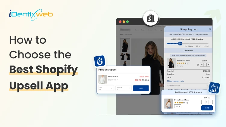
How to Choose the Best Shopify Upsell App for Your Store (9 Decision Factors That Impact ROI)
Are you making the most out of every single visitor that comes to your store? Most Shopify merchants focus almost entirely on getting more traffic. But the real revenue lever? It's often right there in your existing checkout flow, hidden in plain sight. That's exactly where the best Shopify upsell app comes in. But here's the catch: not every Shopify upsell app is built the same. In this guide, we will see 9 key decision factors that separate a high-ROI upsell app from one that just sits there collecting dust. The 9 Decision Factors That Determine ROI From Your Shopify Upsell App Before you install any app from the Shopify App Store, run it through these 9 filters. They're the factors that will determine whether your upsell app earns its keep or just adds noise to your store. Decision FactorWhat It MeansWhy It Impacts ROIUpsell PlacementWhere offers appear (cart, product, post-purchase)Wrong placement = ignored offersTrigger LogicRules that fire an upsell offerIrrelevant triggers = poor conversionsAOV ImpactAverage order value lift potentialCore ROI metric - track weeklyA/B TestingAbility to test offer variantsNo testing = leaving money on tableAnalyticsRevenue, CTR, conversion reportingBlind decisions without good dataStore SpeedPage load impact after app installSlow store = higher bounce rateDesign CustomizationMatch your brand look and feelJarring UI reduces trust & CTRPricing ModelFlat fee vs revenue shareRevenue share hurts at scaleSupport QualityResponse time and helpfulnessBad support = expensive downtime 1. Upsell Placement Options Placement is everything. An upsell shown at the wrong moment feels like an interruption. Shown at the right moment, it feels like a helpful suggestion. The best Shopify upsell apps give you multiple placement options: Product page upsells (before add-to-cart) Cart drawer or cart page upsells Checkout page upsells (available with Shopify Plus) Post-purchase / Thank You page upsells Order status page upsells For most stores, in-cart and post-purchase placements deliver the highest conversion rates because shoppers are already committed to buying. So, if you want a better app for that then you can try iCart & SellMore app because compared to other apps it is affordable and at the same time these apps provide multiple features to boost AOV & conversions. 2. Trigger Logic & Targeting Rules Showing the right upsell to the right customer at the right time is the whole game. A Shopify upsell app with smart trigger logic lets you set rules like: Show this upsell only when Cart contains Product X Trigger this offer when cart value exceeds $50 Display this bundle only to first-time visitors Upsell Product B specifically to buyers of Product A The more granular the targeting, the better your conversion rate. Apps with basic "show to everyone" logic will always underperform compared to apps that let you build conditional, product-specific rules. Irrelevant upsells don't just fail to convert, they actively annoy customers. 3. AOV Impact Your Average Order Value (AOV) is the clearest indicator of how well your upsell strategy is working. When evaluating an app, check its case studies and Shopify App Store reviews specifically for mentions of AOV improvement. Real merchant results are more reliable than vendor marketing claims. 4. A/B Testing Capabilities Even the best upsell offer can be made better. A/B testing lets you compare two versions of an upsell and see which one converts more. Without A/B testing, you're essentially guessing. With it, you're making data-driven decisions that compound over time. Ask these questions before choosing an app: Does the app support split testing of upsell offers? Can you test different placements against each other? Are test results presented clearly in a dashboard? 5. Analytics & Reporting Revenue is the goal, but you need data to get there reliably. The best Shopify upsell apps give you a clean dashboard showing: Total upsell revenue generated Click-through rate (CTR) on each offer Conversion rate by offer and placement AOV before and after upsell implementation Top-performing offers and products An app with great analytics allows you to double down on what works and cut what doesn't 6. Store Speed Impact Here's something merchants often overlook: upsell apps run JavaScript on your store. A poorly coded app can add hundreds of milliseconds to your page load time and that adds up fast. Before installing any app, check: GTmetrix or PageSpeed Insights scores after installation Whether the app uses lazy loading for its scripts Reviews on the Shopify App Store mentioning speed/performance 7. Design Customization Upsell popups and widgets that look out of place are a trust signal problem. Shoppers are sharp, they notice when something looks bolted on. The best Shopify upsell apps give you: Custom color, font, and button styling Fully responsive mobile design Control over popup timing and animation Drag-and-drop or code-level layout editing Always check if the app has design customization options before committing. 8. Pricing Model Most Shopify upsell apps charge in one of two ways: a flat monthly fee, or a percentage of the revenue generated through the app. Both models have tradeoffs. ModelBest ForWatch Out ForFlat Monthly FeePredictable costs, scales well at high revenueFixed cost even during slow monthsRevenue ShareLow upfront risk for new storesGets expensive fast as revenue grows 9. Support Quality Even the best-coded Shopify apps occasionally run into issues like theme conflicts, display bugs, feature questions. Responsive, knowledgeable support is what separates a minor hiccup from a full revenue-impacting outage. Before choosing an app, check: Average response time mentioned in reviews Whether live chat or email support is available If there's a help documentation library How the developer responds to negative reviews in the App Store Final Thoughts: Choosing the Best Shopify Upsell App Run every shortlisted app through the 9 decision factors in this guide - placement, trigger logic, AOV impact, A/B testing, analytics, speed, design, pricing, and support. Those 9 filters will cut through the noise and point you to the right choice.

Vineet Nair
11 Min • 9 June 2026
8 Views

Sajini Annie John
3 Min • 5 June 2026
13 Views
Vineet Nair
14 Min • 5 June 2026
18 Views
")
Vineet Nair
9 Min • 5 June 2026
13 Views

Vineet Nair
8 Min • 4 June 2026
18 Views

Sajini Annie John
2 Min • 3 June 2026
20 Views
Vineet Nair
10 Min • 3 June 2026
19 Views

Vineet Nair
7 Min • 2 June 2026
31 Views

Sajini Annie John
6 Min • 30 May 2026
48 Views
")
Vineet Nair
10 Min • 29 May 2026
44 Views
Sajini Annie John
5 Min • 28 May 2026
35 Views

Vineet Nair
11 Min • 28 May 2026
41 Views