

Shopify Help Articles
Gather knowledge about the latest insights, updates, tips, and tricks in the Ecommerce industry.
5 Min • 29 April 2026
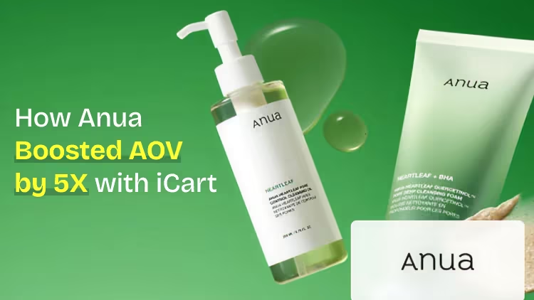
How Anua Unlocked 5X AOV Growth with iCart’s Smart Cart Features
delivery customization Challenges Solutions drive results Scale business delivery customization Challenges Solutions drive results Scale business delivery customization Challenges Solutions drive results Scale business delivery customization Challenges Solutions drive results Scale business Anua is a globally recognized Korean skincare brand known for its minimalist philosophy and focus on gentle yet effective formulations. Built on the idea of simplifying skincare routines, Anua develops products that deliver visible results while avoiding harsh or irritating components, making them suitable for sensitive skin types. Initially using a traditional full cart experience, Anua transitioned to iCart’s side cart solution in August 2025, to create a more seamless and engaging shopping journey. This shift allowed customers to easily explore complementary skincare products without disrupting their browsing flow, making it more intuitive to discover items that fit into a complete routine. By surfacing relevant recommendations directly within the cart, the brand enhanced product visibility across its range. Challenges Before implementing iCart’s side cart solution, Anua faced limitations with their existing full cart experience, which created friction in the customer journey. The traditional cart setup redirected users away from product pages, interrupting their browsing flow and reducing opportunities to explore additional products. As a skincare brand built around routines rather than single-item purchases, this made it difficult to effectively showcase complementary products and encourage customers to build complete regimens. Additionally, the lack of in-cart personalization and strategic upsell opportunities meant that customers were often unaware of related products that could enhance their skincare results. This limited the brand’s ability to increase average order value (AOV) and fully leverage its diverse product range. Anua needed a more dynamic and intuitive cart experience that could seamlessly introduce relevant recommendations while maintaining a smooth and engaging shopping journey. ❌ Cart Value Barriers Low average order value (AOV) due to single-item focus Most customers completed purchases with one primary product instead of building multi-step routines. Cart abandonment near shipping thresholds Customers were not clearly informed or motivated to reach free shipping or discount thresholds. Missed savings opportunities Customers were unaware of potential value in purchasing bundled routines or multiple complementary products. ❌ Absence of Progress-Based Incentives No free shipping or discount progress bar Customers were not motivated to increase their cart value due to lack of visible incentives. Missing tiered rewards system There were no structured milestones (e.g., “Spend more to unlock offers”), reducing upsell opportunities. ❌ Ineffective Cart UI/UX (Pre-Side Cart) Full-page cart disrupted shopping flowCustomers had to leave their browsing journey, increasing friction and drop-offs. No quick add/remove functionality Users couldn’t easily modify their cart or add suggested products without navigating away. Solution To overcome these challenges, Anua implemented iCart’s side cart solution to transform their traditional cart into a high-converting, interactive experience. By replacing the full-page cart with a seamless side cart, the brand ensured that customers could continue browsing while viewing their cart, significantly reducing friction in the shopping journey. Additionally, features like product recommendations & progress bars for free shipping and discounts motivated customers to increase their cart value. By combining personalization, incentive-driven messaging, and a user-friendly interface, Anua successfully turned their cart into a powerful revenue-driving touchpoint rather than just a checkout step. To maximize their cart effectiveness, they implemented two powerful features: ✅ Progress Bar with Multi-Reward Incentives Implemented a tiered progress bar to encourage higher cart value Customers are guided with a clear message like “Add $3.10 to unlock secret offer,” motivating them to continue adding products. Generated over $5M+ in revenue through incentive-driven cart progression Used product-based rewards to align with customer intent Instead of generic discounts, Anua incentivized purchases with relevant skincare items like Dark Spot Pads and mini serums. Built visual motivation for routine expansion As customers add products, they can clearly track progress toward unlocking multiple rewards, encouraging them to build a complete skincare routine. ✅ Product Recommendations Implemented “Frequently Bought Together” recommendations Customers adding a single product (e.g., toner) are shown complementary items like serums, moisturizers, or pads to complete their routine. Generated over 275K revenue through in-cart recommendations Encouraged full skincare regimen building Instead of isolated purchases, the cart suggests step-by-step product combinations aligned with common skincare routines. Increased product discovery at the final stage By surfacing relevant items directly in the cart, Anua ensured customers explore more of their catalog without leaving the checkout flow. Results Achieved in Last 180 Days 22932 Total Store Orders 45101 Total iCart Orders 5X iCart Generated AOV 65.70% Upsell Affected Conversion Rate These improvements reflect a clear shift in customer behavior on Anua’s store. Cart abandonment reduced as shoppers discovered complementary skincare products and felt encouraged to build complete routines. Engagement also increased, with customers interacting more with in-cart recommendations and exploring relevant product pairings. Results & Impact And...Results is Our Main Clarification By implementing iCart’s cart drawer, product recommendations, and progress bar, Anua transformed its cart into a high-performing conversion touchpoint. Shopping Experience Enhancement The improved cart experience encouraged customers to discover complementary products and understand the value of sustainable beauty routines. For instance, the clear presentation of subscription savings alongside one-time purchase options helped customers make more informed decisions about their long-term hair care needs. As Anua continues to optimize its cart experience, the brand is closely monitoring: Routine-based purchasing behavior - tracking how customers move from single items to multi-step regimens Engagement with in-cart recommendations - measuring interaction with suggested products Cart value progression - analyzing how incentives influence higher spending [related_cases_slider] Ready to Write Your Success Story? Try icart App Join successful businesses like Anua and Master your delivery scheduling Delight customers with precise timing Grow your special occasion orders Expand your delivery reach
Read Blog
11 Min • 15 September 2026
How to Migrate WooCommerce to Shopify in 2026 Without Losing Orders or SEO
Migrating from WooCommerce to Shopify can be done through Shopify’s Store Migration app, CSV imports, third-party migration tools, or a custom API setup. Products, customers, and selected order data can move, while themes, plugins, and URLs need rebuilding or redirecting. After migration, configure payments, shipping, taxes, and checkout, test orders and key store functions, and verify and monitor SEO. Moving from WooCommerce to Shopify involves more than transferring your products. You’ll also need to migrate customer and order data, recreate key store features, maintain important URLs, and make sure your search rankings are not affected during the move. If you're moving from WooCommerce to Shopify in 2026, keeping your existing store running while you prepare, migrate, and test the new Shopify store can help prevent data loss and launch-day issues. This guide walks through the migration process, with particular attention to products, customers, orders, functionality, redirects, and SEO. Why do store owners migrate from WooCommerce to Shopify? Most people we consult aren't unhappy with WooCommerce. It is a very capable e-commerce platform. They move because managing hosting, plugin updates, security, and ongoing maintenance becomes increasingly time-consuming. Shopify is a hosted platform, so hosting and much of the underlying maintenance are handled for you. Features such as Shop Pay, Shopify POS, and its app ecosystem can also simplify day-to-day operations. If you're still weighing it up, my WooCommerce vs Shopify guide walks you through the complete comparison. What moves when you migrate WooCommerce to Shopify Not everything in a WooCommerce store is migrated in the same way. Products, customers, and some order data can be transferred, while themes and plugins need to be rebuilt or replaced, and existing URLs need to be redirected. DataWhat happens during migrationProducts and variantsStore Migration app, CSV import, or a migration appCustomersCustomer CSV, Store Migration app, or a migration appOrdersMigration app or the Shopify API onlyReviewsA reviews app like Judge.me, Loox, or YotpoBlog posts and pagesMatrixify, or copied over by handCouponsA migration app, or rebuilt in DiscountsTheme and designRebuilt on a Shopify themePluginsReplaced with Shopify apps or native featuresURLsNew format, so you need 301 redirects What to do before you move from WooCommerce to Shopify Back up everything. Use your host's backup or a plugin like UpdraftPlus to perform a full data export. Record your URLs and traffic. Export your top landing pages from Google Search Console for the last 90 days. You'll need them for redirects. List every active plugin. These can become Shopify apps or native settings, depending on the functionality it was used for in your store. Check your product attributes. Shopify allows three options per product. Flag anything using four or more. Review and clean your data. Remove duplicate or outdated records where appropriate, review discontinued products, and standardize complicated variant names before importing your data. How to migrate from WooCommerce to Shopify step by step 1. Build your Shopify store Set up your Shopify store, but keep your WooCommerce store live while you work. You still need the old store for checking data, URLs, images, and functionality during the migration. Shopify lets you select WooCommerce during signup. It also creates a starter theme based on your existing store URL. The generated theme uses Dawn and recreates parts of your current storefront. 2. Decide what you are moving and how Make a list of everything that needs to move: products, variants, customers, historical orders, reviews, pages, blog content, discounts, and any other store data you still use. Then choose the migration method for each. Shopify's Store Migration app is currently in early access for certain stores and can import WooCommerce products from the original WooCommerce CSV. For everything else, you can use Shopify CSV imports where supported, a third-party migration tool like Cart2Cart or LitExtension, a custom API migration, or a Shopify migration agency. If you cannot manage the move, Identixweb can handle the migration for you. Our Shopify migration service helps move your store data, rebuild required functionality, map redirects, review SEO risks, and test the new Shopify store before launch. 3. Export and prepare your WooCommerce data WooCommerce has a built-in CSV exporter for products under Products > All Products > Export. You can choose the products, columns, categories, and whether to include custom metadata in the export. What happens next depends on your migration method. The Store Migration app will accept the WooCommerce product CSV without reformatting it. If you use Shopify's product CSV importer, the WooCommerce columns need to be mapped to Shopify's format first. For customers, export their data and format it using Shopify’s Customer CSV template. Import them through Shopify Admin > Customers > Import. Historical orders need a migration app such as Matrixify, LitExtension, or Ablestar WooCommerce Importer. This is because Shopify does not offer a native order CSV importer. 4. Migrate products, customers, and orders in that order Move your products first, customers second, and historical orders last. We recommend this sequence so imported orders can connect to the right products and customers. Validate each data set immediately after importing it rather than waiting until the entire migration is complete. After the product import, compare prices, SKUs, variants, inventory, weights, images, and descriptions against WooCommerce. Shopify specifically recommends reviewing product data after import because incorrect data like prices can affect the store immediately. 5. Rebuild your storefront and replace WooCommerce plugins Your WooCommerce theme does not become a Shopify theme, and your WordPress plugins do not become Shopify apps. Build the storefront on a Shopify theme and recreate the parts of your WooCommerce setup that customers actually use. Go through the plugin list you made earlier and match each important function with a Shopify feature, app, or custom solution. Don't migrate plugins one-to-one. Instead, identify what each WooCommerce plugin does and determine whether the same functionality can be handled by Shopify's native features, an app, or a custom solution. 6. Set up payments, shipping, taxes, and checkout Set up your locations, shipping zones and rates, payment provider, tax settings, checkout preferences, store policies, fulfillment process, and customer notifications. Don't assume your WooCommerce settings can simply be copied to Shopify. Review each payment, shipping, tax, checkout, and fulfillment setting based on how the new store will operate. 7. Testing Before launch, test the Shopify store from the customer's perspective. Place test orders, check successful and failed payments, refunds, cancellations, fulfillment, customer emails, navigation, search, forms, product variants, discount codes, and shipping rates. 8. Run a final data check and switch the domain If your WooCommerce store remained open during the migration, check for products, customers, and orders created after your first transfer. Compare record counts and spot-check important orders before you switch traffic to Shopify. Once the Shopify store is ready, connect or transfer your existing domain and make Shopify the live storefront. After the switch, test your old URLs again to make sure the redirects reach the correct Shopify pages rather than returning 404 errors. How to migrate products from WooCommerce to Shopify The best migration method depends on your catalog size, product complexity, and the data you need to preserve. You can use Shopify's supported migration options, CSV imports, a third-party migration tool, or an API-based migration. WooCommerce columnShopify columnNameTitleDescriptionBody (HTML)Attribute 1 name/value (s)Option1 Name / Option1 ValueSKUVariant SKURegular priceVariant PriceStockVariant Inventory QtyWeight (lbs)Variant Grams (multiply by 453.6)ImagesImage Src WooCommerce can hold several attribute values in one cell. Shopify wants one option value per row, so each variant needs its own line. Shopify also raised the cap to 2,048 variants per product, so catalogs with lots of sizes and colors fit easily now. The limit of three options per product didn't change. If a product uses four attributes, move the extras into product metafields or use a product options app. Watch your images too. Product images are imported from their WordPress URLs, so keep the old site online until the import finishes. Images inside descriptions still point at your WordPress server. Matrixify can move them into Shopify Files, or they'll break when you cancel hosting. How to migrate orders from WooCommerce to Shopify Shopify's native CSV import can't handle orders, and the Store Migration app skips them too. You'll need a migration app like Matrixify, LitExtension, Ablestar, or Cart2Cart, or a custom build on the Shopify API. Order history is worth moving. Your team keeps a full buying history for support, returns, and reporting. But the export can fool you. A few months ago, I was on a call with a store owner. He sells coffee gear and has run WooCommerce for about eight years. He wanted every order moved, and he'd already done the export himself. His file had around 1,900 orders. His dashboard showed more than 11,000. He assumed the export had timed out. His export plugin hadn't been updated in years and was still reading WooCommerce's old order tables. We dropped the plugin and pulled orders through the WooCommerce API with a migration app. The counts matched on the first run. We also talked about what he actually needed. Failed checkouts from earlier years weren't helping anyone. We completed and refunded orders from the last three years, kept his original order numbers, and archived a full export of the rest. Before the real import, we switched off staff order notifications. Otherwise, his inbox would have taken thousands of "new order" emails in one afternoon. A few rules I follow on every order migration: Filter by status and date. Decide which order statuses and date ranges you actually need before importing historical orders. Silence notifications first. Prevent staff from receiving thousands of new-order emails during the import. Account for guest orders. Guest shoppers may not exist as customer records in WooCommerce, so check how your chosen migration method handles customer information stored against guest orders. Plan for order numbers. Check how your migration method handles existing WooCommerce order numbers and how new Shopify order numbers will be generated. Protect your SEO with a 301 redirect map Your URLs will change, and there's no way around it. Shopify uses fixed paths, so a clean 301 redirect map is what protects your traffic. WooCommerce URLShopify URL/product/mug//products/mug/product-category/mugs//collections/mugs/about//pages/about/pourover//blogs/news/pourover Keep your product slugs identical to your Shopify handles, so each redirect is a simple prefix swap. Build the map from a site crawl plus your Search Console export. Import it in bulk under Content > Menus > View URL redirects. Cover blog posts and category pages, not just products. Missed blog URLs are the gap I see most often. After launch, submit your sitemap and watch Search Console for 404s. Migrate your store, not the issues A meaningful WooCommerce to Shopify migration is a chance to clean up old data, replace unnecessary plugins, and simplify your store setup. It also makes sure customers and search engines land where they should after the switch. If your store has years of order history, custom WooCommerce functionality, a large catalog, or organic traffic, treat the migration as a proper project. FAQs 1. How to migrate from WooCommerce to Shopify? Create your Shopify store, export and prepare your WooCommerce data, then migrate products, customers, and historical orders using Shopify’s supported import options or a migration app. After that, rebuild your storefront, replace WooCommerce plugins, configure payments and shipping, set up 301 redirects, test the store, and switch your domain to Shopify. 2. How to import products from WooCommerce to Shopify? Export your products from WooCommerce > Products > Export as a CSV file. You can import that file using Shopify’s Store Migration app, or reformat the data to Shopify’s product CSV structure and upload it through Shopify Admin > Products > Import. 3. Should I move from WooCommerce to Shopify? Consider moving to Shopify if you want a hosted ecommerce platform where hosting, maintenance, and the technical infrastructure are managed for you. If you depend heavily on WordPress, need backend customization, or want direct control over hosting and code, WooCommerce is a better fit. 4. How much will it cost to migrate my store from WooCommerce to Shopify? There is no fixed migration cost because it depends on your product count, customers, historical orders, functionality, design work, apps, and SEO requirements. DIY migrations can use CSV imports and migration tools at relatively low cost, while the charges of apps such as Matrixify and Ablestar depend on the data being migrated. 5. Can WooCommerce work together with Shopify? Yes, but WooCommerce and Shopify don't natively operate as one shared ecommerce backend. You can, for example, add Shopify Buy Buttons to a WordPress site or use third-party integrations to sync selected products, inventory, customers, or orders between the two platforms.
8 Min • 29 July 2026
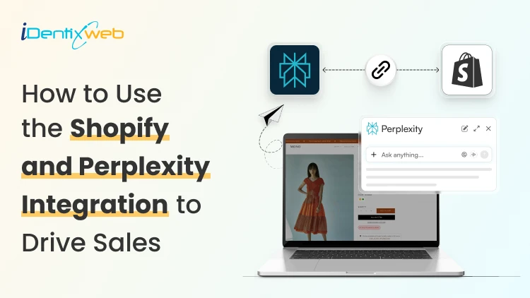
How to Use the Shopify and Perplexity Integration to Drive Sales?
Buyers have stopped going to Google and searching for products to buy. They ask Perplexity and other AI platforms one question and buy whatever it recommends. The Perplexity Computer Shopify connection now works in two directions: Your catalog can appear inside Perplexity answers, Perplexity Computer can run store tasks on your behalf. Most merchants have set up neither, which is exactly why I’m adding this guide. What does the Shopify and Perplexity integration mean? Perplexity and Shopify connect in two separate ways. One is a sales channel. The other is an agent that works inside your store data. The sales channel side is Perplexity Shopping. Your product data reaches Perplexity through Shopify Catalog, and shoppers see products with images, pricing, and review summaries inside the answer. The agent side is Perplexity Computer. Computer connects to hundreds of tools, and Shopify is one of them. You give it a task in plain language, it breaks the job into subtasks across multiple models, and it delivers finished work. How does Perplexity decide which products to recommend? Perplexity pulls product data from retailer feeds, merchant sites, and reviews, then builds its answer. For Shopify merchants, Shopify Catalog automatically syncs your product data to connected AI platforms, including Perplexity, ChatGPT, and Google AI Mode. Product information is more important. If a SKU has no GTIN, a vague description, and four reviews, Perplexity has almost nothing to work with, and it will favour a competitor with complete data. I look for three signals. Structured product data. Product identifiers, Google product category, materials, dimensions, and accurate price and availability. Review depth. Perplexity summarizes pros and cons from customer reviews. Contextual descriptions. A spec list tells the model what the product is made of. A description that names the buyer and the use case tells it who the product is for. Shopify’s own insight says that AI-referred shoppers convert at almost 50% higher rate than organic. Set up the Perplexity and Shopify connection step by step 1. Run an agentic readiness check Shopify has a free tool to check if your product page is ready for AI-selling. Do an agentic readiness check first. 2. Confirm Shopify Catalog is populated Catalog is the delivery mechanism. It syndicates whatever sits in your product records, so incomplete records travel straight into AI answers as incomplete records. 3. Open Agentic Storefronts in your Shopify admin Catalog makes products discoverable. Go to Settings > Sales Channels, and review each AI channel individually. Agentic has been rolled out for merchants this year. 4. Add Perplexity Make Perplexity a sales channel in Agentic. You can also add other AI platforms like Copilot and ChatGPT. 5. Let AI crawlers through Check robots.txt and any bot-blocking rules in your CDN or security app. Blocking AI crawlers will impact your sales significantly when customers are searching for your product on AI platforms. 6. Test with real buyer prompts Pick fifteen questions your customers actually ask, run them in Perplexity, and note where you appear and where a competitor does. I do this every week for stores that I’m working for. Manual testing gives you ground truth that no dashboard provides yet. If you are working through the same setup for OpenAI's ecosystem, my ChatGPT Shopify integration guide covers Instant Checkout and the merchant application side in detail. Optimize your Shopify store for AI search engines like Perplexity and SearchGPT The work that helps you optimize your Shopify store for AI search engines like Perplexity and SearchGPT is the same, which is the good news. Start with product pages. Replace generic claims with specifics a model can extract: who it suits, what problem it solves, what size or spec range it covers, and how it compares to the obvious alternative. Add a short FAQ block to product and collection pages, with the question as a heading and the answer in two or three sentences. Mark it up with an FAQ schema. Collection pages deserve real text. A collection with a title and nothing else gives Perplexity no reason to understand your products. Write a minimum of 150 words explaining what belongs in the collection and who buys from it. In my experience in 2026, comparison content is the strongest lever most stores ignore. Buying guides, category comparisons, and honest product versus product pages match the exact shape of questions people bring to AI search. My full walkthrough on answer engine optimization for Shopify stores breaks down the schema types, FAQ patterns, and topical clusters worth building first. What does the Perplexity Computer Shopify connector do for merchants? The Perplexity Computer Shopify connector gives an agent read and write access to your store data. You enable it once from the Connectors panel and complete OAuth. Computer treats work as tasks rather than chats. You describe an outcome, it plans the subtasks, routes each one to a suitable model, and hands back a finished deliverable. Tasks can run on a schedule whether or not your laptop is open. Here are the five tasks I always set up first: Weekly catalog gap audit. Ask it to list every product missing a GTIN, product category, or description longer than a set word count. An updated catalog is the biggest factor in AI visibility. Bulk description rewrites. Feed it your brand voice rules and let it draft AI-readable descriptions for your products. Review everything before publishing. Competitor price and positioning monitoring. Set a recurring task that checks competitors and flags where you are underperforming. Review mining. Have it read recent reviews, add the common reviews together, and turn them into FAQ entries for the matching product pages. Monday morning report. Orders, refunds, stock risks, and the best-sellers, delivered as a document before you open the admin. Turn High-Intent AI Traffic Into Bigger Orders Visitors arriving from AI search platforms are often ready to buy, making the cart the perfect place to increase order value. Most carts only show products... iCart can show revenue-boosting offers. Try Free Till 100 Orders iCart Cart Drawer Cart Upsell helps you convert that intent with relevant upsells, product bundles, and free-shipping progress bars built directly into the cart. Measure whether Perplexity is actually driving sales I track these four things for Perplexity and any other AI platforms when it comes to tracking sales. Citation rate. Your appearance counts across your fifteen test prompts, checked monthly. Referral sessions from perplexity.ai in GA4, segmented separately from other AI referrers. PayPal Instant Buy orders, reconciled against your Shopify revenue so nothing goes uncounted. Catalog completeness, as a percentage of SKUs with full required fields. It is the leading indicator for everything above. Movement in citation rate usually shows up thirty to sixty days after catalog fixes land. Judge the channel on that timeline, not on week two. Where to start this week Perplexity Computer for Shopify work pays off fastest when you focus on what you want. Run the readiness check, fix your best-sellers, add it as a sales channel, and set one recurring Computer task to update your catalogue. The merchants who benefit from AI recommendations right now are the ones whose product data is clean when the channel opens. FAQs 1. What is the Perplexity Computer Shopify connector? The Perplexity Computer Shopify connector is an integration that lets Perplexity's agent platform read and act on your Shopify store data. You enable it from the Connectors panel in Computer. Once connected, you can assign store tasks such as auditing product data, drafting descriptions, or generating sales reports. 2. What is the price of Perplexity Computer to run a Shopify store? The Computer is available to Perplexity Pro, Max, and Enterprise subscribers. Pro subscribers receive full access, while Max subscribers get monthly credits and higher spend limits. Pro is priced at $20/month, and Max costs $200/month. 3. How is optimizing for Perplexity different from optimizing for ChatGPT or SearchGPT? The underlying work overlaps almost entirely. Complete structured data, genuine reviews, contextual descriptions, and FAQ content improve visibility across Perplexity, ChatGPT, and Google AI Mode. The differences sit in checkout infrastructure and opt-in requirements, not in content strategy. 4. How long before the Shopify and Perplexity integration shows results? Expect thirty to sixty days between catalog improvements and a measurable change in citation rate. Feed syndication is fast, but AI engines need time to re-crawl, re-evaluate, and accumulate review signals before they start recommending a store consistently. 5. Can Perplexity Computer make changes to my store without approval? It can if you grant write scope and do not require confirmation. Configure Computer to check in before executing write actions, start with read-only reporting tasks, and expand permissions only after you trust the output.
5 Min • 18 July 2026
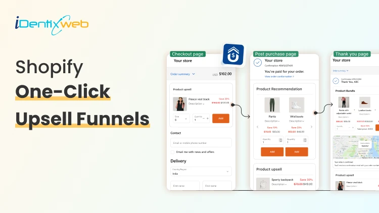
Shopify One-Click Upsell Funnels: 7 Proven Frameworks to Increase Revenue Per Order
You spend all day driving traffic to your store. The visitor lands, adds one product, checks out. Order confirmed. Thank you page. Done. That last step is where most stores quietly leave money on the table. A Shopify one click upsell fixes that. It shows the shopper one more offer right after they pay because there is no re-entering card details, no second checkout. One tap and the order grows. This post walks through 7 Shopify upsell funnel frameworks that work in 2026. What is a Shopify one click upsell? A Shopify one-click upsell is a post-purchase feature that lets customers add an additional item or upgrade to their cart after they check out, but before the final thank you page. The customer accepts with a single tap. No re-entering card info. No second checkout. 7 Proven Shopify One Click Upsell Funnels to Increase AOV Not every store needs every framework. Pick the ones that match your catalog and your average cart. 1. Complementary Product Funnel This shopify one click upsell offers a related product that matches the main purchase. A good funnel here should keep the add-on price low enough to feel like an easy yes. Example:Phone → Phone caseCamera → Memory cardCoffee maker → Coffee filters 2. Upgrade Funnel This upsell funnel should clearly explain why the upgraded version is better. It works well when the customer only needs to pay the difference and it’s best for premium product tiers. Example: Basic hoodie → premium hoodieSmall shampoo → salon-size bottle 3. Bundle Funnel This funnel turns one product into a bundle offer. It helps raise order value by giving shoppers a better deal on multiple products. This shopify bundle funnel is great for beauty, fashion, and home products. Example: Bought mascara → Offer mascara + eyeliner + primer bundle Want to create this type of shopify upsell funnel without making the post-purchase experience complicated? SellMore helps Shopify merchants build targeted funnels which you can show from checkout page to order status page. 4. The Stock-up Funnel The shopper just bought one bottle. You offer three more at a discount. Or you offer the 3-month bundle. BeeFriendly Skincare uses this exact Shopify one click upsell play. This funnel is best for products people use again and again, like skincare, coffee, supplements, or pet food. 5. The free shipping threshold funnel The shopper's order is $42. Your free shipping kicks in at $50. You offer a $12 add-on that pushes them over. They already know shipping is coming. Getting it free feels like a win. The add-on almost pays for itself in their head. This is one of the simplest funnels to run because the math is easy to explain in one sentence: "Add this and get free shipping." 6. The subscription conversion funnel The buyer paid full price. You show them the subscribe-and-save option right after. "Get this every month for 15% off." Same product, recurring order, lower price. Turn a one-time buyer into recurring revenue. 7. The category cross-sell funnel Different from a complementary add-on. This one moves the shopper into a category they haven't tried. Bought a face serum → try the eye cream. Bought running shoes → check out the recovery Conclusion A successful upsell strategy is not about showing more products; it is about presenting the right offer at the right moment. Whether you use upgrades, bundles, subscriptions, free-shipping offers, or downsells, each funnel should feel relevant and easy for the customer to accept. Start with one shopify one click upsell funnel that matches your product type and average order value. Track its acceptance rate, revenue per offer, and customer response, then improve the offer based on real performance. A simple, well-targeted funnel will usually deliver better results than multiple aggressive offers that interrupt the post-purchase experience. Frequently Asked Questions 1. What is a one-click upsell on Shopify? A one-click upsell on Shopify is an offer shown right after checkout, before the thank-you page. The shopper taps once to accept, and the item is added using the payment already on file. No re-entering card details. 2. Does Shopify have one-click upsell built in? Not out of the box. Shopify supports one-click post-purchase offers through Checkout Extensibility, but you need an app or a custom build to actually create and run the offers. Most stores use an app like SellMore to skip the code. 3. What's the difference between a one-click upsell and a thank-you page upsell? A one-click upsell shows on the post-purchase page between payment and the thank-you page one tap, no re-entry. A thank-you page upsell shows on the order confirmation page after the thank-you loads and usually requires a second checkout. Both work; the one-click version converts higher because the friction is gone. 4. How many one-click upsell offers should I show per order? One primary offer, plus one downsell if they decline. Chaining more than that starts to feel pushy and take rates fall off.
Vineet Nair
8 Min • 17 April 2026
279 Views
Vineet Nair
8 Min • 17 April 2026
299 Views
Sajini Annie John
5 Min • 16 April 2026
235 Views
Sajini Annie John
4 Min • 15 April 2026
259 Views
Vineet Nair
7 Min • 15 April 2026
313 Views
Sajini Annie John
1 Min • 15 April 2026
269 Views
Vineet Nair
6 Min • 15 April 2026
285 Views
Sajini Annie John
5 Min • 11 April 2026
275 Views
Sajini Annie John
10 Min • 10 April 2026
298 Views
Sajini Annie John
7 Min • 2 April 2026
298 Views
Sajini Annie John
9 Min • 27 March 2026
308 Views
Vineet Nair
6 Min • 1 May 2026
320 Views