

Author: Journi Zoie
Gather knowledge about the latest insights, updates, tips, and tricks in the Ecommerce industry.

5 Min • 20 March 2026
How Anua Unlocked 5X AOV Growth with iCart’s Smart Cart Features
delivery customization Challenges Solutions drive results Scale business delivery customization Challenges Solutions drive results Scale business delivery customization Challenges Solutions drive results Scale business delivery customization Challenges Solutions drive results Scale business Anua is a globally recognized Korean skincare brand known for its minimalist philosophy and focus on gentle yet effective formulations. Built on the idea of simplifying skincare routines, Anua develops products that deliver visible results while avoiding harsh or irritating components, making them suitable for sensitive skin types. Initially using a traditional full cart experience, Anua transitioned to iCart’s side cart solution in August 2025, to create a more seamless and engaging shopping journey. This shift allowed customers to easily explore complementary skincare products without disrupting their browsing flow, making it more intuitive to discover items that fit into a complete routine. By surfacing relevant recommendations directly within the cart, the brand enhanced product visibility across its range. Challenges Before implementing iCart’s side cart solution, Anua faced limitations with their existing full cart experience, which created friction in the customer journey. The traditional cart setup redirected users away from product pages, interrupting their browsing flow and reducing opportunities to explore additional products. As a skincare brand built around routines rather than single-item purchases, this made it difficult to effectively showcase complementary products and encourage customers to build complete regimens. Additionally, the lack of in-cart personalization and strategic upsell opportunities meant that customers were often unaware of related products that could enhance their skincare results. This limited the brand’s ability to increase average order value (AOV) and fully leverage its diverse product range. Anua needed a more dynamic and intuitive cart experience that could seamlessly introduce relevant recommendations while maintaining a smooth and engaging shopping journey. ❌ Cart Value Barriers Low average order value (AOV) due to single-item focus Most customers completed purchases with one primary product instead of building multi-step routines. Cart abandonment near shipping thresholds Customers were not clearly informed or motivated to reach free shipping or discount thresholds. Missed savings opportunities Customers were unaware of potential value in purchasing bundled routines or multiple complementary products. ❌ Absence of Progress-Based Incentives No free shipping or discount progress bar Customers were not motivated to increase their cart value due to lack of visible incentives. Missing tiered rewards system There were no structured milestones (e.g., “Spend more to unlock offers”), reducing upsell opportunities. ❌ Ineffective Cart UI/UX (Pre-Side Cart) Full-page cart disrupted shopping flowCustomers had to leave their browsing journey, increasing friction and drop-offs. No quick add/remove functionality Users couldn’t easily modify their cart or add suggested products without navigating away. Solution To overcome these challenges, Anua implemented iCart’s side cart solution to transform their traditional cart into a high-converting, interactive experience. By replacing the full-page cart with a seamless side cart, the brand ensured that customers could continue browsing while viewing their cart, significantly reducing friction in the shopping journey. Additionally, features like product recommendations & progress bars for free shipping and discounts motivated customers to increase their cart value. By combining personalization, incentive-driven messaging, and a user-friendly interface, Anua successfully turned their cart into a powerful revenue-driving touchpoint rather than just a checkout step. To maximize their cart effectiveness, they implemented two powerful features: ✅ Progress Bar with Multi-Reward Incentives Implemented a tiered progress bar to encourage higher cart value Customers are guided with a clear message like “Add $3.10 to unlock secret offer,” motivating them to continue adding products. Generated over $5M+ in revenue through incentive-driven cart progression Used product-based rewards to align with customer intent Instead of generic discounts, Anua incentivized purchases with relevant skincare items like Dark Spot Pads and mini serums. Built visual motivation for routine expansion As customers add products, they can clearly track progress toward unlocking multiple rewards, encouraging them to build a complete skincare routine. ✅ Product Recommendations Implemented “Frequently Bought Together” recommendations Customers adding a single product (e.g., toner) are shown complementary items like serums, moisturizers, or pads to complete their routine. Generated over 275K revenue through in-cart recommendations Encouraged full skincare regimen building Instead of isolated purchases, the cart suggests step-by-step product combinations aligned with common skincare routines. Increased product discovery at the final stage By surfacing relevant items directly in the cart, Anua ensured customers explore more of their catalog without leaving the checkout flow. Results Achieved in Last 180 Days 22932 Total Store Orders 45101 Total iCart Orders 5X iCart Generated AOV 65.70% Upsell Affected Conversion Rate These improvements reflect a clear shift in customer behavior on Anua’s store. Cart abandonment reduced as shoppers discovered complementary skincare products and felt encouraged to build complete routines. Engagement also increased, with customers interacting more with in-cart recommendations and exploring relevant product pairings. Results & Impact And...Results is Our Main Clarification By implementing iCart’s cart drawer, product recommendations, and progress bar, Anua transformed its cart into a high-performing conversion touchpoint. Shopping Experience Enhancement The improved cart experience encouraged customers to discover complementary products and understand the value of sustainable beauty routines. For instance, the clear presentation of subscription savings alongside one-time purchase options helped customers make more informed decisions about their long-term hair care needs. As Anua continues to optimize its cart experience, the brand is closely monitoring: Routine-based purchasing behavior - tracking how customers move from single items to multi-step regimens Engagement with in-cart recommendations - measuring interaction with suggested products Cart value progression - analyzing how incentives influence higher spending [related_cases_slider] Ready to Write Your Success Story? Try icart App Join successful businesses like Anua and Master your delivery scheduling Delight customers with precise timing Grow your special occasion orders Expand your delivery reach
Read Blog
10 Min • 12 August 2026
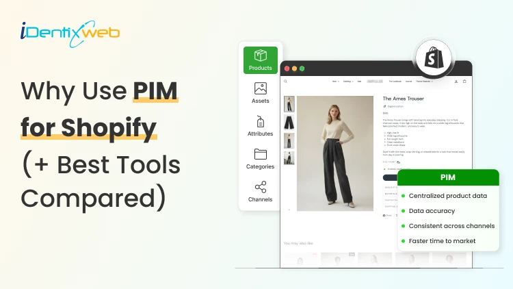
PIM for Shopify: Benefits, Costs & Best Tools for Merchants
PIM (Product Information Management) for Shopify is a centralized system that helps merchants manage, enrich, and distribute accurate product data across Shopify, marketplaces, and other sales channels. It improves data consistency, reduces missing product information, supports faster catalog updates, lowers return risks, and strengthens multi-channel selling. Popular PIM options for Shopify include Plytix, Sales Layer, Apimio, Jasper PIM, Akeneo, Salsify, inRiver, and Pimcore. Most Shopify stores lose sales because the information around their products is inconsistent or confusing to customers. A PIM for Shopify fixes that by giving you one clean source of info for every title, spec, image, and attribute, then pushing it out everywhere you sell. Better product data helps you get more revenue, fewer returns, and products that actually show up when a shopper asks an AI what to buy. I'll walk you through what a PIM really does for a Shopify store, whether you need one yet, and what the good options cost in 2026. What is a PIM for Shopify? A PIM (product information management) system is a central hub where you create, enrich, and manage all your product data. For a Shopify store, a PIM sits alongside your admin and gives clean, complete, consistent product content into Shopify and out to marketplaces, feeds, and AI channels. Shopify already stores product data. A PIM is different because it's built for scale and structure. You get flexible attribute models, validation rules that catch missing or wrong fields, and digital asset management for images and videos. The reason store owners search for a PIM is that their catalog has grown, the channels multiplied, and keeping product data accurate has become difficult. How does better product information turn into more sales? 1. Fewer returns and refunds Returns are one of the first places where inconsistent product data starts eating into margins. The National Retail Federation estimates the average retail return rate at nearly 17%, with returns costing retailers close to $850 billion annually. Accurate sizing, specifications, images, and product descriptions reduce the gap between what customers expect and what they actually receive. 2. Higher conversion and less abandonment Incomplete product information can send shoppers directly to a competitor. Akeneo found that: 70% of consumers would choose a different product when information is missing. 65% would abandon the purchase completely. This is where a Product Information Management (PIM) system becomes useful. A PIM can enforce mandatory product attributes before a SKU is published. For example, every product can be required to include: Dimensions Materials Care instructions Product specifications Multiple product images Instead of relying on someone to notice missing information manually, the system helps prevent incomplete product listings from reaching the storefront. 3. Better Visibility in AI Shopping Channels In 2026, consistent product data matters beyond your Shopify storefront. It also affects how products appear in AI-powered shopping experiences. Shopify has expanded product discovery through channels such as: ChatGPT Perplexity Microsoft Copilot Google AI Mode These systems rely heavily on structured and complete product information to understand what a product is, who it is suitable for, and when it should be recommended. A product with: A vague description, missing GTIN, limited specifications, and a few structured attributes gives an AI shopping assistant far less information to work with. For a deeper understanding of how to rank in AI engines, read my breakdown on best practices for AEO in Shopify stores in 2026. Do you actually need a PIM for Shopify yet? A lot of Shopify stores don't need a standalone PIM. If you sell a few hundred products on one or two channels and your data is manageable, Shopify's native tools should be your choice. Shopify's metafields and metaobjects are the reason. Metafields let you add structured custom fields to products, variants, collections, and more, so you can store specs, size guides, and warranty details that Shopify's default fields don't cover. Metaobjects let you build reusable content objects, like a brand or a care guide, and connect them across many products. If you're not using them yet, here are a few of my guides and articles you can go through. Shopify metafields guide How to add product metafields Shopify metaobjects guide What to look for in a PIM for Shopify? Focus on five things: How does it connect to Shopify? How flexible is its data model? How well does it handle assets? How does it syndicate to channels? How does it keep data clean? Connection comes first, and it splits into two camps. Some PIMs offer a native Shopify integration or a listed Shopify app, so product data flows straight into your store with minimal setup. Others connect through a middleware layer or a third-party connector, which works but adds a moving part to maintain. If you search "PIM for Shopify app," you're looking for that first camp, and it's the smoother path for most stores that don't have a developer on call. Check the current Shopify App Store listing and recent reviews before you commit, since integrations and pricing change often. Beyond the connection, here's what actually matters: A flexible data model and taxonomy, so you can define the exact attributes your products need and enforce them. Data validation and governance, so incomplete or malformed data can't reach your storefront. Digital asset management for images and video, ideally with variant-level control. If you want icons and trust badges on product pages, our guide on displaying images with metafields shows the native version of the same idea. Channel syndication and localization, so one enriched record can publish to Shopify, marketplaces, feeds, and AI channels in the right format each time. Automation and AI enrichment to fill gaps, generate copy, and score data quality, which saves the most tedious hours. If a tool nails those five and connects cleanly to Shopify, it'll serve you far longer than one that just has a long feature list. A PIM Is Only as Good as Its Integration The value of a PIM also depends heavily on how well it connects with Shopify and the rest of a merchant's technology stack. When a native connection does not cover the required workflow, Identixweb develops custom Shopify integrations that help businesses connect product data and other systems around their specific operational requirements. Best PIM for Shopify in 2026 Plytix Plytix is a common starting point for growing brands because it offers a free tier for smaller catalogs and supports unlimited users. Its paid plans scale based on SKU requirements, making it suitable for businesses that expect their catalogs to grow over time. Akeneo Akeneo is designed for businesses that need advanced product information management across large catalogs, teams, markets, and languages. Salsify Salsify combines product information management with broader product experience and syndication capabilities, making it more suitable for brands distributing product data across multiple channels. Pimcore Pimcore supports sophisticated product data models and is often considered when businesses need greater flexibility around product information, digital assets, and other connected data. Sales Layer, Apimio, and Jasper PIM Sales Layer, Apimio, and Jasper PIM target a similar segment. They are generally suited to brands that need: Centralized product information Better product data consistency Multi-channel syndication Easier catalog management Shopify integration without a complex enterprise implementation What does a PIM for Shopify actually cost in 2026? PIM pricing in 2026 runs from free to well over $50,000 a year, and the plan name matters less than your catalog complexity. Most SaaS PIMs price by the number of SKUs, users, channels, and outputs, while enterprise platforms quote custom deals you won't see without a demo. Here's the rough shape of the market, based on current published pricing and PIM cost breakdowns from vendors like Plytix and Akeneo: Free and entry SaaS tiers cover small catalogs, often up to around 1,000 SKUs, with limited features. Good for testing the idea. Mid-market SaaS plans commonly start in the few-hundred-dollars-a-month range and scale with SKU count. Plytix, for example, publishes a Pro tier starting around $499 a month for larger catalogs, and other SaaS PIMs sit in a similar band. Enterprise platforms like Akeneo, Salsify, and inRiver don't publish full pricing. Budgeting guidance from these vendors points to five figures a year and up once services are added, and first-year totals can climb much higher with implementation. PIM for Shopify Plus and high-volume catalogs For Shopify Plus and high-volume stores, a PIM shifts from optional to close to essential, because the whole reason you're on Plus is scale, and scale is where manual product data breaks. The specific wins for a PIM on Shopify Plus: One source of truth across multiple Plus storefronts and regions, so a single edit propagates everywhere instead of being redone per store. Localization at scale, with translated attributes and region-specific data flowing to the right storefront automatically. B2B and wholesale support, where different buyers need different data, pricing, and catalogs from the same underlying products. Governance and workflows, so a team of merchandisers, marketers, and suppliers can all contribute without corrupting the catalog. How to roll out a PIM the right way? To close out this blog, here's the sequence I'd follow: Audit your current data first. Pull your catalog, find the gaps, the duplicates, and the inconsistencies. You'll fix these no matter which tool you pick, so do it before you buy. Design your attribute model before importing anything. Decide the fields every product must have, the allowed values, and the rules. A governed model is what keeps a PIM clean six months later. Start with a pilot, not the whole catalog. Migrate one category or your best-sellers, get the Shopify sync working end-to-end, and confirm the data lands correctly on your storefront and channels. Assign ownership. Someone has to own product data quality, or the system slowly drifts back to the mess you were escaping. Then scale. Roll out category by category, syndicate to your channels, and layer in automation and AI enrichment once the foundation is solid. FAQs 1. What is PIM for Shopify? A PIM system for Shopify is software that centralizes, organizes, and manages product data such as titles, descriptions, specifications, images, variants, and attributes before syncing it to your Shopify store and other sales channels. It is useful for merchants with large catalogs because it helps maintain accurate, consistent product information across channels. 2. Is Shopify a PIM system? No. Shopify stores and manages product data, and its metafields and metaobjects add structured custom fields, but it lacks the multi-channel syndication of a dedicated PIM. For a single store with a small catalog, native Shopify is often enough. For large catalogs across many channels, a PIM will help. 3. What is the best PIM for Shopify? For most small and mid-sized stores, Plytix, Sales Layer, or Apimio fit well and connect to Shopify easily. For large, complex catalogs, enterprise platforms like Akeneo, Salsify, or inRiver are a better choice. 4. Do I need a PIM system for Shopify multi-channel selling? If you have thousands of SKUs, multiple variants of products, and content that is localized and sold across global markets, you need a PIM system for Shopify multi-channel selling.
7 Min • 19 August 2026
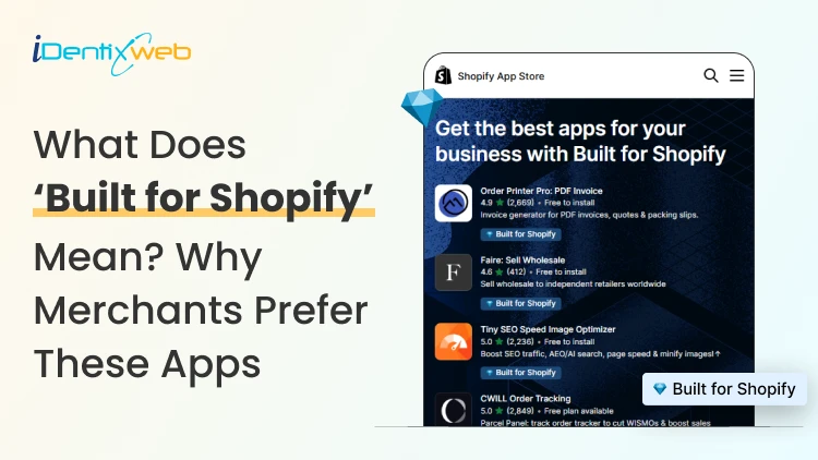
Built for Shopify Apps Benefits: What Merchants Gain from the Badge
Built for Shopify apps give merchants a stronger quality signal when choosing apps. They are evaluated against Shopify’s standards for performance, design, integration, usability, and ongoing compliance. Benefits for 'Built for Shopify' apps include smoother admin workflows, simple storefront integration, better performance safeguards, and easier app discovery. The Shopify App Store gives merchants thousands of ways to add features that Shopify does not provide by default. The difficult part is deciding which app to install to make your life easier. That is where the Built for Shopify badge helps. It is Shopify's highest level of recognition for apps that meet its quality standards. Built for Shopify apps have their benefits, but it's more than that. That being said, I would not just choose an app because it has the badge. I would use it as a strong first filter, then compare functionality, pricing, reviews, support, permissions, and compatibility. What does Built for Shopify mean? Built for Shopify, often shortened to BFS, is Shopify's quality program for apps distributed through the Shopify App Store. Apps that earn the status must meet requirements such as performance, integration, design, App Store compliance, merchant adoption, reviews, and category-specific criteria. Shopify describes Built for Shopify as the highest level of recognition and achievement an app can reach. The badge appears on qualifying app listings and app cards in search results and category pages. Merchants can also filter App Store results to show only Built for Shopify apps. Above is an app, Delivery Date & Pickup Stellar. You can see it has a Built for Shopify badge just below its name. I’ve worked closely with Shopify merchants and been involved in developing Shopify apps around real store requirements. I know how much difference a well-built app can make to day-to-day store management. Built for Shopify apps: Benefits for merchants 1. You get a faster way to shortlist better apps Several apps offer similar features. The Built for Shopify badge helps you to filter apps that are helpful in a specific category. Instead of comparing every app only by listing content, pricing, and reviews, you can use the badge to quickly identify apps that meet Shopify's standards. It makes the selection process much easier. 2. You reduce the risk of choosing an app that hurts store performance Every app you install can affect your storefront or Shopify admin experience. Built for Shopify apps must meet Shopify's performance requirements. This includes limits around storefront and admin Web Vitals. For you as a merchant, this means the app has been evaluated against measurable performance standards rather than relying only on the developer's claims. 3. You get an app that feels more familiar inside Shopify Built for Shopify apps are expected to follow Shopify's UX and design standards. This includes clear navigation, responsive layouts, familiar controls, and admin behavior. For you, that can mean less time figuring out where settings are located and a smoother experience for team members navigating through the admin panel. 4. You can manage more of the app without leaving Shopify One of the biggest benefits of choosing a Built for Shopify app is better Shopify integration. Shopify expects the primary functionality of an embedded BFS app to work inside the Shopify admin where applicable. That means you are less likely to depend on completely separate dashboards for everyday tasks. If you use multiple apps, this will make daily store management more organized and easier to follow. 5. You get cleaner storefront installation and removal Apps that add storefront features can create problems if they make unnecessary changes to your theme. Built for Shopify requirements encourage apps to use Shopify's current extension architecture, including theme app extensions. These extensions are made to integrate more easily with themes and are removed when the app is uninstalled. For you, that means less risk of being left with unnecessary storefront elements after removing an app. 6. You choose apps that already have real merchant usage An app cannot qualify for the Built for Shopify badge without meeting Shopify's merchant adoption and review requirements. That means the app must already have real usage across active stores before it can earn the badge. For you, this provides confidence that the app has been used by actual merchants. 7. You get a quality signal that Shopify continues to review The Built for Shopify badge does not stay forever with the app. Shopify continues to monitor requirements and reviews BFS apps over time. If an app stops meeting the requirements, it can lose its status. This makes the badge more useful because it reflects ongoing compliance with Shopify's standards. Built for Shopify requirements merchants should understand AreaWhat Shopify checksWhy it matters to merchantsPrerequisitesApp Store compliance, Partner standing, installs, reviews, recent ratingGives Shopify merchant usage and quality signals to evaluatePerformanceAdmin Web Vitals, storefront impact, relevant checkout performancePlaces measurable limits around app performanceIntegrationEmbedded workflows, App Bridge, Shopify-based processesKeeps important workflows connected to ShopifyDesignFamiliar UX, responsive layouts, clear navigationMakes everyday app use more predictableCategory criteriaRequirements specific to an app's functionChecks whether apps use Shopify's expected functionality for their categoryOngoing complianceAutomated checks and recurring reviewsRequires apps to continue meeting current standards The exact criteria depend partly on what the app does. For example, a product review app does not necessarily have the same functional requirements as a fulfillment, subscription, returns, or product bundles app. This is why I would avoid one checklist as the complete BFS standard. Shopify maintains detailed developer documentation and updates category criteria as its platform changes. Should I install only ‘Built for Shopify’ apps I will advise this to merchants: A Built for Shopify app is not always the right choice for your store. It might lack an important feature, cost more than your budget, or request permissions you do not want to grant. The badge also should not be interpreted as a guarantee of perfect support, zero bugs, higher conversion rates, stronger SEO rankings, or specific revenue growth. Those outcomes are outside the scope of what Shopify says the BFS badge certifies. I’m also not saying a non-BFS app is automatically a bad app. A newer app might not yet meet the standard for the BFS badge, but it can definitely help your store grow. If budget is a major factor, compare options in my guide to free Shopify apps rather than choosing by badge alone. How to find Built for Shopify apps The simplest method is to look for the Built for Shopify badge on an app listing. You can also use the BFS filter on Shopify App Store search and category pages. That badge should be visible directly on the App Store listing, which makes it easy to verify before installing. Final takeaway The strongest benefit of Built for Shopify apps is the standards behind the badge. Shopify evaluates qualifying apps for performance, design, integration, merchant adoption, App Store compliance, and relevant category requirements. It also reviews these apps over time instead of giving a permanent badge. For merchants, I would use the badge as a shortcut to a better shortlist, not as permission to skip due diligence. Start with BFS apps when suitable options exist, then compare feature fit, permissions, reviews, pricing, support, and compatibility before making the final choice. At Identixweb, we provide Shopify app development services for merchants who need functionality that an existing public app cannot fully cover. FAQs 1. What does Built for Shopify mean? The Built for Shopify badge identifies Shopify apps that meet Shopify's highest quality standards. Shopify evaluates qualifying apps across performance, design, integration, prerequisites, and relevant category-specific requirements. 2. What are the main Built for Shopify requirements? Current requirements include Shopify App Store compliance, good Partner standing, merchant adoption and review criteria, performance thresholds, Shopify admin integration, design standards, simple installation practices, and category-specific rules. 3. Can an app lose the Built for Shopify badge? Yes. Shopify reviews BFS apps and monitors several requirements on an ongoing basis. Apps that stop meeting the criteria and fail to correct the issues can lose Built for Shopify status. 4. Are Built for Shopify apps always better than non-BFS apps? Not in every situation. The badge is a strong quality signal, but merchants should still compare features, pricing, support, permissions, integrations, reviews, and compatibility before choosing an app.
10 Min • 27 August 2026
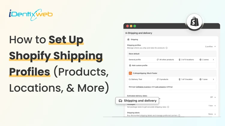
How to Set Up Shopify Shipping Profiles (Products, Locations, & More)
To set up a custom shipping profile in Shopify, go to Shopify Admin → Settings → Shipping and delivery → Shipping profiles → Add custom profile. Add the required products or variants, assign fulfillment locations, create shipping zones, and configure shipping rates based on your requirements. Custom shipping profiles help merchants manage different shipping rules for products like fragile, heavy, oversized, or region-specific items without affecting their entire catalog. Shipping gets complicated when you can't treat every product the same way. A T-shirt, glass vase, and 20-pound bag of pet food might all sit in the same Shopify store. But charging the same shipping rate for each can hurt your margins. Shopify shipping profiles solve this by grouping products with similar shipping needs. It controls where they ship from, where they can ship to, and what customers pay. This guide covers products, variants, fulfillment locations, shipping zones, rates, multiple warehouses, and the checkout issues merchants should test before going live. What Are Shopify Shipping Profiles? Shopify defines a shipping profile as a set of shipping rules for specific products and locations. Stores get a General shipping profile by default, while custom profiles handle products that need different rates. Shipping profileBest forWhat happensGeneral shipping profileProducts using the same shipping ratesProducts stay here unless moved to a custom profileCustom shipping profileFragile, oversized, heavy, or other special productsSelected products or variants get their own locations, zones, and rates Shopify currently allows up to 99 custom shipping profiles for stores using the shipping-profile system. A product or variant can belong to only one profile at a time. Adding it to another profile automatically removes it from the previous one. When do you need a custom shipping profile? You need a custom shipping profile when certain products need different shipping rules from the rest of your catalog. I will explain this better with a few examples below: Furniture or oversized products: Use a separate profile when these products need higher flat rates or special delivery charges. Fragile items: Create one when products such as glassware require extra packaging and higher shipping costs. Heavy products: Use a separate profile if shipping charges need to be calculated differently based on weight. Products sold only in selected regions: Use a separate profile when certain items should ship only to specific countries, states, or regions. Products with free shipping: Create a profile when only selected products should qualify for a $0 shipping rate. Products needing carrier-calculated rates: Use a separate profile when only certain products need live carrier rates instead of your standard flat rates. If most products follow the same shipping rules, keep them in the General shipping profile and create custom profiles only where there is a real difference in cost, location, or delivery requirement. What to prepare before setting up a shipping profile Before creating a profile, I normally map these four things. 1. Products Decide which products or variants genuinely need different shipping treatment. For example, a home decor store will keep cushions and small accessories in the General profile. They move large mirrors into a custom profile because they require protective packaging and higher shipping charges. 2. Fulfillment locations Check where the products are stocked and fulfilled. Locations can represent warehouses, retail stores, fulfillment partners, and other order origins. When a shipping profile is created, eligible online-fulfillment locations are added to it. Locations can share one location group when they use the same zones and rates, or be separated when shipping rules differ. 3. Shipping zones A shipping zone is a group of countries or regions that share shipping rates. You might create zones such as Domestic, Canada, Europe, or selected international countries. Want to sell internationally? Here’s my breakdown of international shipping on Shopify for merchants in 2026. 4. Shipping rates Shopify supports flat rates, order-value-based rates, weight-based rates, carrier or app-calculated rates, and free shipping. Shipping in Shopify can be complicated. Here are my top Shopify shipping strategies to increase sales in 2026. How to create a Shopify shipping profile step by step Step 1: Open Shipping and Delivery From the Shopify admin, go to: Settings > Shipping and delivery Under Shipping profiles, you will see the General profile and any existing custom profiles. Step 2: Create a custom shipping profile Click Add custom profile and enter a clear name, such as: Heavy Products Fragile Items Furniture Free Shipping Products US Warehouse Products Step 3: Add products or variants You can also see the Products section just below the Profile name section. A product or variant can belong to only one shipping profile at a time. This becomes especially useful when only certain variants need different shipping rules, while the rest of the product can stay in the General profile. For example, a merchant selling framed prints might keep the standard-size variants in the General profile. They will move only the oversized frame variant into a custom profile if it needs higher shipping charges, different packaging, or a different fulfillment method. Step 4: Configure fulfillment locations Review Fulfillment locations. If several warehouses should use the same zones and prices, keep them in the same location group. If one warehouse needs different rules, separate it. For example: New York: United States Each location group can have its own zones and rates. Step 5: Create shipping zones For each location group, click Add zone, name it, select the countries or regions, and click Done. For example, a US merchant may create a West Coast zone for California, Oregon, and Washington with a lower shipping rate. They may place Alaska and Hawaii in a separate zone because delivery there costs more. Separate zones help merchants charge rates that better reflect the actual cost of shipping to different regions. Build zones around actual delivery coverage and cost. If certain regions are significantly more expensive to serve, separate rates will be more practical. Step 6: Add shipping rates Inside each zone, click Add shipping option and choose the rate type. Flat rate: Charge one fixed amount, such as $7 for Standard Shipping. This works well when shipping costs are predictable. Order amount-based rate: Change shipping by cart value. A store could charge $8 below $50, $5 from $50 to $99.99, and offer free shipping from $100. Weight-based rate: Charge according to shipment weight. This suits food, hardware, liquids, bulk goods, and similar products. Make sure product weights are accurate, and your tiers cover the full expected weight range. Carrier or app-calculated rate: Let an eligible carrier or app calculate shipping from information such as weight, destination, and package details. Step 7: Save and test Click Save, then place test orders using realistic combinations: A product from the General profile A product from a custom profile Products from two profiles Products fulfilled from different locations Different domestic or international addresses Orders above and below free-shipping thresholds Free shipping can be a great tool to increase conversions. Here’s my complete guide to Shopify free shipping strategies for merchants. Need Help Configuring Your Shopify Shipping Settings? As product catalogs, fulfillment locations, shipping zones, and rate rules grow, managing everything accurately can become difficult. For example, a merchant may sell standard products from one warehouse, oversized items from another, and charge different rates for Alaska and Hawaii. If these rules are not configured properly, customers may see the wrong rate, duplicate charges, or no suitable shipping option at checkout. That’s where Identixweb can help. Our Shopify Store Settings Configuration service helps merchants configure complex shipping, payment, tax, and checkout settings so everything works correctly together. What happens when products come from different profiles? I get this question a lot. Under the current shipping-profile system, Shopify can combine shipping rates when an order contains products from different profiles or requires different location groups. Example: ProductProfile shipping rateT-shirt$4Fragile mug$7Possible combined charge$11 In this case, the customer may see an $11 shipping charge at checkout because Shopify is combining the applicable rates from both profiles. The setup may be technically correct, but the final charge can still feel high to the customer. That’s why merchants should test mixed-profile orders before going live, especially when customers commonly buy products from different profiles together. This helps confirm that the final shipping cost is reasonable and avoids unexpected checkout charges. Common Shopify shipping profile mistakes I see #1 Creating too many profiles This is the most common mistake I encounter with merchants. More profiles do not automatically improve shipping. Start with the General profile and add a custom profile only when a real cost, destination, or fulfillment difference exists. #2 Ignoring mixed-cart costs A rate that looks reasonable for one item but when the customer adds another item with a different profile, the shipping rates increase. Always test mixed carts before creating a profile. #3 Using inaccurate weights Weight-based and calculated rates depend on accurate product data. Incorrect weights can lead to inaccurate checkout charges. #4 Creating zones without checking markets A country appearing in a shipping zone is not enough if that country is not in an active market. Set up Shopify shipping profiles the right way A well-planned Shopify shipping profile helps merchants charge more accurate shipping rates without making fulfillment unnecessarily complicated. The key is to group products only when their shipping costs, destinations, or fulfillment requirements are genuinely different. Start simple, test mixed-product carts, review location-based rates, and update profiles whenever products, warehouses, or shipping costs change. A clean setup makes checkout easier for customers and shipping easier to manage as the store grows. FAQs 1. How to add products to a shipping profile in your Shopify store? Go to Settings > Shipping and delivery > Shipping profiles, open or create a custom profile, and select the products you want to add from the Products section. A product or variant can belong to only one shipping profile at a time, so adding it to a custom profile automatically removes it from its previous profile. 2. What is the difference between a general and custom shipping profile? The General shipping profile is Shopify's default profile and automatically applies to products that aren't assigned to a custom profile. A custom shipping profile is used when certain products need different shipping rates, zones, or fulfillment rules, such as fragile, heavy, or oversized items. 3. Can I offer free shipping for any selected products? Yes. To offer free shipping only on selected products, add those products to a custom shipping profile and create a flat shipping rate with the price set to $0 or enable free shipping for that rate. 4. Does shipping increase when customers buy two products in different shipping profiles? Yes. When products from different shipping profiles are purchased together, Shopify combines their applicable shipping rates and displays one total rate at checkout, which will make the final shipping charge higher. 5. Should I use flat or carrier-calculated shipping rates in Shopify? Use flat rates when shipping costs are predictable, and you want a simple, consistent checkout experience. Use carrier-calculated rates when costs vary significantly by destination, package weight, dimensions, or delivery speed.
Journi Zoie
June 24, 2024
3923 Views
Journi Zoie
May 7, 2024
4288 Views
Journi Zoie
January 26, 2024
5602 Views