


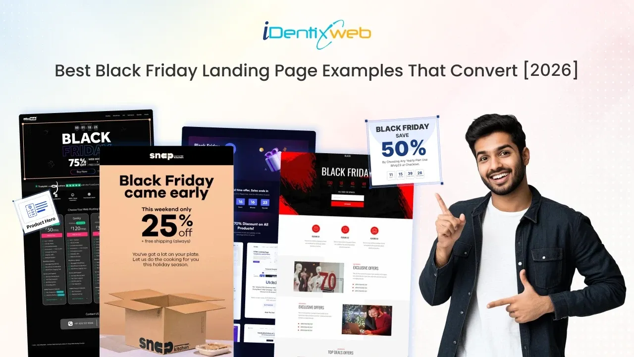
Black Friday is like the Super Bowl for online stores. It’s the one weekend when customers are practically sprinting to shop, and as a Shopify store owner, you don’t want to drop the ball.
Our Shopify team sees the same mistake every BFCM: merchants focus only on discounts, hoping the price slash alone will carry them through.
Truth?
Discounts get attention, but it's your Black Friday landing page that actually seals the deal and converts browsers into buyers.
A Black Friday landing page is a dedicated page built around one sale offer, with a real deadline and one clear action.
It's where your emails, ads, and SMS send shoppers. Adobe forecasts US shoppers will spend $12.9 billion online on Black Friday (November 27, 2026) and $15.1 billion on Cyber Monday (November 30).
This guide covers 6 real Black Friday landing page examples, a Shopify template you can copy, and the banner colors that stay readable on every screen.
Black Friday Landing Page Design: Tips That Convert
Lead with an Unmissable Headline
Your headline is the first thing people notice. Be bold, be clear, and make the discount or offer front and center.
Instead of saying “Holiday Savings Available,” hit them with “50% Off Storewide - This Black Friday Only.” It’s direct, urgent, and tells people exactly why they should stay.
Use Visuals That Pop (But Don’t Distract)
Shoppers are scanning quickly for offers. Big, bold visuals, thick black backgrounds, high-contrast typography, and black and red colors, create that classic Black Friday landing page vibe.
But remember, visuals should highlight your product or offer, not steal the spotlight. Keep it clean and focused.
Add Urgency
Countdown timers, “Only X Left in Stock,” or “Sale Ends Midnight Friday” work because people don’t want to miss out.
The trick?
Keep it authentic. A fake countdown timer that resets every time someone reloads will cost you trust. Use urgency to help customers act, not to trick them.
Fake urgency is a legal risk too. In the EU, your older price must be the lowest price from the previous 30 days.
Make It Mobile First
Most of your Black Friday homepage traffic will come from mobile.
Adobe expects phones to drive 57.4% of US online holiday spending in 2026. Mobile devices placed 70% of online orders during Cyber Week the previous year. (Source: Salesforce).
If your page looks great on a desktop but clunky on a phone, you're burning money.
Test your landing page on iPhone and Android, keep the offer, end date, and button on the first screen, and keep checkout friction-free.
Keep the Call-to-Action (CTA) Laser-Focused
Your CTA should scream clarity. “Shop the Sale,” “Grab the Deal,” or “Start Saving Now.”
Don’t clutter the page with five different buttons leading in different directions. A high-converting Black Friday homepage guides the customer toward one path: checkout.
Sprinkle in Social Proof
Reviews, testimonials, and user-generated photos do wonders during high-stakes sales.
Customers want reassurance that other people loved what they bought. Drop in a few five-star reviews right under your CTA to reduce hesitation and build instant trust.
Quick Tip: Install the Best Black Friday Sales App for Your Store
iCart, the upsell Shopify app, can bring sales like nothing else this Black Friday season. Use features like sticky cart drawer, product upsell, and AI-powered recommendations to boost your Shopify holiday sales.

There are many Black Friday landing pages you can take inspiration from. Here are the best ones I have come across.
Best Colors for Black Friday Announcement Banners in 2026
| Banner colors | Contrast ratio | Best for |
| White text on black | 21:1 | The classic Black Friday look |
| Black text on bright yellow (#FFD400) | 14.7:1 | Discount codes and "ends tonight" bars |
| Black text on electric lime (#C6FF00) | 17.7:1 | Streetwear, tech and younger audiences |
| White text on deep red (#C8102E) | 5.9:1 | Flash sales and last-chance bars |
| Near-black text on soft off-white | About 16:1 | Premium brands that skip loud sale colors |
Watch out for bright red text on black (#E10600, about 4.2:1) and white text on light red (#FF3B30, about 3.6:1). Both fail.
Best Landing Page Examples to Learn From
Gymshark
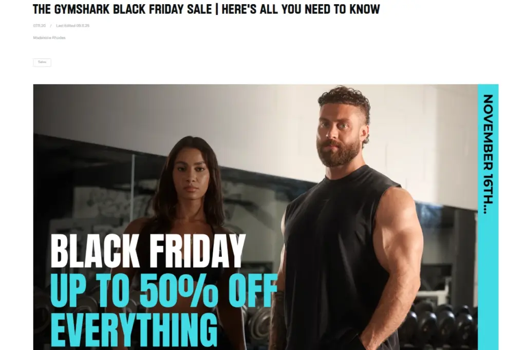
Gymshark’s Black Friday landing page reads like a news story, not an ad. The headline, “The Gymshark Black Friday Sale | Here’s All You Need to Know,” sits above a bold hero announcing “Black Friday: Up to 50% off everything” in white and cyan colors.
Every year, they update their single page with FAQs like when the sale will start and end, and support timings.
- Why it works: One URL gains rankings every year and answers support questions early.
- Copy it on your store: Publish a "[Brand] Black Friday: Everything You Need to Know" post, update it yearly, and link it from your announcement bar.
The North Face
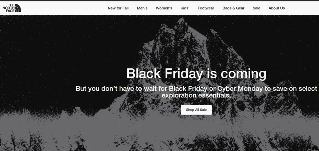
The North Face proves a pre-sale page can still sell. Over a striking black-and-white mountain graphic, the headline “Black Friday is coming” is followed by a line most brands wouldn’t dare write: shoppers “don’t have to wait for Black Friday or Cyber Monday to save on select exploration essentials.”
A single white “Shop All Sale” button turns that early curiosity into orders.
- Why it works: Early visitors buy now, and the page ranks before the sale.
- Copy it on your store: Link your hero button to a smart collection set to "Compare-at price is not empty," so every markdown appears automatically.
Sundays
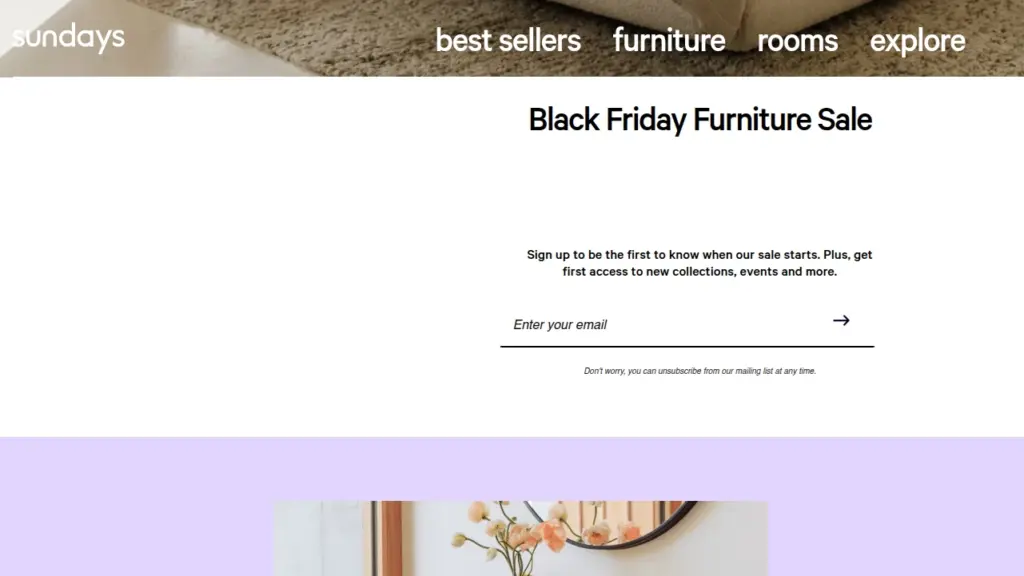
Sundays, a Shopify furniture brand, keeps its “Black Friday Furniture Sale” page with very few design elements, and that’s the point.
There’s no product grid and no discount yet, just one line inviting shoppers to be first to know when the sale starts, plus first access to new collections and events.
Below sits a single email field with an arrow button and a small note that subscribers can unsubscribe anytime, which quietly lowers the barrier to signing up.
- Why it works: Furniture is a planned purchase. Early subscribers get time to measure their space and choose a sofa before the sale opens.
- Copy it on your store: For big-ticket products like furniture, build the list first, then sell.
Hostinger
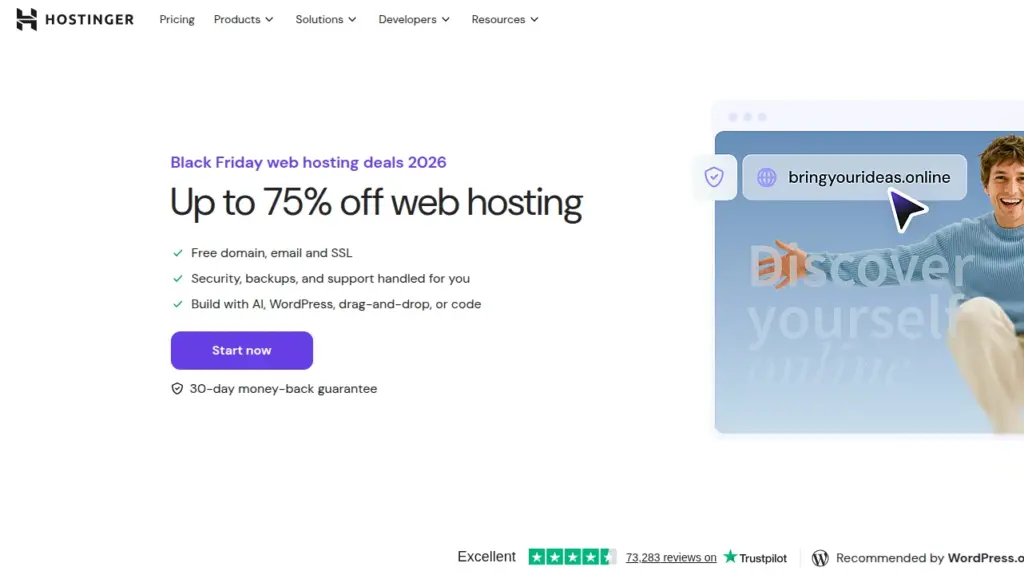
While Hostinger isn’t a Shopify store, we like how its Black Friday page fits the entire pitch on one screen.
Two things we love about this landing page. A purple “Start now” button sits right above a “30-day money-back guarantee”. A Trustpilot “Excellent” rating and a WordPress.org recommendation at the bottom of the screen.
- Why it works: The guarantee sits exactly where the decision happens.
- Copy it on your store: Put your guarantee next to your button. On Shopify, that’s one line under the CTA with your holiday returns window and free shipping threshold.
Organic Basics
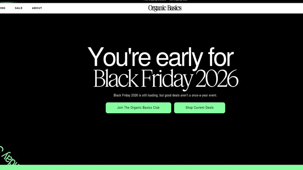
Organic Basics, a Danish clothing brand on Shopify, turns an early visit into a compliment. Its hero says “You’re early for Black Friday 2026,” with a short line that follows: Black Friday “is still loading, but good deals aren’t a once-a-year event.”
We love how no visitor hits a dead end. Give early visitors one reason to sign up and one way to buy today.
- Why it works: Every visitor, early or on time, gets a deal.
- Copy it on your store: Add two hero buttons and collect sign-ups with the free Shopify Forms app, which can tag them for early access.
Peppermayo
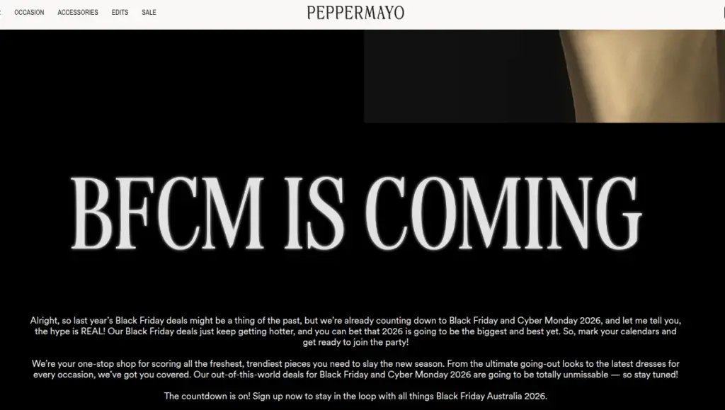
Peppermayo, an Australian fashion label on Shopify, runs one page for the whole weekend.
“BFCM IS COMING” glows in oversized letters across a black background. The copy below sounds like a friend texting about a sale: chatty, excited, and full of brand personality, ending with a clear push to sign up for “all things Black Friday Australia 2026.”
The sign-up has two strong hooks. Every subscriber is entered to win a $5,000 AUD Peppermayo voucher, and the sale start time stays “a secret for now,” with email and app subscribers hearing first.
- Why it works: A secret start time plus a prize turns browsers into subscribers.
- Copy it on your store: Email your list the start time hours before you announce it publicly.
Shopify Black Friday Landing Page Template
- Announcement bar: The offer and end date in one line.
- Hero: The discount, the end date in live text, and one button.
- Trust line: Free shipping threshold, returns window, and payment options.
- Products: Your sale collection or 4 to 8 bestsellers, with compare-at prices showing. This gets a lift when you add a sticky cart drawer and upsells.
- Reviews: Star ratings or customer photos.
- FAQ: Shipping cutoffs, code stacking, and holiday returns.
- Email or SMS sign-up: For visitors who aren't ready to buy today.
How We Built a BFCM Landing Page for a Shopify Store
The previous year, we worked with a Shopify store owner who sells shoes and planned to send every email and ad to her homepage.

Her hero image had "30% off + free gift" attached to the picture, and sliders with three different offers.
On a phone, the offer was too small to read, and the "Shop Now" button sat below the first screen.
The team moved the sale to its own page at /pages/black-friday. The offer went live with a real end time, one button led to the sale collection, and a trust line covered free shipping and returns.
The deal ran as an automatic discount, so nobody searched for a code.
After Cyber Monday, the same URL became an early-access sign-up for 2026.
The lesson the team still applies: a landing page rarely needs a bigger discount, just fewer things competing with it.
Creating Your High-Converting Black Friday Landing Page
We have built Black Friday pages for stores of every size, and the ones that convert share four traits:
- One offer
- A real deadline
- A fast mobile layout
- Proof next to the button.
Black Friday 2026 lands on November 27, so build your page in early November and test it on a real phone before the traffic arrives. This holiday season, don't just play the game; play to win.
Checkout more Black Friday guides:
- Black Friday Social Media Campaign Examples
- Black Friday Email Campaign Examples
- Black Friday Ideas for Small Businesses
FAQs
1. How do I announce a Black Friday sale?
Tease the sale by email and SMS one to two weeks out, then give subscribers early access a day before launch. Shopify Messaging runs email, SMS, and WhatsApp campaigns from your admin, and your first 10,000 emails each month are free. When the sale goes live, add the offer and end date to your announcement bar.
2. How do I create a Black Friday Cyber Monday landing page?
Build a one-page template with the offer and end date in live text, a sale collection, reviews, and a short FAQ, then set an automatic discount with start and end dates so the deal runs without a code. On November 30, swap the hero for your Cyber Monday offer and keep the same URL.
3. Should I create a separate landing page for Black Friday & Cyber Monday?
Yes, keep it separate from your homepage so every email and ad lands on the exact offer it promised. One page can cover both days, though, since a single URL that changes its offer keeps its links and rankings. Add a second page only if Cyber Monday runs a different offer with its own ads.
4. Which are the best color combinations for a BFCM landing page?
Black with one high-contrast accent works best: white on black (21:1), black on bright yellow (14.7:1), black on electric lime (17.7:1), or white on deep red #C8102E (5.9:1). Test every banner and button against the WCAG 4.5:1 minimum for normal text.
5. Can AI build a Shopify Black Friday Landing page?
Yes. Shopify's Sidekick can write, copy, and generate custom theme blocks in the theme editor, and Canvas lets you redesign theme templates by chatting with Sidekick. Canvas is still in early access, desktop-only, and can't add app blocks yet, so review every change and test the page on a phone before launch.

About the author
Vineet Nair
Vineet is an experienced content strategist with expertise in the ecommerce domain and a keen interest in Shopify. He aims to help Shopify merchants thrive in this competitive environment with technical solutions and thoughtfully structured content.