


Shopify UX design is the way your store looks, feels, and guides a shopper from the first click to checkout.
Believe it or not, this matters a lot. If people cannot find products fast, they will leave your store. I have worked on enough Shopify stores to see the same UX mistakes. If your bounce rate is increasing, your store has a UX problem.
That is why Shopify UI UX designs are important. For example, if you have clear navigation, customers will spend more time in your store. Google also rewards a strong page experience that is easy to navigate and clearly answers what visitors need.
In this Shopify UX blog, I will provide tips on how to approach your UX in your Shopify website design to increase conversions.
Fundamentals of Shopify UX design in 2026
Shopify UI vs UX
In the Shopify UI UX design, both UI and UX have different meanings.
- UI is what shoppers see
- UX is how easily they move through the store
Your colors, buttons, spacing, layout, menus, and product cards are your Shopify UI.
The path from homepage to product page to cart to checkout is your Shopify UX design.
Start with one clear shopping path
Every Shopify UX design that I audit starts with one simple journey. For example,
- Shopper lands on the homepage
- Finds the right collection
- Opens a product page
- Adds the item to the cart
- Checks out without confusion
If any step feels slow or unclear, conversions drop. So make sure the basic shopper journey is simple in your store.
Clarity is better than creativity
This is one of the biggest lessons I share with ecommerce stores in general. You do not need a homepage full of moving banners, animations, and stacked offers.
You need a layout that answers the shopper’s basic questions fast.
- What are you selling?
- Who is it for?
- Why should I trust this store?
- What should I click next?
Be mobile-first
A lot of Shopify stores get most of their traffic from mobile. So if your store feels difficult to navigate on the phone, that is a serious conversion problem.
Common mobile UX issues I have seen in stores include:
- Buttons that are too small
- Menus that are hard to open
- Pop-ups that take over the screen
- Sticky elements that block the main CTA
So make sure your store has strong usability across all devices.
Use the language that shoppers actually search for
When I structure content and page headings, I use the words people already search for. Place relevant words in prominent spots like the page title and main heading. This helps your store to appear in Google’s search results when someone searches for your product.
Use Google’s autocomplete for this. Type your product into Google and see what shows up.
- Autocomplete
- People Also Ask
- Related searches at the bottom
Best UX design practices to boost Shopify sales
1. Make the cart easy to understand
A cart should help the shopper move forward. I like carts that are simple, clean, and easy to scan. A recent Cart & Checkout UX Benchmark report by Baymard found that only 2% of ecommerce stores have good cart and checkout usability.
A good cart experience should make it easy to:
- Review selected items
- Edit quantity
- Remove products
- Understand total pricing
- Move to checkout quickly
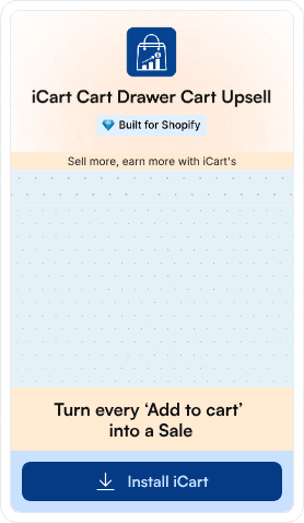
If you want more control over how your cart looks and behaves, install apps like iCart Cart Drawer Cart Upsell.

It lets you customize your cart as a side cart drawer, cart popup, or full cart. It also comes with a no-code editor so you can adjust the cart experience without having technical expertise.
2. Use a homepage that guides the first click
Your homepage should not try to do everything at once. I prefer a homepage that pushes the shopper toward one clear next step.
What do I usually want on a homepage?
- One clear hero section
- One main CTA
- A clear product category or hero product
- A clear collection page of your products.
3. Keep navigation simple
Navigation is one of the first things I clean up in a new store. Many store owners have complicated menus because they want every category visible at once.
How to keep a simple navigation?
- Clear category names
- Fewer top-level menu items
- Labels that shoppers understand instantly
- Logical grouping of products
4. Design collection pages for easier browsing
Collection pages are often ignored by store owners, but they matter a lot in Shopify UI/UX optimization. This is where shoppers decide whether browsing feels easy or frustrating.
Here’s what I include in a strong collection page:
- A simple product grid
- Consistent image sizes
- Visible product names and prices
- Useful filters & sorting options
5. Build product pages that reduce doubt
This is where I find the biggest conversion gaps in most new stores. Their product pages are not built for conversions. Low-quality images and poor product descriptions are often the biggest issues I see.
I focus on these six things first:
- Clear product title
- Strong product images
- Easy variant selection
- Benefit-driven product copy
- Visible delivery and return details
- A buy button that stands out
6. Reduce checkout friction early
Checkout problems often start before the shopper even reaches checkout. Baymard’s checkout usability research says the average ecommerce site can have 35% conversion lift from better checkout UX.
My practical checkout advice for new stores
- Show costs as early as possible
- Avoid surprise fees
- Use trust signals near key actions
- Keep form fields easy to understand
7. Improve speed and visual stability
Speed is part of UX. So is layout stability. If the page loads slowly or is difficult to scan by the customer, shoppers lose trust.
Common issues I fix to increase speed and enhance visual stability.
- Oversized images
- Too many scripts
- Too many pop-ups
- Slow theme elements
Common UX pitfalls I try to avoid
Complicated homepage design
This is one of the biggest mistakes I see. Do not add too many offers, too many sections, and too many banners on the homepage.
Confusing navigation
If people cannot understand your menu in a few seconds, your structure needs work. Signs of weak navigation. Store owners often add a poor search setup and duplicate collections that confuse the customers.
Weak mobile experience
A store can look fine on a desktop and still perform poorly on mobile. Baymard’s benchmark also shows mobile product page UX lags behind desktop on many ecommerce sites.
Aggressive upsells
Upsells can work well, but only when they fit the shopping flow. Do not let it interrupt the user too early or too often. It will hurt conversions.
Do not take Shopify UX design lightly
If I had to sum it up in one line, I would say this: Even a decent Shopify UX design will improve your conversion rate.
If I were a store owner in 2026, I would focus on these Shopify UI UX design changes:
- A cleaner homepage
- Better navigation
- Stronger product pages
- Simpler cart flow
- Better mobile experience
FAQs
1. What is Shopify UI/UX?
Shopify UI/UX is the combination of how your store looks and how it works for shoppers. UI covers things like buttons, layout, colors, menus, and product cards, while UX is the full shopping experience from homepage to checkout.
2. How to improve Shopify UX design in your storefront?
Make the path to purchase easier: simplify navigation, clean up collection pages, improve product page clarity, and reduce friction in the cart.
3. How to optimize your Shopify UI on your website?
To optimize your Shopify UI, focus on the visual parts shoppers interact with most: headings, buttons, spacing, product cards, filters, and mobile layout. Keep the design consistent, making important actions stand out, and using a layout that feels easy to scan.
4. Do you need coding experience to optimize UI/UX on the Shopify site?
No. A lot of UI/UX improvements can be done through Shopify themes, the theme editor, app settings, content structure, better images, and simple menus.


")

About the author
Vineet Nair
Vineet is an experienced content strategist with expertise in the ecommerce domain and a keen interest in Shopify. He aims to help Shopify merchants thrive in this competitive environment with technical solutions and thoughtfully structured content.