The Recommendation Widget in the SellMore app allows you to display AI-powered or collection-based product suggestions on selected store pages.
It helps customers discover more products, increases store engagement, and can boost your sales.
You can customize the widget layout, choose the product source, set discounts, and style the design to match your store branding.
Widget Setup
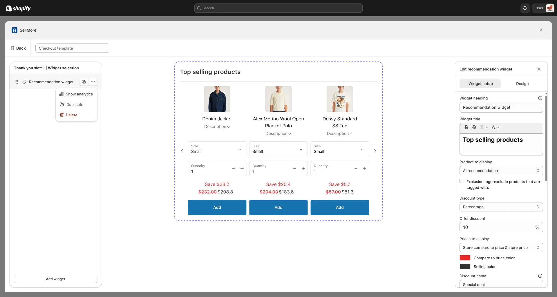
Widget Heading
The Widget Heading is the text shown at the top of the recommendation widget only inside the widget editor. It helps you label and identify the widget so you can easily understand which offer you’ve created. This heading will not be visible on your storefront—it’s for your reference and editing purposes only.
Widget Title
The main title displayed inside the widget.
This is usually a short, catchy line that draws attention to the recommended products.
Example: “Top Picks for You.”
Products to Display
Here, you decide where the widget will pull products from:
- AI Recommendation – The app automatically selects the most relevant products for each customer using AI.
- Specific Collection – Displays products from a collection you manually select from your Shopify store.
Exclusion Tags
Use this option to prevent certain products from being displayed in the widget. If you enter the product tag in this option, those products will not be displayed in the product recommendation widget.
Discount Type
Choose how you want to offer discounts in the recommendation widget:
- Select Discount – Only the normal recommendation product will be displayed. When the customer adds, no discount will be applied, and the product will be added at its original price.
- Percentage – Apply a percentage-based discount. For example, if you set 10%, the recommendation product will be sold at 10% off.
- Fixed Amount – Apply a fixed discount value. For example, if you set $100, the customer will receive a $100 discount on the recommendation product.
- Fixed Amount Per Item Added – Apply a discount per quantity of the recommendation product. For example, if you set $5 and the customer adds 3 items, a $15 discount will be applied.
Offer Discount
Set the value of the discount based on the discount type you selected above.
Price to Display
Choose how product prices are shown in the widget:
- Store Price Only – Displays only the original product price from your Shopify product.
- Store Compare-to Price & Store Price – SDisplays the compare-at price (set in your Shopify product) alongside the original store price.
- Store Compare-to Price & Price Including Discount – Displays the compare-at price (set in your Shopify product) alongside the discounted price calculated by the app.
- Store Price & Price Including Discount – Displays the original store price alongside the discounted price calculated by the app.
You can also set custom colors for:
- Compare-to Price Color – The color of the original price.
- Selling Price Color – The color of the selling/discounted price.
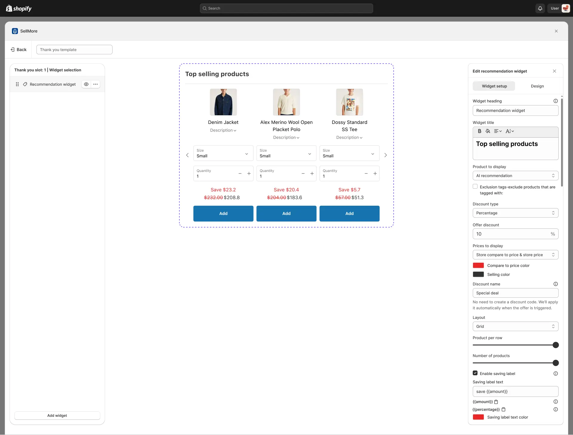
Discount Name
Set a name for the discount applied by the widget.
The app will automatically apply the discount when a customer engages with the widget, so there’s no need to manually create a discount code.
Layout
Choose the way products are arranged in the widget:
- List View – Products are displayed vertically.
- Grid View – Products are displayed in a grid.
Products per Row
Set how many products you want to display in a single row (e.g., 3 products per row).
Number of Products
Set the total number of products to display in the widget (e.g., 10 products).
Enable Saving Label
When this option is enabled, customers will see a discount label showing the savings they received, displayed either as a percentage or as a fixed amount.
- {{Amount}} – Shows savings in currency.
- {{Percentage}} – Shows savings in percentage.
Design Options
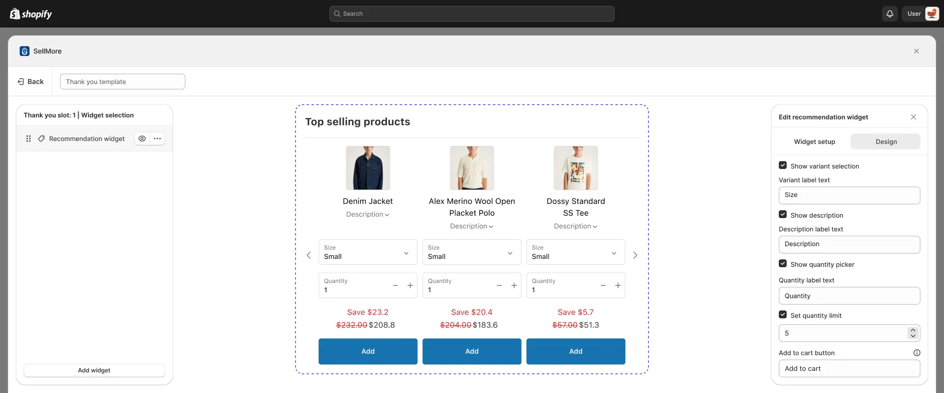
Customize the appearance and layout of the widget:
- 1. Show Variant Selection
When this option is enabled, customers can select product variants (such as size, color, or style) directly from the upsell widget. This ensures that the correct product variant is added to the cart without requiring customers to leave the page.
2. Show Description
When this option is enabled, the upsell widget will display the product’s description. This allows customers to view additional details about the item (such as features, benefits, or highlights) without navigating away from the current page.
3. Show Quantity Picker
When this option is enabled, customers can choose the quantity of the upsell product they want to add directly from the widget. You can also set a custom label for the quantity selector (for example, “Quantity” or “Qty”), replacing the default text.
4. Add to Cart Button
When a quantity limit is set for an upsell product, you also have the option to customize the text of the Add to Cart button. This lets you replace the default button text with your own wording (e.g., “Buy Now,” “Add Deal,” or “Grab Offer”), making it more aligned with your store’s tone and promotions.
Additional options
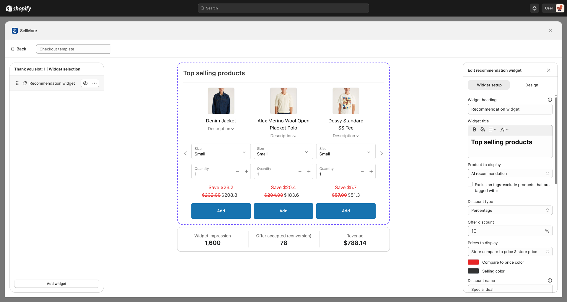
You can hide or unhide the widget using the eye icon button. You can also view analytics, duplicate, or delete the widget by using the three-dot icon next to the eye icon button.
- Analytics – Check widget performance data like views and clicks.
- Duplicate Widget – Copy an existing widget to create a similar one quickly.
- Delete Widget – Permanently remove the widget from your store.
- Add Widget – You can also add a widget by using the ‘Add Widget’ button at the bottom of the left side panel. Using this button, you can add product upsell, product recommendation, and product bundle widgets.