


With the arrival of Online Store 2.0, both Shopify merchants and developers are highly benefited. For developers, Online Store 2.0 made it easier to develop customized features and apps. And for Shopify merchants, Online Store 2.0 gives greater flexibility to design and build their online storefront easily.
Shopify 2.0 has easy-to-use templates, fully customizable layouts, sections, metafields, and many more to improve the shopping experience.
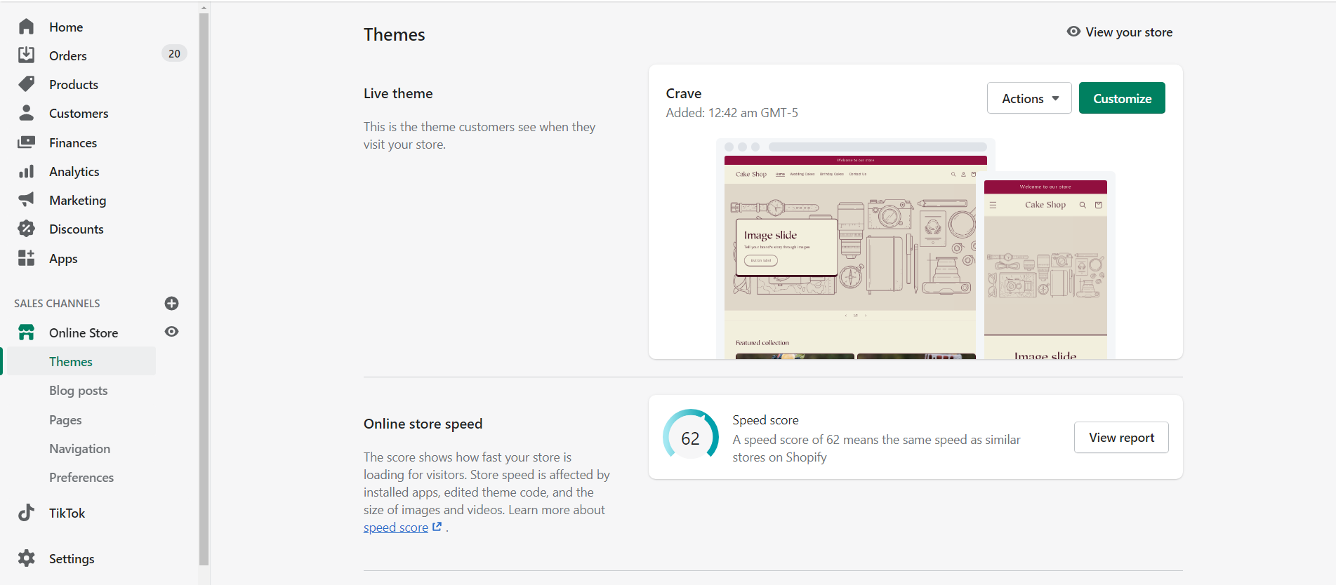
Shopify has brought 3 new free Online Store 2.0 themes to make your store stand out from the crowd after the Dawn theme. These 3 themes are Crave, Craft, and Sense.
All these themes are mainly for food and beverages, home and garden, and health and beauty. In this blog, we’ll discuss the Crave theme and how to customize the crave theme.
Shopify Crave Theme
Crave theme is a free Online Store 2.0 theme suitable for food and beverages stores of any catalog size. Crave is an eye-catching theme with mobile optimized layouts and dynamic checkout options for shopping on the go.
Features
- Slideshow
- Advanced product filtering
- Fixed navigation
- Promotional banner
Benefits of Crave theme
- Vibrant and playful design with bold colors and distinct shadows that attract the buyer's attention
- Mobile optimized layouts that are for the on-the-go buyer
- Flexible and advanced customization options without the need to edit code.
Customizing Crave theme
With the help of sections and blocks, you can easily customize your store’s content without any need to touch the code.
Let’s understand each and everything present in the Shopify Crave theme. I will show you how to design and customize your storefront from scratch with the Crave theme. I will pick each and every template and explain the usage of sections on each page. So stick to the end of this blog.
To start customizing click on the Customize button as shown below.
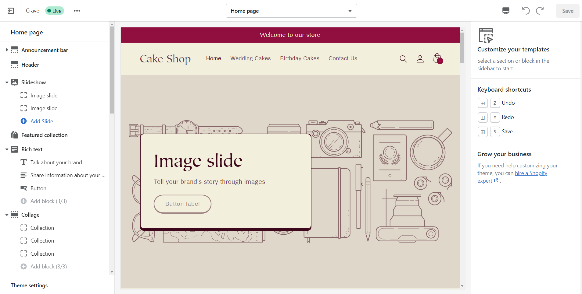
On clicking the Customize button you may be landed on the theme editor which may look like as shown below. The editor is divided into 3 panels. Left, middle, and right.
The left side panel is the layout in which you can add sections and blocks as per your need. The middle panel is the preview panel where you can see the changes/customization made by you. And right panel shows the settings or options of each section and blocks that you select which are customizable.
Sections
Sections are provided to create the desired layout as per your needs. Most of the sections contain blocks that allow you to customize and give a new look to your store without editing code. Now let’s see the sections offered by the Crave theme.
- Announcement bar
- Header
- Footer
- Blog posts
- Collage
- Collapsible content
- Collection list
- Contact form
- Custom liquid
- Email signup banner
- Email signup
- Featured product
- Featured collection
- Image banner
- Image with text
- Multicolumn
- Page
- Rich text
- Slideshow
- Video
Let’s understand these sections under each of the templates that we are going to see below.
Templates
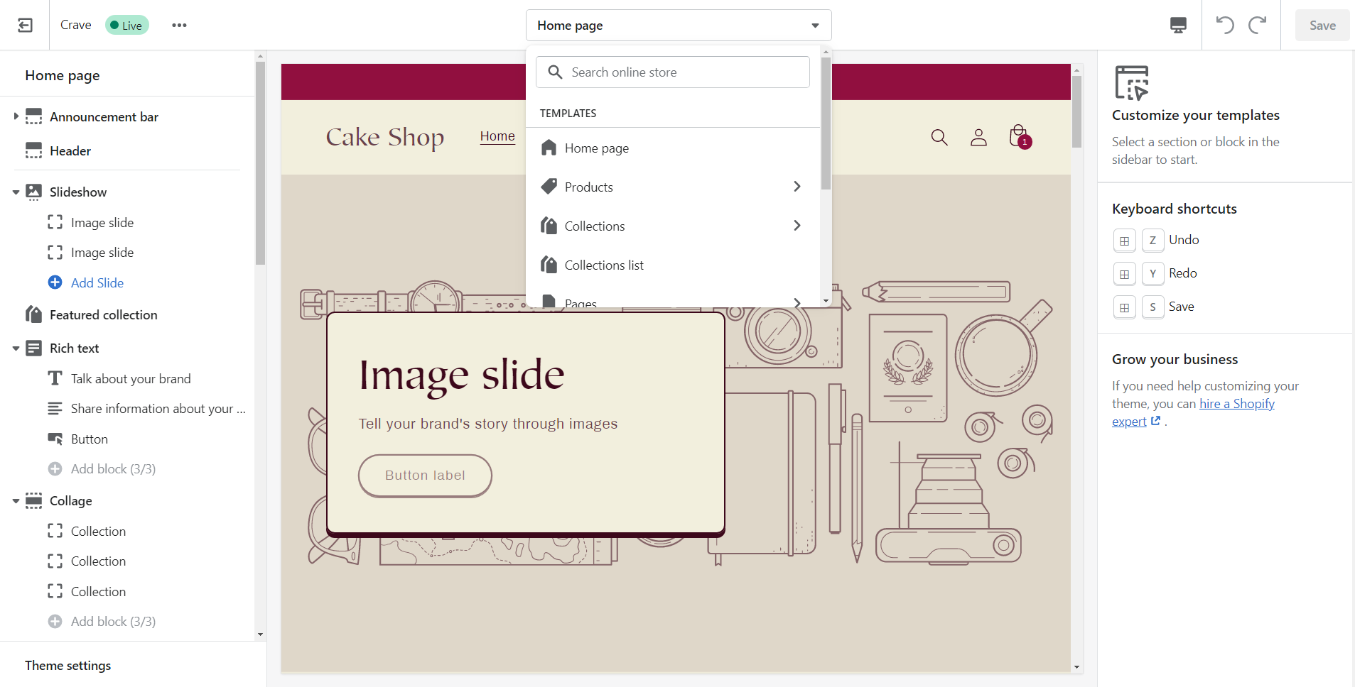
To open the pages click on the dropdown of templates as shown above. Here is the list of templates and let’s start customizing each of them one by one using required sections.
- Home Page
- Products
- Collections
- Collections list
- Pages
- Blogs
- Blog posts
- Cart
- Checkout
- Others
Home Page
The home page is the king of the website. The home page is the place where your customers can see the first impression about your store. Let’s see how we can make it better using sections.
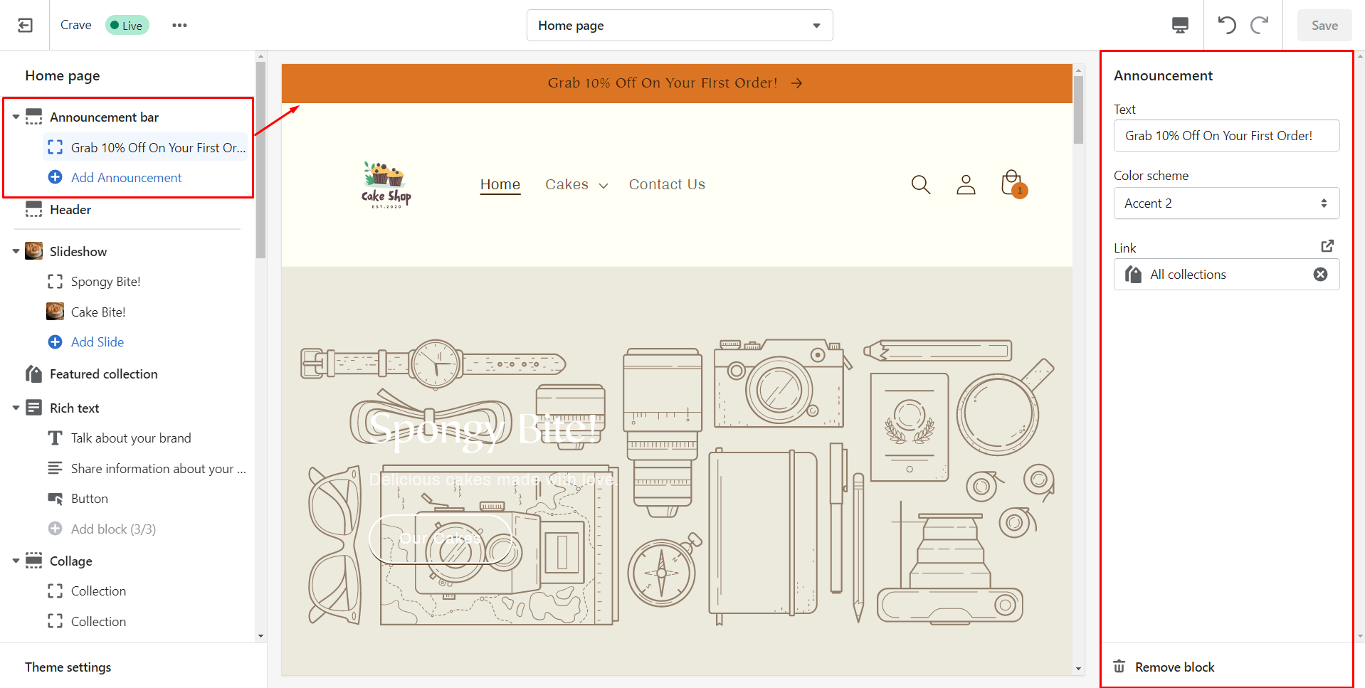
Announcement bar
The announcement bar helps you to display any important information for your customers. It provides no settings to customize but you can customize up to 12 blocks to display.
| Section Settings | Description |
| Text | The text that you want to show your customers or the announcement you want to make. |
| Color Scheme | The Color of the announcement bar. |
| Link | The link where you want to redirect your customers while clicking the announcement bar. |
Steps to customize the announcement bar
Step 1: Click the announcement bar from the left panel.
Step 2: By clicking on the announcement, you can see the corresponding settings in the right panel.
Step 3: Add the text you want to display.
Step 4: Choose the color scheme of the announcement bar.
Step 5: Add the link where you want to take your customers when they click on the announcement bar.
Step 6: Click on the Save button to save changes.
So here I have customized my announcement bar. Have a look at it.
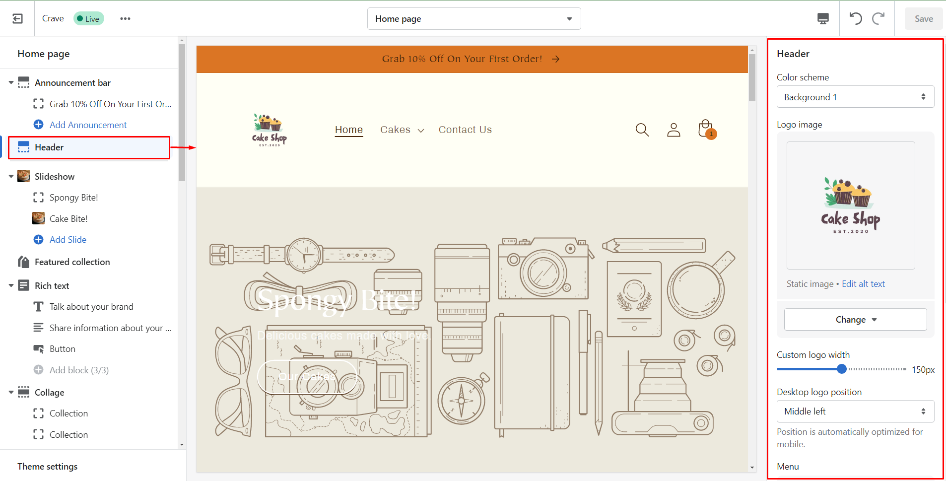
Header
Header shows all the pages present in your online store.
| Section Settings | Description |
| Color Scheme | Background color of the header. |
| Logo image | Logo of your brand. |
| Edit alt text | A brief description of the logo image you add to improve search engine optimization (SEO) and accessibility for visually impaired customers. |
| Custom logo width | Width of the logo. It can be any multiple of 10, from 50 px to 250px. Default size if 100px. |
| Desktop logo position | Position of the logo where you want to display. Middle left, top left, top center (default). |
| Menu | The main menu that you want to show. |
| Show separator line | Line to separate your header from the page’s content. |
| Enable sticky header | Make the header sticky when the customer scrolls up the page |
| Spacing | Spacing below the header. |
Steps to customize the header
Step 1: From the left panel, click on the header and you can see the settings for it on the right-hand side.
Step 2: Set the color scheme for the header background.
Step 3: Add the logo image & give the alt text to improve SEO.
Step 4: Set the width of the logo using the slider. You can change the width up to 150px.
Step 5: Choose the position of the logo.
Step 6: Change the main menu if needed.
Step 7: Enable the separator line to display a line that separates the header.
Step 8: Enable the sticky header if you want to make the header sticky while customers scroll up the page.
Step 9: Set the bottom spacing margin for the header.
Step 10: Finally, click on the Save button.
Have a look at the changes made by me on the header.
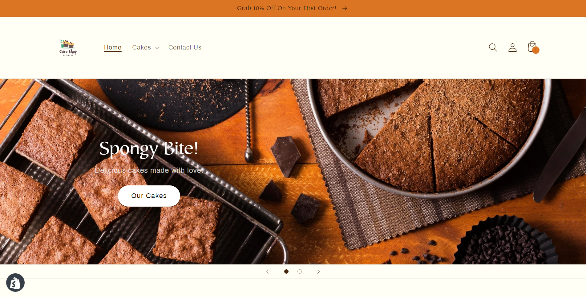
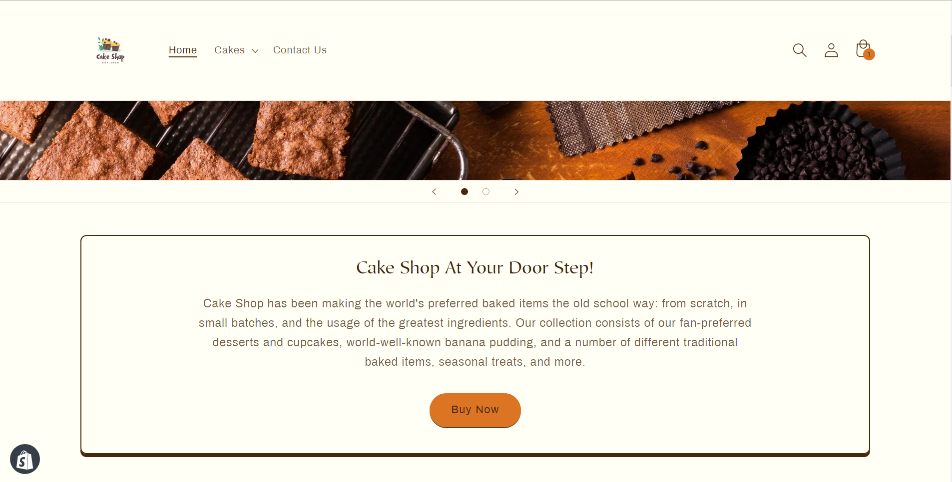
Slideshow
You can add up to 5 images to display as a slideshow.
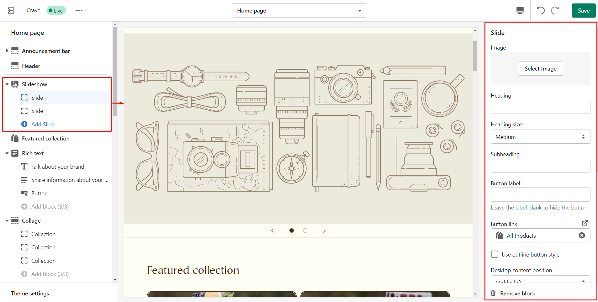
| Section Settings | Description |
|---|---|
| Layout | You will get 2 options to choose the layout of the slideshow. Full width or Grid. |
| Slide height | The height of the slideshow. |
| Pagination style | Style of the slideshow’s navigation that displays under each image. |
| Auto-rotate slides | Enabling this checkbox will play the images one by one automatically. |
| Change slides timer | You can set the timer of the slideshow. Minimum: 3 seconds & Maximum: 9 seconds. |
| Mobile layout | You can select the content alignment on mobile. |
| Accessibility | Describe the slideshow for your customers. |
| Image Slide Settings | Description |
| Image | Static image for your slideshow. |
| Edit alt text | Describe your slideshow for readers. |
| Heading | Optional heading text for the image. |
| Heading size | Size of the heading. |
| Subheading | Optional subheading text for the image. |
| Button label | Text for the button. |
| Button link | URL for the button where you want to link to. |
| Use outline button style | Outline style of the button. |
| Desktop content position | Position of the content box over the image. |
| Show container on desktop | Click on the checkbox to show container box. |
| Desktop content alignment | Position of the text in the container box. |
| Image overlay opacity | Adjust the opacity of the image overlay. |
| Color scheme | Adjust the background color of the content box. |
| Mobile layout | Set the layout of content that should be displayed on mobile. |
Steps to customize the slideshow
Step 1: Add the image and alt text for the image that you want to show in slides.
Step 2: Enter the heading text.
Step 3: Choose the size of the heading.
Step 4: Add text for the subheading.
Step 5: Enter text for the button or leave the label blank to hide the button.
Step 6: Add the link for the button where your customers will be redirected while they click on it.
Step 7: Check the box to show a solid outlined button.
Step 8: Select the position of the content box you want to display over the image.
Step 9: Click the checkbox to show a container box on the image.
Step 10: Choose the alignment of content.
Step 11: Adjust the opacity of the image overlay.
Step 12: Select the color scheme of the background color of the content box.
Step 13: Adjust the content alignment of the mobile layout.
Step 14: Save changes using the Save button.
Take a quick look at the changes I have made to my store’s slideshow.
Rich text
This section allows you to add rich text with a header, content, and a button with a link.
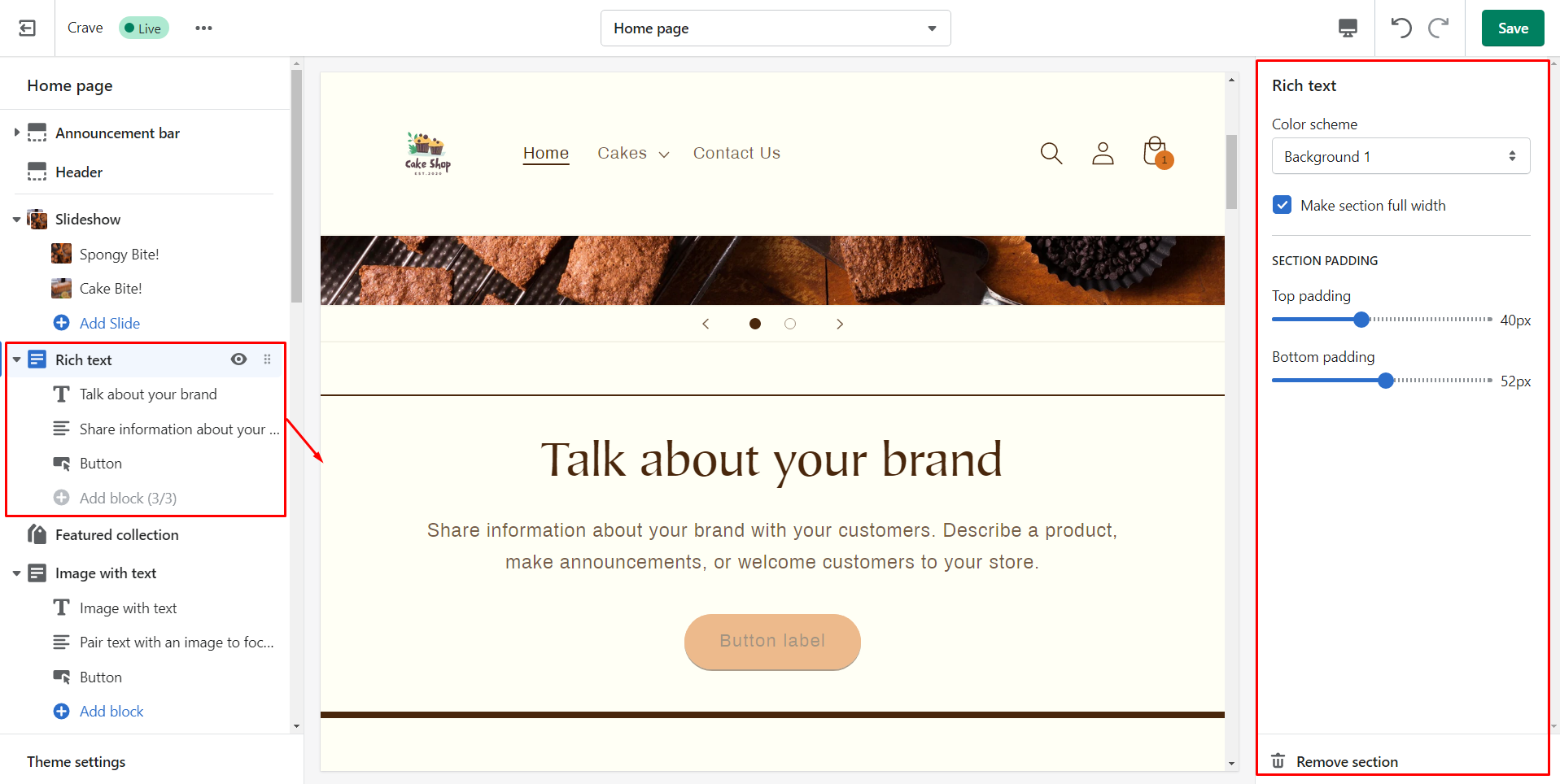
| Section settings | Description |
| Color scheme | Background color of the rich text section. |
| Make section full width | By default the rich text section will be full width. You can make it half-width using the checkbox. |
| Section padding | Spacing between top or bottom of the rich text section. |
| Heading Block | Description |
| Heading | Title of the section. |
| Heading size | Size of the title. |
| Text Block Setting | Description |
| Description | Paragraph you want to add in the section. |
| Button Block Settings | Description |
| Button label | The text/name on the button. |
| Button link | URL where you want to navigate your customers while the click on the button. |
| Use outline button style | Border of the button. |
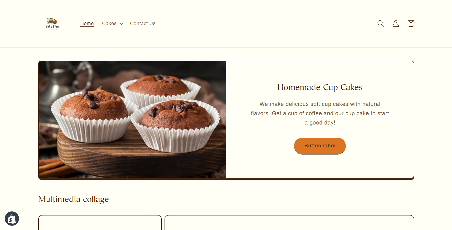
I have added the rich text. See below.
Featured collection
This section allows you to show products in a single collection.
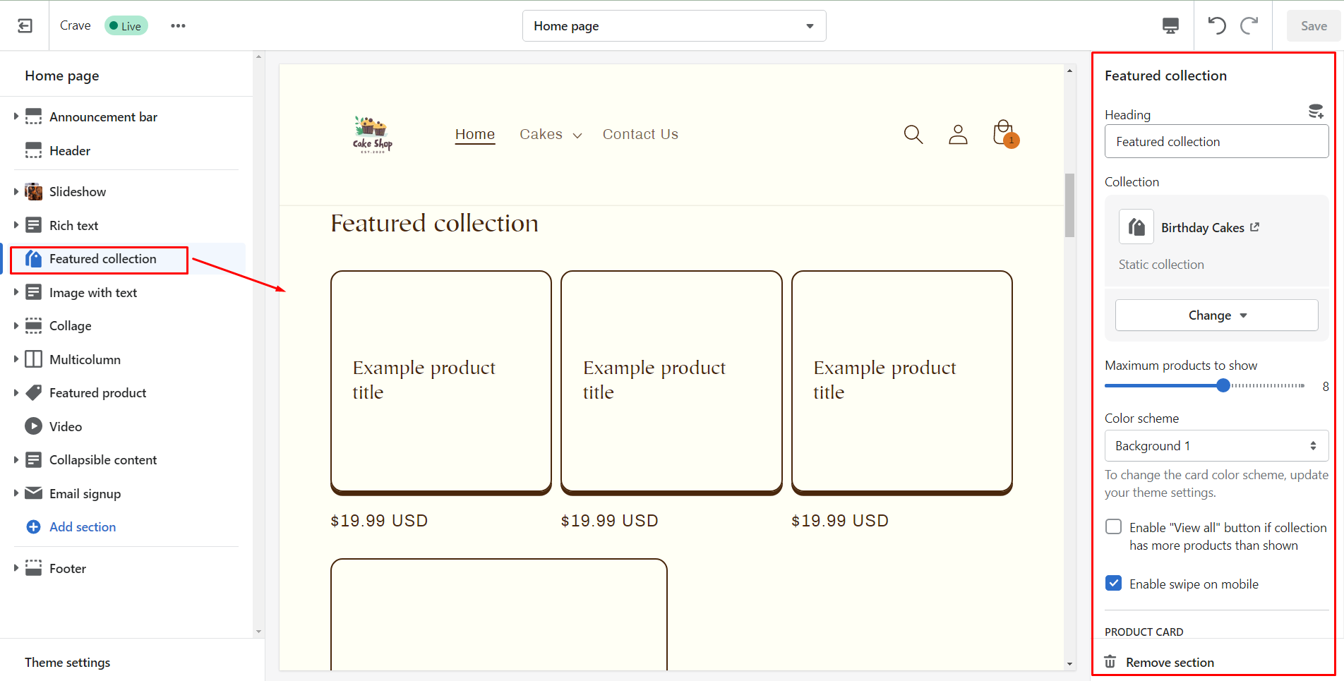
| Section settings | Description |
| Heading | Title of the section |
| Collection | Particular collection from where you want to show products from. |
| Maximum products to show | The number of products you want to show from the collection. |
| Color scheme | Background color of the featured collection section. |
| Enable "View all" button if collection has more products than shown | Enabling this button will show more products if the collection has more products than set in the maximum products to show. |
| Enable swipe on mobile | Enabling this option will allow customers to see more products by changing the mobile display from a column to row. |
| Image ratio | Set the image ratio of product images. |
| Show second image on hover | Customers can see another image while they hover their cursor over the product images. |
| Show vendor | To display the vendors of products |
| Show product rating | Displays the average rating of products. |
| Section padding | Spacing |
Steps to customize the featured collection
Step 1: Add the heading for the featured collection section.
Step 2: Choose the collection you want to display.
Step 3: Set the limit of the number of products you want to show.
Step 4: Select the background color of the featured collection section.
Step 5: If needed enable view all collection button if you have more products than shown.
Step 6: Enable swipe on mobile if needed.
Step 7: Set the ratio of the product image.
Step 8: Enable the checkbox to show the second image on hover.
Step 9: Click the checkbox to display the vendor name.
Step 10: Show product rating if needed.
Step 11: Adjust the spacing of the featured collection section using the slider.
Step 12: Save changes at the end.
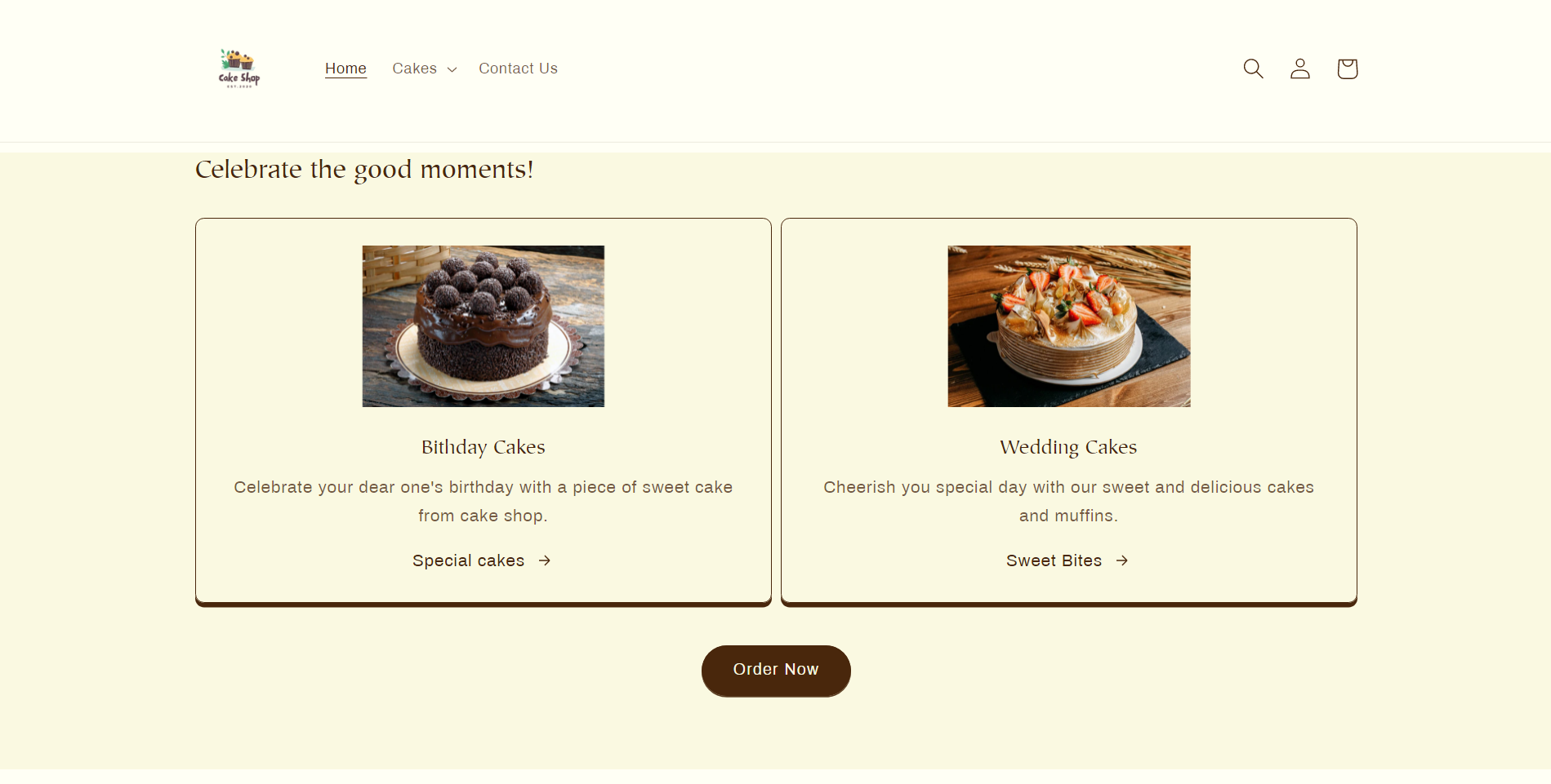
So here I have added my featured collection.
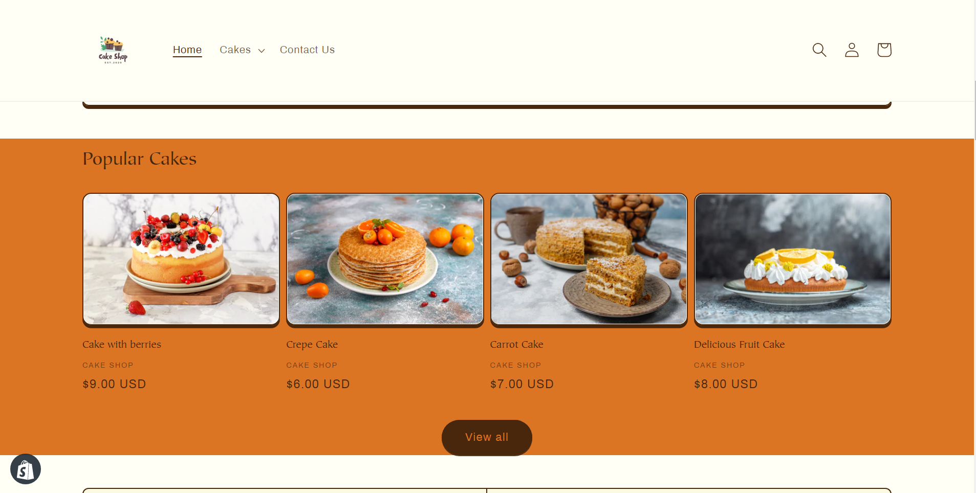
Image with text
This section contains an image with a text including a button to link where you want to take your customers.
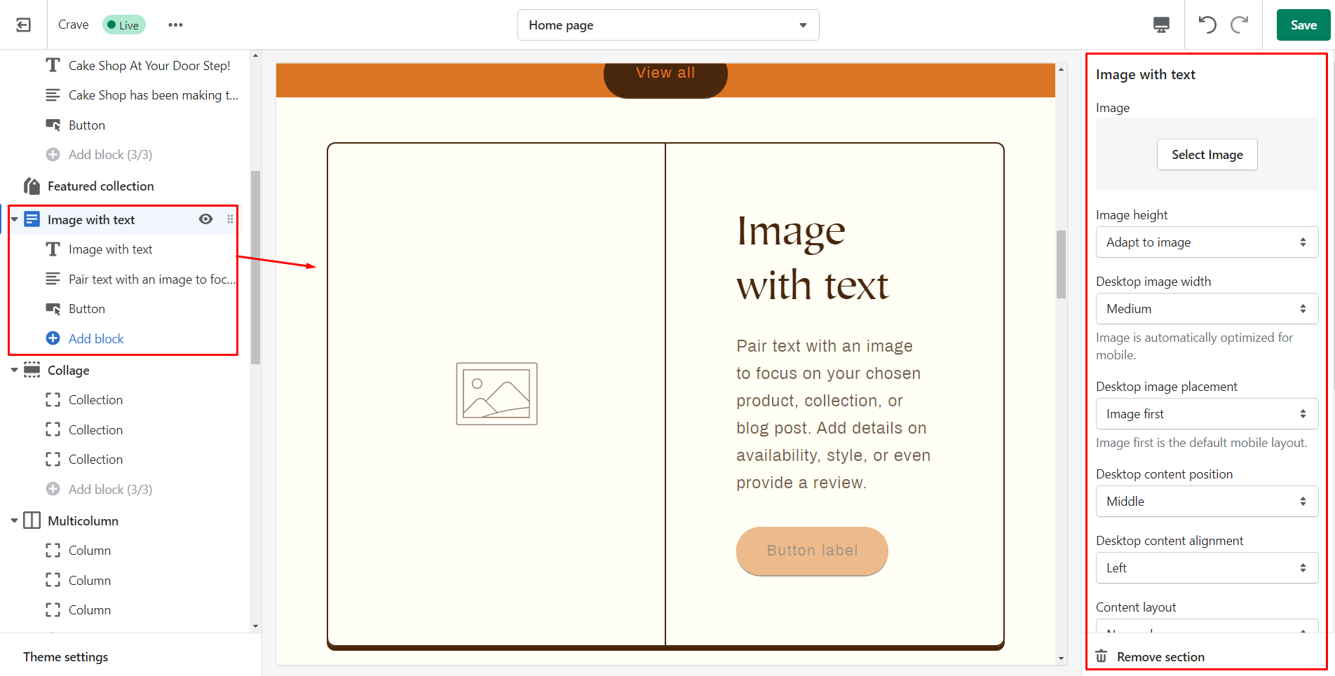
| Section settings | Description |
| Image | Choose the image that you want to display. |
| Edit alt text | Describe about the image for improving SEO. |
| Image height | Height of the added image. |
| Desktop image placement | Set position whether image or text should appear first. |
| Desktop content position | Alignment of text. |
| Content layout | Allows the image and text boxes to overlap with one another. |
| Mobile layout | Alignment of content for mobile device. |
| Section padding | Spacing of the image with text section. |
| Heading Block | Description |
| Heading | Title of the section. |
| Heading size | Size of the title. |
| Text Block Settings | Description |
| Content | Shows paragraph style text.. |
| Text style | Style of the content |
| Button Block Settings | Description |
| Button label | The text/name on the button. |
| Button link | URL where you want to navigate your customers while the click on the button. |
Here I have added an image with text. See the output below.
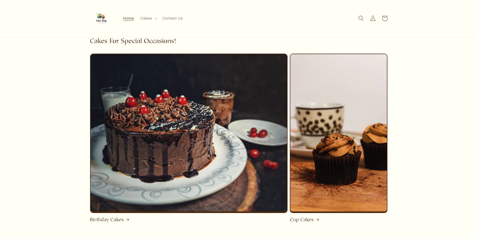
Collage
This section allows you to create a collage of videos, images, products, and collections.
| Setting | Description |
| Heading | Title of the section. |
| Desktop layout | Appearance of collage section on desktop. |
| Mobile layout | Appearance of collage section on mobile. |
| Color scheme | Background color of the collage section. |
| Section padding | Spacing of collage on both top and bottom. |
Steps to make collage
Step 1: Add the heading for the collage.
Step 2: Choose the layout of the collage to be shown on the desktop.
Step 3: Choose the layout of the collage to be shown on mobile.
Step 4: Select the background color of the collage.
Step 5: Set the spacing of the collage.
Step 6: Save changes.
Have a look at the output below.
Multicolumn
This section allows you to show content in a column layout.
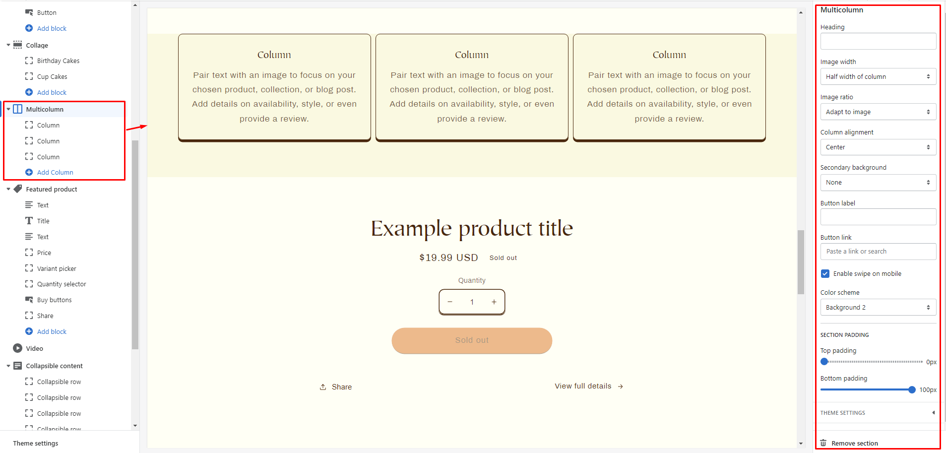
| Section settings | Description |
| Heading | Title of the section. |
| Image width | Width of the images that you add in columns. |
| Image ratio | Image ratio of the images added. |
| Column alignment | Position of images and text within the columns. |
| Secondary background | You can either choose column background to show or none to hide the secondary background. |
| Button label | Label shown on the button. |
| Button link | Link on the button. |
| Enable swipe on mobile | Enable to change the mobile display from column to row. |
| Color scheme | Background color of the multicolumn section. |
| Section padding | Spacing at the top and bottom of the section. |
Steps to add multicolumn
Step 1: Add the image.
Step 2: Enter a title to the section.
Step 3: Write the paragraph you want to show in the column.
Step 4: Assign the name of the label you want to show.
Step 5: Add the link to label where you want to redirect customers.
The output of the multicolumn is shown below.
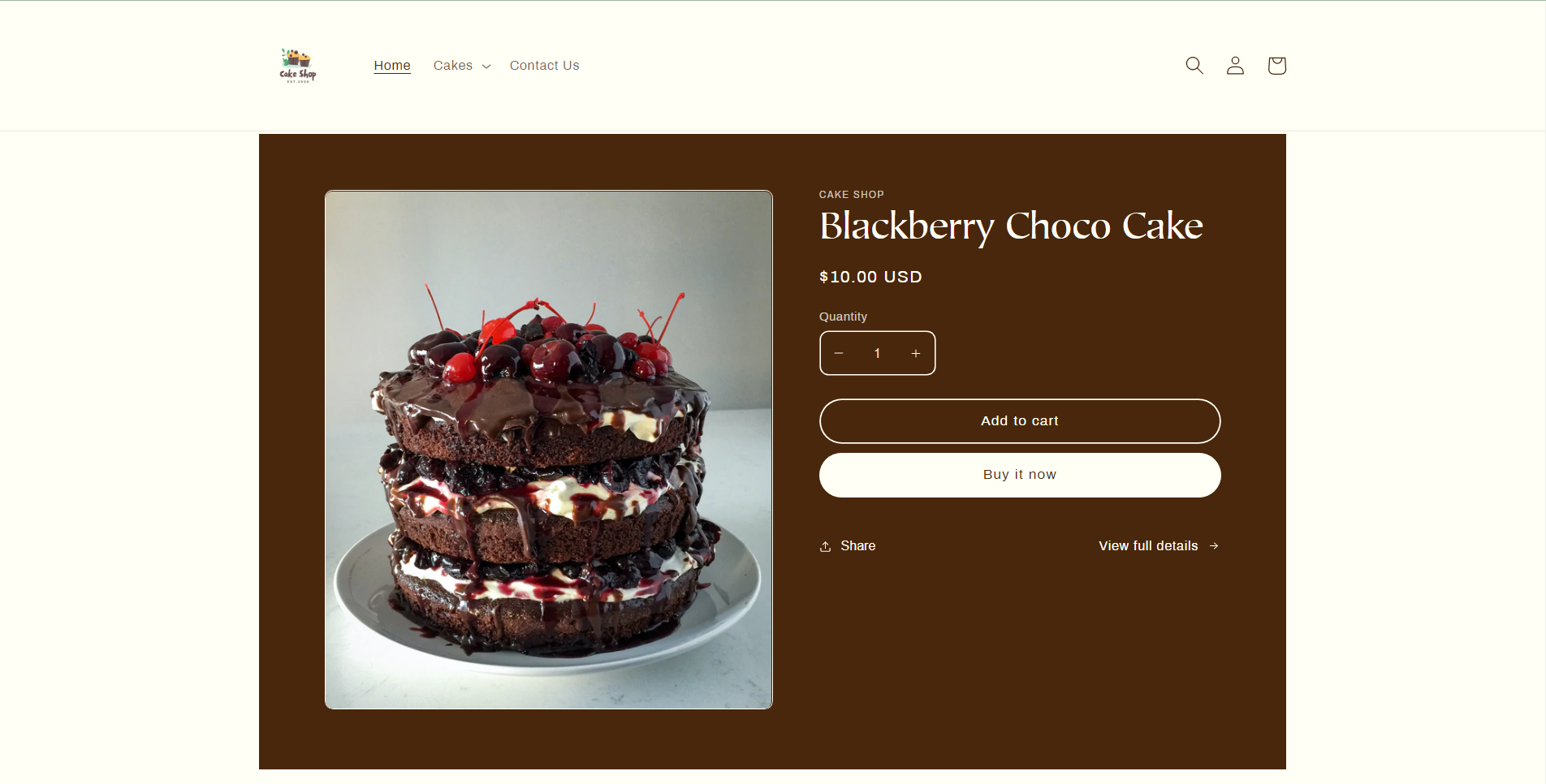
Featured product
In this section, you can feature a special product.
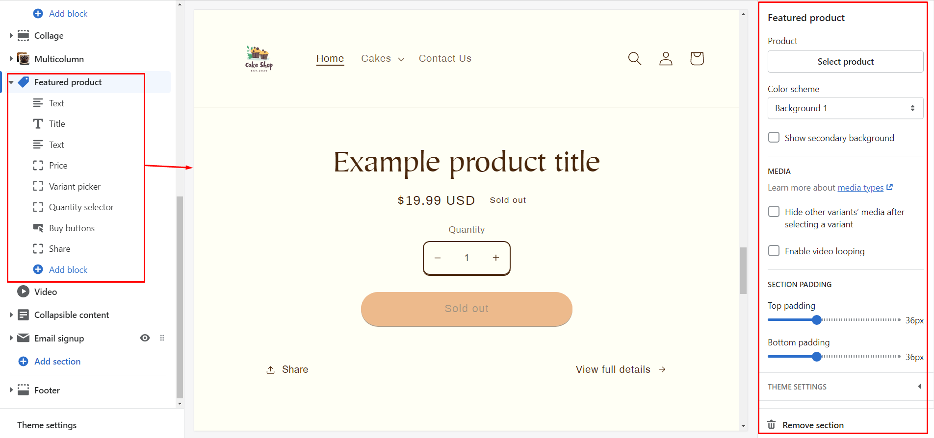
| Section settings | Description |
| Product | The product that you want to show as a featured product. |
| Color scheme | Color scheme of the featured product. |
| Show secondary background | Displays the featured product on the secondary background color. |
| Hide other variant’s media | Once a variant has been selected you can hide media of other variants enabling this option. |
| Enable video looping | Enabling this option will play the video again and again in a loop. |
| Section padding | The spacing of the featured product section. |
Here I have featured my product. How’s it?
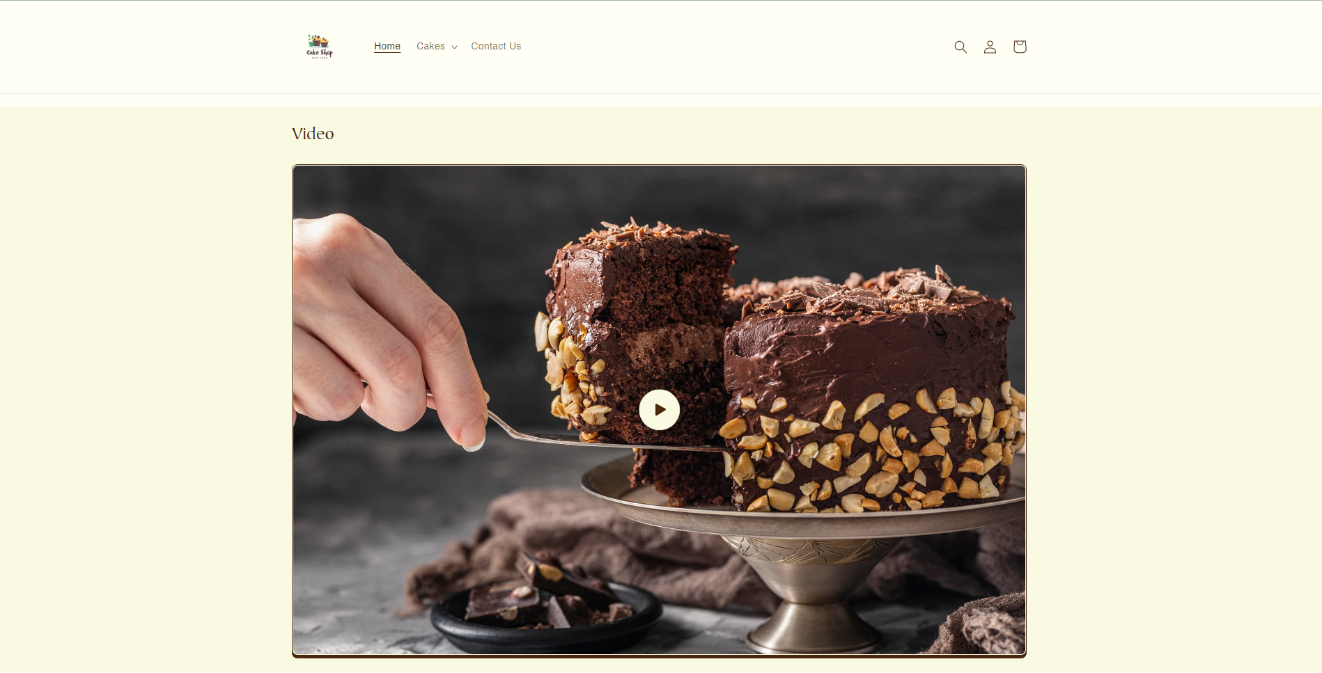
Video
This section lets you add a video from Youtube or Vimeo on a page in your store.
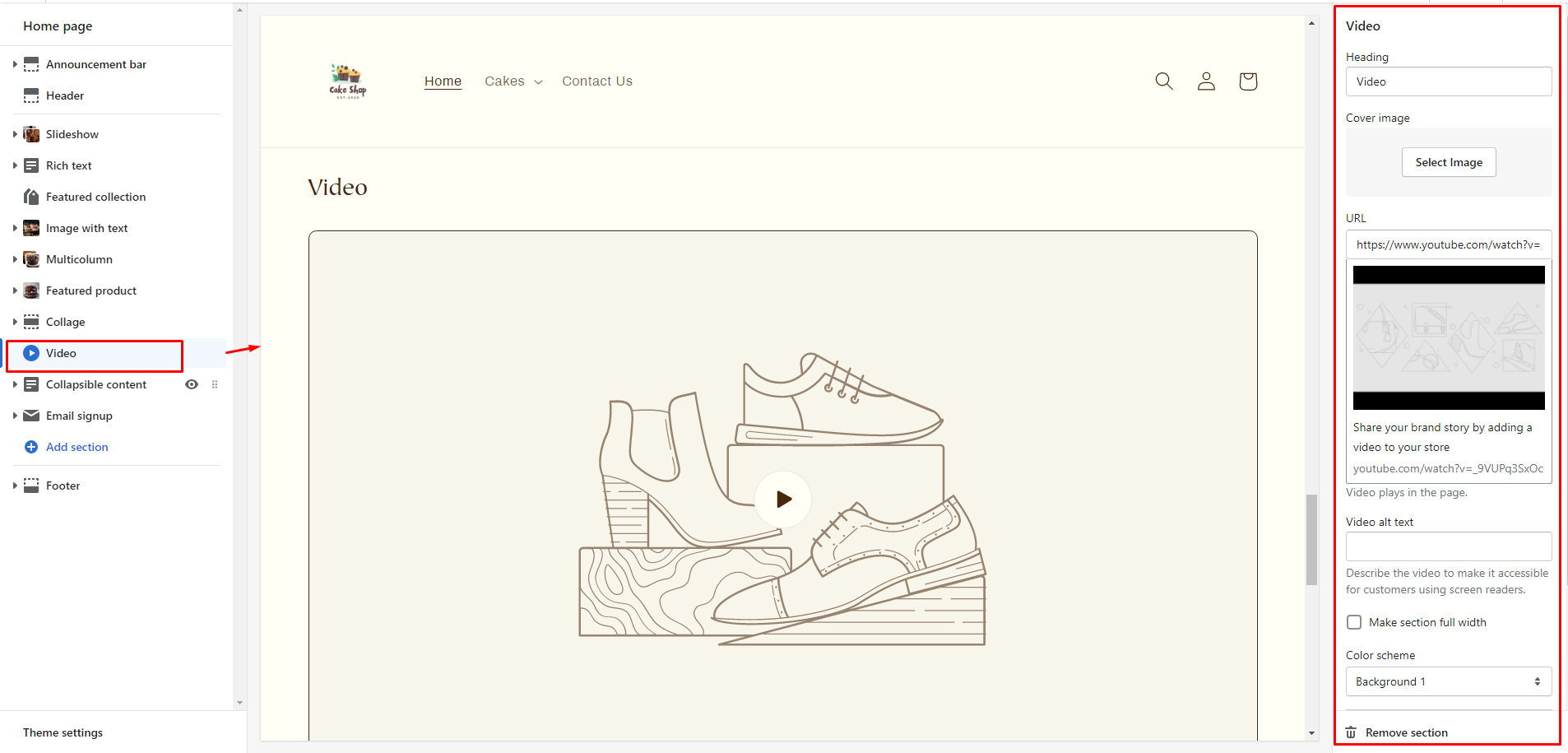
Below shows the output of this section.
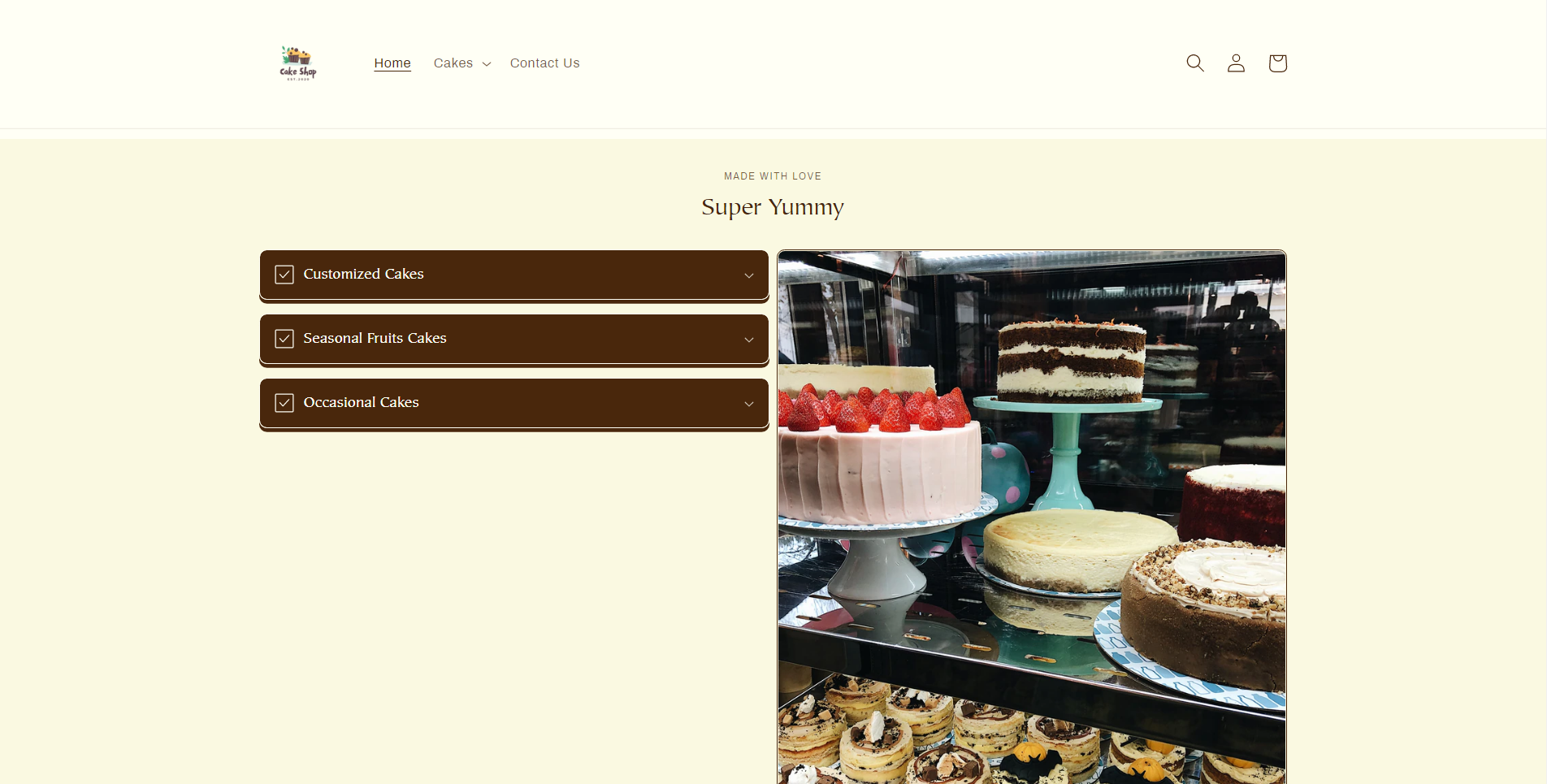
Collapsible content
This section allows you to add content that can be collapsed or expanded, and an image that can be placed to the left or right of the collapsible content.
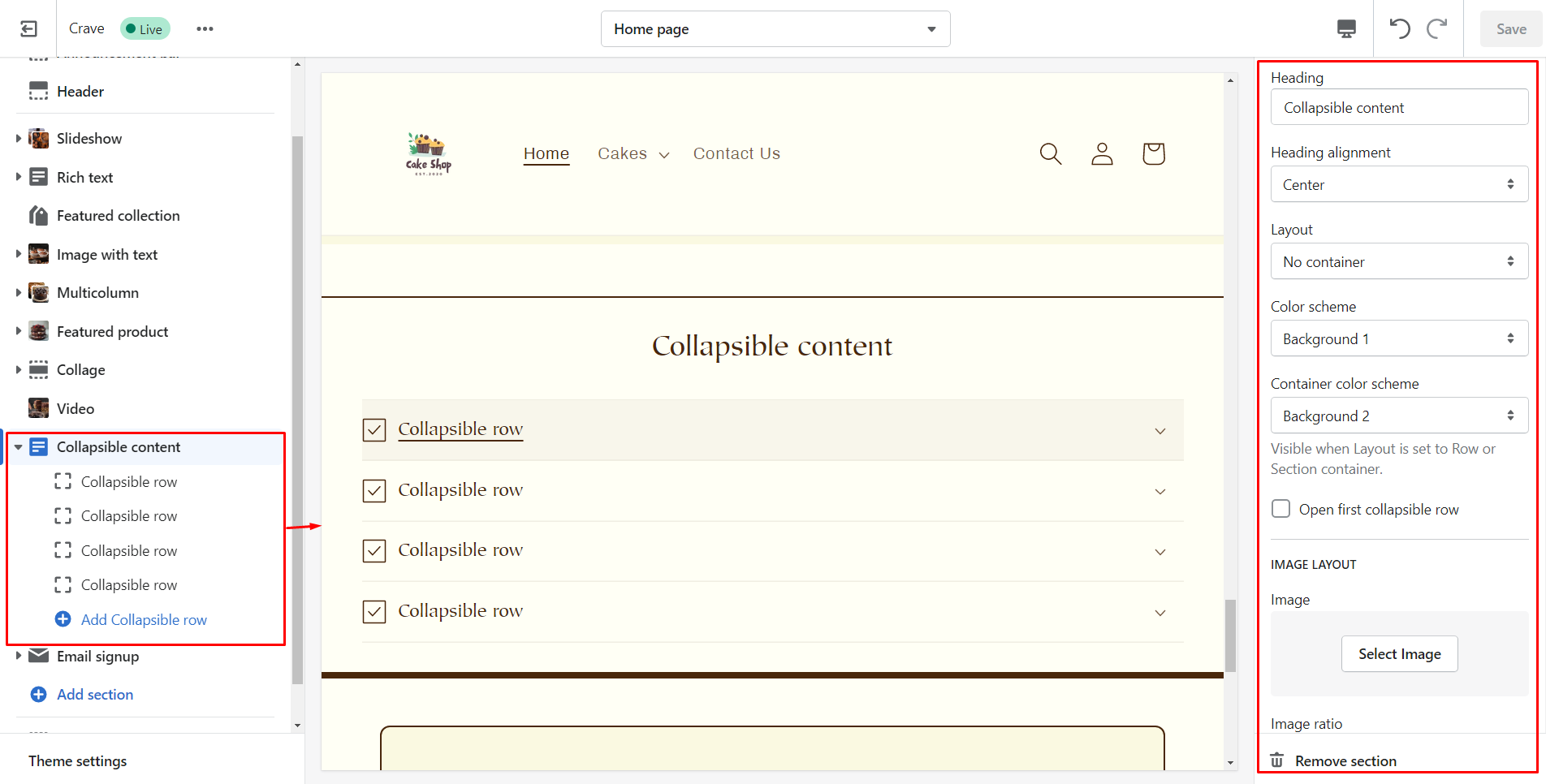
| Section settings | Description |
| Caption | An optional caption that displays above the heading of the section. |
| Heading | Title of the collapsible section. |
| Heading alignment | Position of the section heading. |
| Layout | Layout of the section. |
| Color scheme | Background color of the section. |
| Container color scheme | Background color of the collapsible content container. |
| Open first collapsible row | To show the first row of your collapsible content by default. |
| Image | The image for the section. |
| Edit alt text | A short description about the image to improve SEO |
| Image ratio | The image ratio for the section. |
| Desktop layout | Choose whether to show collapsible rows first or the image. |
| Section padding | Add spacing of the collapsible content. |
See the output of this section.
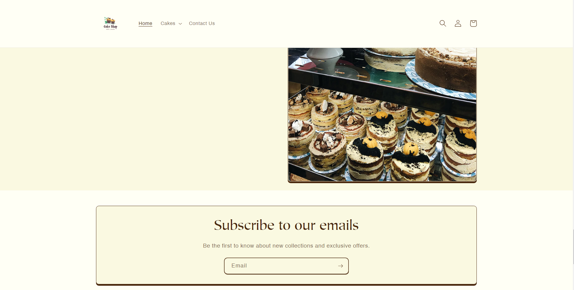
Email signup
Using this section your customers can add their email addresses and subscribe to your newsletter or marketing.
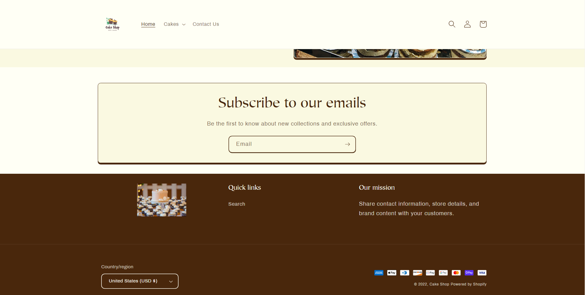
Footer
Footer will be shown on all pages in your theme.
| Section settings | Description |
| Color scheme | Background color of the footer. |
| Show email signup | To show the email signup form where customers can subscribe to your newsletter and marketing. |
| Heading | Title for the email signup form. |
| Social media icons | It shows social media icons with a link. |
| Enable country/region selector | Shows a selector for choosing countries and regions that you have added in the payment settings. |
| Enable language selector | Shows a selector for choosing countries and regions that you have added in the language settings. |
| Show payment icons | Displays icons of payment method |
| Spacing | Add space above the footer. |
| Section padding | Add space to top or bottom of the footer. |
See how I transformed my previous footer into a new one.
Product page
By default, you will find 2 sections on this page product information and product recommendations.
| Product information settings | Description |
| Enable sticky content on desktop | Make product information sticky while customers scroll down the page. |
| Desktop layout | See how the product media will look on desktop. |
| Desktop media | Select the size of media for desktop. |
| Mobile layout | Choose whether to show/hide thumbnail images on mobile. |
| Hide other variant’s media when a variant is selected | To hide images of other variants when a variant is selected. |
| Enable video looping | Enabling this option will play the video in a loop automatically. |
| Section padding | Add space to the top or bottom of the product information section. |
| Product recommendations setting | Description |
| Heading | The title of the section. |
| Color scheme | Background color of the section. |
| Image ratio | Size of the images that you show in recommended products. |
| Show second image on hover | Displays image of the product when customers hover the cursor on the image. |
| Add image padding | Allows you to add extra space around the images. |
| Show image border | Displays border around the image. |
| Show vendor | Displays the name of the vendor for each product. |
| Show product rating | Shows average product star ratings with reviews. |
Steps to add product information
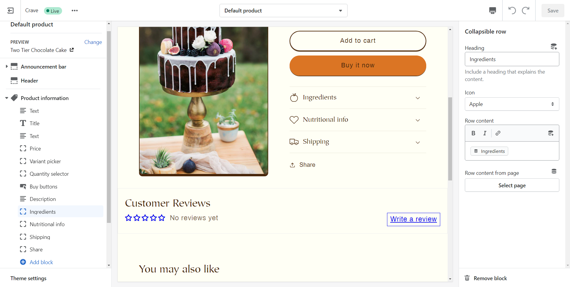
As seen in the above image you can add the information about the product using the corresponding sections and blocks. But if you want to add custom information about the product then it’s possible with the metafields.
Follow the steps to add product information with metafields:
Step 1: As shown in the above image at the top right corner you can see an icon of insert dynamic source. Click on it and add metafield.
Step 2: Click on products.
Step 3: Give definition that you want to add.
Step 4: Select the content type and save.
Step 5: From your Shopify admin go to the products page and click on the product you want to add information.
Step 6: At the bottom of the page, you will see the list of metafields that you have created.
Step 7: Choose the one that you want to show and add the description over there.
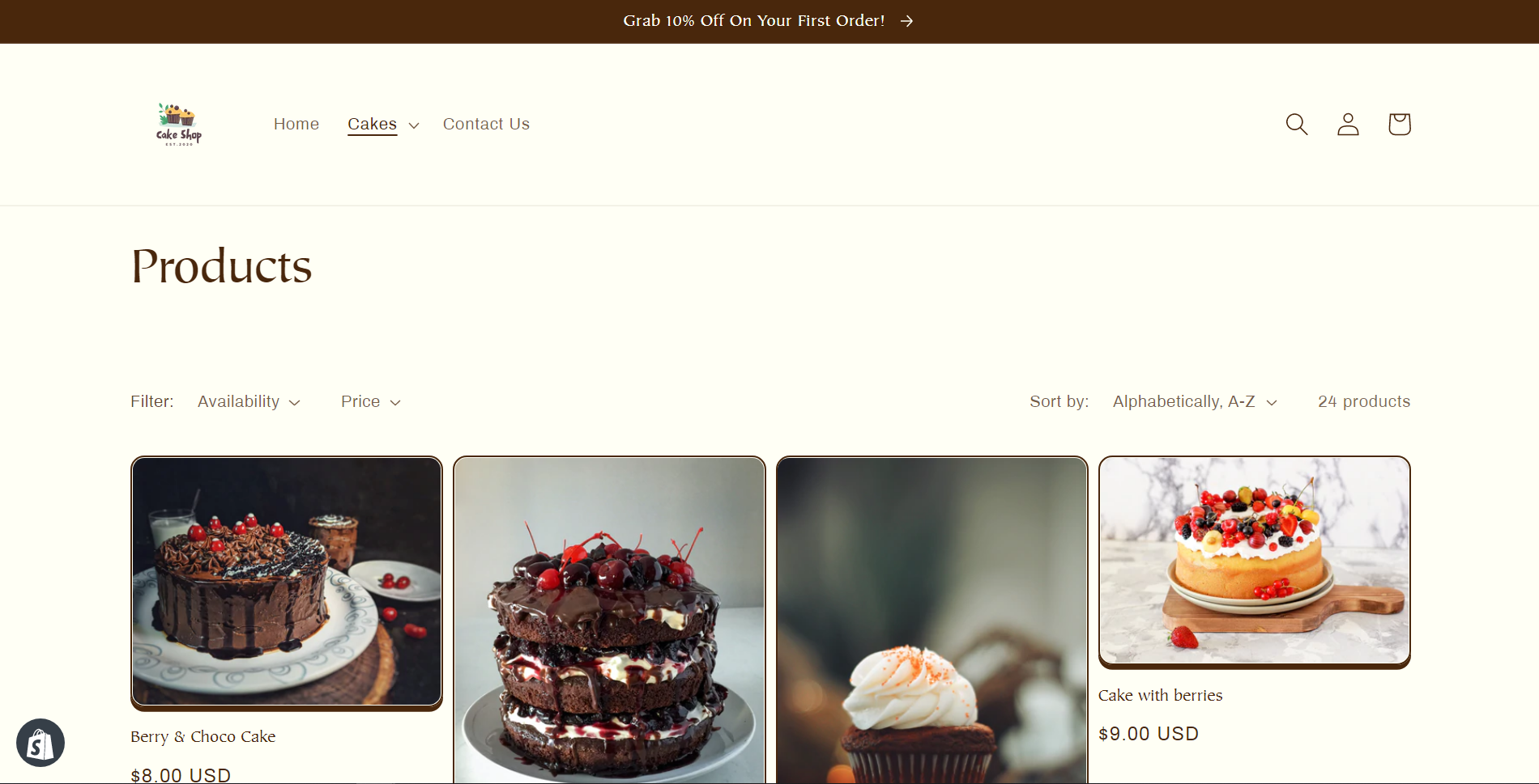
Collections page
| Collection banner section settings | Description |
| Show collection description | Shows the description of collections. |
| Show collection image | Displays the collection image. |
| Product grid section settings | Description |
| Products per page | The number of products that you want to show on each page. |
| Image ratio | The image ratio for the product images. |
| Show second image on hover | Displays image of the product when customers hover the cursor on the image. |
| Add image padding | Adds extra space around the product images. |
| Show image border | Shows a border around the image. |
| Show vendor | Displays the vendor name for each product. |
| Show product rating | Shows star ratings with reviews for each product. |
| Enable filtering | Allows customers to filter products in the collection based on the filters in navigation settings. |
| Collapse larger screens | To show any of the filter customers must click a filter and sort the heading. |
Collections list
This page shows the list of all collections that are available in your store.
| Setting | Description |
| Heading | Represent the title of the page. |
| Sort collections by | Shows collection in several orders. |
| Image ratio | The image ratio for the collection images. |
| Color scheme | Background color of the collection title section. |
| Add image padding | It adds extra space around the collection images. |
Pages
You can create custom pages like About Us, etc.
Blogs
Blog pages are the homepage where all your blog posts will be shown with their images, title, and first few words of the blog post.
Blog post pages
The content of each blog post will be shown with a featured image, title, share button, and content.
Cart
By default, the cart page contains items and a subtotal section.
Password page
This page displays when you have enabled password protection in your online store.
404 page
When customers try to visit a link that your site doesn't at that moment 404 page will be shown to them.
Search page
The search page helps customers to search specific products or pages within your online store.
Conclusion
I hope this guide helped you! Explore the new Crave theme, enable it on your store, customize it in your own style, and boom sales. If you need any assistance let me know in the comment section or contact our support team.
")
")

About the author
Sajini Annie John
Meet Sajini, a seasoned technical content writer with a passion for e-commerce and expertise in Shopify. She is committed to helping online businesses to thrive through the power of well-crafted content.