


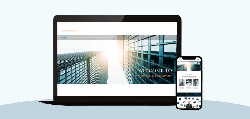
“Creating a Mobile Friendly eCommerce Website” - used to be one of the serious challenges for eCommerce businesses a few years ago. Fortunately, the scenario has changed, as most website themes now come with mobile-friendly features.
If you have chosen Shopify to create an online store, you are lucky as the Shopify platform is unbeatable in providing a smooth mobile user experience. Responsive themes, mobile-friendly checkouts, and mobile stores are just a few of the mobile-friendly features available in Shopify.
If you haven’t updated your store theme for a long time, then possibly your store is not mobile-friendly. Therefore, you should update your store theme to make it up-to-date.
Check if your Shopify Store is Mobile friendly
When you modify the Shopify themes in order to add new functionality to your store, it affects the responsiveness of your Shopify website. In other words, if the theme's HTML or CSS (liquid code) is altered in any way, it may lose its mobile compatibility.
Small tweaks can spell the difference between a beautiful mobile-friendly theme and one that doesn't work. As a result, the mobile user experience of your store may compromise.
To resolve it, you may need to check your Shopify website and help your store to retain its responsiveness. Let’s explore the amazing tool that answers whether your Shopify store is mobile-friendly.
Google Mobile Friendly Test
The Google Mobile-Friendly Test tool lets you know how Google interprets your eCommerce store and whether it considers your Shopify store as a mobile-friendly website.
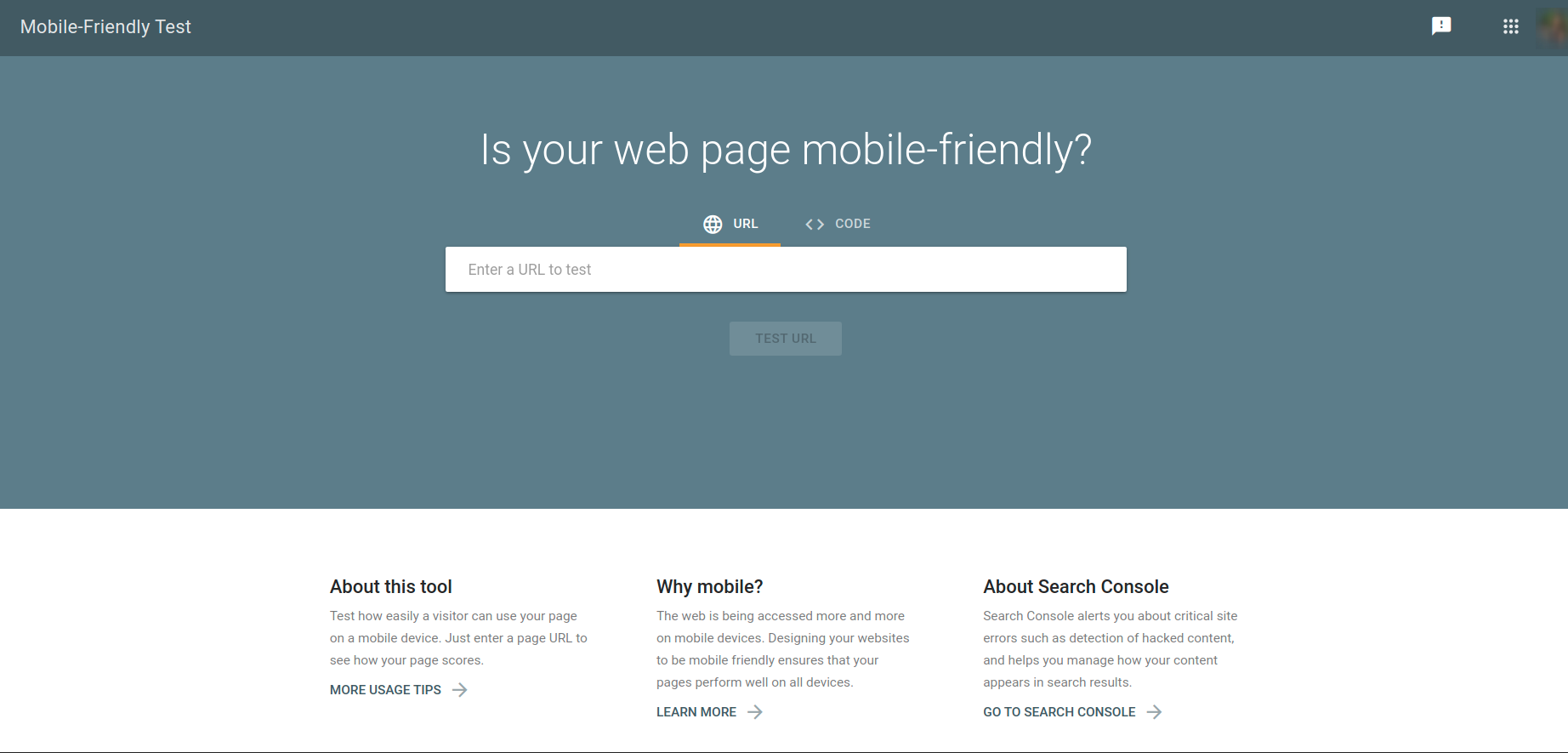
Paste your store URL and click on the Test URL button. It will analyze the URL in different resolutions and show the test result. The best way to test your Shopify store for responsiveness is to check every page one by one.
Manual Shopify Mobile Store Testing
A tool can never be 100% accurate as it is not a human who’s checking your store. You can also check if your Shopify mobile store is mobile-friendly using your mobile browser manually.
Take some time to sit and visit your store on different devices. This will really help you to get which page or portion of the website is affected and needs improvement.

Improve your Shopify Store for Smartphone Shoppers
Hope you’ve got a list of modifications required! Now I would like to recommend some points that may need your attention to improve your Shopify store for smartphone shoppers.
Easy Navigation
Make sure to review the navigation structure of your Shopify store and try to remove the additional layers, to simplify your store’s navigation. Organize your navigation menu and keep it simple. Keeping one level of nested content is good for both search engine bots and your visitors.

Reduce Website Loading Time
Users do not like to wait for long. Check your store’s loading time using the website speed testing tools. Good sites start to load in under 1 second whereas poor sites start to load in over 2.5 seconds.
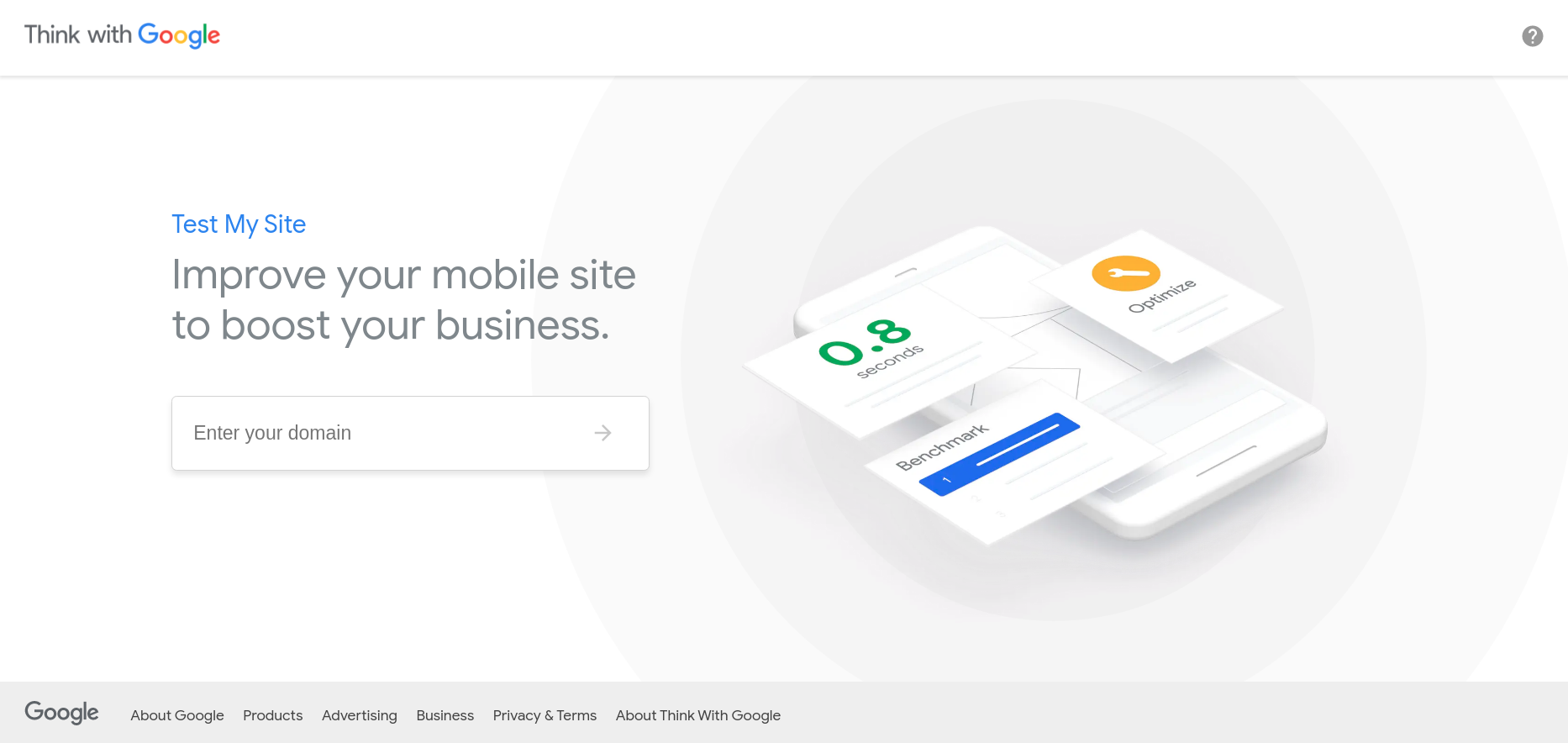
The Google Test My Site checks the loading speed of your store on mobile. After analyzing your Shopify store, it will give the mobile page speed of your store in seconds. What I really love about the Google Test My Site tool is it offers a full report of your site’s mobile page which instructs you where to improve to speed up the site’s loading time.
Optimize Shopify Mobile Theme User Interface
The user interface matters a lot when your visitors land at your store to find something best for them. Check whether your site’s mobile view is as attractive as your web view.

Poor User Interface (UI) may discourage your visitors from continuing to shop in your store. Let’s improve your site’s mobile UI until it’s soothing to the user's eye.
- Store Logo and icons: Make sure the logo size is appropriate for mobile view and all the icons in the header and footer are visible at their place.
- Make your font large: Small fonts are difficult to read and it drops the user's interest too. Make sure the font size is between 14 and 16 pixels and is easily visible.
- Use Conventional fonts: Most mobile phones may not support fancy or non-conventional fonts. So it's recommended to use conventional fonts like Arial.
- Ensure Call-To-Action (CTA) Buttons are visible: CTA buttons play a vital role in increasing your sales. Make the CTA buttons larger and more focused.
- Resize the images: It's better to use compressed and small sized images instead of bulky images that also ensure faster loading speed of your store.
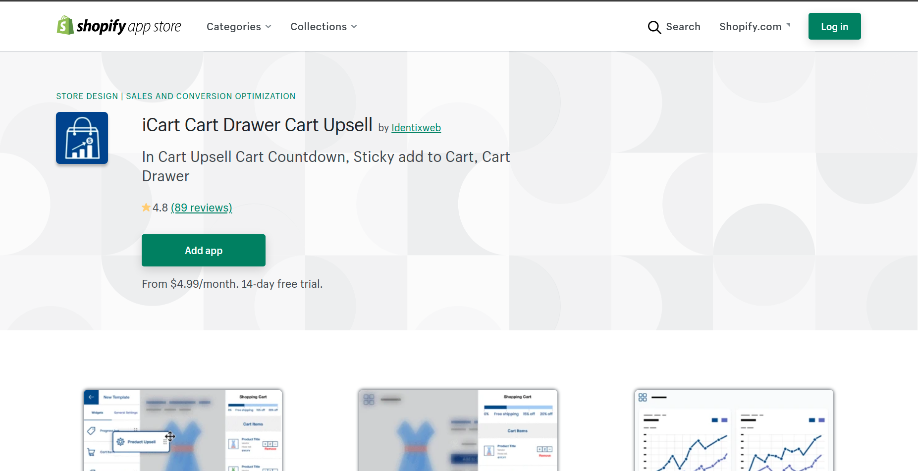
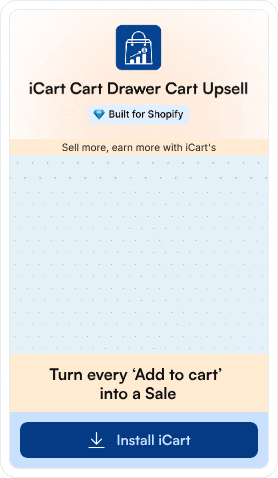
Shopify Mobile-Friendly Upsell App
You may have added various Shopify apps for upselling or other features to your store. As stated above, it can change the default theme and also affect the responsiveness of your store.
To resolve this challenge, you can use iCart Upselling App, an all-in-one Shopify upsell app that's fully responsive to any device. It will help you to boost your sales without affecting your mobile responsiveness.
An online store that isn't mobile-friendly is doomed to lose SEO ranks, sales, and business reputation. Therefore it’s essential to check it regularly and improve it whenever required.
")

![How to Automate Shopify Post-purchase Email? [Examples + Tips to Convert]](https://www.identixweb.com/wp-content/uploads/2026/04/26-03-Thu-Blog-How-to-Streamline-Shopify-Post-purchase-Email-Flow_.webp "How to Automate Shopify Post-purchase Email? [Examples + Tips to Convert]")